(expanding on animuson's comment)
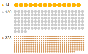
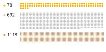
The rows of dots illustrating badges is silly. It doesn't convey any useful information. It doesn't even visually convey the number of badges, since the size of the dots is adjusted depending on the number of badges. This picture (with both screenshots scaled at 80% to fit on the same line) suggests that I (left) have more silver and bronze badges than Jeff (right), if I go by badge-covered area!
Drop that and use the space for something useful, such as having a column for tag badges and a column for other badges.


