Super User
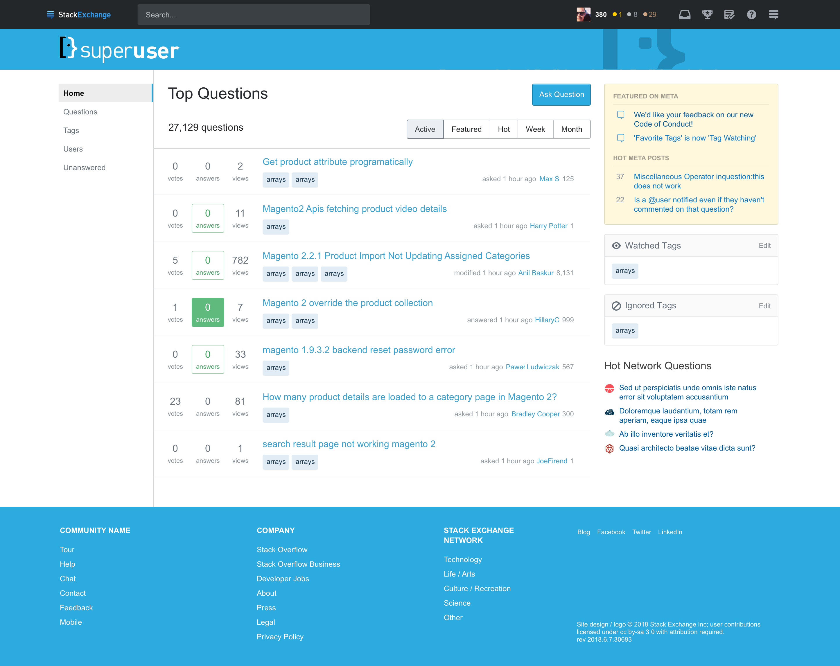
I think brand colouring and identity is important. I have slightly tweaked the proposed Super User theme to use the on-brand colour from the colourised Super User logo:
The right-hand side logo mosaic doesn't really represent the Super User logo that I am familiar with. The logos are disjointed, and it looks like they've just been plastered wherever the designer felt was good enough. I opted to replace that with a desaturated closeup of the most familiar parts of the Super User logo. Additionally, I have returned the dual colours back to the left-hand side logo (even though it's really black and white).


