Two issues
The change is not good, it makes things much harder to read
The process of the change was awful
Apologies for being blunt below, but I'm cross I even have to write this. Has Stack Exchange learned nothing about community engagement and change management? And I'm in a hurry because I have actual work to do, so wordsmithing isn't a priority.
The change itself is not good
This change makes it really hard to read the site on Brave (Chrome-like) on Linux Mint 20. This isn't a moving the cheese thing. This is actually making my eyes hurt.
The text is smaller ("gee, thanks" says the 54-year-old man), line height and letterspacing is...off... I'm not a fonts guy so I don't know the ins and outs of why, but even zooming the text to a reasonable size again it's still really hard to read (and the layout gets hinky).
Sure, I could use a userscript to fix it, and then have to update that user script every time you make another change like this instead of fixing things that actually matter (like Stack Snippets), and deal with the inevitable bug — sometimes quite subtle bugs making you miss important information — related to using a userscript that you don't test with (why would you?) before doing updates.
I should not have to do that just to help people on Stack Overflow.
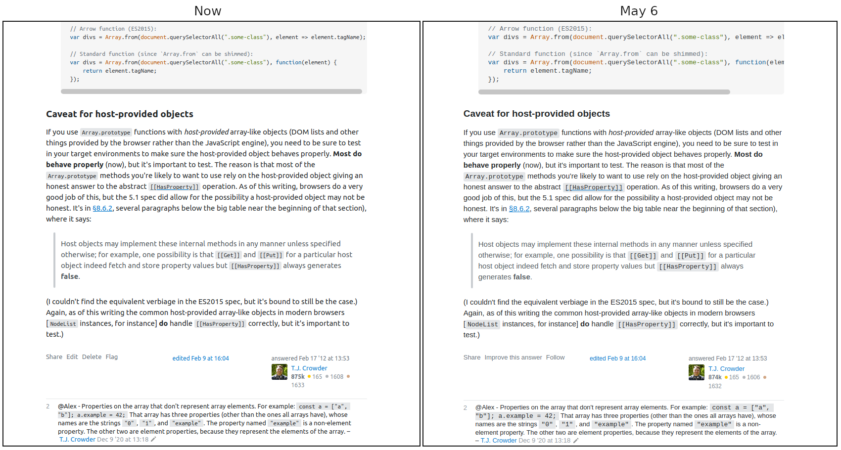
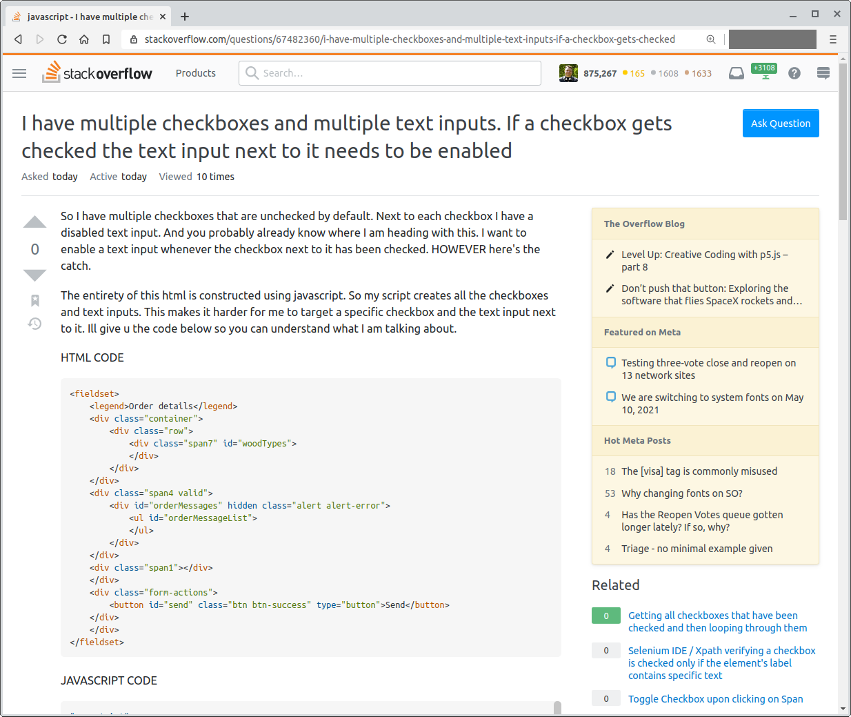
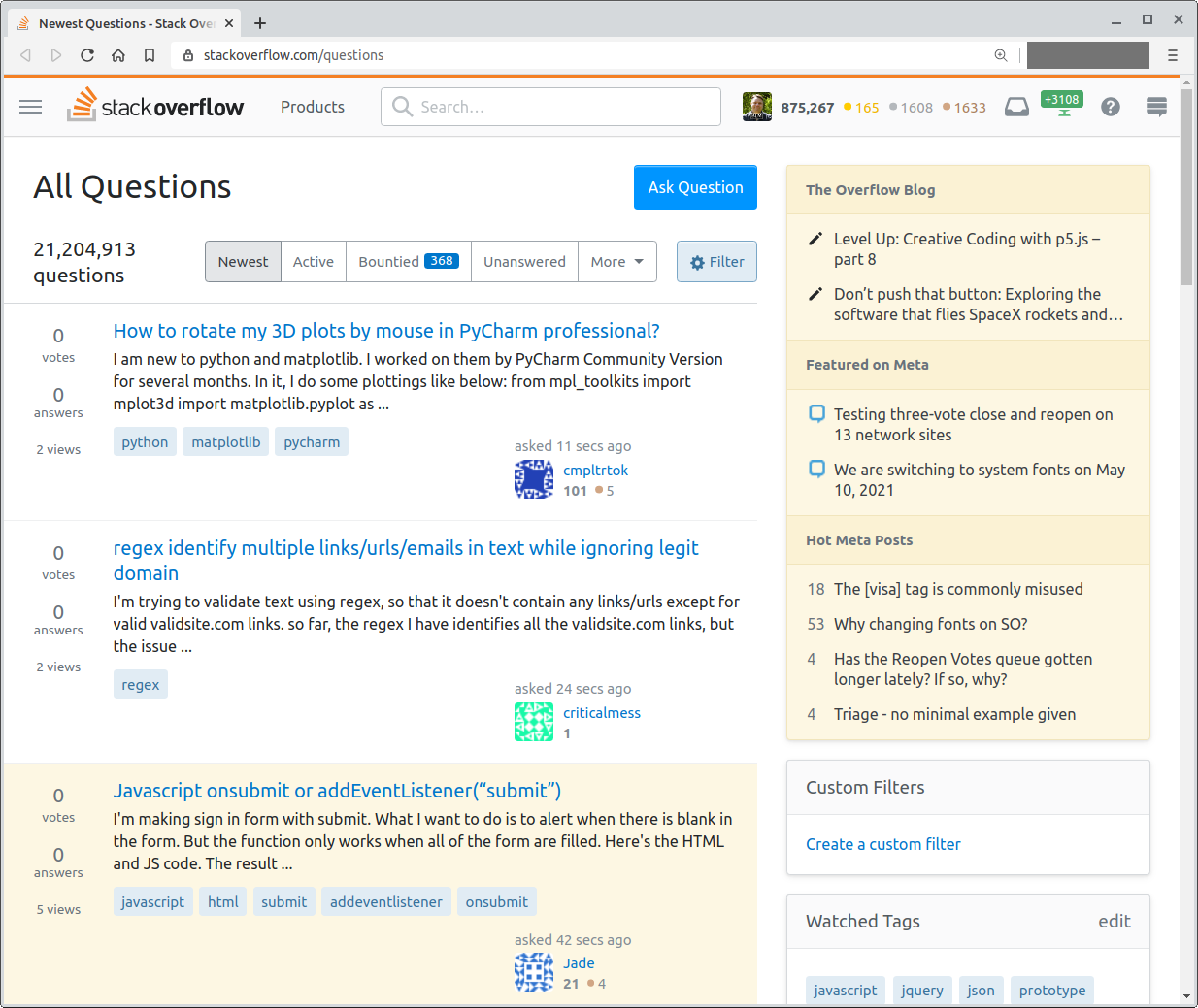
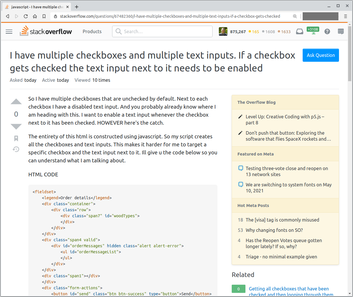
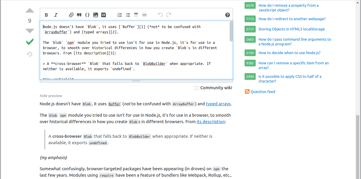
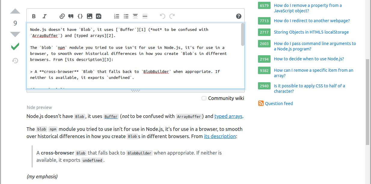
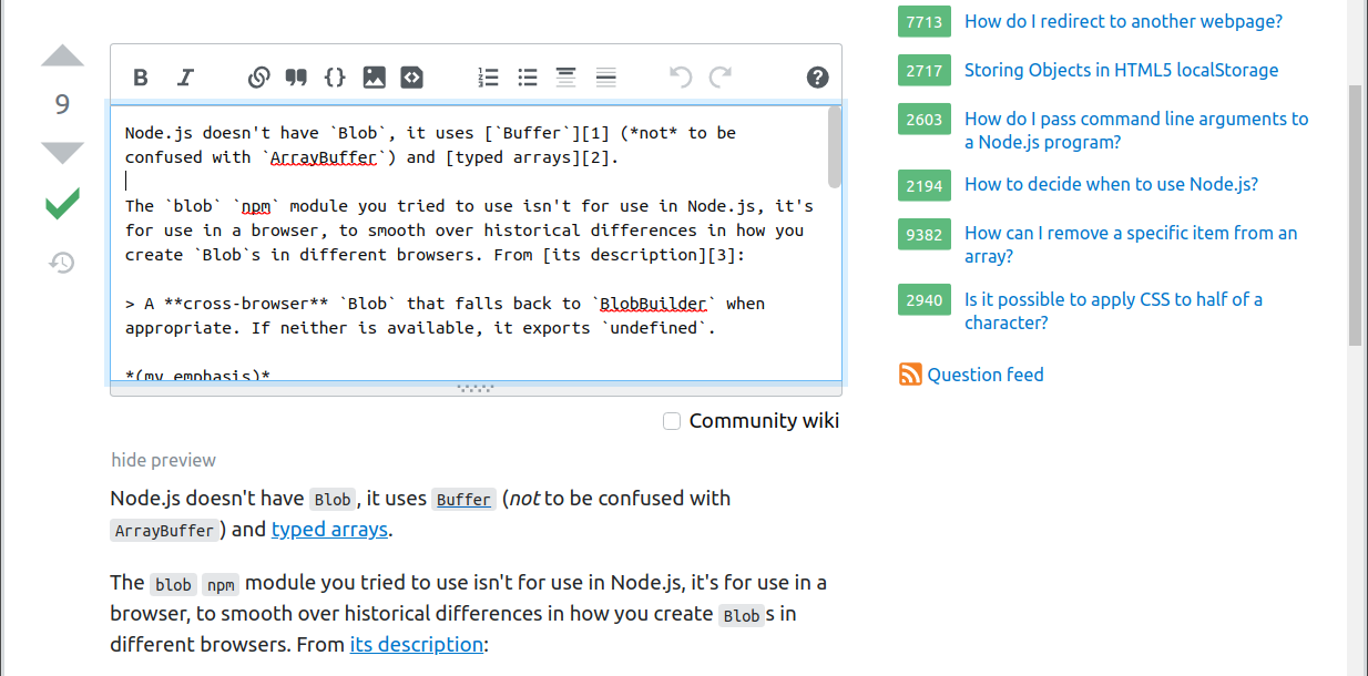
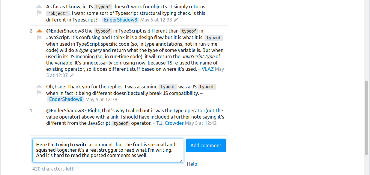
See the end of this post for pictures of how it looks on my system, but here's a side-by-side between now and May 6th (I suggest downloading and viewing at 100%):
I'm surprised to find that the font-size values didn't change (because it seems smaller), it's "just" the font-family. But it's a big negative impact on readability, on my system anyway.
Making large blocks of text readable online is surely a solved problem? Blog after blog has perfectly readable text (much more readable than mine; I need to fix it). News sites. Etc., etc., etc.
The process of the change was awful
Reading and writing text is what using Stack Exchange is all about. Changing the text is a huge deal.
I visit Stack Overflow every day, several times a day. There was no advance warning of this change that I saw (if it was in the "The Overflow Blog" or "Featured on Meta" lists, pardon me for focussing on questions and answers — a change this big should be a banner I have to dismiss). I take it the only announcement of it was in the "Featured on Meta" list that I, like many, don't pay much attention to.
I was going nuts trying to figure out what button I'd accidentally pressed to screw up my text like this. Again, a banner was called for.
Maybe I'm not representative, though I see I'm far from alone with finding the new font harder to read.
Having used a proper process would at least reassure me that it was taken seriously and done properly even if it negatively impacts me personally. Here's an off-the-cuff of how this change could have been handled better IMHO (but I'm not a process consultant, it can probably be done even better):
1. Requirements: Is a change really needed?
Ask the users, in particular your regular power users: Do we need to change it, or is it fine as is?
2. Requirements: Why is a change needed? What needs changing? How?
Ask the users why they feel a change is needed, what needs changing, and how.
3. Implementation: Options
Do up mock pages showing:
- Original
- Option A
- Option B
- Option C
- Option D
- Option E
and collect feedback on the options, narrowing it to (say) two.
4. Implementation and Communication: A/B Testing
Announce the upcoming change and ask people to opt into being randomly assigned one of the test groups. Get feedback and measure engagement vs. previous levels of engagement. Be sure to get a representative sample testing (including young people, older people, people with "perfect vision," people who need corrective lenses, ...).
5. Implementation: Optional
A change this big is never going to be okay with everyone. Provide an opt out. Yes, it incurs maintenance cost (or more accurately, making the change incurs maintenance cost; leaving it alone wouldn't have cost anything). Review annually to see if you can retire the opt-out.
Or here's an idea: Have options. There is no one-size-fits-all. Offer a two or three presentations.
6. Implementation: Finalize
Finish the identified change without hundreds of !important CSS rules, not least so userscripts or similar can reasonably handle undoing it.
7. Communication: Advance warning
Banner-level warning of the upcoming change with a preview link so everyone can see what it will look like to them.
8. Communication: Notification
Banner-level notification the change has been put in place.
Here's what it looks like
(please click to see the full size versions)
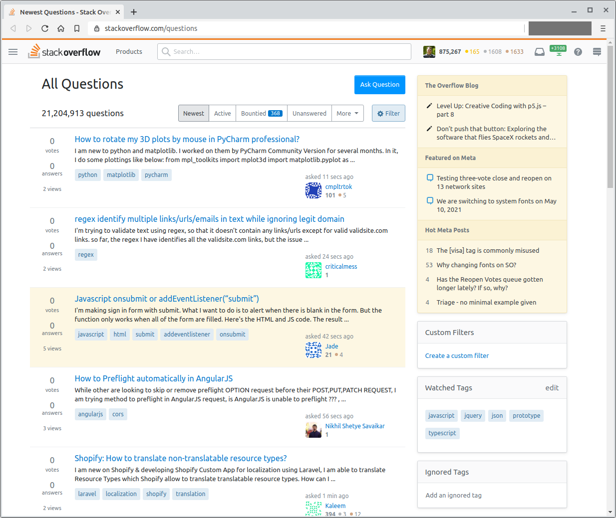
Question list - unzoomed:
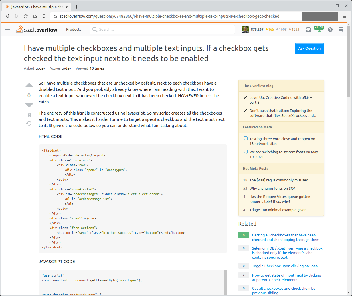
Question - unzoomed:
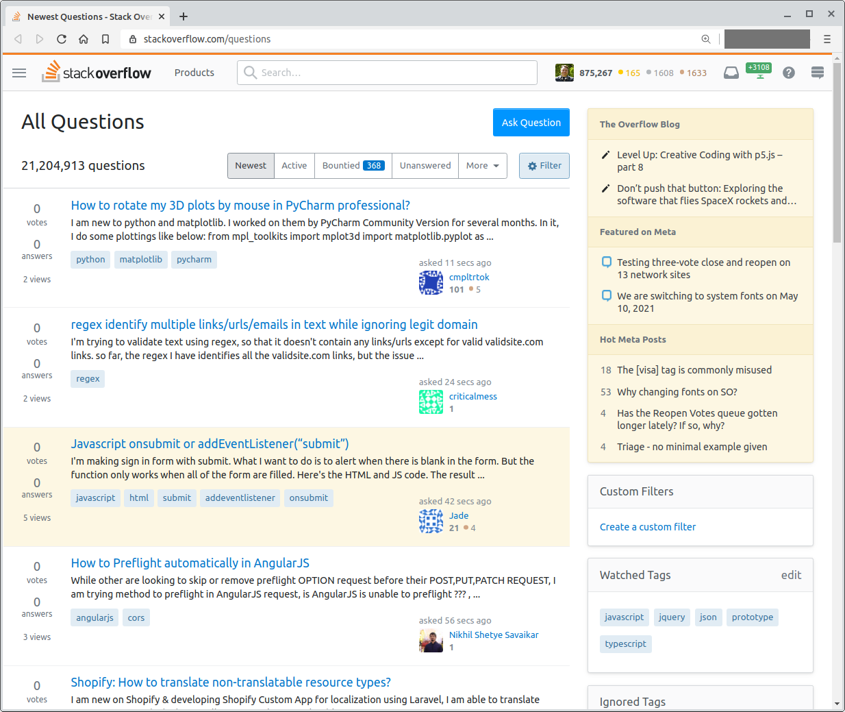
Question list - zoomed 110%:
Question - zoomed 110%:
Question list - zoomed 125%:
Question - zoomed 125%:
Posting an answer - unzoomed:
Posting an answer - zoomed 110%:
Posting an answer - zoomed 125%:
Comments - unzoomed:
Comments - zoomed 110%:
Comments - zoomed 125%:

