49

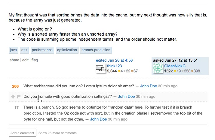
I've been working with Stéphane on some slight changes to the way we display comment-related elements on posts with long comment threads. There are a few problems we're trying to solve:

  1. It's not very obvious when comments are hidden, which could lead to a user missing out on important context or other information about the post.
  2. When there are hidden comments, we have a single button to accomplish two tasks: add a comment, and show hidden comments. We've toyed with doing a bigger overhaul on comment UI, but it's difficult right now for us to have a sense of what users are intending to do with comments. Splitting these two actions into two separate buttons will help us get a better understanding of user behavior, and be less confusing to the user. (If you click "add a comment" in the new version, it will still expand any hidden comments; we still want you to read what's there before posting your own thoughts :) )
  3. Single-line comments take up two lines, which leads to more scrolling / fewer posts visible above the fold. This is particularly problematic for comments on questions – the more space comments take up, the farther down the first answer gets pushed, and most people viewing a question page are there to find an answer.

Proposal

add / show comments split


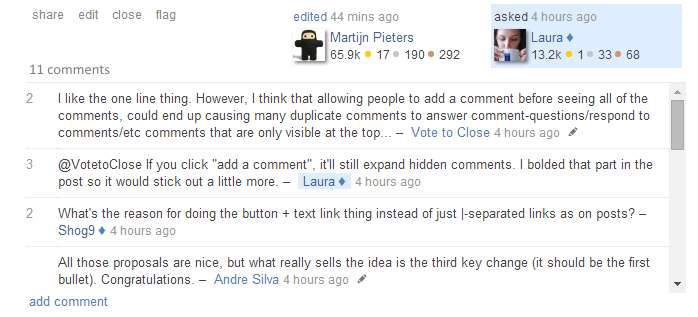
Current Version, for comparison

current add/show comments combined

The key changes:

  • There's a new double-lined horizontal rule between the last comment and the add / show buttons. We hope this draws a bit more attention to the fact that there are comments hidden, without overemphasizing the comment area as a whole.
  • "Add a comment" and "show N more comments" are two different buttons, but close together so you notice them both. "Add a comment" is the more likely desired action, so it's a bit more eye-catching.
  • Single-line comments will now take up only a single line. Rather than having the upvote arrow and flag icon stacked vertically, they'll be shown horizontally on hover.

What do you think?

18
  • 6
    @VotetoClose If you click "add a comment", it'll still expand hidden comments. I bolded that part in the post so it would stick out a little more.
    – Laura StaffMod
    Commented Jul 8, 2014 at 15:55
  • 5
    What's the reason for doing the button + text link thing instead of just |-separated links as on posts?
    – Shog9
    Commented Jul 8, 2014 at 16:02
  • 9
    Also, how is voting/flagging gonna work on mobile, where hover is a bit infuriating? Already pretty easy to hit the wrong thing there.
    – Shog9
    Commented Jul 8, 2014 at 16:04
  • 3
    The double line seems like too much separation - as though it has little to do with the comments above. I like the separate actions, though, often I want to see the comments but don't want the interruption of a big comment box that I wasn't planning on using.
    – Pollyanna
    Commented Jul 8, 2014 at 16:29
  • 1
    @Shog9 The app does this well - tapping a comment brings up the options for flagging, voting, editing, etc. In the web interface, however, you're right. I always tap the comment, then pinch-zoom in on the flagging icons to make sure I hit the right one. Definitely not mobile browser friendly.
    – Pollyanna
    Commented Jul 8, 2014 at 16:31
  • @Shog9 1) We already have quite a few |-separated items (note that the | doesn't appear on all sites anyway); the comment stuff neither belongs up with those other items nor warrants repetition of the same style; on a text-heavy page, all of those links are already starting to blend together. 2) I don't know how this will work on mobile, since we haven't finalized the desktop version yet. :)
    – Laura StaffMod
    Commented Jul 8, 2014 at 16:42
  • 3
    @Laura "I don't know how this will work on mobile, since we haven't finalized the desktop version yet." Might be worth taking both into account during the design phase, rather than relegating the mobile UI to an afterthought once the desktop UI is finalized...
    – Pollyanna
    Commented Jul 8, 2014 at 17:03
  • @AdamDavis There's already a separate project to revamp the mobile site; I just haven't connected with them yet to see if they already have plans for any changes to comments. We generally design for desktop first, then make adjustments for mobile – or, sometimes, punt on any mobile changes because it's a rarely-used-on-mobile feature. We haven't always done the greatest job with our mobile site, but we're trying to be better.
    – Laura StaffMod
    Commented Jul 8, 2014 at 17:40
  • 3
    When you hover over a comment with upvotes, is the vote count replaced by the flag and arrow? If so, could you expand on why?
    – Jon Ericson Staff
    Commented Jul 8, 2014 at 22:58
  • 1
    I'm glad this comment section is getting long enough to demonstrate the eventual new format.
    – Pollyanna
    Commented Jul 9, 2014 at 5:29
  • 1
    @JonEricson Yes, hovering means the comment score is replaced by flag and arrow. Our existing UI has taught users that hovering over comments reveals other actions; we decided to prioritize single-line comments only taking up one line, and this was the best way to do it. We aren't hiding any essential information here. By the time you hover, you've already seen the comment score, and if you forget it and really want to know, you just have to move your mouse off the comment.
    – Laura StaffMod
    Commented Jul 9, 2014 at 14:08
  • 1
    @slhck Sort of. We split the "add / show x more comments" button into two separate actions, but there are a couple more subtler changes coming. status-in-progress :)
    – Laura StaffMod
    Commented Jul 25, 2014 at 14:15
  • 6
    Speaking as a tablet user who no longer needs to hide my keyboard every time I expand a set of comments, THANK YOU Commented Jul 26, 2014 at 2:01
  • 1
    Personally, I hate this change. I have to spend a little extra effort now to figure out which link to click (to make sure I don't click the wrong one), while before there was only one link to click, so that wasn't a problem. Granted, though, I don't use a tablet for my Stack Exchanging.
    – user163250
    Commented Jul 29, 2014 at 18:01
  • 3
    I think it's a great change. I would add the triple dot ellipsis as @AdamDavis proposed in that bottom area to make it clearer that 'stuff is hidden' too. Commented Aug 1, 2014 at 5:47

4 Answers 4

81

For particularly long comment threads I kinda want to know where the invisible comments are before clicking the "show all comments" and, frankly, I often don't want to re-read all the comments when I'm following up on a topic, just recent/new comments.

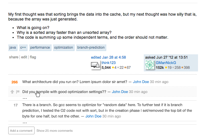
So I'd go a little further and propose that you put ellipses between comments where there are hidden comments, both to reinforce the position of the shown comments in the comment hierarchy, and so you can expand just a section or two of hidden comments, rather than the whole thing:

enter image description here

Probably make them the same gray used for the buttons/actions below. It would immediately alert readers that some comments are hidden, and clicking on one set of ellipses would expand that section alone, giving users a greater degree of control over their reading.

While I'd be tempted to replace the ellipses with more information, "2 comments hidden by splattne and Jon Skeet"* I'd resist that temptation - the point of hiding them is to avoid information overload and provide ease of use for the most important comments.

Of course I'd still suggest expanding all when adding a comment, and the shortcut to expand all would probably still be used more.

* Jon Skeet here used as an example. In practice, Jon Skeet's comments are never hidden.

9
  • 37
    I kinda want to know where the invisible comments are before clicking the "show all comments". + 100. Your solution is much better at demonstrating this. Far too often I've read long comment chains and only realised at the bottom that I've missed n comments, and now the whole conversation reads entirely differently.
    – Matt
    Commented Jul 8, 2014 at 16:16
  • 3
    I'd like that feature, but I would go with a much more subtle indicator like a doubled line. The dots take up quite a bit of space. Commented Jul 8, 2014 at 16:44
  • 4
    @MadScientist I'm torn. For those that know, a much thicker line would be sufficient. The ellipses are very obvious and would be obvious for even those not familiar with our UI hints. We don't use a double-line or very thick line elsewhere to indicate more content. The mockup I made was done in paint.net quickly - I'd be happy with a much smaller amount of space being taken - have the lines butt up next to the ellipses, and take up only an extra 3-5 pixels rather than the 8-10 I've used.
    – Pollyanna
    Commented Jul 8, 2014 at 17:02
  • 1
    I do like this feature, and had started off with a similar idea, but it turns out that calculating where the hidden comments are is much more expensive than calculating that there are hidden comments. For the sake of performance / page load times, we opted not to go that route.
    – Laura StaffMod
    Commented Jul 9, 2014 at 14:10
  • 19
    I bet there's a solution to that which won't affect performance very much. There's this cool website where you can ask such questions to find out solutions you might not have considered...
    – Pollyanna
    Commented Jul 9, 2014 at 14:20
  • 9
    @Laura Please move the "Show all comments" button to the top if you're not going to use this solution
    – Gus
    Commented Jul 11, 2014 at 23:05
  • 2
    @Laura seconded Gus's point - I'd like to know up-front if there are any gaps in context. Perhaps you can show: "Some comments hidden. Click to expand." at the top of the chain. Of course, I prefer Adam's original proposal if at all possible.
    – metacubed
    Commented Jul 12, 2014 at 8:25
  • 1
    @Laura: Another suggested idea similar to this post: meta.stackoverflow.com/questions/265347/… Commented Jul 12, 2014 at 17:05
  • Count me in too; meta.stackoverflow.com/questions/270396/…
    – tripleee
    Commented Sep 2, 2014 at 13:07
27

Rather than "Show x more comments" please consider "Show all y comments".

A lot of dynamic web pages now use "Show x more items", but don't mean to show you all items, merely more than you're currently viewing.

"Show all y comments" is much more clear about the purpose of that link.

1
  • Fair enough, and makes sense.
    – Laura StaffMod
    Commented Jul 9, 2014 at 14:11
12

Thoughts so far:

  • Separate actions should prove interesting in terms of how folks actually interact with the UI, but I'm concerned that the inconsistent styling will skew the results here; that button sticks out a lot more than the link does. From a practical standpoint, an option that expands comments without opening the form would be really nice on mobile, where currently expanding the comments also opens (and puts focus in) the entry form, thus opening the keyboard and making it harder to read the comments you've just expanded!

    Interestingly, the mobile app already has two separate actions for expanding and commenting:

    1 more comment... Add Comment

    Note that it also makes "add" a button and "expand" a link, but puts the link first - I tend to like this more, but whether or not this serves to influence interaction, I would recommend following this style purely for consistency's sake.

  • Collapsed voting buttons are nice in terms of saving vertical space; my only concern here is that it may become even easier to hit the wrong button (especially on mobile, but this has been an occasional issue even on the desktop). No way to know until we see it in action; just something to be aware of.

    As Adam notes, aping the mobile app here might be a good solution for the mobile site; I tend to think this is overkill for the desktop though.

5
  • I'm not an UX expert and don't want to start a religious debate on it but most call to actions are located near the right bottom. In your given sample you could argue that for consistency's sake the App should follow the style on the sites.
    – rene Mod
    Commented Jul 8, 2014 at 18:19
  • @rene "don't want to start a religious debate" Well that's no fun.
    – Pollyanna
    Commented Jul 8, 2014 at 19:18
  • That screenshot makes me feel sick... inconsistent from the real site :) Also, looking through the mockups with the button, I knew right away I would hesitate as to which button to click. The current way looks good and does what you need it to do. Commented Jul 27, 2014 at 22:53
  • has this change been deployed network wide? I ask because I started observing "top n comments shown" limitation at sites that haven't had it so far - Workplace and Programmers
    – gnat
    Commented Jul 28, 2014 at 3:53
  • That's been the behavior on all sites for years, @gnat. The difference for TWP and Progse is that for questions with > 15 answers, all comments are hidden by default - the top N are only shown if there are N comments with upvotes.
    – Shog9
    Commented Jul 28, 2014 at 3:59
-8

What about such design instead?

  • Fixed height for the comments container, even when there are 100 comments
  • "add comment" still always visible
10
  • 2
    Then either the comments are not in order, or the highest voted comments aren't on top and visible without taking action (like scrolling). So I wouldn't prefer this method.
    – Pollyanna
    Commented Jul 8, 2014 at 21:34
  • 12
    Eugh no. When looking at a large comment stream, scrolling up and down that small area will not be fun.
    – Matt
    Commented Jul 9, 2014 at 8:33
  • 1
    So 2 or 3 +0 comments will obscure a +100 comment posted right after them?
    – Doorknob
    Commented Jul 14, 2014 at 13:35
  • @Doorknob well, the sort can be changed. Commented Jul 14, 2014 at 13:42
  • 1
    ... then reading the comment thread wouldn't even make any sense, since you would see replies to comments before the comments themselves. (And clicking sort -> newest is definitely not easier than one click of show all comments.)
    – Doorknob
    Commented Jul 14, 2014 at 13:46
  • Good point @Doorknob, guess I didn't put enough thought into this! :-( Commented Jul 14, 2014 at 13:48
  • 3
    Meh, inframes are bound to cause problems with scrolling. When reading a long comment thread I don't want a small window, and even more than that, when scrolling that small window I don't want to accidentally scroll the outer page every second time because my mouse focus is at the wrong place. Commented Jul 27, 2014 at 19:41
  • @Pierre.Vriens thanks, but I really don't mind the downvotes and accept them as what they are - people who disagree/don't like my idea. Commented Dec 17, 2015 at 8:10
  • 1
    @Pierre.Vriens well, obviously we have very different opinions, and our only option is to "agree to disagree" about downvotes - and for what it's worth, I usually leave a comment when downvoting, knowing it can sometimes get me in trouble as with Iain. Commented Dec 17, 2015 at 8:20
  • 1
    1 more comment (I'm in a rush): now THAT are the kind of downvoter that "I" like... those are the friends that dare to say "hey, there is some spinach between your teeth"! Commented Dec 17, 2015 at 8:24

You must log in to answer this question.

Not the answer you're looking for? Browse other questions tagged .