89

Update:

Thanks for all the feedback and bug reports! I am locking this thread so people don't keep answering it when we no longer monitor it.

If you see a bug or want to raise a feature request, please do so in the usual manner, as a new question.


Some of you may have noticed that we just launched the new profile and activity pages that we have been talking about for a while now on most Stack Exchange sites.

Most? Well, yes, the new design is dependent on a SE network-wide update (a new base css framework) that the design team have been working on. This is an ongoing effort and we will be launching the new pages as sites are moved to the new design.

You've all been hugely helpful already - much of what we love most in here came from feedback and suggestions you gave us on Meta.

But it's possible that it's not quite perfect yet. If you find any bugs and have any feedback to give, please post these as answers to this post.

Just post one issue per answer - that would help us focus on specific items one at a time.

8
  • 5
    These look great so far! Nice work to everyone involved in creating and testing them! Commented Apr 15, 2015 at 15:23
  • Can we cross-post from the previous feedback request question? Commented Apr 15, 2015 at 15:31
  • 2
    This is wonderful! Also, not sure if this should be its own issue as a proper answer, but I've noticed something weird (Chrome Beta): When hovering over visited N+X days, X consecutive line, my cursor displays an overtype tooltip, and changes into an interactive tooltip only after I click on it.
    – Unihedron
    Commented Apr 15, 2015 at 15:31
  • @Unihedro - beta versions are not supported... could be a bug there. Once it is out of beta we can revise.
    – Oded StaffMod
    Commented Apr 15, 2015 at 15:34
  • 3
    Nice Job! I love specially the badge progress tracking feature. So usefull! Commented Apr 15, 2015 at 15:35
  • Now, if you really want extra work, you might want to make it compatible with IE 8 . Again, this is just extra work. Commented Apr 15, 2015 at 16:11
  • @Oded should site specific bugs be posted here?
    – Tim
    Commented Apr 15, 2015 at 16:24
  • @Tim - if they are indeed site specific, might as well post them on the site specific meta.
    – Oded StaffMod
    Commented Apr 15, 2015 at 16:24

75 Answers 75

7

- we will be changing these to not use past tense anymore.

'How to earn this badge' popup uses past-tense when describing badges

The wording of the descriptive text on the 'How to earn this badge' popup is written as if I've already earned the badge, i.e:

Edited 50 tag wikis

How to earn this badge

Can we remove any time/tense-based references from the badge descriptions here?

7

If you have a number of "unread" content in the user profile, the "votes" tab doesn't fit on the screen horizontally:

enter image description here

It dangles to the bottom-right of wherever you hover over the other tabs. This happens on TeX.SE, but perhaps also on other sites. For me it doesn't on Meta.SE.

Confirmed browsers:

  • Google Chrome 42.0.2311.90 m
  • Internet Explorer 11.0.9600.17691
  • Mozilla Firefox 37.0.1

enter image description here

2
  • Any news here? I'm still seeing the same issue from time to time. Commented May 23, 2015 at 15:24
  • @PaulGessler: Nothing yet. I'll poke harder today...
    – Werner
    Commented May 23, 2015 at 16:47
7

Thank you for your feedback, I pushed a fix, it'll be live after our next production build.


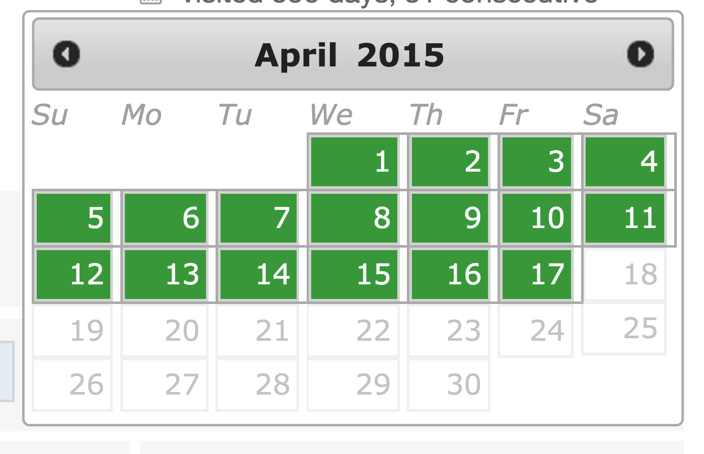
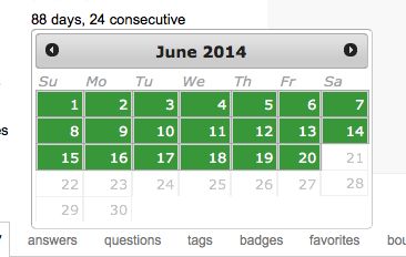
The calendar for consecutive days has gotten worse

The consecutive day calendar formatting has gotten much worse. The previous version didn't have all this whitespace between cells.

enter image description here

For comparison, here are screenshots of the previous calendar:

enter image description here enter image description here

6

this suggestion on my meta stackoverflow profile here makes no sense until it show people reaches(even zero/0 people have reached)

see near " "People Reached" tells you how many people found your posts here while searching for help. " enter image description here

6

- this is not a privacy setting and we do explain that at the top of the hide communities page.

I alluded to this in my other post but decided that it was also worth raising separately.

When I go to any of the sites with the new profile page, there's an option to view my network profile, so I figured I'd view my profiles in another browser to see if the "hide communities" function was working.

On the site itself, it works. For instance, I decided to hide my profile on the Anime & Manga site, and I get the following when I view my profile on that site when not logged in:

enter image description here

Similarly, when I view my profile on the German Beta, the communities I've hidden aren't shown:

enter image description here

But there's a "view network profile" link, and my network profile shows all of my communities, regardless of whether or not they are hidden.

I'm not really sure if this is intended behaviour or not, but well, this would make it easy for someone nosy (and who is neither the user themself or a moderator) to find someone's hidden communities. While I don't care too much about people on other sites discovering my otaku tendencies, well, I'd much rather not have my (potential) participation on sites like Academia or on religion sites for all the world to see.

And well, this just seems a bit contrary to the whole point of being able to hide communities?

12
  • 1
    Hiding community is to limit the visibility of your association to a certain site, not really "disassociate" yourself from the community. The usual advice is to create a different account for the other sites which you don't want people to link back to you.
    – nhahtdh
    Commented Apr 16, 2015 at 2:48
  • @nhahtdh: makes sense, but I wanted to point this out in case it wasn't quite intended.
    – Maroon
    Commented Apr 16, 2015 at 2:50
  • 2
    @Oded, regardless of whether this is a privacy setting it seems odd that it should hide the communities in some profile pages but not others. I went through hiding a bunch of communities which I don't really participate in, in order to make my network profile page a bit cleaner, and the only thing it accomplished was to add a massive panel on my own view of my per-site profile page telling me which sites I'd hidden. Commented Apr 16, 2015 at 10:04
  • And when other users visit your profile pages, they will not see those communities. @PeterTaylor - that's the point of this feature.
    – Oded StaffMod
    Commented Apr 16, 2015 at 10:05
  • @Oded, I was trying to change the appearance of my network profile page, and it didn't work. (I tested by viewing with an anonymous browser window). Commented Apr 16, 2015 at 10:07
  • @PeterTaylor - I understand. But that was never the intention of the feature (and we do say on the hide communities page that "Hiding a community means other users will not see it in your Communities list and Top Network Posts."). No mention of the network profile page.
    – Oded StaffMod
    Commented Apr 16, 2015 at 10:09
  • 5
    @Oded, I think that expecting a general user to draw a distinction between "Communities list" referring to the list in the per-site profile page but not to the list in the accounts tab of the network profile page is nerdview. Commented Apr 16, 2015 at 10:11
  • @Oded another one Commented Apr 16, 2015 at 11:06
  • @Sha - we will be discussing how the feature works. Don't know yet what the fix will be, but we will be talking it over in the team.
    – Oded StaffMod
    Commented Apr 16, 2015 at 11:08
  • @Oded sure, but the question is dupe of this answer (peculiar, isn't it? :)) and you already marked this one as status-bydesign. Commented Apr 16, 2015 at 11:09
  • 4
    @Sha - if this comes up multiple times, it means there is a problem with our design... And we need to discuss that.
    – Oded StaffMod
    Commented Apr 16, 2015 at 11:11
  • I believe this was fixed, here: meta.stackexchange.com/questions/253599/…
    – pkamb
    Commented Nov 17, 2019 at 7:40
6

This is a somewhat preemptive consideration.

Being a high-rep user on TeX.SE I am left with a view of only two possible badges to track: Socratic (gold) and Peer Pressure (bronze).

enter image description here

Assuming that one day I might obtain Socratic, that will leave me with only a Peer Pressure badge to track... indefinitely.

My thoughts on this:

  1. I'm not really eager nor attempting to obtain such a badge. So, why track it at all?

  2. Tracking it seems superfluous, as the tracker would go from 0/1 to 1/1 immediately when you delete a post satisfying the criteria. I guess the same goes for Student, Supporter and Tag Editor (maybe others as well).

  3. What happens when a user has obtained all trackable badges?

The answer to (3) might be that some badges are awarded multiple times (Socratic included), and one can always just leave that as the "track next badge". But then why not include Great Answer or Great Question (or others that could be awarded multiple times) as well?

5

- badge progression is closer to "real time" than the awarding of badges. So, we know the criteria of a badge and whether one has reached it (so we can tell you that this is no longer a badge that can be tracked and to congratulate you on earning it). But this is a separate mechanism from actually awarding the badge (we have separate schedules for the different badges - done for performance reasons). We will be looking at making the award faster for tracked badges.

I recently hit 600 question votes (out of ~1800 total votes), which should qualify for the electorate badge. That was the suggested next badge on my new profile page and, as expected, vanished after hitting 600. While the suggestion changed immediately, the actual badge took a while to show up.

It shows up on the suggestions with a check mark: Badge suggestions showing electorate checked

But the badge page does not show it checked: enter image description here

I had received other badges since qualifying for electorate and they seem to show up in both places, but the screens were still out of sync.

Why would the two screens show different statuses for a badge?

5

- this is clickable and will bring up a popup describing the badge.

Hovering over next badge remains mute

In the new profile, there is a badge section in which progress for the next badge is displayed. However, in contrast to the traditional hovering behaviour of badges which showed the actual purpose of the badge, nothing is shown for the next badge.

Request: Make the next badge hoverable with the traditional description.

(This feature would be nice for reasons of consistency ; clicking there will show all badges of interest with their descriptions, but again, the light-weight hovering still would be nice)

(Source)

5

- we may revisit the design of this section at a later date.

It's not apparent that the bio is scrollable when there's enough content to overflow. There's a (non-standard, kind of hard to see because of the grey and large amount of space surrounding it) scrollbar, yes, but no other visual cues that there's more content.

enter image description here

Making it so that a line of text is cut off and adding a 1px border on .about fixes the problem nicely:

enter image description here

5

- Not all badges are trackable. Most of the ones we don't show as trackable are those that tracking would impact performance.


In the new Profile you can take track of your progress on getting new Badges.

But some of the Badgeds are missing in the selection, e.g.: Announcer and Pundit.

I would like to know why I cannot select them in the Track and therefore the progress is not visible.

2
  • Not all badges are trackable. Most of the ones we don't show as trackable are those that tracking would impact performance.
    – Oded StaffMod
    Commented Apr 16, 2015 at 10:07
  • @Oded, I think the following question would be "Of those that are trackable, why are they not listed"?
    – Pacerier
    Commented Apr 30, 2015 at 7:58
5

- this will be with you in the next build. This probably happened due to you hiding Stack Overflow before your user there got deleted. We are now syncing up such deletions with the hidden communities list.

Everything on my "accounts" list here is correct, although the fact that it shows communities I marked as "hidden" on my profile (when I view this on a browser I'm not logged in on) seems weird to me.

However, when I go to the "hide communities" page, one of the communities I have an option of hiding or unhiding is Stack Overflow.

enter image description here

When I click on the link here, I'm directed to an error page. The thing is, I remember deleting my Stack Overflow account after I realized I had little use for it; I left with, if I'm not mistaken, 106 rep.

When I tried logging in to double-check if I'd really deleted my profile, I got this page, so it can't be that I'd forgotten to go through with deletion.

enter image description here

None of the other sites I've deleted my profile from before are showing up in the "edit communities" page. (For instance, I used to have a profile on Skeptics, but there's no option to hide/unhide the Skeptics community.)

1
  • @Oded: thanks for the response, although the explanation seems weird to me: there was at least one community -- the economics beta -- I definitely dropped after the hide community options appeared (and to boot, I might have hidden it first), but I haven't had such problems with that one. I don't remember when I dropped Stack Overflow, but there's a chance it was prior to this.
    – Maroon
    Commented Apr 20, 2015 at 17:29
5

- we don't have default tab choices anywhere else on the site (that's why they have different URLs, which you can link).

Use the current tab and last used tab OR use a "favorite" tab when viewing/switching between profiles.

Right now, if I go to a profile such as this one, it defaults to the "Profile" tab. I can click on the "Activity" tab and it will pull it up as it should. Now, if I click, "Meta user" I expect to be taken to the "Activity" tab of the Meta profile, but instead it goes to the default "Profile" tab.

The same goes for when I view a different user's profiles. If I am on the "Profile" tab and then open another user's profile, I expect to view the same tab that I was just on, but with a different user's information. Instead it always goes to the "Profile" tab.

The other option is to allow users to set a default tab for viewing profiles, either "Profile" or "Activity". This way we can always see the tab we want to when we view user's profiles.

I bring this up because personally I find the "Activity" tab much more useful for my purposes and always end up switching over to it when I view user's pages.

3
  • 1
    @Oded Any reason why this was declined? Commented Apr 18, 2015 at 13:43
  • 1
    There's a userscript workaround for this on StackApps. Commented Apr 18, 2015 at 14:32
  • 1
    We have now got two profile pages: the "nice" one and the "useful" one. Which one people want as default? You've got one guess. /sarcasm
    – yo'
    Commented Apr 20, 2015 at 11:43
5

Thanks to this new feature, I'm able to now track daily reputation on Meta Stack Overflow via the Epic or Legendary badges, which is a pretty nifty side effect.

I did notice, however, that if you get a negative total rep score while tracking one of those two badges, the bar fills in.

enter image description here

Shouldn't the bar...not fill in?

5

The "new privilege" announcement doesn't contain a link.

Regular pointer -- not a link

I would expect it to contain a link that i can click to learn more about the privilege.

4

- not all badges can be tracked. We had to drop a few where tracking would cause unacceptable performance issues.

Convention badge does not show on the new Badges sections I have to say that the new badges section looks great. But then I notice that there where some badges that where not showing up there like Convention

is this a bug or is there a reason why Convention, Talkative and others are not there?

I looked in all the categories for them but I could not find them

5
  • 1
    You already have Talkative, so I wouldn't expect it to show up in a "next badge" tracker. Also some of the event-based badges can't really be worked toward, you either do that thing or you don't, so I don't expect things like Convention to be in a "next badge" tracker either.
    – Aaron Bertrand Staff
    Commented Apr 15, 2015 at 20:37
  • 1
    You are on the "Available" tab. Click "All" and try again.
    – Werner
    Commented Apr 15, 2015 at 20:42
  • @AaronBertrand: Convention ("10 posts with score 2 on meta") sounds very much like a work badge. In contrast, Investor - 0/1 (offer a bounty) is more like an event badge?
    – Bergi
    Commented Apr 16, 2015 at 4:11
  • @AaronBertrand I do have Talkative but its not on the list event when you look at all. if you look for 'Outspoken' you wont find that one ether Commented Apr 16, 2015 at 11:54
  • Sorry, I confused Convention and Caucus.
    – Aaron Bertrand Staff
    Commented Apr 16, 2015 at 12:58
4

Could we update site-logos/favicons to also use scalable vector graphics (SVG) on the profile pages?

enter image description here

Related feature request: Favicons in top-bar dropdown not SVG

4

- we may revisit this at a later date.

The Your Comminities in the sidebar should be the same as the one in the Stack Exchange Dropdown:

enter image description here

enter image description here

3
  • In lieu of an automatic change, you can manually edit the dropdown list to add or remove communities.
    – HDE 226868
    Commented Apr 15, 2015 at 22:10
  • 1
    @HDE226868 I'd like to be able to chose which appear, in what order, rather than just be able to hide some though.
    – Tim
    Commented Apr 16, 2015 at 10:21
  • @Oded okay, fair enough :)
    – Tim
    Commented Apr 17, 2015 at 12:51
4

- we appreciate that you are finding this layout difficult, but will not be changing it in the short term.

Feedback: Top Tags emphasis doesn't work for me

Top tags screenshot

When I look at this, the three tags which I see at first glance are the first, second, and fourth. The alignment effectively hides the third one, giving a misleading emphasis.

4


Asked as a separate question

The old user pages showed if a user was unregistered, but I haven't been able to find that note on any users with the new page. Now it's possible that no one is using the sites I've been checking without registering fully, but it seems unlikely - I've checked a lot of 1 rep users!

This was a useful piece of information to have, as it gave a strong indication as to whether a user would even return. This is helpful for considering whether to spend more effort to improve questions or just to close them, for example.

Can it be added back?

4
  • 1
    I find the reasoning to be bad. Questions should be improved/closed on the post merit - not whether the OP will return or not. If the question is good enough to warrant editing, that's what you should do. If it isn't you should vote to close it. Don't forget - we are trying to help more than just the OP - we are trying to be a resource to everyone.
    – Oded StaffMod
    Commented Apr 17, 2015 at 10:17
  • 1
    @Oded Consider a poorly written question which has a close but not perfect duplicate. If the user was around you can work with them to improve the question and make it distinct, if they're a drive-by user it's better to just close as a duplicate. Duplicates are much less frequently reopened, so knowing how likely it is that the user will return helps me decide how to act on the question. Commented Apr 17, 2015 at 15:15
  • 2
    @Oded When I see a new user doing weird things instead of just deleting their unneeded post (this happens often), I either (1) point out the delete button under the post; or (2) explain how to register account, to be able to delete. Which explanation to give depends on the user's status, so I go look at their profile to find out...
    – user259867
    Commented Apr 17, 2015 at 18:49
  • @Oded One reason to know is when a post needs deleting. Only registered users can delete their posts; it's confusing for an unregistered user to be told “click the delete button”, since they don't get a delete button. Of course, it would be simpler for everyone except maybe SE developers to remove the distinction between unregistered and registered users altogether. Commented Apr 19, 2015 at 23:50
4

Pluralization bug at "posts edited"

When you've edited 1 post, the Activity tab says "1 posts edited":

1 posts edited

4

- with you in the next build.

Filtering and sorting of the posts list on a user's profile (the external-facing page) is not preserved when returning directly to the page via the back button:

Kind of annoying.

4

- These are sorted by the combined completion %ages of both bars (I don't think there is a reasonable secondary sort to this), given that both parts are required in order for the badge to be earned. In that respect the three highlighted badges are all 5% completed (2/20 == 10% - the other bar is 0% - so together 5% complete, 5/100 == 5% + 1/20 == 5% - so altogether 5% complete).


The Select your next badge dialog doesn't sort the tags as expected.

I would expect the tag with score 5 come before the tag with score 0, since it is more likely I will hit that one first.

2
  • These are sorted by the combined completion %ages of both bars (I don't think there is a reasonable secondary sort to this). In that respect the three highlighted badges are all 5% completed (2/20 == 10% - the other bar is 0% - so together 5% complete, 5/100 == 5% + 1/20 == 5% - so altogether 5% complete).
    – Oded StaffMod
    Commented Apr 20, 2015 at 16:32
  • @Oded Thank you for this formula as without this I had heck of time in figuring out. +1 Patrick for bringing this up. Commented Aug 19, 2015 at 0:24
3

- we will be looking at the mobile design as a whole, as a separate project.

The back and forward button in the answer list looks weird on the mobile website:

3
  • What browser/OS (and versions)?
    – Oded StaffMod
    Commented Apr 16, 2015 at 8:54
  • I am using iOS 8.3 @oded Commented Apr 16, 2015 at 9:09
  • @Oded: Okay, but I am sure this was okay a few days ago. Sure this isn't related? Commented Apr 17, 2015 at 12:58
3

- Other numbers on the site are not intended as approximations, but are shortcuts due to lack of space - if you hover over that reputation figure, it tells you exactly how much reputation. People reached is not and cannot be an exact number.


How about removing the ~ (tilde) from the "people reached" number in the IMPACT box?

enter image description here

So instead of showing ~39k people reached, drop the ~ and just show 39k people reached. Everyone will still know that "39k people reached" means "approximately 39,000 people reached" and not "exactly 39,000 people reached".

It will make it consistent with other areas of the user interface (I'm not aware of anywhere else in the user interface where the tilde is used). For example, consider user reputations:

enter image description here

It doesn't show ~237k, it just shows 237k.

1
  • 7
    Other numbers on the site are not intended as approximations, but are shortcuts due to lack of space - if you hover over that reputation figure, it tells you exactly how much reputation. People reached is not and cannot be an exact number.
    – Oded StaffMod
    Commented Apr 16, 2015 at 18:34
3

This is a modification to the existing design rather than a bug report, according to me, scrolling the username with the profile description looks odd to me ... For example...

Profile

Also, why we have borders on tabs when zoomed out at 90%

Tabs

3

Diamonds in the list are rendered a little too high when viewed on my iPad:

enter image description here

3

- in the next build.

Wrong way to show membership length, probably linked to fixing this one.

error

1
  • Just came here to add this one, looks a bit odd
    – Und3rTow
    Commented Apr 20, 2015 at 14:00
3

- This post explains the methodology, as well as its constraints. The most relevant to this issue is that we can't easily track whether views on a question came before or after an answer was posted. But the method is designed to make it fairly uncommon to get an answer that meets the criteria for credit after a large number of views are already there.


Feedback: A new user can earn a significantly higher "people reached" number than users with more experience.

In her profile, a user whose initial post is a new answer on an old question, shows that she's reached ~7k people. A user, in this case, me, who's been active for months, shows ~2k.

If I understand the formula correctly, I imagine her number was generated based on the fact that she answered a popular question which has accumulated almost 7k views since its posting in 2011, whereas nothing I've done has attracted as much attention. Obviously this happens to many experienced users, and can be discouraging.

Her answer is equally as important, if not moreso, than any of my contributions. I'm not implying in any way that I'm more valuable; just pointing out what I think is a potentially negative characteristic of this statistic.

Me

New user

1
  • 3
    This post explains the methodology, as well as its constraints. The most relevant to this issue is that we can't easily track whether views on a question came before or after an answer was posted. But the method is designed to make it fairly uncommon to get an answer that meets the criteria for credit after a large number of views are already there.
    – Jaydles StaffMod
    Commented Apr 20, 2015 at 14:07
3

- we too had this idea, but there isn't a good location to link these to at the moment. We will certainly revisit this as and when such a link target will exist.


The new profile view is really good. It shows more better picture of profile. I just noticed one thing I am not sure previously it was available or not but It would be good user experience I think.

Currently on user profile we see gold,silver and bronze badge count, but when we click one of these count nothing happens.

For examle,shouldn't it show gold badges user earned if user clicks the gold badge count?

enter image description here

1
  • @Oded it will be a good user experience. Do consider it Commented Apr 29, 2015 at 12:23
3

Mismatched numbers

BUG!!!

My badge progress bar says I've edited 61 posts. But in the Impact section, I've edited 62 posts.

7
  • 1
    Probably caching, but interesting nonetheless.
    – Tim
    Commented Apr 15, 2015 at 20:33
  • Could be that the new counter counts tag wiki/excerpt edits while Strunk & White doesn't.
    – senshin
    Commented Apr 15, 2015 at 20:34
  • @senshin I have have never edited a wiki post (at least not on StackOverflow).
    – unbindall
    Commented Apr 15, 2015 at 20:36
  • @DominatorX Tim is not talking about your browser's cache.
    – Aaron Bertrand Staff
    Commented Apr 15, 2015 at 20:39
  • @DominatorX He means a tag wiki, the description of a Tag, not a CW post.
    – Tim
    Commented Apr 15, 2015 at 20:48
  • I can edit the description of a tag?! :o
    – unbindall
    Commented Apr 15, 2015 at 20:50
  • 7
    Probably not a bug. Multiple edits to the same post or any edits to your own posts don't count towards the badges. Commented Apr 16, 2015 at 1:42

You must log in to answer this question.

Not the answer you're looking for? Browse other questions tagged .