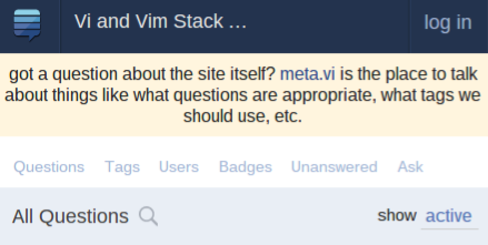
When a site has a "system message" shown (such as the message shown on recently launched beta sites, like Vi/Vim), the mobile layout suffers:
Compare the above with how the mobile navigation bar normally looks:
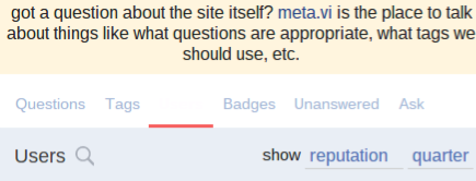
Worse yet, a selected tab on the navigation bar is shown in white on white:
Observed in mobile Opera 27 on Android, and also in desktop Chrome 41 on Chrome OS, from where the screenshots are taken.
The problem is that <div class="system-message-container"> is positioned where the navigation bar is supposed to be; if it is deleted, the normality is restored.


