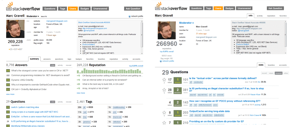
The newly designed user page has been online for a while now. It contains a lot of improvements and is really nice work overall. However, one aspect about doesn't cease to irk me: The first tab that people see when entering the profile. It has deteriorated massively from a design point of view, and now looks like a moderator control panel. It no longer feels like a user profile that one can show to a non-SO person.
Look for yourself - the left hand one is the new design, the right hand one is the old one. Which one would you rather show to a person who doesn't have a clue about Stack Exchange?

To be perfectly clear: This isn't about cheese that's been moved. Many users use their SO profile as a kind of visiting card, and hence it should look good and polished. I think the new condensed design is a strain on the eyes, but I can live with it being shown to us power users - it arguably helps see everything at one glance.
But as a profile page, I think it's terrible and contains lots of clutter that is completely meaningless to a non-SO visitor.
Please add a new first tab to the page that non-SO users see by default and that is cleaner, less utilitarian, nicely designed presentation with more white space, much like the old one. Show the new design as the second tab, selected by default for existing users.
Context: this request was posted twice in User profile page - Feedback wanted and New user page - LIVE (both 10k only, as they have since been deleted). As suggested, I'm posting it again as a separate feature request.
