132

Update

We have done a bunch of work following your feedback - just look at all those tags on the different answers here!

The top suggestion was to do something about the badge visualization - we have listened and completely redesigned that piece - check out the new and improved badge visualization, on the profile page.

In the next few weeks we will preview further profile changes here on MSE - mostly to the activity page and following feedback and rework on those, the new profile page will go live to the rest of the network (6-8 weeks, give or take).


You may recall this thing - our profile page makeover prototype, the reloaded user page. We posted a prototype 6 months ago and got a lot of feedback. Since then, generations of dinosaurs were born, fell in love, had families and were eventually killed by a comet. Or climate change, or maybe texting and driving or some nonsense like that.

We picked up work again after a couple months of avoiding it (one or two of you noticed...) and started cleaning up some of the rough edges. We are looking to get this right and the change isn't urgent, so we are taking our time on it. We want to have something that is clearly better than the current page.

What is all this about again?

The user profile page was trying to address two fairly different use cases:

  • What is most valuable and useful when you want to see what someone else is all about.
  • What you should see when looking at your own profile.

Because it was trying to solve both problems in one place, it was decent at both, but not great at either, and it probably was overall more optimized for the "looking at my own profile" use case.

So, here's what's happening

If you go to your profile on MSE right now, you'll see it now has two tabs in the top left:

enter image description here

The "Profile" page is your new public profile. It's what everyone will see by default when they click your picture at the bottom of a post or find you in the users list. It should communicate what you know and what you've done.

The "Activity" page is intended to be your own personal dashboard, stuff that isn't necessarily of interest to others but that you want to see when visiting your own profile. Right now it's just the old profile page, but we'll be tackling that next and asking for feedback here on how to make it more useful.

See for example the Activity and Profile pages of BalusC - the former shows you his overall activity on the site, the latter showcases him.

Some of the things we changed based on your feedback:

User info section:
old user info

new user info

We also added a new "people helped" counter based on the views your questions and answers have gotten. This is essentially a sum of views of your questions, and answers that fall within the following criteria: accepted, have a score of 5 or more, have more than 20% of total score of all answers on a question or are within the top 3 answers by score. No deleted posts are counted.

Tags:

old tags

new tags

And some other tweaks and visual updates we can't quite remember - you can see the old version here.

Unfortunately the very popular request to make the badges interactive didn't quite make it in -- but we may still come back to this later.

Feedback

We are looking for your feedback before this goes out to the rest of the network - what's broken? What's missing from the new page? What needs a bit of polish?

29
  • 25
    Is there a plan to allow users to see the activity page by default even for other users? This is something I'd really prefer on sites where I'm a moderator. Commented Nov 27, 2014 at 16:04
  • @Mad - not at this time, but that's why we are taking feedback :)
    – Oded StaffMod
    Commented Nov 27, 2014 at 16:05
  • @cVplZ - I will. It is not that complex, but has a bunch of different clauses. Stay tuned.
    – Oded StaffMod
    Commented Nov 27, 2014 at 16:28
  • 3
    Leaving "by default" aside, are you planning to keep "Activity" visible to other users, or will it be converted to a private page? My evaluation of the profile prototype depends on whether it's one of two things we can see, or the only thing.
    – user259867
    Commented Nov 27, 2014 at 17:31
  • 3
    @Raff - the activity page will be visible to all. It is, after all, what the old user page was. All that info is already public, why change that?
    – Oded StaffMod
    Commented Nov 27, 2014 at 17:34
  • 1
    Here's some links for the pages, which will automatically adjust based off of who is signed in: profile, activity.
    – Pokechu22
    Commented Nov 27, 2014 at 17:55
  • 27
    I still think all the repeating icons for badges is just hideous and looks silly. There has got to be something better you can do with that space.
    – animuson StaffMod
    Commented Nov 27, 2014 at 18:51
  • I want to see how it looks on my SO profile.
    – i3arnon
    Commented Nov 27, 2014 at 23:30
  • @animuson: I would guess, that’s what the interactive badges are intended to do. But without them, I agree.
    – Wrzlprmft
    Commented Nov 28, 2014 at 0:01
  • @Wrzlprmft It's hard to see how one could interact with 1000+ badges on some profiles. They would take a while to load (and those are the most viewed profiles, too).
    – user259867
    Commented Nov 28, 2014 at 0:43
  • 1
    Very sad the animated badges didn't make it :(
    – fredley
    Commented Nov 28, 2014 at 16:18
  • 3
    I really don't see the point of this. With the sole exception of the "Top network posts" box and the silly "X people helped" number, there is no information on the "profile" page that isn't already on the "activity" page. The profile page is just a version of the activity page that takes more space to display less info. If you justify the existence of the profile page by redesigning (removing information from) the activity page, then you have two semi-unuseful pages instead of one useful page. If you don't remove information from the activity page, then the profile page is simply superfluous.
    – Boann
    Commented Dec 3, 2014 at 14:58
  • 1
    This is very messy and it looks as if SE is trying to nullify the division of the network into distinct sites and communities and throw everything into a big messy melting pot instead. It reminds me of Quora, and the new profile is equally unuseful to the ones on Quora because you have a hard time to retrieve your own stuff.
    – Dilaton
    Commented Dec 5, 2014 at 22:53
  • 1
    I like it. It provides useful information in an interesting way. Don't listen to the people who can't help but resist change. When will we see this network wide?
    – RubberDuck
    Commented Dec 20, 2014 at 12:37
  • 2
    The new badge treatment is much better -- thanks! Commented Jan 21, 2015 at 16:37

66 Answers 66

105

The whole piece was redesigned, so making . Let me know if you feel that's off-base.

(expanding on animuson's comment)

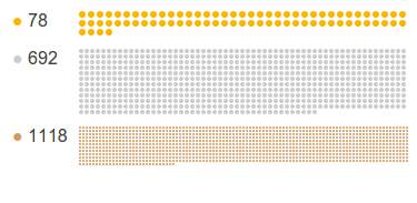
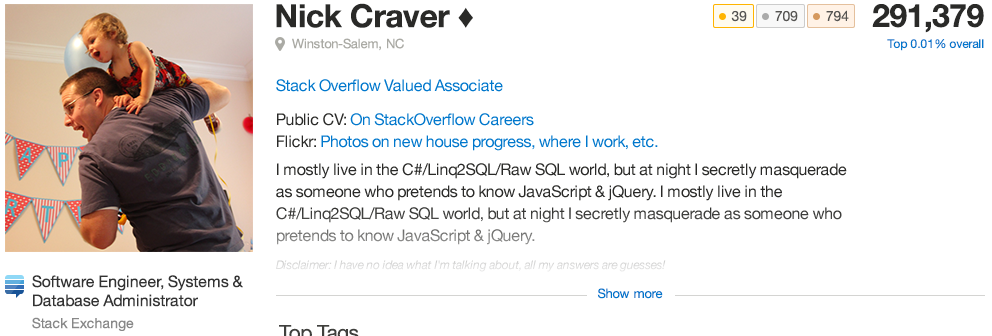
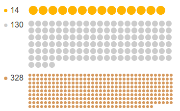
The rows of dots illustrating badges is silly. It doesn't convey any useful information. It doesn't even visually convey the number of badges, since the size of the dots is adjusted depending on the number of badges. This picture (with both screenshots scaled at 80% to fit on the same line on the desktop site) suggests that I (left) have more silver and bronze badges than Jeff (right), if I go by badge-covered area!

Gilles's badges Jeff Atwood's badges

Drop that and use the space for something useful, such as having a column for recent badges and one for the most notable badges (suggestion by Monica Cellio). Or one for the counts and one for the notable badges. Or drop the column formatting altogether.

7
  • 5
    I agree that this is silly and wasted space. Instead of dedicating a column to tag badges (which will be sparse on some sites and for many users), I'd rather see either recent badges or the ones I think are most notable. Commented Nov 27, 2014 at 21:55
  • 1
    @MonicaCellio Tag badges are quite reflected in the tags section just above, after all.
    – yo'
    Commented Nov 27, 2014 at 21:57
  • 2
    +1 Yes please. In prototype part 2 I made a similar request. I want to see recent badges, and I don't find this display useful or effective at conveying what it's supposed to convey: the quantity of badges is not conveyed well by the diagram when the resizing makes 1,118 badges look far less significant than 692. Commented Nov 27, 2014 at 23:29
  • (referencing to left and right images fails on the Android app, the second image is below the first one, I suggest you use 1 and 2, a or b, etc.)
    – A.L
    Commented Nov 28, 2014 at 1:18
  • @A.L Good point, but the visual comparison requires that the images are side to side, so I'm a bit stuck (I could paste the images together but it's too much effort). This answer is written in a left-to-right language, so I consider it transparent that the left image is the first one and the right image is the second one. Commented Nov 28, 2014 at 1:23
  • @Gilles : it's hard to see that there is 2 images since their background is white (like the answer background). Can you please try to add > in front of the 2 images? The blockquote will add a yellowish background, it may help to see the borders of the 2 images
    – A.L
    Commented Nov 28, 2014 at 9:39
  • 3
    If we switch the dots to a column of badges (we should), then I think it would be cool if we could choose which badges we wanted to have on display. For example, I am much more proud of some of my bronze badges in particularly obscure topics than I am of some of my gold badges. Commented Nov 28, 2014 at 12:42
74
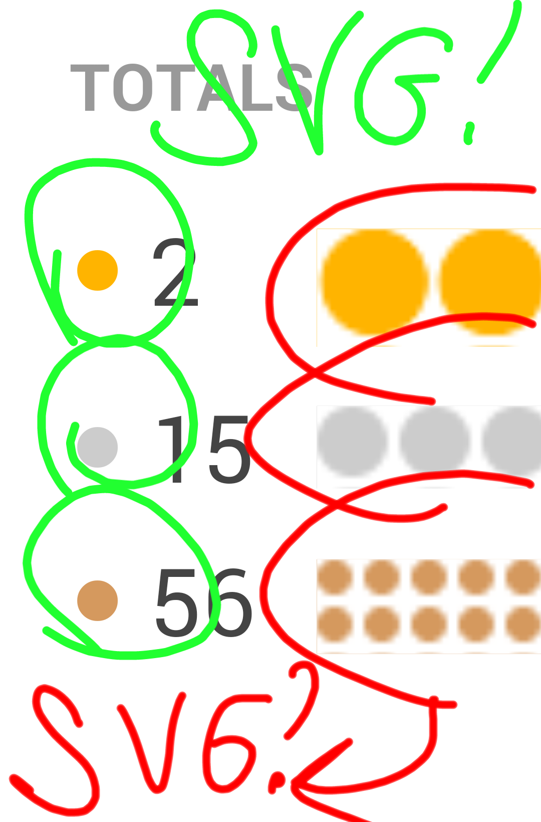
  1. FOR SVG (or just divs with enough border-radius, as it is done with badges on the left - they are not SVGs, but SVG is just a short word to use on the pic :); but on other sites where the shape of badges is more complex, I think that SVGs would be used rather than CSSing divs)! And no excess borders please.

In a sense, this is , since the whole thing changed and is all lovely and zoomable.

enter image description here

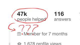
  1. Wow, great number! What does it mean?

    Already mentioned in other answers here and already has a dedicated meta thread.

    enter image description here

  2. Someone is trying to eat the right part of badges... (this is fixed)

    enter image description here

  3. (using the profile of Jeff Atwood)

    • The biggest place is not for the tag with highest score
    • Only the tag in the biggest slot has a badge displayed, even if the user earned badges for other tags
    • There is in the last slot, however more scoring tags are omitted ( or or - their score is 1k)

    All these points have now been addressed (next build).

    enter image description here

  4. Clicking "My Logins" from "Profile" tab doesn't open login window. But it still works in "Activity" tab. (this is fixed)

    enter image description here

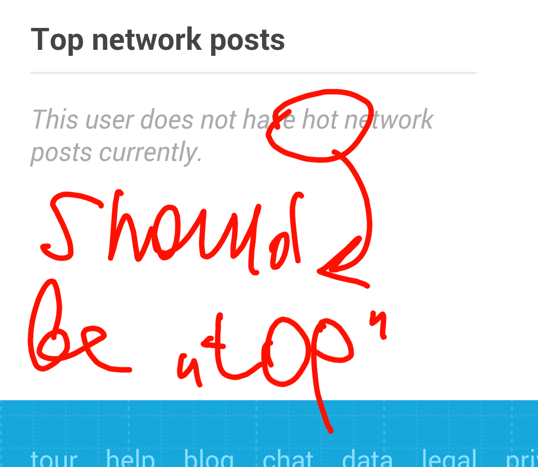
  5. If user don't have top network posts, the section tells us that he doesn't have... hot network posts? (updated to top)

    enter image description here

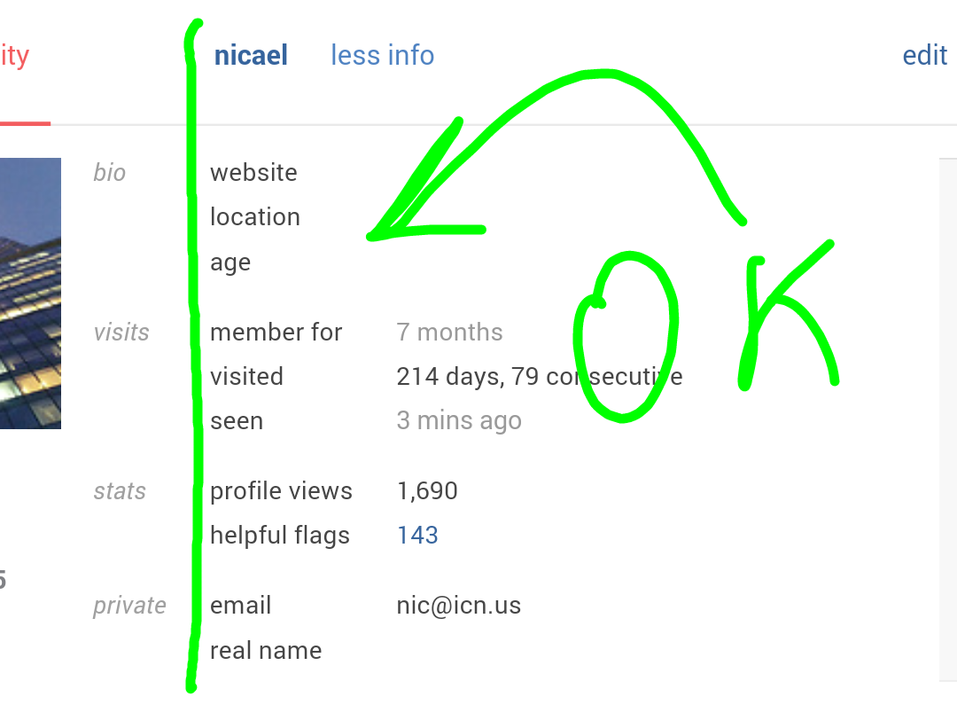
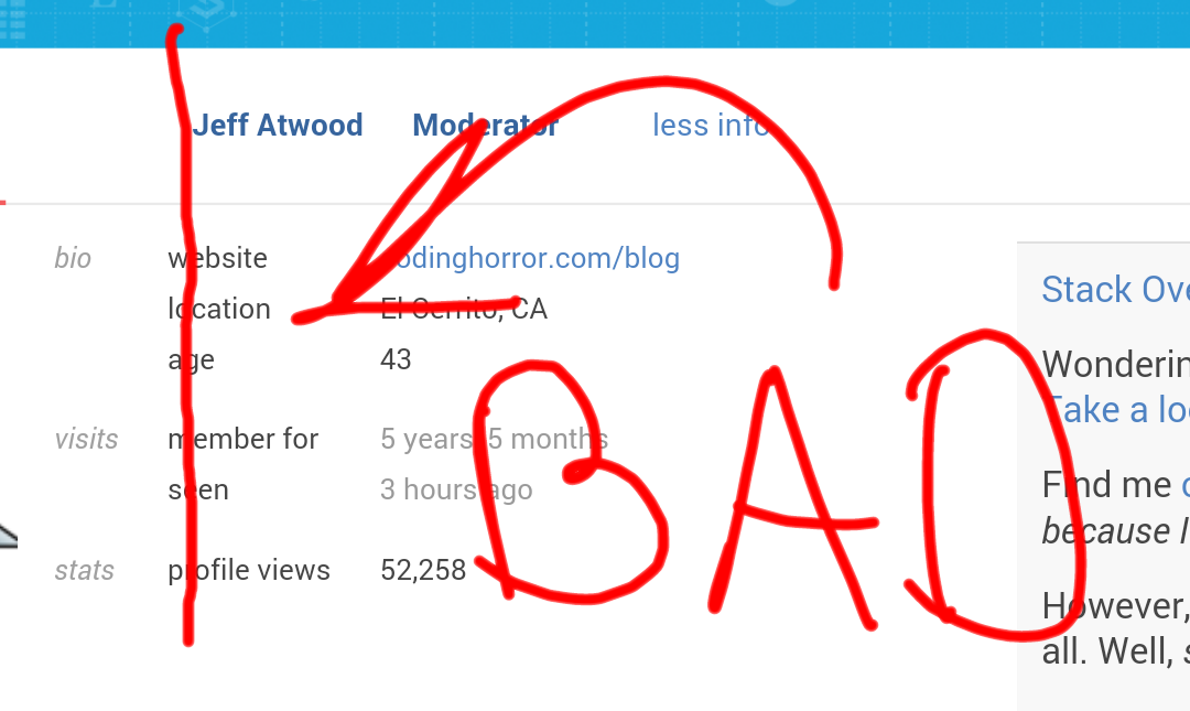
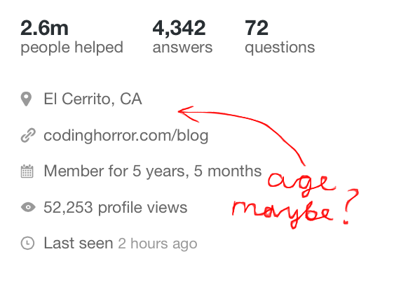
  6. Uset info fields (website, location, age) are good margined only in the profile of currently logged user:

    enter image description here

    For all other users, the margins are bad:

    enter image description here

    Given the low impact and that we are working on a redesign for the activity page, this will not be fixed.

21
  • 5
    It is planned, but we though that for a preview this was OK.
    – Oded StaffMod
    Commented Nov 27, 2014 at 16:27
  • 42
    Why are your free hand circles green? USE RED!! Commented Nov 27, 2014 at 16:33
  • 6
    47K people helped... ???? What?? exactly
    – user263469
    Commented Nov 27, 2014 at 17:01
  • 10
    No need for SVG, a div with border-radius is enough.
    – bjb568
    Commented Nov 27, 2014 at 17:14
  • @bjb568 Yeah, didn't think about it, silly me :D Of course div with border radius will be enough.
    – nicael
    Commented Nov 27, 2014 at 17:21
  • 2
    Seems like the help is the cumulative amount of views that questions or answers you have provided have been viewed. Commented Nov 27, 2014 at 17:36
  • 10
    @RyanMcDonough Which is a meaningless stat IMHO. At any case, introduction of such a number should be discussed separately from the profile page makeover.
    – yo'
    Commented Nov 27, 2014 at 18:10
  • 3
    @bjb568 But what about sites that have custom badge icons? They won't be able to get away with rounded <div>s..
    – gandalf3
    Commented Nov 27, 2014 at 20:08
  • @gand Sure, but now it is just on MSE :)
    – nicael
    Commented Nov 27, 2014 at 20:09
  • Oh. Well, until then I suppose. BTW, nice hand drawn lines ;) (no joke, they really are nice) Did you use a tablet or some fancy nice software (or both)?
    – gandalf3
    Commented Nov 27, 2014 at 20:11
  • 1
    @gand First img is from my SGS5, drawn in "Draw!", other are drawn on my computer (using mouse) with pixlr.com/editor :)
    – nicael
    Commented Nov 27, 2014 at 20:13
  • @gandalf3 Those should be at least 3x.
    – bjb568
    Commented Nov 27, 2014 at 20:17
  • 2
    @bjb568 Huh? What should be? (and 3x what?) I'm afraid I don't understand..
    – gandalf3
    Commented Nov 27, 2014 at 20:20
  • @gandalf3 "custom badge icons" on other sites; bjb is a fan of high-density display resolution.
    – user259867
    Commented Nov 27, 2014 at 20:27
  • 2
    @bjb568: Then you would get something similar to my first example again. No algorithm is intelligent enough to reduce the sice of a picture such that the result is designed to the pixel.
    – Wrzlprmft
    Commented Nov 27, 2014 at 22:15
63

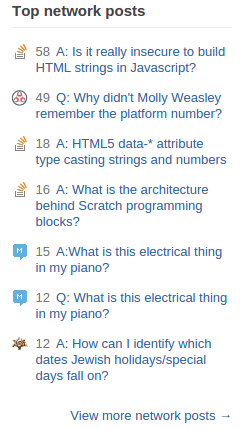
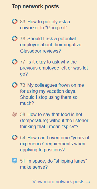
The top network posts should show whether they're questions or answers. Like this:

enter image description here

Just because I think it would be nice to know at a glance.

6
  • 5
    Not to mention, as you have an example of in your image, sometimes your top votes are from self-answered questions.
    – KOVIKO
    Commented Nov 27, 2014 at 20:02
  • Even better, split it into two lists. "Top Network Questions," and "Top Network Answers." Commented Nov 29, 2014 at 20:23
  • 3
    @jimirings That's already covered on the full profile; i think it's good not to take up that much space on the site-specific profile.
    – Scimonster
    Commented Nov 29, 2014 at 20:24
  • @Scimonster It wouldn't have to take up more space. We could do the top 3 questions and the top 3 answers, fill the same amount of space, and only show one less post than we are now. When you say "full profile," I'm not sure if you mean the new activity tab or the network profile, but the network profile is a whole different beast and the activity tab only shows top Q's and A's for that specific site, not network-wide. Commented Nov 29, 2014 at 20:41
  • 1
    @jimirings I meant network profile.
    – Scimonster
    Commented Nov 29, 2014 at 20:58
  • 1
    @BlueRaja Of course you can't have an answer without a question, but still, wouldn't you like to know if your tops are questions or answers? :)
    – Scimonster
    Commented Dec 6, 2014 at 16:23
58

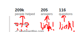
Make these thingies links to their respective pages, please:

moar linky needed


These UI elements have a specific job, adding links would detract from that.

Hrm? That really doesn't make much sense. Adding links does not necessarily require a change in appearance, correct? (Aside from underlining on hover, or something along those lines.) So if the only effect is purely functional and not visual, how would that "detract from their job?"

In any case, I expect them to be clickable, and you don't gain anything by keeping them unclickable (other than making it that much harder to find what you're looking for).

15
  • 6
    Obviously, the first thing should link to the list of people you helped... or failing that, to some blog post explaining "written once, read many times" effect... or better yet, discarded altogether.
    – user259867
    Commented Nov 27, 2014 at 17:15
  • 16
    Can we have a gold badge if we helped 100k people? I think that is the least for our efforts.
    – juergen d
    Commented Nov 27, 2014 at 17:33
  • @juergend: Let's use Jon Skeet as a benchmark instead. I'd say his number would be closer to 750K, but I'm thinking that 250K would be reasonable for gold instead of 100K.
    – Makoto
    Commented Nov 27, 2014 at 20:17
  • 5
    @Makoto: A SEDE query could tell how many would get the badge on those numbers to make it sound. It sure could be a bigger number instead of 100k. But I would not say Jon Skeet is a good comparison to the rest of the users.
    – juergen d
    Commented Nov 27, 2014 at 20:23
  • Yeah, that might be the better way to go. Shog's got 1.4M helped in his profile, and we know that's both an outlier and only on MSE.
    – Makoto
    Commented Nov 27, 2014 at 20:25
  • @Makoto Atwood got 2.6m arbitrary PH points.
    – user259867
    Commented Nov 27, 2014 at 20:29
  • @Raff: I might make this a formal request, but this is why I'm saying that 100K for a gold badge might be too low. I'd need more info to determine that, though.
    – Makoto
    Commented Nov 27, 2014 at 20:30
  • 2
    @Makoto Shog9 has 1.4 million people helped on Meta.SE. I'm sure Jon Skeet's number on SO would likely be at least 7.5 million if not like 40 million with that same algorithm.
    – CRABOLO
    Commented Nov 27, 2014 at 21:56
  • 1
    We won't be adding links everywhere - in particular when there are links to these pages already present. These UI elements have a specific job, adding links would detract from that.
    – Oded StaffMod
    Commented Nov 28, 2014 at 14:55
  • 1
    As for "People Helped" - there is a separate discussion thread for that.
    – Oded StaffMod
    Commented Nov 28, 2014 at 14:56
  • 9
    @Oded Hrm? That really doesn't make much sense. Adding links does not necessarily require a change in appearance, correct? (Aside from underlining on hover, or something along those lines.) So if the only effect is purely functional and not visual, how would that "detract from their job?" In any case, I expect them to be clickable, and you don't gain anything by keeping them unclickable (other than making it that much harder to find what you're looking for).
    – Doorknob
    Commented Nov 28, 2014 at 15:04
  • 2
    @Oded So StackExchange was wrong for ages by having three identical links to a lot of stuff in the user profile? They have a specific job, I agree: to be at hand so that I can easily reach whatever stuff. I can't see any harm in making stuff clickable.
    – yo'
    Commented Nov 29, 2014 at 22:38
  • 1
    @Oded in the current profile page design, all headers are links. You'll be taking away a feature that is used by many. Commented Dec 1, 2014 at 15:38
  • @Sha - I am keeping the discussion open and will be bringing it up internally, as I am not convinced either way.
    – Oded StaffMod
    Commented Dec 1, 2014 at 16:01
  • Thanks @Oded, keep us updated. Commented Dec 1, 2014 at 16:02
43

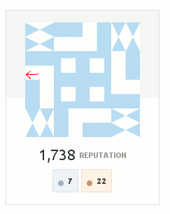
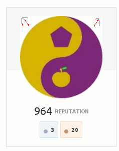
- after discussing internally, we decided to decline this request. We understand that for some avatars the display is not optimal, but that will be true for just about any design with some avatars.

The grey background that spans the top half of the avatar box is somewhat distracting. It’s barely visible but sufficiently visible to catch someone’s eye.

It looks particularly irritating for avatars with a white background, which does not only include some selected custom avatars such as mine but also many Identicon avatars:

enter image description here enter image description here

10
  • 13
    Clearly, these avatars should use transparent background. ;)
    – Raphael
    Commented Nov 28, 2014 at 8:21
  • 3
    @Raphael: Yes, they should and I wish they could. However, even then, that grey box is distracting.
    – Wrzlprmft
    Commented Nov 28, 2014 at 11:23
  • 2
    We have sites with dark themes, which have the exact same background issue already (see Science Fiction & Fantasy). Declining this one.
    – Oded StaffMod
    Commented Nov 28, 2014 at 14:42
  • 2
    @Oded: If you are referring to avatars in general, you might answer this to the feature request, I linked. If you are referring to transparency in Identicon avatars, you might have a point (though it’s only the Meta of Science Fiction & Fantasy, where this would be an issue). (If you are referring to the answer, I have no idea what you are talking about. )
    – Wrzlprmft
    Commented Nov 28, 2014 at 14:48
  • This is mostly about avatars in general. But in regards to the background - that's here to stay.
    – Oded StaffMod
    Commented Nov 28, 2014 at 14:51
  • 1
    Contrast point taken- I'll see what our designers think. I'm also wondering if a lightweight outline makes sense to address the issue where a white background "bleeds" into the white wrapper.
    – Jaydles StaffMod
    Commented Nov 28, 2014 at 18:45
  • 1
    @Wrzlprmft - Not sure what the problem there is - Gravatar and SE support transparent avatars - see my answer to that question Commented Dec 1, 2014 at 10:05
  • @Wrzlprmft I stand slightly corrected - this is only not an issue if you use Gravatar rather than the image upload feature. Commented Dec 1, 2014 at 10:10
  • 1
    Some of us have avatars where transparency isn't so easy to create. The burden should rest with SE simply making the avatar expand to the full space of the container rather than forcing us to add transparency to our own images so that they look right. Our avatars were here first.
    – TylerH
    Commented Dec 1, 2014 at 16:39
  • @Oded: Please note that, while I used some avatars, where the background looks particularly bad, to illustrate my request, my main point is that the background looks bad with every avatar – which was not addressed in your statement of declining.
    – Wrzlprmft
    Commented Dec 22, 2014 at 15:48
39

I don't like having the top network posts directly on the site profile. Voting varies a lot between sites, so this is likely to highlight questions in a different subject matter. I post on a variety of sites, and I know everything is public, but if (hypothetical example) I show my Theoretical Computer Science profile to someone, I don't want them to think too much about my Gaming questions from when I spent 48 hours walled in after the latest blockbuster release.

9
  • 9
    We are working on being able to exclude sites from the list.
    – Oded StaffMod
    Commented Nov 27, 2014 at 20:19
  • 5
    @Oded From the network-wide list? But why would I want to show my CS research for gamers? Or from each site individually? You mean I have to configure 128 sites and counting? Commented Nov 27, 2014 at 20:35
  • 3
    I believe the idea is to have one global exclusion list that will apply to both the communities list and the top network questions list.
    – Oded StaffMod
    Commented Nov 27, 2014 at 20:40
  • @Gilles So, in essence, you want to be able to hide connections between accounts?
    – E.P.
    Commented Nov 27, 2014 at 20:51
  • 15
    @episanty Not really: if I really cared about that I'd use different accounts with different credentials. Rather, I want to not thrust unrelated accounts into the viewer's face. Having them all in my network profile is fine, having them all on my profile on one site isn't so great, having the highly biased view of top-scoring posts is yucky. Commented Nov 27, 2014 at 20:54
  • 11
    Maybe we could do away with absolute numbers and use a figure relative to the average/median score on that site (or even for that tag)? That would not solve the "what interest does the bicycle community have in my Unix answers?" problem but would tackel the difference in voting behaviour/scale.
    – Raphael
    Commented Nov 28, 2014 at 8:26
  • 3
    @Oded, please consider site weighting as Raphael suggests in the prev comment. This doesn't need to be dynamic & IMO should be per-site not per-tag. I'm thinking that a query that runs once per day (or even once per week) that computes a scaling factor for each site, that the "top" lists can then factor in, would be enough. Some of my best posts are on small sites where vote counts just won't get the post onto that list, but the answer isn't to blanket-exclude my big sites -- those are valuable too, but shouldn't dominate. In a way it's similar to the HNQ problem & can be solved similarly. Commented Nov 30, 2014 at 22:21
  • Agree that this is a problem: we had a user leave LEGO Answers because his highly rated answer was appearing above his SO answers on some network lists :(. Commented Dec 1, 2014 at 10:15
  • @Raphael I've made a separate post for weighting the sites: meta.stackexchange.com/a/244460/162102 Commented Dec 22, 2014 at 15:09
29

This issue has its own thread now:

We're working on a new stat to help convey the reach of your posts here


"people helped" is a rather misleading term. It helps to boost the ego, but it's really a lie.

Most of the question views will not count as somebody you actually helped. For one, your answer may be number 3 in the list with a score of -3 and really not helping anybody.

It's a nice statistic, but call it "total views of posts" or "post views" for brevity. And add a mouse-over with explanation or a link to a site with details. Because, right now, I am merely speculating as to what it means.

7
  • 3
    I don't think answers that are "number 13 in the list with a score of -3" are counted in "people helped," because "answers that fall within the following criteria: accepted, have a score of 5 or more, have more than 20% of total score of all answers on a question or are within the top 3 answers by score" (from the question)
    – MTL
    Commented Nov 27, 2014 at 18:29
  • 3
    @Shokhet: OK, 13 was too far out. I toned it down to "number 3". But I'd like to see a minimum requirement of "non-negative score". Commented Nov 27, 2014 at 18:36
  • That makes sense, I agree.
    – MTL
    Commented Nov 27, 2014 at 18:46
  • 2
    We'll share the method and get some input on tweaks, but it wouldn't count your example - the current method requires posts to be upvoted and high enough ranked that they likely get seen by a good number of visitors.
    – Jaydles StaffMod
    Commented Nov 27, 2014 at 19:36
  • @Jaydles: I trust you'll find a reasonable algorithm. Commented Nov 27, 2014 at 20:03
  • 1
    Yes. For some users "people annoyed" would be a far more accurate description -- I agree calling it "post views" would more accurately convey what it is.
    – Glen_b
    Commented Nov 28, 2014 at 4:13
  • This now has a dedicated meta thread: meta.stackexchange.com/questions/244261/…
    – Oded StaffMod
    Commented Nov 28, 2014 at 14:43
23

I want to be allowed to decide which of my badges are notable. You might think that Explainer is cool, but perhaps I want to showcase one of my silver badges in the top spot instead.

So, feature request: Allow us to choose which badges are notable.

6
  • 3
    Wouldn't the most rare badges you've earned usually fit the bill?
    – Raphael
    Commented Nov 28, 2014 at 8:23
  • 1
    @Raphael Sometimes, but not always. And that's the point of this suggestion.
    – Scimonster
    Commented Nov 28, 2014 at 8:26
  • Note that the profile has essentially nil options now (aside from About Me). There are many more useful options that should come first, especially if what you propose is unlikely to be used by many.
    – Raphael
    Commented Nov 28, 2014 at 8:34
  • 9
    That would be great for questions and answers, too. I'm really not that excited that my top answer ever is about fractions Commented Nov 28, 2014 at 12:48
  • @Raphael And what options did there used to be anyways?
    – Scimonster
    Commented Nov 29, 2014 at 20:00
  • I know the feeling @AlexanderGruber. My top answer on Code Review was a review of some LOLCODE. Not my finest moment, but it stares everyone right in the face when they visit my profile.
    – RubberDuck
    Commented Dec 20, 2014 at 12:50
21

The score for the Top network posts doesn't really stand out. For a few seconds I was wondering why the titles of posts were things like "18 Shortest unmatchable regular expression" and "16 How many Stack Exchange logins should I have?"

In my opinion, it may look better with a slight background, maybe like this:

enter image description here


Also, I have a score of -8 in . Why is it in my top tags?


Braiam just pointed out that there is a discrepancy between my score on https://meta.stackexchange.com/users/238586/the-guy-with-the-hat?tt=profile

enter image description here

and the score on https://meta.stackexchange.com/users/238586/the-guy-with-the-hat?tab=tags&tt=activity

enter image description here

That's been fixed now.

3
  • 2
    Actually you have 3, but yeah, there's something weird going on meta.stackexchange.com/users/238586/…
    – Braiam
    Commented Nov 27, 2014 at 16:26
  • Yeah - that tag score doesn't look right. Will investigate.
    – Oded StaffMod
    Commented Nov 27, 2014 at 16:30
  • 2
    It's totaling the question and answer scores together.
    – Scimonster
    Commented Nov 27, 2014 at 17:19
20

This issue has its own thread now:

We're working on a new stat to help convey the reach of your posts here


Please call People Helped something else or drop it: that name is disingenuous.

You've explained the way this is calculated, and I've read it:

We also added a new "people helped" counter based on the views your questions and answers have gotten. This is essentially a sum of views of your questions, and answers that fall within the following criteria: accepted, have a score of 5 or more, have more than 20% of total score of all answers on a question or are within the top 3 answers by score. No deleted posts are counted.

The problem is, we all know full well that view counts are not remotely correlated to people helped. It pretends all of the following scenarios, which would increase the view count, also signify a new person helped, even though that isn't the case (this list is not exhaustive):

  • Someone who happened across the question, determined it wasn't what they were looking for, and left.
  • People who were visiting to read, already knew everything written in an answer, agreed with it and considered it helpful, and upvoted that answer.
  • Repeat visitors, who aren't looking for an answer to help them. (In 2010, people investigating the views count mechanism found that the same visitor could increase the view count multiple times, if they simply spaced out their visits. If this is still current, I could count for 5 "people helped" myself on a question just revisiting my own answers to edit them further.)
  • People visiting to perform moderation, or check that things are okay. (This accounts for most times I've added to a view count)

The people who visited and were helped by an answer is only a portion of views. It's also an indeterminable portion of the views. (That means we can't emulate such a number accurately either.)

My answer to Betrayed by my GM; how can I respond? is one of my highest-scored, most viewed answers. I'm confident I made a difference to some people, but I don't believe it's accurate to say the views (6595) capture that number. This was an extreme and toxic social situation most viewers will never have to deal with (thankfully). Fewer than that could have learned something, or maybe through a ripple effect a lot more than that number did. But I don't know how many were helped, really, and neither do any of us.

The honest thing to do would be to admit we don't know how many people we help. Views are views. That statistic is more accurately labelled "views on questions you've answered which meet certain criteria" or something else, but "people helped" is not an accurate label. I'm not sure what such a statistic would mean, exactly, but if you display it, please do not label it "people helped". Raff has suggested in comments the possibility of calling it "total readership", which is one possibility much nearer the mark.

12
  • 1
    Related discussion: meta.stackexchange.com/questions/244261/…
    – yo'
    Commented Nov 27, 2014 at 23:50
  • 1
    Some form of total reach of posts would be more accurate, if the statistics is to stay at all. Or SE could do what they did in tooltips in "Hot Network List": this user has been arbitrarily awarded 145.2k helpfulness points.
    – user259867
    Commented Nov 28, 2014 at 0:12
  • Also, I suggest moving this to the discussion started by tohecz , since this is not really a design decision but a content decision.
    – user259867
    Commented Nov 28, 2014 at 0:17
  • @Raff I posted it here since it's feedback on the profile page makeover. I considered leaving this as an answer to tohecz's question, but in the past I've left feedback on an announced feature outside the announcement and SE staff asked me to move it to the announcement. Commented Nov 28, 2014 at 0:21
  • 2
    Okay. Another possible more-honest name would be Total Readership.
    – user259867
    Commented Nov 28, 2014 at 0:26
  • @Raff Thanks, I've mentioned that in the conclusion of the answer. Commented Nov 28, 2014 at 0:41
  • +1, agreed. One point: "I could easily count for 5 "people helped" myself just revisiting my own answers to edit them further" is unlikely; I haven't seen the algorithms, but it's likely that they only count unique IP addresses, so you'd count the same no matter how many times you came back to edit further.
    – MTL
    Commented Nov 28, 2014 at 2:23
  • @Shokhet Added some citation to that. The views mechanism does let the same individual count for multiple views, supposing they simply space out their visits. Commented Nov 28, 2014 at 4:52
  • @doppelgreener I see that now. Thanks for clearing that up for me :)
    – MTL
    Commented Nov 28, 2014 at 4:58
  • I agree. When I read "people helped" I thought it votes the total number of upvotes + anonymous feedback. (Which would, of course, underestimate the number of people helped.)
    – Raphael
    Commented Nov 28, 2014 at 8:29
  • 3
    Suggest calling it "kittens killed". Commented Nov 28, 2014 at 9:28
  • 1
    How about calling it "dissemination"?
    – Scimonster
    Commented Nov 28, 2014 at 10:51
19

This is much-improved over the previous version. However, the tags section still has too low a signal-to-real-estate ratio. Look at all that empty space within the top tag block! If you want to do some sort of size-based visualization, you could easily get twice as many tags in that same space without it being cluttered. The current ("activity") version is much more useful to me, showing me ten tags instead of six and in less space.

You've said that the order will be changed to show top tags by score (like on the current page). That's good; that's less confusing.

I don't particularly need to know if people have badges for their top six tags; I can see the scores, after all, and if I really want to know if there were enough non-CW answers to earn the badge, I can hover and find out. If the badges don't cost much space then meh, but if that's part of why you're spreading things out so much in this view, consider dropping it from here and adding it to the "all tags" page, which favors functionality over aesthetics already, instead. It'd do no harm, and it might be handy to have one place to scan for "tags this user has answered enough to earn badges". (This would also address the request elsewhere to call out tag badges in the "badges" section, which is only space well-spent for users who have several of those. Most don't.)

0
19

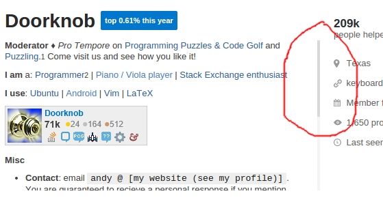
The custom scrollbar here is fancy and all:

scrollbar

But it's really hard to click since it's so skinny. Could it be embiggened?


After taking a look at the CSS:

.bio::-webkit-scrollbar {
    width: 4px;
    background: #f4f4f4;
}

.bio::-webkit-scrollbar-thumb {
    background: #dad7d7;
}

It shows up bigger in Firefox because FF doesn't support those pseudo-elements.

Personally, I like the way it looks in Firefox better, so those lines of CSS could just be removed.

12
  • What's your browser/OS? I'm guessing chrome, it looks fine on FF/Linux.
    – terdon
    Commented Nov 27, 2014 at 16:34
  • @terdon Chromium 37.0.2062.120 on Ubuntu 14.04.
    – Doorknob
    Commented Nov 27, 2014 at 16:35
  • 5
    Nowadays we don't really click to scroll anymore. Commented Nov 27, 2014 at 16:54
  • 2
    I click to scroll sub-page elements; otherwise my swipe would scroll the whole page. I'm not seeing a skinny scrollbar on Firefox, by the way. Commented Nov 27, 2014 at 21:30
  • 1
    @MonicaCellio "It shows up bigger in Firefox because FF doesn't support those pseudo-elements"
    – Braiam
    Commented Nov 27, 2014 at 22:09
  • 2
    @Braiam if you note the timestamps, that information was not in the answer when I made the comment. Ok, so it sounds like if they keep this I'm going to need to install Stylish on Chrome in order to override that CSS, 'cause what's in that screenshot sure is hard to use. Commented Nov 27, 2014 at 22:10
  • 1
    @MonicaCellio well, it quite possible that you haven't see it yet, so I was just informing you ;)
    – Braiam
    Commented Nov 27, 2014 at 22:52
  • +1 for "embiggened" .....although, honestly, it's not such a big deal if you're on a computer -- I rarely click the scroll bar to scroll anything, preferring to scroll with the mouse dial or with two fingers on a touch pad.
    – MTL
    Commented Nov 28, 2014 at 2:17
  • 1
    @Shokhet Depends on your usage. There's those like me who use their keyboard for anything that the mouse can't do quicker. Likewise among those that use the mouse, there's people who like their scroll-wheel or middle-click, and those that like having a decent scroll bar they can actually position their mouse over. Commented Nov 28, 2014 at 10:43
  • @doppelgreener Yes. For instance, my Mom uses internet a lot, but she doesn't know how to use the scroll wheel (it confuses her, the scroll bar does not).
    – yo'
    Commented Nov 28, 2014 at 13:12
  • Looks like eating some turkey helped poor 'ol skinny.
    – Oded StaffMod
    Commented Nov 28, 2014 at 15:11
  • @Oded But did he leave any for me? :( (thanks!)
    – Doorknob
    Commented Nov 28, 2014 at 15:17
18

The text color of the badges on the sites section upsets me:

enter image description here

The bronze badge text stands out way too much. Make all the badge labels the same colour.

3
  • I think that is the general coloring of high numbers on SO. There are a lot of bronze badges, and because of that the number starts becoming orange-ish.
    – SeinopSys
    Commented Nov 30, 2014 at 16:20
  • 1
    @DJDavid98 Nope, it happens even for numbers of badges that are not high here, I have 43 bronze, less than the 56 gold I have on Arqade.
    – fredley
    Commented Nov 30, 2014 at 18:32
  • I actually don't see a reason why the numbers would be bold ... ?
    – yo'
    Commented Dec 1, 2014 at 22:32
16

Please weight "top network posts" by site.

My top network posts section currently looks like this:

5/7 Workplace

You'd think, from this list, that I participate mainly on The Workplace with a smattering elsewhere on the network. But that's not really true; it's just that posts on The Workplace get a lot more votes overall than posts on the other communities where I participate. By local standards some of my Mi Yodeya posts are way more significant than the ones shown here, but we are a small community and those posts are unlikely to ever crack this list. Ditto Writers, Pets, and Moderators Community Building.

This gives a distorted view of my participation. I would like to see posts here be weighted by some measure of per-site activity that reflects voting (average score/post for the site, maybe).

I'm not suggesting that this be done in real time every time a profile is loaded; that would be way too much load on the servers. A job that runs once per day (or even once per week) that updates a table of weighting factors would be good enough. Unlike top posts on the current site (where the profile is being viewed), this needn't be completely up to date.

We have another list that has similar issues and is addressed by weighting: hot network questions. If the raw hotness formula governed what's on that list, SO would dominate and small sites would never get onto the list. SE therefore introduced a score-reduction algorithm based on how many posts a site already has on that list, which smoothed it out some. Handling of the HNQ list is what gave me the idea for how we could address a similar problem in another multi-site list. (I don't know if an algorithm designed for a 100-entry list would work well for a 7-entry list, but that might be worth investigating as a solution here.)

Finally, I understand that the current ordering has always been in place on the network profile, and is what people will see if they click through to that. I'm not asking to change that; I'm just asking that the "first view" of a user active on many sites with highly-varied voting activity be adjusted to more-accurately portray that user's activity.

(I am not asking that users be able to customize this list; I recognize the issues with that. And anyway, I'd rather have an automated list that does a better job than have to maintain a hand-picked list myself.)

13

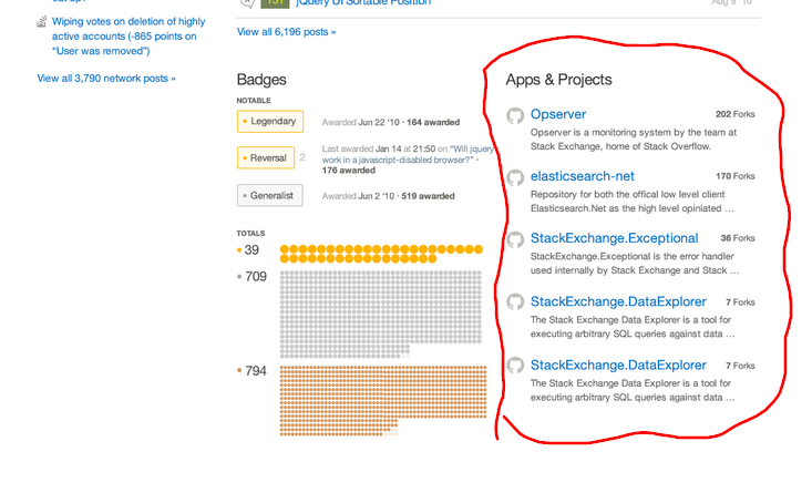
I personally liked the "Apps & Projects" section from the second part, can we have that in?

Freehand Circles FTW

10
  • 7
    You can propose it for SO. It doesn't make sense on any other site (not even on this meta).
    – yo'
    Commented Nov 27, 2014 at 23:50
  • 2
    @tohecz A projects section makes sense on a lot of other sites, and was requested to be made globally available. From part 1: meta.stackexchange.com/a/226180 and meta.stackexchange.com/a/226242, or from part 2: meta.stackexchange.com/a/231291 Commented Nov 28, 2014 at 2:22
  • 2
    You can always add your apps and projects to the "about me" portion of your profile, customized for particular sites. Commented Nov 28, 2014 at 3:04
  • Also to this feedback, +1 yes please! I really want to see the Projects section available. It was a very good idea, and probably one of the most useful sections available. Commented Nov 28, 2014 at 5:39
  • 3
    I would estimate that this makes sense on fewer sites than it does. Maybe one could have the column as an option, being able to fill it with project URLs (from many services) at your own volition (and even on a per-site basis)?
    – Raphael
    Commented Nov 28, 2014 at 8:31
  • 3
    This is still planned, we're just trying to split this thing up into pieces to get it out the door. That feature needs a new edit interface so we punted it for now. Commented Dec 1, 2014 at 15:04
  • @DavidFullerton contenteditable="true" & if (event.keyCode === 13){ ... } for the win.
    – SeinopSys
    Commented Dec 1, 2014 at 15:06
  • @DJDavid98 - didn't realize that would also automatically sync it up to your data store. With validation.
    – Oded StaffMod
    Commented Dec 1, 2014 at 19:48
  • 3
    @DavidFullerton please consider the effects on the vast majority of non-SO SE users who won't have anything to put in that space. Will the space be used for something else or will there just be a vast expanse of nothingness on those profiles? Commented Dec 1, 2014 at 23:09
  • 2
    @monica You'll get the current side-by-side badge layout if you haven't put in any projects. Commented Dec 1, 2014 at 23:14
13

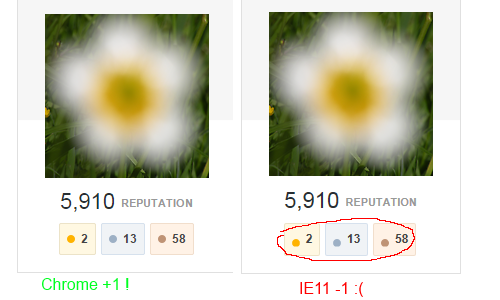
Minor CSS cross browser glitch:

enter image description here

Can you make sure the gold/silver/bronze badges align with their number in IE11 just as good as they do in Chrome?

2
  • 23
    We should just not use IE altogether :P
    – Braiam
    Commented Nov 27, 2014 at 22:11
  • 6
    And while you're looking at that, correct the tooltips: currently they all say "gold badges".
    – Mark Hurd
    Commented Nov 28, 2014 at 0:03
11

I am voting against any features such as

  • Allowing users to select their "top" badges/questions/answers
  • Allowing users to exclude sites from their hot/top networks
  • Showing projects (such as github/bitbucket repositories)

As for the first two points, StackExchange is not a social1 networking2 site. It is a questions and answers site. Customizing your profile will start to creep into the whole personalization thing, which isn't at all what SE is about.

When I go to a profile, I expect to know exactly what I'm looking at -- top/best badges, top posts/answers, etc. I have a specific set of options lined up for my own personal use when I few another user's profile. If users can customize exactly what's on their profile, then that guarantee is no longer there causing a UX impediment and possibly confusing me (as a user).

Further, if users can hide their questions/answers from the page (such as when I want to see their lowest rated questions/answers, which I do from time to time), then I am now seeing possibly skewed information (this is just an example).


As for the third point, you run into several issues here, some of which have already been addressed.

  • What dictates which sites we can pull repositories from? Is this something the user is going to have to maintain or allow access to?
  • We don't have fields for Twitter, Facebook, or XYZ personal profiles; why have projects? I don't care if a user has 15 hello-world-xyz-language repositories, and if they're someone who has an established project, they'll most likely have it linked in their about me section. It's wasted space and breaks the current theme of profile fields.
  • It's still social network-ey. GitHub is probably as close to a social network as a site could be without capitalizing on being a social network. Let them manage that (nothing against them, of course) - not us.
  • Since when has the About Me box ever been less than sufficient for showcasing whatever the user wants to showcase?

Just my $0.02.

3
  • 1
    However, if users spend more time arranging which of their garbage questions is at the top of their list than asking more garbage questions, I'm all for it. Commented Dec 1, 2014 at 6:53
  • 3
    I agree about the projects, but disagree about badges.
    – Scimonster
    Commented Dec 1, 2014 at 8:12
  • You can see the most crap of the user in the Activity supertab, which will be retained. The same for badges, the same for linked accounts. If you "moderate" the site, you're supposed to use that supertab, and not the new default thingy, which is really more like a portfolio.
    – yo'
    Commented Dec 1, 2014 at 22:38
10

The 'top x% this time' box is too big, relative to the username.

enter image description here

It should be a little smaller, IMO.

1
  • It is now smaller.
    – Oded StaffMod
    Commented Nov 28, 2014 at 15:12
9

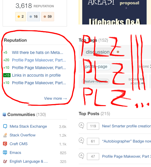
Please please please display at least a littlte section of reputation, something like this:

enter image description here

1
  • 9
    This logically belongs on the Activity tab. Users who are not really interested in the vanity page under discussion (like me) will probably use a userscript or site setting to open that tab as default.
    – user259867
    Commented Nov 29, 2014 at 21:40
8

There's a redundant percent sign for the tags where this is displayed:

Redundant percent sign

This could be fixed by putting the percent sign in parentheses after the number of posts in that tag (in a smaller font), for instance.

2
  • or "47% of posts", where the 47% is still big Commented Nov 28, 2014 at 8:19
  • Fixed. We removed the trailing %.
    – Oded StaffMod
    Commented Nov 28, 2014 at 15:13
8

The new profile page is somewhat overdeveloped. The use cases for a profile page are (speaking from my own experience), in no particular order:

/me looking at my own page:

  • switching to another site or the network-wide profile
  • checking my unmarked questions
  • checking the posts I flagged - have the mods left me a custom message
  • finding out why I have -10 reputation (the user has been deleted)
  • looking at my suggested edits - have they been rejected or not

/me looking at others' pages:

  • looking at knowledgeable posters' favorite pages to see what gold nuggets are there on a particular site
  • checking a user's activity/network scores while doing reviews for spam

Does the new design help those use cases? NOPE. It detracts from the established routine, adds unnecessary clicks for common tasks, and showcases nothing in particular. Badges? Top network posts? Pleease. I can always go to a user's network-wide profile to see all that.

TL;DR : Please please please do not re-invent the profile pages.

Given the number of public beta sites that are waiting for custom themes, it is obvious that SE designers' time could be better spent on graduating sites.

Note: I do understand that adding vanity design elements (aka Facebookization of SE) may lead to users spending more time on SE. Will they spend it answering questions? Unlikely.

1
  • 5
    "Given the number of public beta sites that are waiting for custom themes, it is obvious that SE designers' time could be better spent on graduating sites." - Now that is a point that is undenyable. Hadn't thought about this, but of course, 1 site per 3 months is certainly not the way to go. Sorry if that's not congruent with voting best practices, but +1 for that statement alone just to make a point! Commented Dec 3, 2014 at 15:53
7

This now has a dedicated meta thread:

We're working on a new stat to help convey the reach of your posts here


The PH ("People helped") stat is IMHO just another ridiculous number, even more ridiculous than the rep. I do not see a reason why to introduce yet another stat like that.

It doesn't bring any new information to the system. Even if it did: Imagine that someone has rep:PH ratio 1:10 and someone has 1:2 -- what is it telling about that person? IMHO nothing at all.

Moreover, this PH stat is even more sensitive than rep to post being discussed on meta, getting tweeted or featured etc. ... we are currently facing this problem with rep and if you introduce PH, we'll soon face the problem twice as much.

(As a side note, I believe that introduction of a new stat should be discussed completely separately from design decisions on the profile page.)

PS: As Oded suggested, I created a discussion thread about this feature: What is "People helped" and why does it exist at all?

3
  • Then why not post a discussion question about it?
    – Oded StaffMod
    Commented Nov 27, 2014 at 18:24
  • @Oded Well, I thought that such a significant thing would get a thread similar to this one from the Powers.
    – yo'
    Commented Nov 27, 2014 at 18:28
  • @Oded ok, done: meta.stackexchange.com/questions/244261/…
    – yo'
    Commented Nov 27, 2014 at 18:43
7

This was also reported here, but i wanted to make it official:

Tag scores are now being calculated to include answers and questions, while previously it was just answers.

This is confusing.

I've used the tag score feature to see how close i am to tag badges, but now that's all messed up.

Please, either bring back the old way (just answers) or make it easy to see the breakdown (perhaps with a tooltip).

0
7

It says "Moderator ♦" twice on a mod's profile - once in the top bar, where it is in the activity tab, and once by the username. The link should be by the username.

Also, up in the bar looks like it might be another tab.

enter image description here

(That's gotta be the worst freehand circle ever.)

1
  • 4
    I've seen (and made) waaaay worse free-hand circles Commented Nov 27, 2014 at 17:14
7

Please remember my choice in "Top Posts".

No matter what I choose (all,questions,answers/votes,newest), after reloading the page it resets to all/votes.

0
6

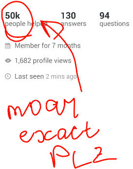
Many thingz in SE show exact info in popup on hover. Please for people helped too?

enter image description here

5
  • 2
    what's that say? I'm reading "moar [ec]ocact plz" Commented Nov 29, 2014 at 2:33
  • @Dop :D It did say "moar exact".
    – nicael
    Commented Nov 29, 2014 at 6:46
  • @Raff improved it a bit :)
    – nicael
    Commented Nov 30, 2014 at 6:22
  • @Doppel ^^^^^^^
    – nicael
    Commented Nov 30, 2014 at 6:23
  • 1
    I can read it! hooray :) Commented Nov 30, 2014 at 7:11
6

I think age also should be displayed in "Profile" tab:

enter image description here

15
  • Avoid PII (Personal Identifiable Information); or at least offer consent before displaying. This includes location (USA is better than CA, CA is better than San Francisco, San Francisco is better than 123 FooBa Street, San Francisco), age and so forth. There is no reason folks need to know these kinds of things. If the terms and conditions state that a user should be older than 18 to participate, and the user accepts it, then its binding. There is no need for Stack Exchange to ask for a birth date.
    – bloudraak
    Commented Nov 30, 2014 at 20:15
  • It is relevant, especially if that information is displayed publicly without your consent. I'm ok with authenticated users being able to see my age.
    – bloudraak
    Commented Nov 30, 2014 at 20:19
  • 1
    @Werner I misread your comment at first. So wait, do you propose to remove age at all or show it only to logged users? You can post such feature-request there as answer. And btw, "that information is displayed publicly without your consent" - it is not.
    – nicael
    Commented Nov 30, 2014 at 20:27
  • My location is. So my assumption here is that you'd like to add the age to the publicly visible data on the right of a publicly viewed profile. You didn't exactly specify under what circumstances the age should be displayed.
    – bloudraak
    Commented Nov 30, 2014 at 20:40
  • What I'm proposing is the ability to give consent as to what personal identifiable information is visible to public users (and search agents). This includes my location. I'll file the feature request as an answer.
    – bloudraak
    Commented Nov 30, 2014 at 20:42
  • Have you searched your name and age on Google? If my age isn't publicly visible, how does Google know it?
    – bloudraak
    Commented Nov 30, 2014 at 20:47
  • 1
    @Werner Your age is publicly visible.
    – nicael
    Commented Nov 30, 2014 at 20:55
  • On this Meta site it is not displayed publicly (I navigated to my profile with a different browser without logging in); on the StackOverflow it is public. When it comes to PII we should always err on the side of caution. If only I knew that 10 years ago, if only...
    – bloudraak
    Commented Nov 30, 2014 at 21:09
  • 1
    @bloud aka Werner :D i.sstatic.net/r7U4C.png age is public on any SE site.
    – nicael
    Commented Nov 30, 2014 at 21:15
  • :) Here's the public view of someone who just visits my profile on the Meta site. i.imgur.com/SLd4xz0.png
    – bloudraak
    Commented Nov 30, 2014 at 21:25
  • And on StackOverflow: i.imgur.com/zwSEEhZ.png
    – bloudraak
    Commented Nov 30, 2014 at 21:26
  • 1
    @bloud u realize that I clicked the different tab?
    – nicael
    Commented Nov 30, 2014 at 21:28
  • 4
    @bloudraak the current profile page ("activity" in the new scheme) already displays your age if you supplied the information. Including it on this redesigned page wouldn't be a PII leak. Commented Nov 30, 2014 at 22:26
  • Its already a PII leak if it contains a combination of personal attributes. The goal is to remove it all together, or provide better means to control its display.
    – bloudraak
    Commented Nov 30, 2014 at 23:57
  • 3
    @bloudraak If you don't want to display it, then remove it from your profile. But since it's already shown in the existing profile, it should be in the new one as well.
    – Scimonster
    Commented Dec 5, 2014 at 7:47
6

In my previous answer (deleted when implemented), I requested a count and score for posts in a tag, to be shown on a mouse hover.

However, I'd like to request a small fix to it: it it's not too much trouble, can those numbers be shown on a hover over the whole gray box for the tag, and not only when hovering over the numbers at the end of the box? That would make it a whole lot easier to use, and (for new users) a whole lot easier to discover it.

0
6

Tag badges link to general respective section of tag badges (bronze, silver, gold), could they link to specific badges please (discussion bronze tag badge, feature-request bronze tag badge)?

enter image description here

0
6

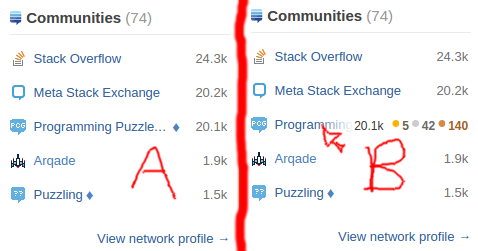
fancy hover effect thingy

Observe: Fancy Hover Effect Thingy™ exists in Exhibit B. Fancy Hover Effect Thingy™ is decidedly absent in Exhibit A.

Could the fancy fadey thingy be implemented if the text overflows the area, even without hovering? That would be much better IMO than what currently exists (ellipses happen, not even at a word break!).

2
  • 9
    The fancy thingy is IMHO not fancy at all. I've always considered fading more distracting than standard ellipsis. (Which is fine if you want to distract the reader, but that's not teh case here.)
    – yo'
    Commented Nov 27, 2014 at 18:14
  • Declining. The fade is not appropriate for items that are too long - the ellipsis is a better/correct solution here.
    – Oded StaffMod
    Commented Nov 28, 2014 at 15:14

You must log in to answer this question.

Not the answer you're looking for? Browse other questions tagged .