In this post a user wrote a tool to gather data about the reputation of users. I'd be interested to see an "official" distribution of reputation. Even better, it would be great to have a feature that showed you your rank amongst other Stack Overflow members. Any chance this could happen?
4 Answers
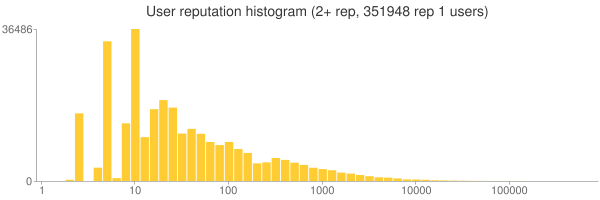
Here's a histogram of users by reputation (decilog scale on X axis):
I'll add this graph to the Stack Overflow stats graphs which gets updated on each data dump.
-
3It's 3-month old. Wouldn't it be nice to have a weekly or even daily update somewhere on meta SO? Commented Sep 21, 2010 at 5:47
-
2
-
Should the X and Y axes be logarithmic, rather than linear scale? Commented Mar 24, 2011 at 22:20
-
1Geoffrey Zheng, Mikhail: for updated version, just got to hewgill.com/~greg/stackoverflow/stack_overflow/stats.html Commented Mar 14, 2012 at 9:37
-
It could use labeled ticks on the y-axis. Not sure why these were conveniently ignored. Commented Dec 23, 2013 at 16:27
-
Because it's so skewed most people make it 200+ instead of 2+– Hack-RCommented Dec 16, 2016 at 21:29
Greg Hewgill's Stack Overflow Statistics are nothing short of amazing. I agree that adapting the user reputation histogram to show each user where he or she is would be a more interesting way to show progress than simply "top 5% this quarter" or "top 4% this month." For style points, it would be cool if you could zoom into and out of the histogram, centered around the neighborhood of your own reputation.

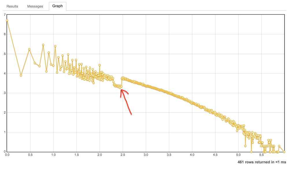
It's possible to view this distribution with an appropriate query in the Stack Exchange Data Explorer. I wrote one a while ago to answer the Meta Stack Overflow question What is the current distribution of Stack Overflow reputation points?. The distribution looks like this:
... when you plot it on a log-log graph, according to this SEDE query. The logarithms are base-10, so the 2.0 on the x-axis corresponds to 102 = 100 reputation and there are about 104 = 10,000 users with this much reputation.
Some noteworthy details:
- The first point is slightly skewed because of the many no-activity users with 1 reputation.
- The sawtooth until x = 2 (±100 reputation) looks strange, but makes sense once you realize how hard it is to get a total reputation of 2 (1 question upvote followed by 2 downvotes).*
- There's a small peak around x = 2, corresponding to 101 reputation; these are mainly users from other Stack Exchange sites who only have the association bonus on Stack Overflow.
- The dip indicated by the freehand arrow, from 200 to 300 reputation, is also caused by the association bonus. Users in this range either don't have other accounts on the network, or have another site where they have more reputation.
- The rightmost data point looks like an outlier, but it's Jon Skeet, so in fact the rest of points in the graph are the outliers.
*: getting a reputation of 2 is even harder nowadays, since question upvotes give 10 reputation now instead of 5.
Now there is the leagues page, reachable also from the Top Users link in the main Stack Exchange page.
It is a powerful tool that allows you to filter by community and by week, month, quarter, year and all time reputation. Users below 200 reputation scores are not tracked.
Unfortunately Greg Hewgill's links are broken and while his website is still there, I could not find his Stack Overflow charts.


