replaced http://stackoverflow.com/ with https://stackoverflow.com/
Source Link

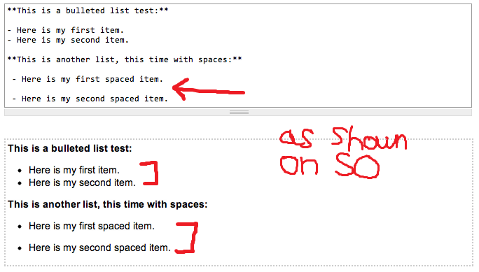
On Stack Overflow (and Meta.SO), the standard leading used with bulleted lists has minimal vertical space between each line. If you want to increase the leading, you can insert a space between the first and second items in the list, which instructs Markdown to wrap things in a <p> taginstructs Markdown to wrap things in a <p> tag.

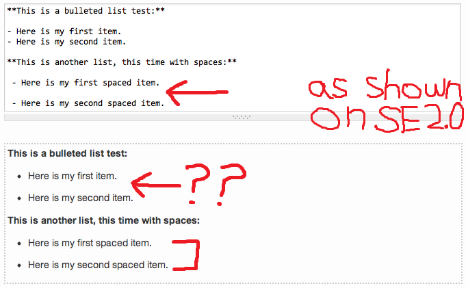
This has apparently been disrupted on many (all?) of the SE 2.0 sites. The standard leading is much too wide, and there is no change when you insert a space between list items. Despite this, the editing help still says the same thing as Stack Overflow.

Compare the following two screenshots—SO is first, then one of the SE 2.0 sites:
(The screenshots show bulleted lists, but this applies equally to numbered lists.)
I suppose this might not be considered a bug, but rather by design, with theory going something like "more leading makes things easier to read, and the non-tech savvy audience of the SE 2.0 sites won't necessarily know to insert a space between their list items". The problem with this approach is two-fold:

  1. Too much leading can be just as hard to read as too little, as the Wikipedia article demonstrates.
  2. If something is truly hard to use or undiscoverable, that should be solved by improving the documentation for the feature, not by introducing inconsistencies. That just makes it worse.

At first, I thought it was connected to the new Grainy theme, but it seems to also be the case on sites like Skeptics, which use their own custom theme.

On Stack Overflow (and Meta.SO), the standard leading used with bulleted lists has minimal vertical space between each line. If you want to increase the leading, you can insert a space between the first and second items in the list, which instructs Markdown to wrap things in a <p> tag.

This has apparently been disrupted on many (all?) of the SE 2.0 sites. The standard leading is much too wide, and there is no change when you insert a space between list items. Despite this, the editing help still says the same thing as Stack Overflow.

Compare the following two screenshots—SO is first, then one of the SE 2.0 sites:
(The screenshots show bulleted lists, but this applies equally to numbered lists.)


I suppose this might not be considered a bug, but rather by design, with theory going something like "more leading makes things easier to read, and the non-tech savvy audience of the SE 2.0 sites won't necessarily know to insert a space between their list items". The problem with this approach is two-fold:

  1. Too much leading can be just as hard to read as too little, as the Wikipedia article demonstrates.
  2. If something is truly hard to use or undiscoverable, that should be solved by improving the documentation for the feature, not by introducing inconsistencies. That just makes it worse.

At first, I thought it was connected to the new Grainy theme, but it seems to also be the case on sites like Skeptics, which use their own custom theme.

replaced http://christianity.stackexchange.com/ with https://christianity.stackexchange.com/
Source Link

On Stack Overflow (and Meta.SO), the standard leading used with bulleted lists has minimal vertical space between each line. If you want to increase the leading, you can insert a space between the first and second items in the list, which instructs Markdown to wrap things in a <p> tag.

This has apparently been disrupted on many (all?) of the SE 2.0 sites. The standard leading is much too wide, and there is no change when you insert a space between list items. Despite this, the editing help still says the same thing as Stack Overflowediting help still says the same thing as Stack Overflow.

Compare the following two screenshots—SO is first, then one of the SE 2.0 sites:
(The screenshots show bulleted lists, but this applies equally to numbered lists.)


I suppose this might not be considered a bug, but rather by design, with theory going something like "more leading makes things easier to read, and the non-tech savvy audience of the SE 2.0 sites won't necessarily know to insert a space between their list items". The problem with this approach is two-fold:

  1. Too much leading can be just as hard to read as too little, as the Wikipedia article demonstrates.
  2. If something is truly hard to use or undiscoverable, that should be solved by improving the documentation for the feature, not by introducing inconsistencies. That just makes it worse.

At first, I thought it was connected to the new Grainy theme, but it seems to also be the case on sites like Skeptics, which use their own custom theme.

On Stack Overflow (and Meta.SO), the standard leading used with bulleted lists has minimal vertical space between each line. If you want to increase the leading, you can insert a space between the first and second items in the list, which instructs Markdown to wrap things in a <p> tag.

This has apparently been disrupted on many (all?) of the SE 2.0 sites. The standard leading is much too wide, and there is no change when you insert a space between list items. Despite this, the editing help still says the same thing as Stack Overflow.

Compare the following two screenshots—SO is first, then one of the SE 2.0 sites:
(The screenshots show bulleted lists, but this applies equally to numbered lists.)


I suppose this might not be considered a bug, but rather by design, with theory going something like "more leading makes things easier to read, and the non-tech savvy audience of the SE 2.0 sites won't necessarily know to insert a space between their list items". The problem with this approach is two-fold:

  1. Too much leading can be just as hard to read as too little, as the Wikipedia article demonstrates.
  2. If something is truly hard to use or undiscoverable, that should be solved by improving the documentation for the feature, not by introducing inconsistencies. That just makes it worse.

At first, I thought it was connected to the new Grainy theme, but it seems to also be the case on sites like Skeptics, which use their own custom theme.

replaced http://meta.stackexchange.com/ with https://meta.stackexchange.com/
Source Link

On Stack Overflow (and Meta.SO), the standard leading used with bulleted lists has minimal vertical space between each line. If you want to increase the leading, you can insert a space between the first and second items in the list, which instructs Markdown to wrap things in a <p> tag.

This has apparently been disrupted on many (all?) of the SE 2.0 sites. The standard leading is much too wide, and there is no change when you insert a space between list items. Despite this, the editing help still says the same thing as Stack Overflow.

Compare the following two screenshots—SO is first, then one of the SE 2.0 sites:
(The screenshots show bulleted lists, but this applies equally to numbered lists.)


I suppose this might not be considered a bug, but rather by design, with theory going something like "more leading makes things easier to read, and the non-tech savvy audience of the SE 2.0 sites won't necessarily know to insert a space between their list items". The problem with this approach is two-fold:

  1. Too much leading can be just as hard to read as too little, as the Wikipedia article demonstrates.
  2. If something is truly hard to use or undiscoverable, that should be solved by improving the documentation for the feature, not by introducing inconsistencies. That just makes it worse.

At first, I thought it was connected to the new Grainy themethe new Grainy theme, but it seems to also be the case on sites like Skeptics, which use their own custom theme.

On Stack Overflow (and Meta.SO), the standard leading used with bulleted lists has minimal vertical space between each line. If you want to increase the leading, you can insert a space between the first and second items in the list, which instructs Markdown to wrap things in a <p> tag.

This has apparently been disrupted on many (all?) of the SE 2.0 sites. The standard leading is much too wide, and there is no change when you insert a space between list items. Despite this, the editing help still says the same thing as Stack Overflow.

Compare the following two screenshots—SO is first, then one of the SE 2.0 sites:
(The screenshots show bulleted lists, but this applies equally to numbered lists.)


I suppose this might not be considered a bug, but rather by design, with theory going something like "more leading makes things easier to read, and the non-tech savvy audience of the SE 2.0 sites won't necessarily know to insert a space between their list items". The problem with this approach is two-fold:

  1. Too much leading can be just as hard to read as too little, as the Wikipedia article demonstrates.
  2. If something is truly hard to use or undiscoverable, that should be solved by improving the documentation for the feature, not by introducing inconsistencies. That just makes it worse.

At first, I thought it was connected to the new Grainy theme, but it seems to also be the case on sites like Skeptics, which use their own custom theme.

Migration of MSO links to MSE links
Source Link
Loading
Source Link
Cody Gray
  • 64.4k
  • 23
  • 197
  • 313
Loading