I don't really like the black bar vibe in general. I do like the new functionality (although I miss the direct link to main, but I am getting used to the drop down), but the old look was cozy and distinctive.
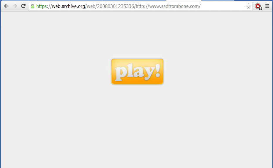
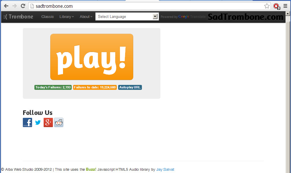
The new look reminds me of some random, unpopular blog/aggregate/whatever web site that only really exists to be some web designers portfolio piece. It's cold and bleak. It reminds me of when sadtrombone.com changed their look:
Old Site (Perfect):

New Site (All it needs is one of those crappy tag clouds on the side):


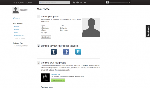
Another example of the vibe I get, Diaspora (supposed to be a Facebook competitor, ultimately another failed social media site):

I don't know. Perhaps I'm being prejudice, but I always associate the full-width, no-margin, black nav bar, white background theme with failed sites in the bleak corners of the internet.
It's sort of the hipster of design themes, tacked on by failing sites at the last minute to try and "look sleak and cool", maybe with a digg button on the side, in a frantic attempt to slow their inevitable slide into becoming a domain name parking site (complete with stock photo of smiling-woman-with-laptop-and-headset) or a Yahoo! portal front-end.
If you keep the black bar, whatever, but please for the love of god promise us you won't add a tag cloud. Those things are like the modern day equivalent of the poorly scaled animated GIF, or <marquee> or that Java applet water reflection text effect (AUUUUGHHHH!).
P.S. [Smiling][4][Smiling][5]-[woman][5][woman][6]-[with][6][with][7]-[laptop][7][laptop][8]-[and][8][and][9]-[headset][9][headset][10], if you are reading this, call me, maybe.
P.P.S. For the ladies.
