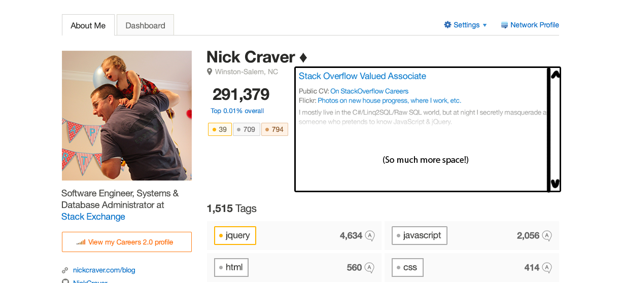
The About Me needs improvementto stand out more.
This is one of the more important sections in a profile, for the people who've used it. It's a major opportunity for us to say a lot of stuff which doesn't fit into the regular profile format.
If your goal is to make a profile page which tells us more about a user, the about me is counterproductive.
You've mostlyyour current design of the About Me is counterproductive: all but a couple of lines are effectively hidden it, and it's thoroughly de-emphasized to the large text meanspoint that it disappears almost immediatelycan be easily missed altogether, despite all the stuff we might have to say in there. The large text narrowsThis is probably because a lot of things on the page are colourful and attention-grabbing, and the About Me (effectively), which is good, but comes at the cost of... well,only thing that isn't, and in fact fades out.
The About Me matters. Let it show up clearly and stand out, rather than disappear after 2-3 lines.!
I've done some rearranging that leaves us with more About Me showing straight off the bat. This looks familiarConsider this rearrangement, now that I'm done. That's a coincidencefor instance, but the current thingwhich gives it emphasis again works well.(and, as a total accident, looks pretty familiar!):

