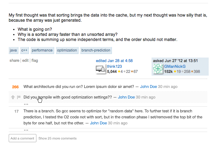
The double line seems like too much separation - as though it has little to do with the comments above.
I like the separate actions, though, often I want to see the comments but don't want the interruption of a big comment box that I wasn't planning on using.
For particularly long comment threads I kinda want to know where the invisible comments are before clicking the "show all comments" and, frankly, I often don't want to re-read all the comments when I'm following up on a topic, just recent/new comments.
So I'd go a little further and propose that you put ellipses between comments where there are hidden comments, both to reinforce the position of the shown comments in the comment hierarchy, and so you can expand just a section or two of hidden comments, rather than the whole thing:

Probably make them the same gray used for the buttons/actions below. It would immediately alert readers that some comments are hidden, and clicking on one set of ellipses would expand that section alone, giving users a greater degree of control over their reading.
While I'd be tempted to replace the ellipses with more information, "2 comments hidden by splattne and Jon Skeet"* I'd resist that temptation - the point of hiding them is to avoid information overload and provide ease of use for the most important comments.
Of course I'd still suggest expanding all when adding a comment, and the shortcut to expand all would probably still be used more.
* Jon Skeet here used as an example. In practice, Jon Skeet's comments are never hidden.
