Your choice of hamburger

Right now, there are two versions of the SE logo on the top bar:
The one on the left is a quad-burger with the text 'StackExchange' after it. This is a very large area which could be clickable and formerly was.
The one on the right is a tri-burger, similar to the three-line UI element commonly used across applications and sites to open menus.
If we're going to have the hamburger at the left anyway, there's no reason to have the one at the right. The right side is cluttered with all sorts of stuff, has a much smaller clickable area, and is buried in the middle instead of being at the edge if you're a moderator.
Getting rid of the hamburger at the right and giving the quad-burger back its rightful place would make the right side less cluttered, which is a good thing. The new setup just causes too much cognitive load and is unpleasant to use.
Optimizing for the uncommon task

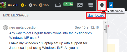
I can perform two actions with this diamond:
- I can click the diamond to open the "mod messages" drop-down.
- Once the drop-down is open, I can click the "dashboard" link to open the mod dashboard.
I look at the mod dashboard all the time, but only look at the mod messages once in a while – basically, whenever it lights up to tell me there's a new message to be read.
Unfortunately, with this change, my common task is now two clicks, and I'm shown the mod messages drop-down all the time even though there's nothing new to read. This is annoying.
Moderator tools as an afterthought

It really looks like the top bar was designed without moderator tools in mind. Although the new hamburger is unnecessary and inferior to the original location for the site switcher, it does work okay when it's at the far right. Its natural position is at one edge or the other.
(That said, its clickable area is too small.)

But with the moderator tools added onto the end, it feels like a very unnatural position. It takes extra cognitive resources to click it each time, because my hamburger is sandwiched between two sets of icons.
Between the poor positioning and hiding the mod dashboard away, it really feels like the top bar was designed without the moderator tools in mind, and they were added as an afterthought.
The invisible line

Did you know there was a line here? I didn't. I can just barely see it, and I can guarantee you that a lot of people are completely incapable of seeing it.
Low-contrast dividers like this are popular lately but are poor design. If you want a divider there – and frankly, I have no idea why it's there in the first place – it should probably be visible to people with moderate-to-poor eyesight.
My suggestion: Get rid of it. It doesn't do anything useful, so we don't really need to see it.
My reputation is off-center

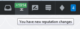
As you can see, the +1914 text is off to the left. Shouldn't it be centered?
What should we do?
Just give us back the old top bar.
.
.
.
What's that, you say? "No"? Well, I kinda figured you'd say that, so I lovingly crafted this mock-up of an alternate design in Microsoft Paint:

See, it's got stuff in different places. There's no tri-burger 'cause the quad-burger already does everything we need without taking up the extra real estate. I didn't really know what to do about the mod dashboard link, so I just wrote in the word "mod". Whatever you do, just don't hide it away in the mod message menu, please.
I also added a smiley face. I would have doodled a bit more, but I ran out of space, so you'll have to content yourselves with that.


