added 180 characters in body
Source Link
jscs
  • 24.7k
  • 11
  • 77
  • 132

(See Monica Cellio's answer and/or the followup MSE post.)


My cheese has been moved, and a holographic replica has been left in its place. There used to be a menu in this very spot that looked exactly like this:
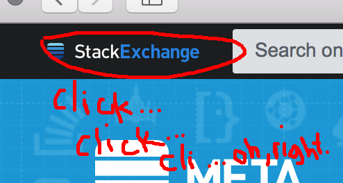
And now this graphic does nothing. The new top bar on Stack Overflow moved the site switcher and put something with a completely different appearance in the spot it used to occupy, so while it took some getting used to, it was pretty obvious even to the lizard brain moving the pointer that something was different.

Here I have an element that looks exactly like the thing I wanted, in the place that I expect it, and it acts like a website that I have a bad connection to ("argh! load, you stupid menu"), until I remember three clicks later.

What, exactly, was the point of this slap in my UX face? Why is this graphic reused for a completely different functional purpose?

(See Monica Cellio's answer and/or the followup MSE post.)


My cheese has been moved, and a holographic replica has been left in its place. There used to be a menu in this very spot that looked exactly like this:

And now this graphic does nothing. The new top bar on Stack Overflow moved the site switcher and put something with a completely different appearance in the spot it used to occupy, so while it took some getting used to, it was pretty obvious even to the lizard brain moving the pointer that something was different.

Here I have an element that looks exactly like the thing I wanted, in the place that I expect it, and it acts like a website that I have a bad connection to ("argh! load, you stupid menu"), until I remember three clicks later.

What, exactly, was the point of this slap in my UX face? Why is this graphic reused for a completely different functional purpose?

added 18 characters in body
Source Link
jscs
  • 24.7k
  • 11
  • 77
  • 132

My cheese has been moved, and a holographic replica has been left in its place. There used to be a menu in this very spot that looked exactly like this:

And now this graphic does nothing. The new top bar on Stack Overflow moved the site switcher and put something with a completely different appearance in the spot it used to occupy, so while it took some getting used to, it was pretty obvious even to the lizard brain moving the pointer that something was different.

Here I have an element that looks exactly like the thing I wanted, in the place that I expect it, and it acts like a website that I have a bad connection to ("argh! load, you stupid menu"), until I remember three clicks later.

What, exactly, was the point of this slap in my UX face? Why is this graphic reused for a completely different functional purpose?

My cheese has been moved, and a holographic replica has been left in its place. There used to be a menu in this very spot that looked exactly like this:

And now this graphic does nothing. The new top bar on Stack Overflow moved the site switcher and put something completely different in the spot it used to occupy, so while it took some getting used to, it was pretty obvious even to the lizard brain moving the pointer that something was different.

Here I have an element that looks exactly like the thing I wanted, in the place that I expect it, and it acts like a website that I have a bad connection to ("argh! load, you stupid menu"), until I remember three clicks later.

What, exactly, was the point of this slap in my UX face? Why is this graphic reused for a completely different functional purpose?

My cheese has been moved, and a holographic replica has been left in its place. There used to be a menu in this very spot that looked exactly like this:

And now this graphic does nothing. The new top bar on Stack Overflow moved the site switcher and put something with a completely different appearance in the spot it used to occupy, so while it took some getting used to, it was pretty obvious even to the lizard brain moving the pointer that something was different.

Here I have an element that looks exactly like the thing I wanted, in the place that I expect it, and it acts like a website that I have a bad connection to ("argh! load, you stupid menu"), until I remember three clicks later.

What, exactly, was the point of this slap in my UX face? Why is this graphic reused for a completely different functional purpose?

Source Link
jscs
  • 24.7k
  • 11
  • 77
  • 132

My cheese has been moved, and a holographic replica has been left in its place. There used to be a menu in this very spot that looked exactly like this:

And now this graphic does nothing. The new top bar on Stack Overflow moved the site switcher and put something completely different in the spot it used to occupy, so while it took some getting used to, it was pretty obvious even to the lizard brain moving the pointer that something was different.

Here I have an element that looks exactly like the thing I wanted, in the place that I expect it, and it acts like a website that I have a bad connection to ("argh! load, you stupid menu"), until I remember three clicks later.

What, exactly, was the point of this slap in my UX face? Why is this graphic reused for a completely different functional purpose?