added 49 characters in body
Source Link
user1306322
  • 10.6k
  • 25
  • 59

I have things to say about these:

⚑ Flag is obviously already used for flagged messages. It wouldn't make sense to use it for non-flagged items. My first thought if I saw that would be "Somehow I gained moderator privileges?"

✓ Check mark is obviously already used for accepted answer on the site. These are the top two symbols I have problems with you trying to use them for review queue. These just don't make any sense.

☰ Hamburger icon with a smaller bottom bun? It's for settings, everybody knows that thanks to modern GUI practices. Only in the second icon it resembles a bullet list. Hamburger with a check mark for "confirm settings"? List of questions with an accepted answer? Don't think so.

Dashboard icon in the left column conveys a meaning of a task productivity tool, like Trello. Dashboard with a check mark… something about accepted answers?

Comment icon means… "comment". Do you gotta leave comments in the review queue? Sure, sometimes, but not always. There's gotta be a better icon though.

Bottom right is a comment about a stapler.


Look how obvious the inbox icon is − there's no confusion. "Incoming messages" is exactly what it means. And the question mark icon for help. Such a great choice. And the cup with a star for awards!

Surely you can find better options for a review queue, something that says "review" with its symbol and doesn't cross over with already used symbols on the site.

The presented options are not quite as good at representing what they mean as the other icons. Please think of better options to choose from.


Why not just the word "review"?

I have things to say about these:

⚑ Flag is obviously already used for flagged messages. It wouldn't make sense to use it for non-flagged items. My first thought if I saw that would be "Somehow I gained moderator privileges?"

✓ Check mark is obviously already used for accepted answer on the site. These are the top two symbols I have problems with you trying to use them for review queue. These just don't make any sense.

☰ Hamburger icon with a smaller bottom bun? It's for settings, everybody knows that thanks to modern GUI practices. Only in the second icon it resembles a bullet list. Hamburger with a check mark for "confirm settings"? List of questions with an accepted answer? Don't think so.

Dashboard icon in the left column conveys a meaning of a task productivity tool, like Trello. Dashboard with a check mark… something about accepted answers?

Comment icon means… "comment". Do you gotta leave comments in the review queue? Sure, sometimes, but not always. There's gotta be a better icon though.

Bottom right is a comment about a stapler.


Look how obvious the inbox icon is − there's no confusion. "Incoming messages" is exactly what it means. And the question mark icon for help. Such a great choice. And the cup with a star for awards!

Surely you can find better options for a review queue, something that says "review" with its symbol and doesn't cross over with already used symbols on the site.

The presented options are not quite as good at representing what they mean as the other icons. Please think of better options to choose from.


Why not just the word "review"?
Source Link
user1306322
  • 10.6k
  • 25
  • 59

I have things to say about these:

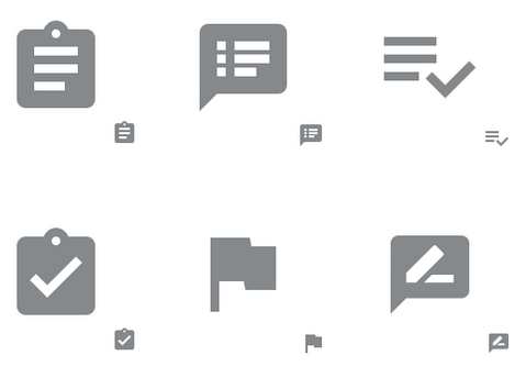
⚑ Flag is obviously already used for flagged messages. It wouldn't make sense to use it for non-flagged items. My first thought if I saw that would be "Somehow I gained moderator privileges?"

✓ Check mark is obviously already used for accepted answer on the site. These are the top two symbols I have problems with you trying to use them for review queue. These just don't make any sense.

☰ Hamburger icon with a smaller bottom bun? It's for settings, everybody knows that thanks to modern GUI practices. Only in the second icon it resembles a bullet list. Hamburger with a check mark for "confirm settings"? List of questions with an accepted answer? Don't think so.

Dashboard icon in the left column conveys a meaning of a task productivity tool, like Trello. Dashboard with a check mark… something about accepted answers?

Comment icon means… "comment". Do you gotta leave comments in the review queue? Sure, sometimes, but not always. There's gotta be a better icon though.

Bottom right is a comment about a stapler.


Look how obvious the inbox icon is − there's no confusion. "Incoming messages" is exactly what it means. And the question mark icon for help. Such a great choice. And the cup with a star for awards!

Surely you can find better options for a review queue, something that says "review" with its symbol and doesn't cross over with already used symbols on the site.

The presented options are not quite as good at representing what they mean as the other icons. Please think of better options to choose from.