Bounty Ended with 50 reputation awarded by gnat
Bounty Ended with 100 reputation awarded by bad_coder

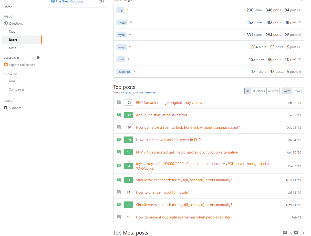
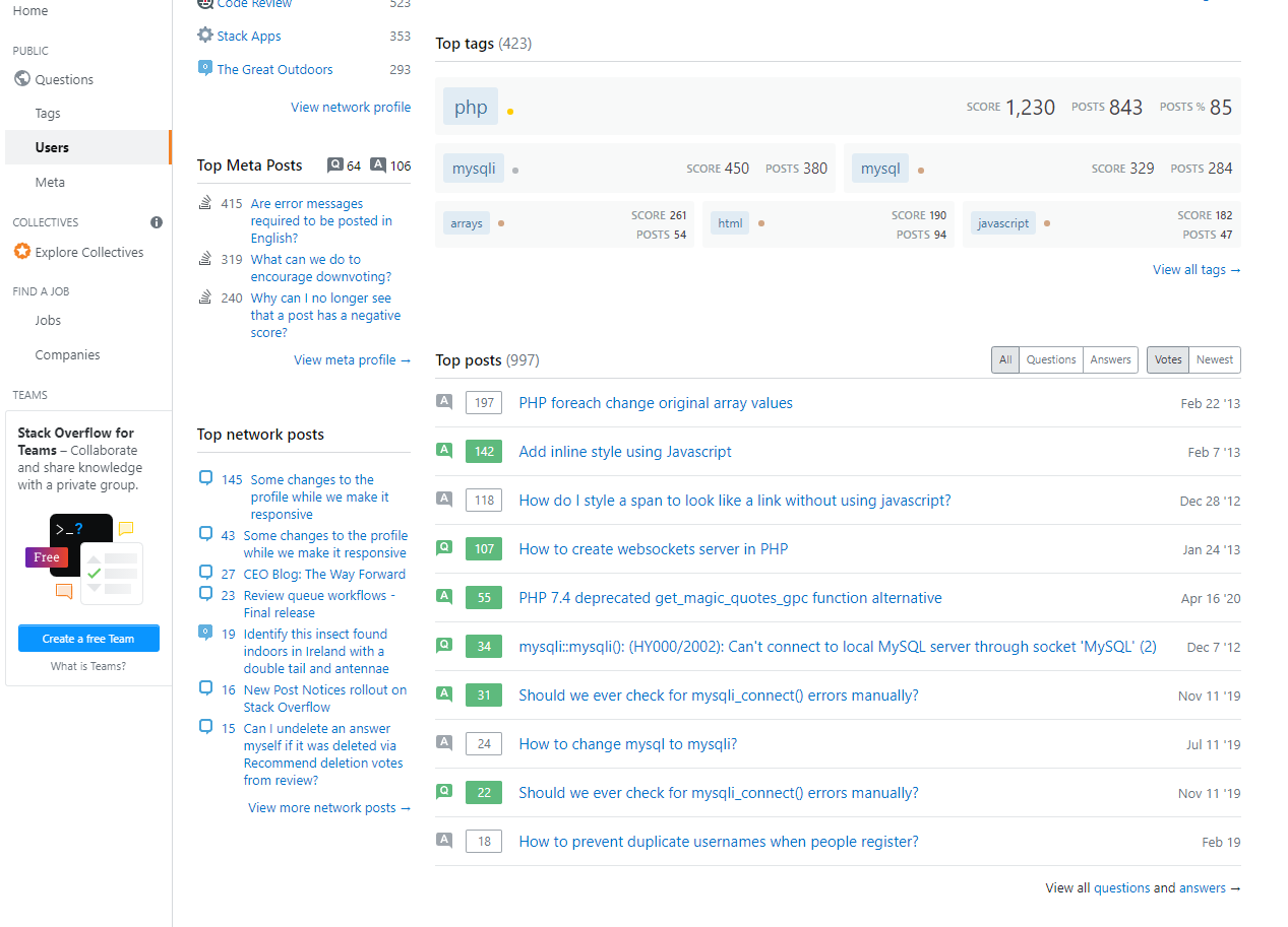
I would like to request that the new profile be made with less space.

Compare the difference:

New:

enter image description here

Old:

enter image description here

The new profile is definitely much cleaner, but there's too much space. The older profile was much more compact. Please consider removing some of the spacing. In particular, the whole bar of space on the left side where the top network posts were should be gone. Maybe make a partition after profile, and put everything else after with width:100% of the profile?

Lines have been made shorter. The new grid is smaller than the previous container. I propose to make this margin smaller:

.gs24>.d-flex, .gs24>.flex--item {
    margin: 8px;
}

The top tags section has too much padding. Make it half what it is now (12px -> 6px).

Thanks for making the improvements and making the site better.
Ease of reading edit. Added source fence with language code.
Source Link
bad_coder
  • 28k
  • 8
  • 51
  • 132

I would like to request that the new profile be made with less space.

Compare the difference:

New:

enter image description here

Old:

enter image description here

The new profile is definitely much cleaner, but there's too much space. The older profile was much more compact. Please consider removing some of the spacing. In particular, the whole bar of space on the left side where the top network posts were should be gone. Maybe make a partition after profile, and put everything else after with width:100% of the profile?

Lines have been made shorter. The new grid is smaller than the previous container. I propose to make this margin smaller:

.gs24>.d-flex, .gs24>.flex--item {
    margin: 8px;
}
.gs24>.d-flex, .gs24>.flex--item {
    margin: 8px;
}

The top tags section has too much padding. Make it half what it is now (12px -> 6px).

Thanks for making the improvements and making the site better.

I would like to request that the new profile be made with less space.

Compare the difference:

New:

enter image description here

Old:

enter image description here

The new profile is definitely much cleaner, but there's too much space. The older profile was much more compact. Please consider removing some of the spacing. In particular, the whole bar of space on the left side where the top network posts were should be gone. Maybe make a partition after profile, and put everything else after with width:100% of the profile?

Lines have been made shorter. The new grid is smaller than the previous container. I propose to make this margin smaller:

.gs24>.d-flex, .gs24>.flex--item {
    margin: 8px;
}

The top tags section has too much padding. Make it half what it is now (12px -> 6px).

Thanks for making the improvements and making the site better.

Source Link
Dharman
  • 9.8k
  • 1
  • 22
  • 56

I would like to request that the new profile be made with less space.

Compare the difference:

New:

enter image description here

Old:

enter image description here

The new profile is definitely much cleaner, but there's too much space. The older profile was much more compact. Please consider removing some of the spacing. In particular, the whole bar of space on the left side where the top network posts were should be gone. Maybe make a partition after profile, and put everything else after with width:100% of the profile?

Lines have been made shorter. The new grid is smaller than the previous container. I propose to make this margin smaller:

.gs24>.d-flex, .gs24>.flex--item {
    margin: 8px;
}

The top tags section has too much padding. Make it half what it is now (12px -> 6px).

Thanks for making the improvements and making the site better.