Since the Product Team wanted numbers, here's some numbers:
Problem #1: How do we make a triangle more accessible to the vision-impaired users (near/far-sightedness, visual agnosia, color blindness, etc)?
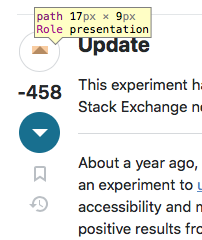
Solution: Make the vote icon less than one third the previous size, and draw a pretty circle around it. It's actually closer to one fourth the former size, but you get the point...
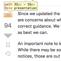
Numbers: The total surface area of the upvote/downvote arrow icons went from 264px² to 76.5px²: that's a 71% reduction in size of the one entire visually-identifiable element used to know whether you're about to upvote or downvote something. Hate to break it to you, but no matter how you spin it, that circle without the trusty triangle infers literally nothing about what will happen when you click, tap, or press it. event and hope they have their speakers on.
Furthermore, in the world I live in, which happens to feel very real, the only way these updated vote buttons will actually have a predictable outcome on a user's voting habits in a deterministic manner is if you add the classic MW2 hit marker sound to your onClick event and hope they have their speakers on.
Problem #2: How do we make our tiny but emboldened circled triangle more accessible to the physically-imparied users (DCD, hand tremors, age-related motor control decline, fat fingers, etc)?
Solution: Increase the size of the button (circle and all) by 5px because the intern just remembered that adding a circle also means adding margins or the whole UI begins to look like a broken record.
Numbers... Previous clickable area was 36 * 36 = 1296px². New clickable area, using πr² with a radius of 19.5 for the circle excluding the border width, we arrive at 1195px². Which is a mind boggling 101px² smaller than before. Bigger button, smaller hittable region.
So in other words, not only can you not eat your cake, but you can't have it either.
At least it's accessible.


