I've just noticed the new rep/vote counts look different, and not in a good way (IMO, obviously people will disagree).
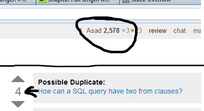
What else has been changed, and is it permanent?
I've just noticed the new rep/vote counts look different, and not in a good way (IMO, obviously people will disagree).

What else has been changed, and is it permanent?
I agree. Compare the healthy
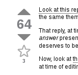

to the poor undernourished
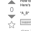

I want the old style back.
The old design was nice, but those heavy, bold numbers added unnecessary weight. With over 280,438,789 views a month on Stack Overflow, that weight was no longer acceptable, particularly considering we're still running off of backup hardware in Oregon. Fortunately, our brave designer-in-chief was able to find numerous small ways to slim down the text without sacrificing clarity.
The new font styles trim the fat, allowing emphasis where it's needed without bogging down the pipes pushing all those extra pixels.
Next time you load up Stack Overflow and the page appears in 70ms, be sure to whisper a quick, "thanks, Jin!"
font-weight:bold text in the CSS was clogging your servers. Really? Oh, wait. It's Friday. (slowing down your servers with a bit of bold/italic. You're welcome)
The new style objectively sucks! ☺ I can tell from some of the pixels and from seeing quite a few voting widgets in my time.
The thinner font makes the vote counts look off-center. Example (colored lines added to demonstrate the pixels are off-center):
The digits are too far to the right:


The digits are too far to the right, and too low:

While the bold style probably wasn't perfectly centered either, this is the first thing I noticed with the new style.
(This is with Firefox 17 on Linux.)
Pffft.
Every time Facebook makes a little change to their page, they have to endure the weight of hundreds of thousands of emails from disgruntled users crashing their servers.
You'd be kerfluffled no matter what the change was. Give it a few days to get accustomed to the new look, and then file a bug report.
It is now clear that Stack Overflow is no longer the place for you. Fear not, Programmers will always welcome your bold awesomeness.
Just no "what language I should learn next" questions, mmmkay?
What else has been changed?
A few other places that I noticed:
Question lists:
Inside a post:
In profile, tag lists:

In profile, account list:

Question list top tabs:

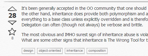
Inside post tags (tagged):
IMO: looks cool, minimalistic, sophisticated. And as Yoda says, deal with it.
Dropping emphasis and styles made the site harder to read. Drawing the eye's attention to the highlighted parts of the page is important. Having to scan longer with the eye makes more strain.
There are millions of users here all who probably get enough eye strain as it is. Why add to it? I will take my load time of 71ms and some nice styles instead of 70ms and eye strain.
If we are sticking with the non-bold counts, can we consider less bold up and down arrows? :-(
Do these new rules need to be !important? Certainly it looks like the font-weight on the "answered" rep score works fine without it.

!important.
I almost didn't notice the changes in the layout.
I just wondered why so many posts were made community-wiki, until I noticed that I was wrong. If I remember correctly, the old design had some grey boxes surrounding the user info underneath each post, only posts marked as community-wiki had not. The new design omits these boxes, giving the first impression that each answer (questions still have the box) is a community-wiki one. The community-wiki answers had no user image showing, but still this confuses me...
The new font style is fine to me.
However, other things which were previously very well balanced with the old font style are now completely out of balance. On top 1 the vote arrows. They are now clearly disproportional. The fix should be relatively easy: make them smaller and very maybe put a 1x wide bright shadow on it to be in balance with the new font style.
Further it is also distracting that the new font style didn't made it into Top Users list, Answers tab nor Tags tab. It's still the old and fat font style.
While it was extremely annoying at first, now I've gotten really used to it. I think everyone has. In fact, I've gotten so used to it that the styling on StackApps looks fat to me and burns my eyes:
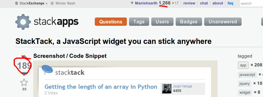
For reference, StackApps and MSO had the same styling before the CSS revamp, and StackApps still has the old CSS.