11

I suggest a trivial layout change that would (IMO) greatly improve readability. The current layout shows the banner inside the question body; this banner stands where the old “possible duplicates” banner was. This placement is, and has always been, extremely confusing, especially to new users who might not realize at all that this banner isn't part of the original question. I believe it's time to change this oddity, and suggest the top banner be aligned with the bottom one as sketched here:
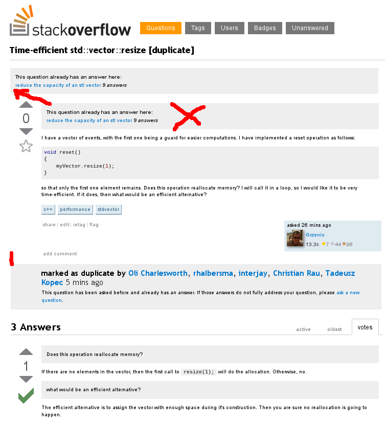
banner alignment

Please do not intrude the posts' bodies! This would obviously make the SE network a better place.

4
  • 3
    The old Possible Duplicate: box was always in the post body and nobody complained. Commented Feb 6, 2013 at 12:56
  • 2
    @BoltClock'saUnicorn - however as the screens have chgnaed people will look at things again and see other areas for change
    – mmmmmm
    Commented Feb 6, 2013 at 13:01
  • 4
    @Bolt true, but now that the text is no longer injected into the post such change looks more proper. (Not to mention much easier to implement) Commented Feb 6, 2013 at 13:20
  • I really like this idea; isn't this the ad space if you're not a user with reduced ads though? Commented Feb 6, 2013 at 14:17

0

You must log in to answer this question.

Browse other questions tagged .