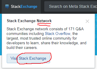
The left part of the top bar now open a nice drop down when clicked:
That's nice and dandy, however Stack Exchange is a network of sites, as the banner title itself says. It's not really possible to "visit" a network, but rather the network portal, or similar word.
I suggest changing the button text to something like "Visit Stack Exchange Portal", or even better let the user know what's expecting them, which is "View Hot Network Questions", which is the default page on https://stackexchange.com/.

