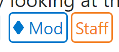
In true Stack Exchange community fashion, here's a (very quick) userscript to tweak the appearance of the new badges. Note that this doesn't revert the change, but just tweaks it to be a bit less distracting.
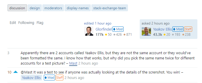
Based on a comment by @Adám above, I played with inverting the badge color and making the background transparent:
I find this design to be still distinctive yet less loud than the filled-in version, which makes them less distracting overall.
Here's the script. It runs on all Stack Exchange Q&A sites, but note that the badges are only currently live on per-site metas. Feel free to edit/ improve it locally to suit your own needs without limitation.
// ==UserScript==
// @name         Invert Staff & Mod Label Colors
// @description  Inverts the color scheme of the Staff & Moderator labels on Stack Exchange
// @homepage     https://meta.stackexchange.com/a/367942
// @author       zcoop98
// @version      0.1
// @grant        GM_addStyle
// @run-at       document-start
//
// @include      https://*stackoverflow.com/*
// @include      https://*serverfault.com/*
// @include      https://*superuser.com/*
// @include      https://*askubuntu.com/*
// @include      https://*mathoverflow.net/*
// @include      https://stackapps.com/*
// @include      https://*.stackexchange.com/*
//
// @exclude      https://data.stackexchange.com/*
// @exclude      https://contests.stackoverflow.com/*
// ==/UserScript==

GM_addStyle(`
  .s-badge__staff {
    border-color: var(--orange-400) !important;
    background-color: transparent !important;
    color: var(--orange-400) !important;
  }
  .s-badge__moderator {
    border-color: var(--theme-secondary-color) !important;
    background-color: transparent !important;
    color: var(--theme-secondary-color) !important;
  }
  .s-badge__moderator.s-badge__xs:before {
    background-image: url("data:image/svg+xml,%3Csvg width='7' height='9' xmlns='http://www.w3.org/2000/svg'%3E%3Cpath d='M2.798.246c.3-.329 1.1-.327 1.399 0l2.579 3.66c.3.329.298.864 0 1.192L4.196 8.75c-.299.329-1.1.327-1.398 0L.224 5.098a.904.904 0 010-1.192L2.798.246z' fill='%230077cc'/%3E%3C/svg%3E") !important;
  }
  .s-badge__moderator:before {
    background-image: url("data:image/svg+xml,%3Csvg width='12' height='14' xmlns='http://www.w3.org/2000/svg'%3E%3Cpath d='M5.528.746c.257-.329.675-.327.93 0l4.42 5.66c.258.329.257.864 0 1.192l-4.42 5.66c-.256.328-.674.327-.93 0l-4.42-5.66c-.257-.329-.256-.865 0-1.192l4.42-5.66z' fill='%230077cc'/%3E%3C/svg%3E") !important;
  }
`);
I know that this doesn't fix any other issues brought up here (eg. contrast, placement, size, etc.), but I presume that Stack Exchange itself will address those, that someone else may find this useful in the meantime anyway.
As a final note, I want to mention that no disrespect whatsoever is intended to the Stack designers who engineered this change, I know this change took effort and careful consideration to create; Meta folk are just fickle about design changes.


