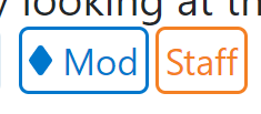
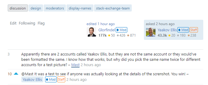
In true Stack Exchange community fashion, here's a (very quick) userscript to tweak the appearance of the new badges. Note that this doesn't revert the change, but just tweaks it to be a bit less distracting.
Based on a comment by @Adám above, I played with inverting the badge color and making the background transparent:
I find this design to be still distinctive yet less loud than the filled-in version, which makes them less distracting overall.
Here's the script. It runs on all Stack Exchange Q&A sites, but note that the badges are only currently live on per-site metas. Feel free to edit/ improve it locally to suit your own needs, without limitation.
// ==UserScript==
// @name         Invert Staff & Mod Label Colors
// @description  Inverts the color scheme of the Staff & Moderator labels on Stack Exchange
// @homepage     https://meta.stackexchange.com/a/367942
// @author       zcoop98
// @version      0.1
// @grant        GM_addStyle
// @run-at       document-start
//
// @include      https://*stackoverflow.com/*
// @include      https://*serverfault.com/*
// @include      https://*superuser.com/*
// @include      https://*askubuntu.com/*
// @include      https://*mathoverflow.net/*
// @include      https://stackapps.com/*
// @include      https://*.stackexchange.com/*
//
// @exclude      https://data.stackexchange.com/*
// @exclude      https://contests.stackoverflow.com/*
// ==/UserScript==

GM_addStyle(`
  .s-badge__staff {
    border-color: var(--orange-400) !important;
    background-color: transparent !important;
    color: var(--orange-400) !important;
  }
  .s-badge__moderator {
    border-color: var(--theme-secondary-color) !important;
    background-color: transparent !important;
    color: var(--theme-secondary-color) !important;
  }
  .s-badge__moderator.s-badge__xs:before {
    background-image: url("data:image/svg+xml,%3Csvg width='7' height='9' xmlns='http://www.w3.org/2000/svg'%3E%3Cpath d='M2.798.246c.3-.329 1.1-.327 1.399 0l2.579 3.66c.3.329.298.864 0 1.192L4.196 8.75c-.299.329-1.1.327-1.398 0L.224 5.098a.904.904 0 010-1.192L2.798.246z' fill='%230077cc'/%3E%3C/svg%3E") !important;
  }
  .s-badge__moderator:before {
    background-image: url("data:image/svg+xml,%3Csvg width='12' height='14' xmlns='http://www.w3.org/2000/svg'%3E%3Cpath d='M5.528.746c.257-.329.675-.327.93 0l4.42 5.66c.258.329.257.864 0 1.192l-4.42 5.66c-.256.328-.674.327-.93 0l-4.42-5.66c-.257-.329-.256-.865 0-1.192l4.42-5.66z' fill='%230077cc'/%3E%3C/svg%3E") !important;
  }
`);
I know that this doesn't fix any other issues brought up here (eg. contrast, placement, size, etc.), but I presume that Stack Exchange itself will address those, and hope that someone else may find this useful in the meantime anyway.
As a final note, I want to mention that no disrespect whatsoever is intended to the Stack designers who engineered this change, I know this change took effort and careful consideration to create; Meta folk are just fickle about design changes.
If you'd instead prefer the old pointy (but smaller) diamond character instead of the new SVG, swap out the final two CSS selector stanzas above with the following (this requires a little more work than simply changing the SVG color):
.s-badge__moderator.s-badge__xs:before {
    background-image: none !important;
    content: "♦" !important;
    width: unset !important;
    height: unset !important;
    margin: 0 2px 0 0 !important;
}
.s-badge__moderator:before {
    background-image: none !important;
    content: "♦" !important;
    width: unset !important;
    height: unset !important;
    margin: 0 2px 0 0 !important;
}
This will yield the following:
In the meantime, I've uploaded the diamond character (♦) version of this script to GitHub.


