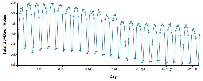
The simple answer is no; voting patterns have not increased since this change was rolled out (at least on Stack Overflow). If anything, voting has decreased since this change was rolled out.
The "site analytics" privilege allows anyone with 25k+ reputation to investigate this for themselves. Having someone with 25k+ reputation share the data with you here on a public forum like MSE allows everyone to (at least partially) investigate this for themselves. Ain't the open and transparent sharing of information great? (And, yes, unlike the moderator-only analytics, there is no restriction on sharing this data publicly; in fact, it's explicitly encouraged to share it on Meta, from a time when the company valued that transparency and openness that attracted us in the first place.)
Anyway…Looking at aggregated up+down votes from January 1, 2023 to today (June 13, 2023), here's what we get:
Before anyone complains about the scales, these are what the built-in tools give you. I agree it would be better if the Y axis started at 0, not a value slightly below 15k. I agree that the X axis is weirdly labeled. But it's still clear enough what is happening here:
- The total number of votes has been trending downward since about February 2023;
- A minor but noticeable dip in the voting rate is observable at the beginning of April 2023;
- Voting rates were roughly stable from April to mid-May 2023;
- There is another minor but noticeable dip in the voting rate observable at the end of May 2023 (it can be reasonably concluded that this aligns with the introduction of the restyled vote buttons).
It's not a huge drop; perhaps it's not even a statistically significant decrease. But the voting rate is definitely not showing signs of improvement, and there is nowhere near a 28% improvement.
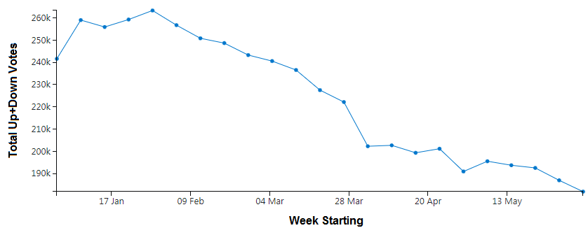
The various features are even more noticeable when we look at a 7-day (weekly) average of voting rates over the same time period:
I'll be honest, this complete lack of noticeable increase in the voting rate surprises even me. I was always skeptical of the claim that redesigning the vote buttons would have any lasting effect on the total number of votes, but I was not at all surprised to see that the change in styling produced a temporary effect. Any time you change things, people are going to be curious about it, interacting with it more than normal. That's why I never really got excited about this change. Although I am a huge advocate of voting—both directions—and would support anything that increased it substantially, I never bought the argument that the classic vote arrows were insufficiently obvious or in any way to blame for the decline in voting. (How could something that has been unchanged for years be responsible for a decline, anyway?) It was easy enough to explain away the "data" that the company presented showing that this redesign increased voting as nothing more than a temporary boost arising directly from the fact that there was a change.
There is even historical precedent confirming this temporary boost in voting whenever the styling is changed: as the April Fools' Day prank in 2011, unicorn animations were added whenever a vote arrow was clicked. There were unicorns everywhere—and the people loved it! People were clicking vote arrows all over the place just to see the cute little unicorns! How much did it increase voting? Sam Saffron (aka "waffles"), a staff member at the time, provides the answer: a little over 5% for upvotes and nearly 14% for downvotes (awesome!). About half the 28%, for a much more impactful and interesting change, but April Fools' Day is a highly localized event, so it's reasonable to assume that there were many people who didn't visit the site that day who never even saw this change.
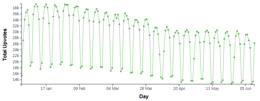
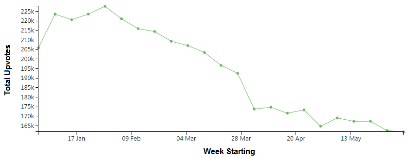
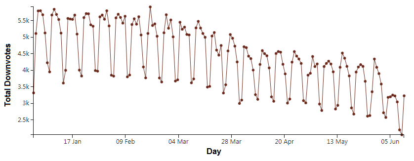
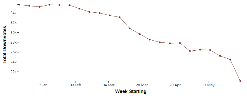
What if we look only at upvotes or downvotes? The trends are similar:
You can see the effects of the ongoing moderation strike prominently in the downvotes. There's a significant drop in the number of downvotes on June 5, 2023, coinciding with the start of the strike. The effect on upvotes is far less noticeable. (It should surprise no one that there are fewer downvotes when the most quality-minded of users go on strike, whereas there is little or no change in the upvoting rate.)
One might argue that the strike skews the analysis of this data; I claim the opposite. Throw out all of the data from June 5 onwards during the strike, and you're left with a little less than a week's worth of data, from May 30 to June 4. This is literally during the "honeymoon" period, immediately after the roll-out of the change, when the above analysis suggests that voting should be skewed significantly upwards, only to level out again later. This change didn't even cause a notable temporary/transient uptick in the rate of upvotes.
As Richard sardonically pointed out, the answer to encouraging more voting does not seem to be "putting a big dumb ring around the voting buttons".

