89

Update:

Thanks for all the feedback and bug reports! I am locking this thread so people don't keep answering it when we no longer monitor it.

If you see a bug or want to raise a feature request, please do so in the usual manner, as a new question.


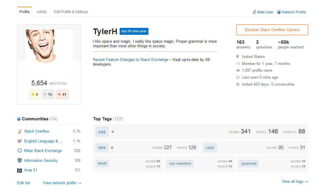
Some of you may have noticed that we just launched the new profile and activity pages that we have been talking about for a while now on most Stack Exchange sites.

Most? Well, yes, the new design is dependent on a SE network-wide update (a new base css framework) that the design team have been working on. This is an ongoing effort and we will be launching the new pages as sites are moved to the new design.

You've all been hugely helpful already - much of what we love most in here came from feedback and suggestions you gave us on Meta.

But it's possible that it's not quite perfect yet. If you find any bugs and have any feedback to give, please post these as answers to this post.

Just post one issue per answer - that would help us focus on specific items one at a time.

8
  • 5
    These look great so far! Nice work to everyone involved in creating and testing them! Commented Apr 15, 2015 at 15:23
  • Can we cross-post from the previous feedback request question? Commented Apr 15, 2015 at 15:31
  • 2
    This is wonderful! Also, not sure if this should be its own issue as a proper answer, but I've noticed something weird (Chrome Beta): When hovering over visited N+X days, X consecutive line, my cursor displays an overtype tooltip, and changes into an interactive tooltip only after I click on it.
    – Unihedron
    Commented Apr 15, 2015 at 15:31
  • @Unihedro - beta versions are not supported... could be a bug there. Once it is out of beta we can revise.
    – Oded StaffMod
    Commented Apr 15, 2015 at 15:34
  • 3
    Nice Job! I love specially the badge progress tracking feature. So usefull! Commented Apr 15, 2015 at 15:35
  • Now, if you really want extra work, you might want to make it compatible with IE 8 . Again, this is just extra work. Commented Apr 15, 2015 at 16:11
  • @Oded should site specific bugs be posted here?
    – Tim
    Commented Apr 15, 2015 at 16:24
  • @Tim - if they are indeed site specific, might as well post them on the site specific meta.
    – Oded StaffMod
    Commented Apr 15, 2015 at 16:24

75 Answers 75

51

See this answer by Nick Craver; tl;dr - GDPR compliance.


Age is no longer listed in our Profile view.

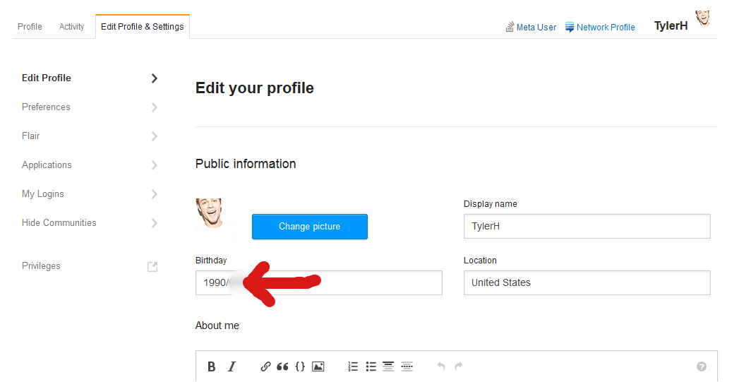
We can still enter our birth date in our profile, and it's listed under "Public Information":

enter image description here

However, our age is no longer visible anywhere on the new Profile page:

enter image description here

I believe this is a bug. Thanks to rlemon for pointing it out.

1
  • 25
    For someone like me who is A) forgetful and B) always on Stack Exchange, this feature was the easiest way to figure out how old I am.
    – Joe
    Commented Apr 21, 2015 at 18:08
39

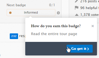
It is not possible to obtain the Informed on child Meta sites (except Meta.SE), yet one can still select it as a possible "track next badge" option:

enter image description here

Clicking on "Go get it" takes you to the main site tour page.

4
34

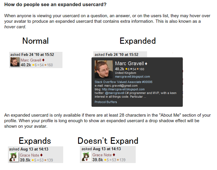
My next privilege is 1000 - I get the vote count and a VIP usercard:

Next privilege from profile screenshot

HU? VIP usercard? Privileges doesn't say anything:

Privileges page 1000 rep section

Ahh, a Help Centre search comes up with the Expanded usercard section:

Help centre Expanded usercard section

But the letters VIP are not mentioned anywhere on that page (I did a Ctrl+F).

This is the only place I saw the phrase VIP usercard - and it doesn't even fit in. I think this should be changed to Expanded usercard - or even dropped completely.

5
  • 19
    +1 This is one of many cases where site behavior has been determined/explained in a meta post somewhere but is not explained at all on the actual site.
    – TylerH
    Commented Apr 15, 2015 at 16:06
  • 11
    The reason it has to be like this is actually... Okay, fine. It was a cheap hack: "VIP" fit, and "Expanded" didn't. Well, at some point it fit. Now neither fits. We'll take a look at options. Thanks!
    – Jaydles StaffMod
    Commented Apr 15, 2015 at 20:09
  • 1
    @Jaydles If there's more than one perk, just add "+1 more..." or "+2 more..." or whatever.
    – TylerH
    Commented Apr 16, 2015 at 1:38
  • @Jaydles Do we have any update on it?
    – Tim
    Commented Apr 21, 2015 at 21:05
  • 1
    @Tim, it's in an "actual things we're banging through" queue. So, no update on timing, but it's not a "maybe someday". :)
    – Jaydles StaffMod
    Commented Apr 27, 2015 at 15:03
33

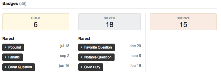
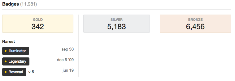
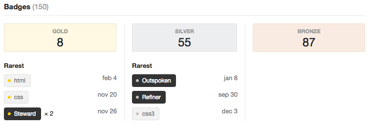
I've noticed some weird bugs when viewing users' profiles; more specifically, the "rarest" badges at the bottom of a user's profile are sometimes completely absent.

This seems to be odd in who it affects and be random in places.

On SO meta - Jon Skeet's Profile

enter image description here

On SO - Jon Skeet's Profile

enter image description here

On SO - web-tiki's Profile

enter image description here

Could this be due to having more than 3 which are classed as the rarest and therefore breaking the code to generate whatever the top 3 are meant to be?

6
  • Which of these badges is wrong, or which section is missing what badge? I'm afraid I don't have badge rarity memorized. Commented Apr 15, 2015 at 17:00
  • 3
    Well, it's saying that users have badges but none of them are classed as the rarest. For example, web-tiki example is showing 87 bronze badges but 0 are classed as the rarest whereas the silver and gold badges are showing. Commented Apr 15, 2015 at 17:02
  • I have one gold badge on Arqade and it's not showing for me.
    – Troyen
    Commented Apr 15, 2015 at 19:40
  • 9
    I think this is a filter for badges within each bucket that meet a "rarest" check. It would be more logical to sort by rarest in that category. (Alternately, we could just drop the filter in cases where total in a category is <4.) We'll take a look.
    – Jaydles StaffMod
    Commented Apr 15, 2015 at 20:12
  • 3
    I think that'd be cool. Just seems odd for Jon Skeets account where he has >5000 badges but none are classed as rare Commented Apr 15, 2015 at 20:46
  • Same here. However, there shows up exactly one bronce badge at least, so not completely absent. While there are several other bronce badges I've earned that certainly are rare.
    – Bergi
    Commented Apr 16, 2015 at 3:52
33

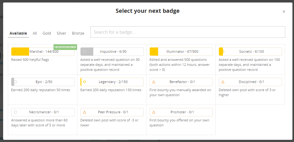
Marshal / Deputy progress shouldn't be shown to moderators

Moderators are recommended to get the unobtainable Marshal (and Deputy I assume) badge. It was the default selection for me:

screenshot of JohnB's profile

badge progress selection

I think this selection should probably be excluded for moderators.


If they don't already have it.

8
  • Moderators cannot raise flags?
    – TylerH
    Commented Apr 15, 2015 at 16:05
  • 2
    @TylerH they can, but unless you obtain Marshal/Deputy before you are elected/appointed, you cannot get the badge. You can see that I have 144 flags raised, but do not have the Deputy badge (80 required).
    – JohnB
    Commented Apr 15, 2015 at 16:07
  • 13
    That sounds like a bug in site behavior. You should still get the badges for flags acted upon by other moderators. Your personal user status shouldn't affect that.
    – TylerH
    Commented Apr 15, 2015 at 16:11
  • 8
    @TylerH you're not alone in thinking that. Relevant feature-request: Count flags handled as a moderator toward Deputy and Marshal badges
    – JohnB
    Commented Apr 15, 2015 at 16:18
  • 3
    Thanks, we'll be removing these for moderators soon.
    – Nick Craver Mod
    Commented Apr 15, 2015 at 21:16
  • @JohnB Actually, that's a different feature request (it asks for handled flags to be counted towards the badges instead). Commented Apr 16, 2015 at 7:27
  • @MartinBüttner The badges are only for helpful flags anyway, so that means flags have to be handled first.
    – TylerH
    Commented Apr 16, 2015 at 13:35
  • @TylerH No I mean that post suggests that the flags handled by that moderator should be counted for that moderator's badges. (At least that's how I read it.) Commented Apr 16, 2015 at 13:36
30

- we may revisit this at a later date.

Allow us to default to the Activity page rather than the Profile page

A lot of times, when I'm going to someone's profile, I don't care about their website, location, age, profile description, etc. I care about their posts, their edits, their activities. This now takes another click to get to the "good stuff", so could we have a setting to let us default to the Activity page?

4
  • 7
    They have this for moderators now. Can they simply remember which tab we were on last?
    – Troyen
    Commented Apr 17, 2015 at 7:42
  • 4
    Because this got declined, I wrote a userscript that can be used as an alternative.
    – ProgramFOX
    Commented Apr 18, 2015 at 12:44
  • 1
    @Troyen That request was made here :) Commented Apr 18, 2015 at 14:44
  • 5
    We have now got two profile pages: the "nice" one and the "useful" one. Which one people want as default? You've got one guess. /sarcasm
    – yo'
    Commented Apr 20, 2015 at 11:43
29

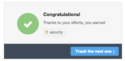
- the congratulations should only display if you've actually been awarded the tag badge. Also, tracked tag badges should award in more "real-time", i.e. when you visit your profile after a small hiatus (10 minutes, currently), we'll recalculate the counts and award if you've reached the threshold.

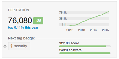
Next Badge can't decide if I've earned the next badge or not

When I go to my dba.SE profile, I see this:

enter image description here

When I click Track the next one >, I see this:

enter image description here

The first state comes back after 10 minutes or so, and then I wash, rinse, and repeat.

I assume this is some kind of caching or synchronization issue between notifications and actual awarding of badges.

Noteworthy: even though I've been notified about 10 times today that I've earned the security badge, it still doesn't appear in my list of badges.

6
  • I've seen the same issue, and in my case too it's with a tag badge that I'm really close to earning. Perhaps it's some algorithm that's rounding up the 92/100 into a 100/100 or something? Commented Apr 16, 2015 at 3:02
  • Actually I have a more plausible explanation for it. I think badges are only awarded once a day, and yet you might still have met all the qualifications for earning a badge before then. Commented Apr 16, 2015 at 3:11
  • 2
    Same here - I was missing 1 upvote on a tag and when I got it, the profile was all "yay congrats well done" ...I thought "oh wow, they changed the daily tag score recalc too?!" ...and then was all disappointed when I saw my tag score was back to 99/100 after clicking "track the next one". Commented Apr 16, 2015 at 3:24
  • When I clicked track the next one and selected "Let's choose" it just selected one for me.
    – James
    Commented Apr 18, 2015 at 0:35
  • @james it's probably because you clicked for the first time after the badge was awarded (which happens daily for several badges). I think there is a sync issue where part of the system knows you've earned the badge, but part of it doesn't.
    – Aaron Bertrand Staff
    Commented Apr 18, 2015 at 0:42
  • On my todo.txt for tomorrow. Commented Apr 20, 2015 at 3:00
28

As this thread has been locked and abandoned, I've raised this issue in a separate post.


I was dismayed to find that badge progress is unavailable for tag badges1.

When I heard of the badge-tracking feature, I was excited to begin tracking my progress toward the gold javascript badge:

So, I clicked the cog in the badge widget to configure my Next Badge...
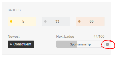
... only to find that my desired badge was unavailable:

Kendra notes that, according to the blog post:

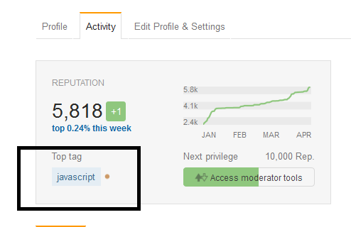
Once you’ve earned all the privileges, the “next privilege” bar automatically starts tracking your progress toward your closest tag badge (or another one of your choosing).

So, tag badges aren't treated like other badges; you have to earn 20k rep before tracking them... in a separate widget... which is both unexpected and disappointing.

I imagine that design discussion went something like this:

Engineer: Are we really going to put all these tag badges in the unfiltered select your next badge view? That's going to cause a performance hit.
Designer: That, and it's really going to clutter the view. By the way, I need something to put in the next permission space once a user has all permissions. I hate wasted space...
Unicorn: Guys, guys... two birds with one stone! We'll track tag badges in the space used for next privilege... and since they'll need 20k rep, that's only like 1% of our users who will ever potentially see it! Performance hit averted and, as a bonus, we can promote this feature as a "reward" for high-rep users. It all hangs together so perfectly! #guitar-riff #rainbow-trail

Unicorn's solution, while certainly expeditious and spin savvy, leaves a bit to be desired. I'd suggest one of the following:

  • Add some UI cue which indicates to the user that suddenly tag and non-tag badges will be treated differently... you know... just for this aspect of the site... for some unknown reason.
  • Simply add tag badges to the whole badge-tracking feature instead of setting them apart. Maybe filter by favorite tags or offer a 6th tab? I personally don't care that I won't have a next permission to track at 20k. There will still be plenty of badges... in the badge tracking UI. Just put a "you're awesome" sticker in the next permission slot.

1 I'm referring to my profile on stackoverflow (not a child meta site) in case that's not clear from the javascript tag. I only have ~18k rep.

0
27

Four problems here:

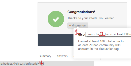
  1. Clicking the badge brings up this pop-up containing the same content as the hover-text. Great for mobile, but this was on the desktop.

  2. The hovertext still exists. I like hovertext. Kinda pointless with the pop-up though. Especially when they both show up, stacked.
  3. No matter how many times I click this thing, I can't get to the actual badge page. The pop-up just keeps popping up. Ctrl-clicking won't open it in a new tab either; just shows the pop-up.

  4. If I grudgingly right-click and select "open in new tab" from the menu, I still don't get the badge page because the badge ID is wrong: there's no badge with an ID of 0.

2
  • 1
    Did you not draw a #3 on the image or am I going blind...
    – TylerH
    Commented Apr 17, 2015 at 18:27
  • 1
    #3 involves typing / clicking. There's no representation of that in the picture.
    – Shog9 Mod
    Commented Apr 17, 2015 at 18:39
27

Recommends unobtainable Excavator badge

I'm in the Health.SE private beta, and the Activity page is recommending the Excavator badge:

enter image description here

The site has been live for 14 days, so Excavator is definitely unobtainable at this point. It would make a lot more sense to recommend Suffrage in my case.

4
  • @Oded Are you sure the fix didn't impact other sites? See this meta.SO.
    – falsarella
    Commented May 5, 2015 at 12:29
  • @falsarella - might be related, I am still looking.
    – Oded StaffMod
    Commented May 5, 2015 at 12:32
  • @Oded Thanks! The problem has been resolved.
    – falsarella
    Commented May 5, 2015 at 18:21
  • 1
    @Oded Not in the Open Source.SE private beta. It wants me to excavate the core of the earth!
    – Zizouz212
    Commented Jun 26, 2015 at 20:37
21

Feedback (not a bug report):

I would still like to see some sort of weighting for the "top network posts" section, as I explained on the earlier post. Right now this is a list of top posts by raw vote count without any other influences, so naturally it's going to show posts from the largest (or most-voting) sites I participate on. Yet I've made contributions that, by the standards of their communities, are way more significant ("top") than some of my top posts. The site where I have the most posts and am also a moderator doesn't show up on my list at all; that feels wrong.

I can exclude whole sites from the list, but that's not what I want either -- I'm looking for better balance, not wholesale exclusion. So my request is to come up with and use some sort of low-impact per-site weighting factor, like we already have for hot network questions.

0
20

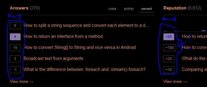
Sync the width of rep update boxes

The above is a picture taken on an inverse color environment from my actual profile.

0
20

Originally posted here: https://tex.meta.stackexchange.com/a/6087/3094

Quack

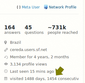
The word consecutive is truncated. It is awful. Please please please pretty please with sugar on top fix this. :(

My system: FF 37.0.1, Fedora 21, 64bits, all updates applied so far

5
  • 14
    Don't visit tomorrow. Problem solved. ;)
    – Oded StaffMod
    Commented Apr 16, 2015 at 11:21
  • @Oded: ooh that's naughty. :) Commented Apr 16, 2015 at 11:22
  • 4
    Suppose they fix it now. It will just break up again when you reach 10000 days. ;) Commented Apr 16, 2015 at 11:28
  • 9
    @ShadowWizard: in that case, I'll prod these guys in 27 years. :P Commented Apr 16, 2015 at 11:33
  • 2
    @PauloCereda -- well, since i missed a day, being on an airplane, my view hasn't got a total of 8 digits, only 5. so it must be a function of length of that line vs. width of provided "box". that has happened before in other situations -- maybe the "management" isn't expecting such devoted followers as you. Commented Apr 17, 2015 at 18:24
16

Tag score too small

Unresolved request from this report in the old question.

Would you please increase the font size of question count by tag (and badge count) by 1 or 2 points? It's very straining on the eyes to read the numbers.

I have included an older design from Anime & Manga for comparison.

16

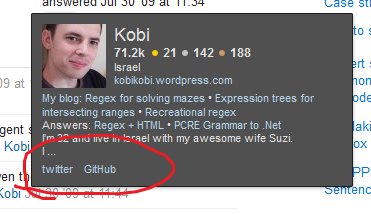
The user card has a feature that pulls important(?) links from the profile description and shows them at the bottom.

From How does the User Card popup work?:

if you include a twitter, google plus, linked in, or facebook those links are prioritized.

user card

This feature ignores the new GitHub and Twitter fields in the profile - If I want the links (and I do), I need to embed them in the description as well.

The homepage is already there - thanks!

0
16

Please add creation date and last-seen date to activity page

Or at least the moderator-only block, if not the page in general. Investigating accounts that seem to be rather related to each other has become harder with the new design because of the extra clicks.

As a user I often want to see this too, but, ironically, as a user I'll see it on the first page I go to. As a moderator I definitely want to see the activity page, not the profile page -- so thanks for that change! -- but it does cost me these two bits of important information. May we please have them there too?

2
  • This is one of the most important pieces of information for me when looking at user accounts and that extra click is a pain, which is part of the reason why I wasn't at all that glad that moderators default to the activity page anyway. But ok, if it would at least feature this important information, I could live with it, well, together with registeredness, of course. Commented Apr 21, 2015 at 11:48
  • 1
    @ChristianRau for me, that and "all actions", to get a view of what this user has been doing lately, are both very important, and they're on different pages right now. Commented Apr 21, 2015 at 12:59
14

- this is standard in all our post listings. If a post doesn't have a year, it was asked within the last year.


It is not entirely clear

in what year

this badge I did earn.

What year did I earn this badge?

3
  • 7
    Probably because you earned this badge back before time existed you dinosaur. (2.9) Commented Apr 15, 2015 at 16:57
  • 10
    Time worked differently before 1970, man.
    – Shmiddty
    Commented Apr 15, 2015 at 16:58
  • 2
    It's all over Stack Exchange. See this and many more. Commented Apr 15, 2015 at 19:35
12

- this section of the profile would have been incredibly busy if we retained all bits of information on the mobile version. We decided to drop some of them in favor of readability.


Probably no bug, but I noticed that the new profile (in the mobile version at least) no longer has a "join date." Why was that removed, and is it possible to re-insert it? I find it relevant, or at least interesting.

This is for the regular mobile version, not the app.

4
  • Is "member for..." not what you're looking for? That one's on the Profile tab, in the upper right?
    – Jaydles StaffMod
    Commented Apr 15, 2015 at 20:13
  • That's a mobile only (on iphone at least) issue - maybe you are looking at the regular version? @Jaydles Commented Apr 15, 2015 at 20:20
  • @Oded: That is unfortunate. Some users, like me, use almost only mobile (from my phone), which means that the new profile is prettier, but quite a bit less useful. The "last seen" in particular steered a lot of my actions. I'll probably have to use the desktop version on my phone, which is kinda counterproductive. :( Commented Apr 17, 2015 at 13:53
  • @Oded: I think both pieces of info, and a 3rd, would neatly fit as a line under the 2 lines having the rest of the old info answers - website. In any case, "last seen" is more useful info than a non-site related web page, so one could, or could have, placed it there too. Commented Apr 17, 2015 at 14:00
12

This is from Ask Ubuntu, but it affects any site with a link underline colour, including EL&U and U&L:

enter image description here enter image description here enter image description here

The link underline is going over the blue box.

It doesn't affect MSE because that has no underline on the text:

enter image description here

This also affects the mini graph (although I can't take a screenshot).

2
  • Underline has more problems. If you hover above the small reputation graph on the Activity page on Unix & Linux, the underline appears between the month labels on x axis.
    – Palec
    Commented Apr 20, 2015 at 0:06
  • @Palec Yes, I was about to post that too. Will when I get home.
    – Tim
    Commented Apr 20, 2015 at 11:40
11

- we decided to not add links in every possible location.

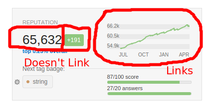
I've noticed that in the reputation panel, surprisingly few things link to the reputation tab.

Links

I expected both the reputation and the delta counter to link to the reputation tab (especially since the reputation counter says "reputation gained since your last visit to the reputation tab".

1
  • @Oded in my opinion, the entire top half should be nested under the same <a> tag for reputation. (The "top x% overall" link needs some thinking). But it's not that much of a game changer :) Commented Apr 17, 2015 at 12:47
11

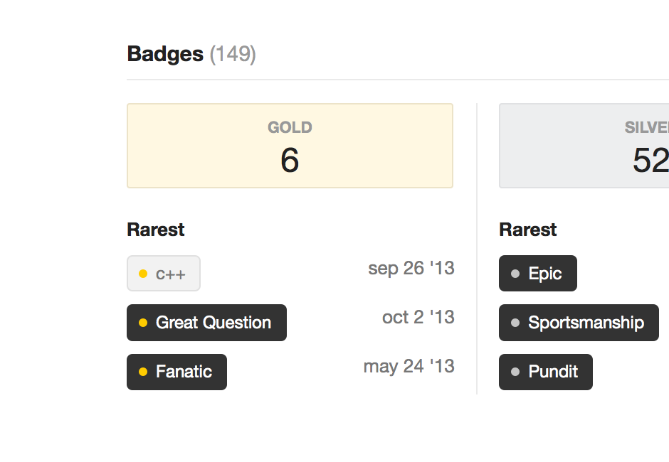
Bug: Really rare badges not showing up in list of rarest badges

On the bottom of my profile page, it says the rarest gold badge I have is "C++", but the "C++11" gold badge (which I have) is much rarer. Is there a threshold that prevents the badge from showing? If so, this doesn't work well together with the word "rarest" :)

This might be the same problem as @Stewartside reports or not - it's unclear to me what he means by "weird bugs".

enter image description here

2
  • 1
    Same here. 500 epic users? That's not rare, [promise] is. This also may be related to the missing rare badges.
    – Bergi
    Commented Apr 16, 2015 at 3:48
  • Same boat here over on SU, my rarest VBA bronze badge (1 of 1) doesn't show, but I'm not sure if it's rarest for site or rarest across network. Commented Apr 19, 2015 at 8:56
11

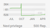
It seems that the new reputation graph doesn't know that rep can't go below 1.

It happilly graphs negative reputation and numbers that don't match the actual rep if someone would have had <1 rep at some point.

It's probably not noticeable on most profiles, but there are some extreme cases:

https://i.imgur.com/KQOCvWm.png

While this is a bit funny, I think it should be fixed.

3
  • Good find :P Is this if you are down voted when at 1 rep or something else?
    – Tim
    Commented Apr 17, 2015 at 11:34
  • @Tim - seen on a different user profile, which I'd rather not disclose.
    – Oded StaffMod
    Commented Apr 17, 2015 at 11:48
  • @Oded Fair enough :)
    – Tim
    Commented Apr 17, 2015 at 12:40
10

- looks like this is caused by overzealous ad blockers.

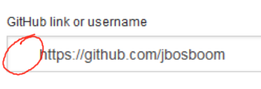
The GitHub profile integration icon seems to be missing on Stack Overflow:

enter image description here

Finally, a use for my Surface Pro 2's pen.

This may be due to server-side caching. (I have cleared my browser cache and refreshed the page several times, so it isn't client-side caching.)

5
  • What site is this happening on?
    – Oded StaffMod
    Commented Apr 15, 2015 at 15:38
  • works for me in SE Commented Apr 15, 2015 at 15:39
  • I see it on SO, so I would assume a caching issue if you're seeing the problem there. Commented Apr 15, 2015 at 15:39
  • 8
    Had the same problem and figured out that it was blocked by ABP.
    – inf
    Commented Apr 15, 2015 at 16:22
  • 2
    It's "Fanboy's Social Blocking List" specifically that blocks it. Commented Apr 15, 2015 at 22:56
10

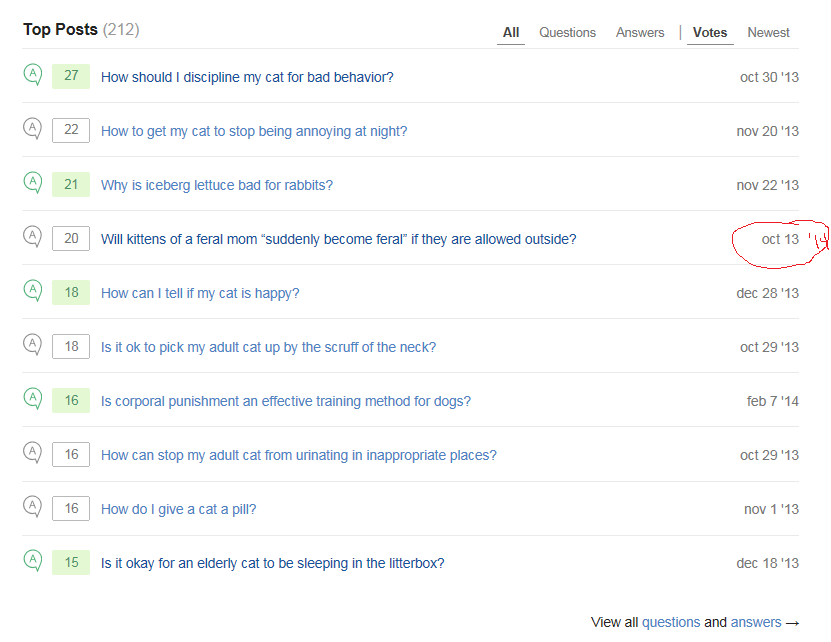
- if a post was created within the last year, we don't show the year. This is consistent across the different post lists.

Year missing from one of my top posts (which would lead me to think it was from this year, 2015, but we haven't gotten to Oct 2015 yet).

enter image description here

5
  • 2
    It's all over Stack Exchange. See this and many more. (so not part of the new profile page design) Commented Apr 15, 2015 at 19:36
  • @ShadowWizard that one you linked is about it when Stack Overflow started - not recently... He is saying that it's missing the year - surely it is? Other posts before Jan 1st have changed to '14 haven't they?
    – Tim
    Commented Apr 15, 2015 at 20:40
  • @Tim not sure,I see the year missing in other places as well. :/ Commented Apr 15, 2015 at 20:58
  • @ShadowWizard Here (on the new user page interestingly) it shows the year: askubuntu.com/users/186134/tim?tab=answers as well as here: askubuntu.com/a/562604/186134
    – Tim
    Commented Apr 15, 2015 at 21:05
  • 2
    @Tim yeah, quite a mess. But still, this is not limited to the new profile page hence likely rejected. Commented Apr 15, 2015 at 21:10
10

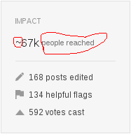
- if that text was 12px and you had in the Millions (e.g. Jon Skeet) it would go over the line:

enter image description here

Mismatch of fontsizes of “people reached”.

~67k people reached

The fontsize mismatch between ~67k, people reached and everything below is irritating and as far as I can tell unnecessary. people reached can easily have the same font size as everything below, as it has only one letter more than posts edited.

4
  • 1
    If we increase the font size of "people reached", it won't fit for bigger numbers. The goal here is also to make the people reach stat different from the ones below.
    – Stéphane StaffMod
    Commented Apr 16, 2015 at 15:04
  • 2
    @StéphaneMartin it only doesn't fit when you get to a 6 digit number: i.imgur.com/ZWIGhIk.png by then surley it needs to be using M (million) not K (thousand)?
    – Tim
    Commented Apr 16, 2015 at 15:47
  • @Tim: Which it does, see for example for this guy.
    – Wrzlprmft
    Commented Apr 16, 2015 at 17:44
  • @Wrzlprmft And to be fair, if that text was 12px it would go over the line: i.imgur.com/pXKdWXo.png
    – Tim
    Commented Apr 16, 2015 at 17:48
10

- number of tag badges limited during initial display; you can now use the search text box to filter to a specific tag.

Next tag badge dialog UI slow for accounts with large number of tags

For users with a lot of tag activity (I have 2376 tags listed), opening up the dialog to select the next tag badge to aim for can take a long time.

The AJAX request for the data only takes ~600ms to load, so this is an issue with the JavaScript code rendering the dialog box. Profiling suggests it takes about 2.5 to 3 seconds to render the dialog box letting me pick my next tag badge to aim for.

Switching between the tabs (All to Gold to Silver to Bronze) or searching for a matching tag can lead to more delays, the switch can take up to 17 seconds!

Perhaps I am an outlier, but maybe this needs some performance work to not make this dialog box take several seconds to be rendered?

2
  • 3
    Whatever gave you the idea that we are interested in performance? Seriously though - we will be looking at this.
    – Oded StaffMod
    Commented Apr 16, 2015 at 16:20
  • 7
    @Oded: yeah, once the payload is in the browser it is no longer your problem, right? :-P Commented Apr 16, 2015 at 16:26
9

- we may revisit this at a later date.

I had to go to my top 10 sites individually and add up my people helped manually like a filthy casual.

So the network profile not being updated as well is a bug.

3
9

- we may revisit this at a later date.

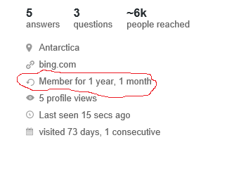
The following icon in the new profile:

enter image description here

feels like a refresh icon in a browser's address bar, not a "member for.." icon. It does not represent that, I suggest an icon similar to the "users" icon in some SE sites, something like:

enter image description here

but with one person in the icon. I know it is way to silly to be considered, but just saying it.

8

- We don't show tags in a different way anywhere. In this case, next to the tag, we indicate that you have earned a tag badge for that tag (a bronze one, specifically). Tag badges are indeed rendered differently - with the badge class (bronze, silver or gold) before the badge name. These are different things.

Don't know its a bug ot not, alignment of the badge bullet(.badge3 class) is reversed

In activity top icon badge/positioning is reversed as of default pattern

enter image description here

Or is there any pattern when the symbol comes first and when the name of the badge comes first

1
  • 2
    I don't understand. Can you provide a screen shot of where it shows the reverse as well?
    – Werner
    Commented Apr 16, 2015 at 13:16
8

- this was always the plan. To let people indicate whatever links they wanted. But of expediency (and so the new pages launch sometime this year), we started with a cut down version of the feature, with the most popular services first.

Why privilege Github over Bitbucket by having a special showcasing section for only the former? I personally somewhat prefer Bitbucket due to it's support for private repositories and Mercurial. It has also recently launched it's own equivalent of Gist, which was the main feature it used to lack in comparison with Github. While Github does seem to have a larger community and userbase, there doesn't seem to be any reason to not accept other code hosting service entries in the profile template.

The blog post seems to suggest that you can add dedicated fields for any link:

The new profile has dedicated fields for links to Github, Twitter, your Rick Schroeder Fan Fiction Tumblr, or wherever you have something to share.

.. but unless it's referring to the "Website link" field, this does not appear to be true.

You must log in to answer this question.

Not the answer you're looking for? Browse other questions tagged .