251

First, apologies for not creating this feedback thread earlier - in hindsight, a change to such an established feature of our sites really does warrant some explanation.

We're running an A/B test on Stack Overflow only that places half of registered users with >= 15 reputation in a variant group that will see voting controls like so (shamelessly stolen from ᔕᖺᘎᕊ's answer here):
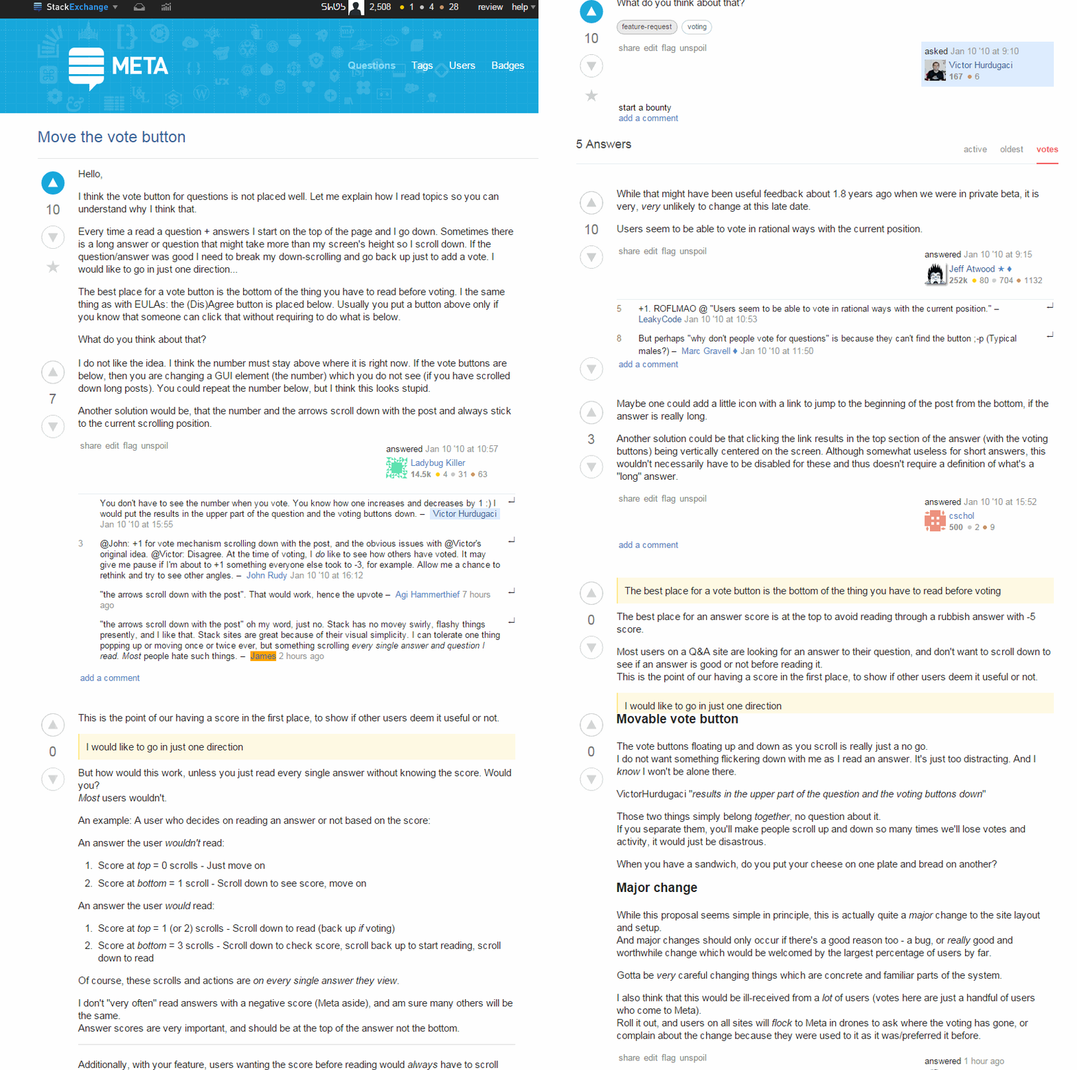

sticky vote controls example


A few points about this current experiment:

  • If you're in the variant group, the controls will only move if you can vote on the post; your own posts will not have the sticky controls
  • This will run for another three weekdays, so it should finish up next Wednesday, 2015-06-10.
  • We've set acceptance criteria at 5% more voting than the baseline.
  • After the experiment concludes, I'll update this question with the results.

Edit 2015-06-08 01:50

We're into the next variant with these changes, based on feedback:

  • stickiness is applied if the post's body is longer than 2/3 of the browser window's viewport
  • stickiness is applied regardless of a post's votability, e.g. the controls will be sticky on your own posts (if they're long enough)

Edit 2015-06-09 19:55

Experiment has completed; preparing a summary.

Edit 2015-06-12 18:30

TL;DR this feature will not be implemented, as it had too little of an impact on voting.

We ran two* variants of these sticky voting controls:

  1. variant 1 results: movement was only enabled on posts you could vote on; no minimum height requirement to the post body; ~3.8% vote loss from baseline
  2. variant 2 results: movement was enabled on all posts if you had at least 15 rep; post body height had to be longer than 2/3 of the viewport; ~2.1% vote gain from baseline

Some definitions for the above result links:

  • baseline: the current behavior, i.e. voting controls do not move from their initial placement
  • trial: a question page was rendered to a user who could at least upvote something on the page
  • success: the user upvoted or downvoted one of the question or answers

We placed a 5% minimum improvement threshold for acceptance; this is completely arbitrary, but it's a common floor in our experiments, as new features == new upkeep. Also, judging from the extreme polarization of the responses to this feature, we would need a user preference to disable it, something we're hesitant to provide for any feature.

Going forward, we might try another experiment with duplicating the controls at the bottom of long posts, but there's no ETA for this.

If you did like the functionality, it can be added via ᔕᖺᘎᕊ's Stack Overflow Extras (SOX) script.

* an initial variant was stopped after only an hour and this change was applied

65
  • 129
    This is the only time I've wished I had 125 points on meta. If you deploy this, please add an option to turn it off.
    – Praetorian
    Commented Jun 6, 2015 at 7:19
  • 6
    Just curious, was this change sitting in a drawer for long time just waiting for someone to ask for it, or was is an ultra spontaneous decision? Commented Jun 6, 2015 at 10:26
  • 9
    I take it that it's the A/B test results ("is there 5% more voting?") which you'll use as your "feedback". So what kind of feedback are you looking for in answers to this meta-question?
    – ChrisW
    Commented Jun 6, 2015 at 10:39
  • 9
    "We've set acceptance criteria at 5% more voting than the baseline." is there any basis for this percentage? Shouldn't the acceptance criteria be "any improvement and no significant complaints"?
    – usr
    Commented Jun 6, 2015 at 15:51
  • 94
    I will be short on it: I HATED IT! This is exactly what I hate. It feels like it is begging to vote. Like those awful adds on some websites that follow you, screaming "CLICK ME! CLICK ME! NOTICE ME!". Commented Jun 6, 2015 at 16:55
  • 34
    I like it - it reduces scroll time on the really long posts (which are often the most vote-worthy).
    – user245368
    Commented Jun 6, 2015 at 17:40
  • 13
    @JarrodDixon THEN DON'T DEPLY IT. Please! Before deploying new features, you could showcase them and figure out if the users want it. But before that, you could solve the existing bugs first. Commented Jun 6, 2015 at 18:55
  • 11
    I like it personally. I sometimes write books (well, maybe short stories) as answers. I'll get a ton more up votes this way! :D J/K! I do like the idea though. I'm a firm believer in voting ... it's what makes the SE work. If there is some simple way to remind people to vote, we should do it. This is simple and innocuous. Get 'er Done! Commented Jun 6, 2015 at 19:19
  • 15
    What is that horrible animation supposed to do for us? Stop it, please!
    – Martin F
    Commented Jun 6, 2015 at 19:46
  • 25
    @IsmaelMiguel As always when some new feature is added to a product, the "fix existing bugs first" complaint is fallacious. Just because they're adding this it does not mean they are not working on other bugs, nor that the advantage of adding this would not be greater than those of fixing other bugs.
    – nico
    Commented Jun 6, 2015 at 20:47
  • 14
    @IsmaelMiguel again, your reasoning is fallacious. Are the people working at this the same that are supposed to be working at the IE bug? Would they work at that bug if they were not working at this? Is that bug affecting a sufficient amount of people to be worth investing time solving? And so on... Unless you work at SO it's difficult to judge these things, as we most likely don't have the larger picture. It's absolutely fine if you don't like the scrolly votey thingy. I am just saying that "solve bugs first" is irrelevant here, as the discussion is on "do you like the scrolly thingy".
    – nico
    Commented Jun 6, 2015 at 21:04
  • 8
    I just want to say, now that I'm over the initial shock and stare of this, I think it is an amazing feature and hope that it doesn't go away. I love it so much and it's almost like it offers a sense of security knowing those buttons are always right there when I need them. Don't change a thing :) Commented Jun 6, 2015 at 22:40
  • 11
    Agree with @Praetorian. Please at least make it optional/configurable.
    – aroth
    Commented Jun 7, 2015 at 2:59
  • 7
    Somebody in this thread really hates A/B tests. Commented Jun 7, 2015 at 8:31
  • 39
    Can it be made to blink too? Maybe with a marquee border around it.
    – j08691
    Commented Jun 7, 2015 at 19:43

39 Answers 39

225

I don't like how it's following me. If it does get deployed, I hope there's a setting to turn it off.

27
  • 74
    Just for you, we'll make it hiss and explode :P Give it a try for a few days and see if you still feel that way?
    – user50049
    Commented Jun 6, 2015 at 6:20
  • 26
    Funnily enough I reckon there'll be a userscript to remove it just as there is currently one to add it. Can't please everybody all the time etc etc.
    – Robotnik
    Commented Jun 6, 2015 at 7:40
  • 7
    First impression is that it is a bit distracting. Maybe it will change with custom. Commented Jun 6, 2015 at 8:09
  • 65
    @CiroSantilli: Not only is it distracting, I also don't care about the score while I'm reading a post. I'm the kind of user who reads a post entirely, then decide if I want to vote. This bit of feature is fancy, but annoying. I'd rather take screenshots of my favorite paragraphs that doesn't have a random vote counter, than ones that do.
    – Unihedron
    Commented Jun 6, 2015 at 8:40
  • 68
    Agreed. When I scroll, I want to scroll without random bits of the page refusing to scroll when requested. I'd rather not see this at all, as I think it's just a bit of gratuitous "because we can" fluff. But if it goes in, I would like a way to turn it off. Commented Jun 6, 2015 at 9:18
  • 12
    @unihedron: I also prefer to read the entire answer before voting, which is exactly why I think this is a good feature; I don't like having to scroll back up to the top of the answer to vote, then back down again to read the next answer. The current implementation looks a bit more jerky (at least on my tablet) than it ideally should, but that's a technical issue that (hopefully) can be fixed. Commented Jun 6, 2015 at 11:51
  • 41
    +1 for it being distracting. In addition to that, though, I rely on the vote buttons as one of those subtle visual cues which help me to navigate around the page quickly, and making them move has slowed me down.
    – ClickRick
    Commented Jun 6, 2015 at 13:00
  • 4
    @Unihedron Ilmari reports being on a tablet, so keyboard shortcuts actually DON'T exist
    – Zaralynda
    Commented Jun 6, 2015 at 13:45
  • 8
    I agree; I've been dealing with this for a few days and I really kinda hate it. Though I can see how other people might like it, I think an option to disable it would be nice. Otherwise I will have to look into a user script to disable it manually.
    – TylerH
    Commented Jun 6, 2015 at 18:20
  • 8
    As I explained in my own post, another reason to dislike the feature is because I was using the place of the arrows on the screen as an indication of where the top of the post was. Now you can no longer see without scrolling back up. I'll be disabling the feature.
    – Mr Lister
    Commented Jun 7, 2015 at 13:06
  • 4
    @GregHewgill the idea is to get more voting. If the controls aren't on-screen for a long answer (which is all the more worthy if it's long and someone spent a lot of time on it), how can people remember to vote? Out of sight, out of mind. And long answers / questions are especially penalized by fixed vote controls, which is precisely the opposite of what you'd want. Commented Jun 8, 2015 at 9:55
  • 5
    @JeffAtwood Long isn't an automatic qualifier for good. Good answers will make people want to vote, so they won't have a problem scrolling back to the top (seriously, you think that's too difficult? It's even easier on mobile) to vote. The kind of people who won't do this because it requires an extra step (scrolling back up) is the kind who will just drive-by and vote anyway because it is a question they've had in the past (see: all the terrible questions on Stack Overflow that get +1, +2, +3 votes within minutes).
    – TylerH
    Commented Jun 8, 2015 at 13:34
  • 3
    @TylerH The entire point of this test is to see if this change does get people to vote more. Your statement that "good answers will make people want to vote" is effectively what is being tested (though I would point out that it is not only good answers that need voting; downvotes on bad answers are as important as upvotes on good answers).
    – KRyan
    Commented Jun 8, 2015 at 15:18
  • 8
    I despise crap following me around as I scroll. If you intent is to guarantee that I NEVER vote on an answer again because I've added the div with the vote arrows to my content blocker (ABP: It's not just for ads!) and thus never see the vote buttons again this is a brillant idea. Otherwise, not so much. As for other 3rd party ways to make it go away suggested above; not going to happen. Creating an ABP rule to remove the offensive div would require less work than Googling "What is a user script"; and I'll take the path of least resistance 100 times out of 100. Commented Jun 8, 2015 at 15:23
  • 2
    I recreated my account on Meta.SE just to upvote this answer and protest this annoying change. Commented Jun 9, 2015 at 12:43
177

Very very nice feature which came from the community and was instantly implemented. My compliments for the speed in which it was implemented.

The feature in general works fine. I still have to get used to it a little and sometimes its current working isn't really intuitive.

Besides that: a lovely feature!

I wonder though why there is a baseline of 5%. Do you expect more users to vote? Why not make it easier to vote and see what happens then? Even if no one votes more than they do now, this is a useful feature to me.

21
  • 2
    @JarrodDixon Currently, the scroll is 57 to "I don't like. If it goes ahead, I hope I can disable." vs 44 "Nice feature.". I guess this speaks for itself. Commented Jun 6, 2015 at 18:34
  • 22
    @IsmaelMiguel Actually, it really doesn't speak for much of anything, because those are not the numbers they are interested in. They are interested in whether or not it increases voting. That is the goal of the experiment. It is those numbers that will speak to the success or failure of the experiment, not voting here. These votes aren't even required to be made by people who have even gotten to try it yet.
    – KRyan
    Commented Jun 6, 2015 at 19:07
  • 17
    @IsmaelMiguel That one person, or sixty-four people, hate it, would be irrelevant if it increases the quantity and/or quality of voting on this site, which is the purpose of the experiment, and would be the purpose of the feature if it is implemented for real. Improving voting improves the site, for millions of people, so no one's personal opinion one way or the other matters much at all compared to that. There will be userscripts to deactivate it if it works but you hate it, there are already userscripts to activate it if it doesn't work but someone wants it, and so on.
    – KRyan
    Commented Jun 6, 2015 at 19:21
  • 3
    @KRyan: I disagree with the underlying premise. On the site that I know best (Math) I find the voting on questions virtually meaningless and the voting on answers less than useful, and I see no reason to think that more votes would improve matters. The answers themselves and the comments under them are vastly more useful than the vote counts. Commented Jun 6, 2015 at 20:50
  • 13
    @BrianM.Scott The vote counts aren't too important; the voting is. The voting is how SE applies a sorting algorithm on answers, and why SE is a system that allows the quick, reliable, and consistent finding of answers to one's questions. Voting is how SE avoids noise and attempts to ensure that the best answers can always be found immediately. Without voting, that doesn't happen, and SE is no better at Q&A than a discussion forum – and discussion forums are not great places for Q&A. More voting improves the likelihood that the SE system will correctly pick out the best answer.
    – KRyan
    Commented Jun 6, 2015 at 21:19
  • 1
    @KRyan: There is no reason to sort answers by vote count unless one thinks that the count is meaningful. In my experience this is less than clear. In particular, I simply do not agree that voting does all that much to identify the best answers. Commented Jun 6, 2015 at 21:42
  • 6
    @BrianM.Scott then you fundamentally disagree with the foundation of the site, and I wonder why you use it. Or I would, were it not obvious: you use it because it works. And whether you think so or not, it works because of voting.
    – KRyan
    Commented Jun 6, 2015 at 23:21
  • 2
    @KRyan: I do indeed have a number of fundamental disagreements with the underlying philosophy. And your final sentence is at best an exaggeration: I don’t think that it works especially well as intended. Rather, I use it faute de mieux, because I enjoy helping people with mathematics, and to the best of my knowledge it’s the only site available that has a decent interface for mathematics. Commented Jun 7, 2015 at 0:41
  • 2
    For the record: a certain lack of votes, relative to earlier times, is rather perceived as a reason for mild concern on Mathematics, as can be seen from several meta-posts there.
    – quid
    Commented Jun 7, 2015 at 14:06
  • 3
    While it sticks around, it's taking up room that is otherwise unused and anyone saying "it's distracting" must be very easily distracted. It offers a small benefit, but there's no downside to it. Ship it!
    – Archonic
    Commented Jun 7, 2015 at 21:17
  • 4
    @Archonic: There obviously is a downside to it, given the number of people who dislike it intensely. They don’t disappear just because you disagree with them. Commented Jun 7, 2015 at 23:27
  • 3
    @KRyan - The issue isn't that one-dimensional. Sacrificing UX quality for an increase in voting quantity/quality is a risky proposition at best. For the SE system to work it also needs to provide an experience that makes users want to keep using it. Ignoring that aspect simply because a change is seen as having a positive impact on voting quality when viewed in a vacuum largely misses the point. Nothing happens in a vacuum, and a pleasant, user-centric UX is just as important to sustained content-quality as voting quality/quantity.
    – aroth
    Commented Jun 8, 2015 at 0:52
  • 3
    @aroth Certainly true, but 56% (current voting) dislike in anonymous polling that may include people who haven't tried it is not the same as confirmation that they are "sacrificing UX quality" in the first place. Ultimately, this feature's worth is a question of how it affects content-quality, but that is very difficult to directly measure since so many other variables affect it. I was mostly responding to knee-jerk reactions and failures to understand how the underlying mechanisms of SE contribute to it's content-quality.
    – KRyan
    Commented Jun 8, 2015 at 15:15
  • 2
    @KRyan: You mean how the underlying mechanisms of SE are presumed to contribute to its content-quality. That they make some positive contribution is not really in doubt, but the extent of that contribution is not clear and appears to vary across sites. And contrary to what a naïve user might naturally suppose, relying primarily on vote-counts to judge answers is a very bad idea. Commented Jun 8, 2015 at 18:58
  • 2
    @BrianM.Scott If relying primarily on vote-counts to judge answers to material you are unfamiliar with is a very bad idea on any particular SE site, that site is broken and has serious underlying problems that need to be addressed. The entire point is that the highest-rated answer (and, potentially, other similarly-highly-rated answers) are the best; if that's not true, then the entire system serves no purpose.
    – KRyan
    Commented Jun 8, 2015 at 19:00
94

I think it feels weird that the controls don't move on my own posts. My initial reaction was that it was a bug, and I had to look it up on meta to find out that this was intended.

Even though I can't vote on my own posts, it's still useful to see my own score and it feels kind of jarring when suddenly one post is behaving differently.

5
  • 37
    I agree; consistency is more important than being clever here, especially since you have the voting buttons at all on your own poss (but you can't use them) -- people will reasonably wonder why the system partially adjusts for their posts but not fully. Commented Jun 7, 2015 at 4:02
  • I also found some inconsistency and the closest I came to localizing the behavior is that the vote counters that I had already voted on seemed to move while others that I had not voted on seemed static. On the very next question I examined the behavior was not repeated. Go figure.
    – user284374
    Commented Jun 7, 2015 at 4:30
  • 1
    This is a good point. If you can make the voting buttons stay put for our own posts, why not just remove them?
    – RubberDuck
    Commented Jun 7, 2015 at 11:39
  • 1
    @RubberDuck: Because it is looks inconsistent and weird and it makes people wonder it other people can even vote on that answer they posted because there don't seem to be any voting buttons.
    – sth
    Commented Jun 7, 2015 at 14:13
  • 3
    Latest variant will scroll the controls on your own posts, provided they are of sufficient length (I edited the question with the changes). Commented Jun 8, 2015 at 2:43
79

I like this because I far too often forget to vote on lengthy posts because the buttons escape my view. I want to wait for the test to finish to say for sure how much this is actually needed, but I suspect the impact is going to be far from marginal.

That said, two things I'd like which would make this more awesome:

Don't scroll when the post length is less than or equal to the height of the voting controls.

I don't know how expensive that's going to be server-side since it would need to be known in advance, getting this from the client would be icky if even really possible. data-postlen=?

Dim the controls when scrolling comes to rest for a second so folks can read, restore opacity when scrolling resumes

I'd like to see how this alleviates some of the "crazy ass things are following me, man!" complaints that folks have, and might alleviate some of the distraction others have reported. They're made more subtle as you read, more prominent when the rest of the screen is moving.


I want to see the numbers on how much more voting we're seeing. I've personally found this useful several times today, but actual numbers are going to be interesting.

Alternate

Put up/down arrows at the bottom of posts, similar to how the links to close / flag are oriented (in fact, before them) - but again, I want to see how this test pans out.

7
  • 21
    Not only can I forget to vote at the end of a long post, but I often get to the end of a long post and ask myself "have I voted yet?". Commented Jun 6, 2015 at 14:10
  • 3
    (Yes I know voting before finishing reading a post is discouraged, but I sometimes read a post more than once.) Commented Jun 6, 2015 at 14:10
  • 2
    I would change this so there was reduced opacity while scrolling, then restore opacity when it stops Commented Jun 6, 2015 at 15:37
  • 1
    @humble.rumble I almost posted it that way. It's the "That thing is now where I'm reading, thus I'm distracted" thing that seems most important, nothing should actively get in the way of you reading something as you scroll, and we'd hope you reach the end of something before you became interested in those controls.
    – user50049
    Commented Jun 6, 2015 at 16:03
  • 8
    #1 sounds good. #2 sounds completely backwards, I'm not sure what it would look like but any extra changes of appearance would make the feature even more distracting. Commented Jun 6, 2015 at 18:51
  • I think dimming/undimming would be worse. A color change out of the corner of my eye would be nearly impossible to ignore while ignoring an effectively static-at-the-top-of-screen arrows is much easier.
    – Adam Lear StaffMod
    Commented Jun 8, 2015 at 17:44
  • Putting the score at the top ("do I want to read this answer?") and the voting buttons at the bottom ("now that I have read this, what do I think?") seems like a MUCH better solution to the "problem" identified. The voting buttons chasing you around are definitely not the way to go.
    – Floris
    Commented Jun 9, 2015 at 21:27
44

I think the biggest thing I dislike about it is that when I am reading a post, something is moving next to me and is distracting.

Especially for longer posts this can be a bit annoying as they normally require more concentration.

That being said...

This will run for another three weekdays, so it should finish up next Wednesday, 2015-06-10.

There will always be resistance to changes, perhaps consider running this a bit longer than just a few weekdays to get a better feel (unless preliminary voting numbers make it clear immediately).

5
  • 4
    Since only half of users currently see the new way, the test could be repeated with the other half without subjecting the current half to any more. Commented Jun 6, 2015 at 14:13
  • 9
    What we need to look at here primarily is what effect it's having on voting, nothing is yet set in stone - this is just a test of a hypothesis and request for feedback on it. Depending on how the test goes, we might implement some changes and ask folks to try it again for a short time, or we might say "not a good idea". Scrolling vote buttons also don't come close to the Google + / Youtube thing, let's keep this grounded?
    – user50049
    Commented Jun 7, 2015 at 14:47
  • @TimPost that's why I suggest running it even longer than a few weekdays ;)
    – enderland
    Commented Jun 7, 2015 at 14:53
  • 2
    @enderland Well, since we don't know the outcome in advance and a negative dip in voting is possible, that's not something we want to risk for more than a short amount of time because of how tightly voting is coupled to continued participation. On this iteration, we'd rather incorporate feedback to make people feel better about it overall, and (likely) try again soon. We have to see the results to really be sure, I hate to sound so speculative but, well, that's the nature of tests :)
    – user50049
    Commented Jun 7, 2015 at 15:17
  • @TimPost unless preliminary voting numbers make it clear immediately -- totally agree there.
    – enderland
    Commented Jun 7, 2015 at 15:22
37

I've provided feedback in a separate post but I'll move it here to keep everything tidy.


This is related to the previous feature of not moving vote buttons past the bottom of the post.

I'd like to request that the "bottom" of a post be redefined to be the bottom of the text and not include the user card. On short posts, the user card introduces unnecessary scrolling.


For example:

This answer is smaller than the size of the vote/score buttons:

Unscrolled Answer

If, however, I scroll down to start reading the other answers, the buttons follow just enough to be distracted by the moving UI component. It follows to the bottom of the user card.

Scrolled Answer

Notice that the buttons on the above image followed me down to the "add comment" (just below the user card).

The stickiness is nice on long posts (like the question portion of the link above), but several of the answers are short and the stickiness is distracting when it occurs unnecessarily. I think this can be resolved by only keeping the buttons sticky within the size of the answer text and not including the user card.

3
  • There is always going to be a number of lines that initiates the dynamic behavior whether it be one line, two lines or more. Consistent behavior is important too and acclimates the user to the vote counter movement.
    – user284374
    Commented Jun 7, 2015 at 4:34
  • It seems like a rule like "don't move it if the post fits on your screen" might help. I'm in the control group, though, so I don't really know.
    – Veedrac
    Commented Jun 7, 2015 at 18:44
  • 11
    I agree and the latest variant makes the voting buttons not descend lower than the bottom of the post text. Commented Jun 8, 2015 at 2:42
24

I think StackExchange is great regardless of this feature (I am neither against it, nor in favour of it), but if you are going to implement it, at least consider fixing this bug.

On my smartphone (in my case an iPhone 5c, running iOS 8.3, latest as of June 6th 2015 - but I think this is related to screen size rather than specific device) the vote buttons are moving over the post when zoomed in. This is bad, because it makes both the vote count and - perhaps more importantly - the post itself hard to read.

Image of bug (top status bar cut off):

picture of random post demonstrating the bug described above

Edit: I forgot to include the solution I would propose: let the vote count go off-screen (i.e. only change y position (relative to the page, not the screen) and preserve the x position (also relative to the page).

If another solution is found preferable, I'm fine with that too. I proposed a solution only because I think it's better to say "I don't like X, maybe Y is a solution" than to just state "grrr I hate X".

5
  • 5
    This also happens when using a low screen resolution: i.imgur.com/9jwV3TS.gif
    – AStopher
    Commented Jun 7, 2015 at 10:13
  • 1
    Disabled for mobile devices, not just the mobile theme. @cybermonkey in the (unlikely) event the experiment is successful, I would fix that bug, but... it looks to be kinda complex for something that'll run another day or two. I'd have to watch for horizontal scrolling and offset the fixed position (I think). Commented Jun 8, 2015 at 2:35
  • @JarrodDixon eww, just use sticky
    – bjb568
    Commented Jun 8, 2015 at 4:24
  • @bjb568 I wish I could, but it's not supported in Chrome (after v35), which is our largest browser. Commented Jun 8, 2015 at 4:26
  • 1
    @JarrodDixon meh, the feature doesn't seem to matter very much, so maybe it could just be disabled on Chrome. Without sticky, everything is just buggy or hacky. A horizontal offset wouldn't look smooth.
    – bjb568
    Commented Jun 8, 2015 at 4:37
22

How are you going to analyze the results of the A/B testing?

One problem that may arise is that people will be voting by accident on the wrong answer, because two sets of controls will be right next to each other.

Some of them will notice the mistake, un-vote, and then vote again on the correct answer. This is something that you can track without much effort. But some of the people won't notice it, and this is something that you won't be able to track.

enter image description here

10
  • 13
    I don't understand this. The floating buttons make it less likely to accidentally vote for the wrong answer. That reason is why I kind of like this change despite my low intolerance for visual effects. Commented Jun 6, 2015 at 18:55
  • 9
    @Gilles they really don't. When they have a fixed position they enhance the visual break between answers, you can clearly see where the next answer begins. But this way they blur the break. Commented Jun 6, 2015 at 18:59
  • 8
    I don't understand what potential for error you're seeing. The floating buttons are always on-screen and always next to the answer, so they're easy to find. With top buttons, I've learned to be careful of accidentally voting on the answer above the long answer I meant to vote for, because when I'm scrolling back up, I might miss the separation between answers, especially when the answer above has no comments. Commented Jun 6, 2015 at 19:02
  • 1
    In the screenshot above, I'm afraid they'd accidentally downvote the top answer instead of upvoting the bottom one. Commented Jun 6, 2015 at 19:51
  • 5
    Why? Because they're used to the voting buttons being too far up? With the change, the buttons are no longer too far up, so that's only a problem in the transition, it isn't an argument against the new positioning. Commented Jun 6, 2015 at 20:25
  • 1
    Haha, if only there were an accurate way to track how many votes go on wrong answers! Commented Jun 7, 2015 at 1:42
  • @DavidWallace SELECT Count(*) WHERE VoteType = Upvote
    – bjb568
    Commented Jun 7, 2015 at 3:01
  • I think there should be ample space between answers; additional bottom padding was just added and they no longer descend into comments, unlike the animated gif. Commented Jun 8, 2015 at 2:39
  • @JarrodDixon It's much better now, thanks! Commented Jun 8, 2015 at 6:47
  • Mmm, that screenshot looks like Meta, even though the OP says the A/B test only runs on Stack Overflow... Is that screenshot actually showing the new feature?
    – Knelis
    Commented Jun 8, 2015 at 12:57
22

I am apparently part of the split/test of the new widgets and I was directed here from my post on meta.stackoverflow regarding the moving vote widget. Moving animated vote counter widget, can animation be configured off?

Here is the sum and substance of the question/discussion regarding the widget and a suggestion that there should be some way for users to disable the moving object on a per-user-basis. Some may love them, others may want to pick up a hammer and permanently fix it. (a configuration option in between is probably a happy medium):

In the past day or two, the little vote widget for questions has started following the question up and down the window for the extent of the question. If it is a long question, that little widget becomes quite annoying.

While I'm all for improvement, I caution against adding all the latest 'gee-whiz' animated bells and whistles just because you can. SO is clean and non-intrusive. The more animated widgets get added, the closer the site moves to the dividing line between clean/enjoyable and annoying/distracting. The line is different for all users, and I'll admit that I prefer a clean usable interface without animated distractions.

This isn't a complaint saying remove it, but rather a suggestion that animated parts of the site have some type of user-preference that allows users who find the moving widgets annoying to simply -- turn them off. (or disable moving animations, or something similar)

The script features that update your comment inbox, etc. are all perfectly fine, they provide no distraction because they don't move. Having the vote counter flittering up/down the left side of the browser window is something I would like to turn off. Recognizing others may love it and think it is the greatest thing since sliced-bread, don't de-animate it, but please find a way to allow users to turn it off.

Remember, somebody's latest gee-whiz feature, is a bug to someone else -- if it can't be turned off. In the case of the flittering widget, on questions with long answers, it is horribly annoying to have the little controls racing down the screen as I scroll down.

3
  • 9
    I only read "The more animated widgets get added, the closer the site moves to the dividing line between clean/enjoyable and annoying/distracting. " and up-voted 'cause of that!
    – Martin F
    Commented Jun 6, 2015 at 19:50
  • 2
    @MartinF and David - how is it "animated"? I would say that something that sticks in the one place is the opposite of animated.
    – Simon East
    Commented Jun 8, 2015 at 4:15
  • @SimonEast: The story (sticky buttons) was lost. The animation (supposed to illustrate the story) annoyed.
    – Martin F
    Commented Jun 8, 2015 at 19:08
21

I'm one of the lucky ones that have the new button behavior. And I don't like it.

At first I didn't know why I should care if this thingie moves around.
But I now realize that I have used the voting buttons as an highly visible divider between question and answer, and multiple answers.

When I read long questions I often scroll back and forth multiple times. Since I scroll in a quick manner, the voting indicators were a great way to know when I scrolled too far. That no longer works.

The voting indicators where also a great way to know when I scrolled to the top of an answer. Now I have to scroll to the previous answer, search for the tiny hair line between answers, or I have to observe when the voting buttons stop moving.

Once that thing is live, I will do whatever it takes to get rid of it. So please don't make that too hard.

2
  • 8
    This has been bothering me too, especially on very long answers with distinct sections - this morning I found myself wondering why an answer had such a crappy introduction before realizing that I'd scrolled a full half of it off the screen already.
    – Shog9
    Commented Jun 8, 2015 at 17:45
  • @Shog9 I don't know if it would be a popular solution, but perhaps this could be helped by adding a heading to each answer so that it is easier to tell when the question starts regardless of where the voting widget is.
    – Jack
    Commented Jun 9, 2015 at 13:24
15

Animation on websites annoys/angers me immensely.

If i want animation, i go to the TV or to YouTube.

If i want information, i go to sites (that don't have animation).

6
  • 1
    Disable CSS and you're set then...
    – nico
    Commented Jun 6, 2015 at 20:52
  • And JavaScript. But you'll lose a lot of functionality in that case and without CSS many websites are very hard to use.
    – 11684
    Commented Jun 6, 2015 at 23:31
  • 3
    In other words, it's not a viable option, is it, @nico?
    – Martin F
    Commented Jun 6, 2015 at 23:39
  • 1
    @MartinF I was just being sarcastic. You seem to be confusing content with presentation. Information is there whether there are animations or not. The vote arrows don't move around all the time (now, that would be annoying), they just move along as you scroll. While reading a long answer you will not be scrolling all the time, so the arrows will not be animated and will not distract you from reading the content.
    – nico
    Commented Jun 6, 2015 at 23:43
  • 2
    I have no idea what you, or anyone else, is saying about voting arrows -- that message is lost completely, thanks to the annoying animation.
    – Martin F
    Commented Jun 7, 2015 at 0:05
  • 1
    Didn't you hear? Stack Overflow is a TV station now! As such, your argument is invalid. ;) Commented Jun 8, 2015 at 10:59
15

For those “lucky” enough to be testing this, here is how you get rid of it. Note I am using Firefox with Stylish. When you scroll a second div is created, and if you stop the scrolling on some answers this second div creates a space between the answer and the comments.

.js-vote-sticky {
  position: static !important;
}
.js-vote-sticky + div {
  display: none !important;
}

Source

1
  • 9
    This will disable the effect, but not the unacceptable scroll and resize event handlers. I suggest hijacking $.fn.stick_in_parent: Object.defineProperty($.fn,'stick_in_parent',{set:function(){},get:function(){return function(){return this}}});
    – Oriol
    Commented Jun 6, 2015 at 17:19
13

I've been put in the group with the sticky vote controls.

I've learned today that I rely on those vote controls to indicate the structure of the page to me. In particular they indicate the top of the question and each answer. They're like the bullet points on a list, on a page that is just a really big list. If they're moving around, I lose the structure I depend on to make sense of things.

  • If I'm busy scrolling, I no longer have a sense of how many answers I've been past and where on the page they are located.

  • If I stop scrolling in the middle of a large answer and I'd like to read it, my ability to locate the top of that answer is currently impaired. I usually scroll up until I see the voting controls. Instead I scroll up until they stop moving, and then re-orient. If I'm scrolling too fast, I might confuse those voting controls with those of the previous answer for a moment before realising my mistake. (They're right there at the top left where I'm focusing, after all.)

It's actually surprising how disorienting it is. The pages lose the key dependable structural element I have apparently learned to depend on heavily. And I scroll and skim fast through answers, so this is a big impairment for me.

Call it adjustment, certainly. I've built a mental model for rapidly navigating Q&A pages and I'll have to rebuild it. But that is going to take some serious adjustment.

I would prefer not to have sticky vote controls. I like my bullet-point vote controls.

1
  • 2
    OK this is a fair point, interesting
    – Pekka
    Commented Jun 9, 2015 at 6:05
11

I don't mind it scrolling vertically, although it was a bit unsettling at first. But please don't scroll horizontally! I browse with a large text size, so sometimes need to scroll horizontally, and the vote buttons follow me across the screen, obscuring whatever text of the question/answer is in the top-left corner.

1
9

I'm finding it disorienting.

The "vote" buttons behave "unpredictably", visually.

As I'm scrolling down, some of them are moving "up", but one is staying still at the top of the page, until suddenly it pops off the top, to be replaced by another.

No, thanks.

1
  • It bothers me that some of the buttons scroll with the answers but others don't. Commented Jun 9, 2015 at 15:40
7

I find this extremely annoying. I don't want to see it. Ever. Not only do I not care about the score of a post while I'm reading it I think it begs for votes way too much. Not to mention being terribly distracting.

If I want to vote I can scroll up the page some. I think a much better solution would be to add mostly transparent "go to top of answer" buttons at the bottom of really long posts. Or, if you could do it unobtrusively, detect if I am rapidly scrolling and add both bottom and top buttons next to the text (again, mostly transparent so it isn't as jarring), but I'm not sure if that would have the same terrible annoyance of the current proposal.

2
  • 1
    Or put the vote buttons at the bottom always.
    – Jason C
    Commented Jun 10, 2015 at 0:00
  • That seems a bit extreme.. Radical change, but I guess it does make some sense.
    – ɥʇǝS
    Commented Jun 10, 2015 at 0:05
6

I agree about the "not scrolling vote controls on your own posts," but I can't change it without invalidating the current experiment. Based on the results, we might run another test where the controls always move. – Jarrod Dixon

Evidently I'm not in the variant group (I'm not seeing any change) but I support the original suggestion that we locate the voting buttons in a fixed position at the foot of the post. I'd like to see the score alongside them, but also remain at the top of the post (without necessarily having voting buttons there). I suggest this arrangement for two reasons:

  • It makes sense to have actually read the post before voting, while
  • It also remains useful to be aware of how others have voted before reading.

From a quick scan of remarks by others here and elsewhere, I see I'm not alone in being not at all keen on the idea of things moving around.

So, with the comment I've quoted from @Jarrod Dixon in mind, can we please also have a test where the controls never move? And a vote on the final choice about any movement, after we've all had a chance to try out the different ways?

2
  • 2
    There will always be some posts for which it is appropriate to vote before finishing reading (obvious low quality/spam) but that's also a reason to have a flag option at the top too. Commented Jun 6, 2015 at 14:16
  • @trichoplax I take your point and I've edited my answer slightly to allow the possibility of keeping buttons at the top too,
    – Reg Edit
    Commented Jun 6, 2015 at 21:21
6

I don't care actually. If answer is good and helped me — I vote it up, regardless where these buttons are.

5

Works on this, https://stackoverflow.com/q/30673961/1927206

Does it need to move around on posts of that size? I was confused. If it had been a post which went off the end of the page, so the voting mechanism needed to move at some point, I'd have probably worked out the purpose.

There are probably going to be at least two camps on this. My camp is "only move when needed", by the length of post (if possible, I have no clue) and ability to vote.

If you are analysing whether this generates more votes than otherwise, I think you should separate the "short" posts from the "long" ones. You'd not really expect more votes when the movement wasn't needed, presumably the intent is to get more votes for longer posts by making it (physically) easier to vote on those?

Are there really enough "long" posts to have an impact?

And, is it my imagination, or does the voting scroll into the comments in the mock-up in the question? That would be bad.

That would be bad, why? Someone or someones are going to "vote" on a comment they like. Sometimes they'll realise (then, or at some later point). Sometimes they won't.

3
  • No - they don't go down into the comments: meta.stackexchange.com/questions/257910/…. The only reason they're in the gif is because the gif was from my answer (which did go into the comments)! Commented Jun 6, 2015 at 8:18
  • 1
    @ᔕᖺᘎᕊ Yes, I know they don't, but they do on the image in this question, and on one of the linked questions someone says it would be good if they were there in the comments. I therefore want to get my retaliation in early. Now I see from your link that my retaliation is late, but I'll leave it to potentially deter naysayers. Commented Jun 6, 2015 at 8:22
  • A minimum height requirement has been added. Commented Jun 8, 2015 at 2:01
5

I think this feature is not bad per se, but weighting the pros and cons and the main goal, I would prefer an option like the alternate in TimPost's answer or the first part of LadybugKiller's answer here.

Something moving (or animated) distracts me a lot and avoids me to concentrate in what I'm reading.

As the main goal is to increase the amount of votes (up or down) while doing it easier (without scrolling up and down after every answer), that could be achieved without moving the vote controls:

1- If the answer if short enough, I don't need to scroll (I still see this control on my screen), so it isn't needed to move it.

2- If the answer is long enough, a repeated control in the lower part would do the job without any harm.

If you want not a repeated control, just show it at the lower part of every answer, as it would be very uncommon to vote an answer while reading just the upper part.

1
  • Score at top, vote buttons at bottom. Would be cool.
    – Jason C
    Commented Jun 9, 2015 at 23:59
4

Could the distance the votes stay from the top of my screen be the same as the distance between the vote and grey seperator when it's not scrolled?

This is the distance I would like it to be - from the faint grey line to the point of the upvote. I make it 50 px from the line to the point:

But closer to 70 from the window top to the point:

Please can these be the same?

2
  • 17
    You bookmarked Google?
    – bjb568
    Commented Jun 6, 2015 at 15:30
  • 2
    @bjb568 yes yes :P There was a reason for it many years ago I think
    – Tim
    Commented Jun 6, 2015 at 15:44
4

I think it'll be cool if deployed for Desktop Users. It must be added as an additional feature. It can be a bit annoying for Mobile Users as I too use SO and other sites through my phone and the floating vote button will hinder my experience on the small screen size.

When thinking on a large scale, I think there would be plenty of users who uses SO through their mobile and tablet devices with each one having a different screen size. So, even if you introduce it, you'll be playing around with live users. I think SO is just fine as it is now.

3

It would make sense to put duplicate vote/accept buttons at the bottom of a very long post, so you don't have to scroll several screens back up to vote. Instead of them moving, of course.

3
  • What about posts that are very long which you want to check the vote while in the middle of reading it? If you scroll up/down looking for the vote box there, then you will loose your place.
    – Trisped
    Commented Jun 9, 2015 at 1:28
  • Pro tip: select the text with cursor, and even when you scroll the page it stays selected. Commented Jun 9, 2015 at 8:17
  • Yes, unless you are doing that already or are not a pro. :) I had a similar opinion when I first saw the change, but phase 2 seems to have fixed my issues while being easier to implement, maintain, and use than the multiple vote system. Does phase 2 still bother you?
    – Trisped
    Commented Jun 9, 2015 at 20:14
2

I am not sure how much effort it would be to implement this conditionally, but Firefox natively supports this via CSS. Something like the below CSS would be able to replace the JQuery library and the JS code in Firefox.

.vote {
  position : sticky;
  top : 0;
}

So why not simply let the browser handle all the processing and code to get the same behavior?

1
2

Thank you for not making it "smooth scroll" like most auto scrolling advertisements are. It looks like a nice feature, but for small and simple posts (like this answer will likely be), it feels very weird to have a small element remain fixed and then move instantly.

Can we have it turned off if the rendered length of the post is like half of the screen or less?

2

Scrolling vote buttons make it much easier to read the first (long) answer, vote, and then continue to other answers.

This would be especially useful on sites like Worldbuilding, where many answers have pieces of the complete solution. I find myself scrolling up a whole screen to vote, then back down to read the next answer.

2

I like the stickiness; it's convenient and I harbor none of the "omg, it's following me" reservations raised by other users. That said, I'm not too keen on this particular line-item:

  • stickiness is applied if the post's body is longer than 2/3 of the browser window's viewport

What problem was this attempting to address? All it seems to do is introduce inconsistent behavior.

2
  • 4
    It's to prevent needless movement on pages where none is required. I really like it, YMMV.
    – Veedrac
    Commented Jun 8, 2015 at 15:35
  • "We're into the next variant with these changes, based on feedback:" and the feedback is in the answers. Commented Jun 8, 2015 at 21:26
2

I haven't gotten a chance to try this, it seems like it could be useful, but instead of following why not just permanently fix all vote buttons to the bottom of the post instead of the top? You're expected to read the post anyway before voting (at least I think you are), so it seems to address the "I don't feel like scrolling up" premise without the stickiness that some find irritating. On the other hand it's useful to have the score at the top so maybe this comment answer isn't the greatest idea. But people whine about score affecting votes anyways, so maybe score fixed to top, buttons bottom...

I think this would be a simpler way to address the identified issue, plus some.

2
  • 2
    You want the score at the top and middle to answer the "Is this worth reading?" and "Is this essay worth finishing?" questions.
    – Trisped
    Commented Jun 9, 2015 at 1:32
  • 1
    @Trisped Maybe something like: Score at top (is this worth reading?), nothing in middle (if somebody's halfway through hopefully they have enough capacity for independent thought to decide if it's worth finishing without checking the score again), buttons at bottom (read then vote). I think. I dunno.
    – Jason C
    Commented Jun 9, 2015 at 11:29
1

I noticed this yesterday, while working on an answer, including that my own answer votes arrows would be fixed. It looked nice.

I cannot reproduce this functionality anymore, it is kind of confusing to not be permanently in the variant group.

1
  • I now have two Tabs open on different questions on Stack Overflow and for one this works, and for the other it doesn't. The confusing^2
    – Anthon
    Commented Jun 6, 2015 at 13:10
1

Why not make it an option? As for me, I'll grab it immediately!

Not the answer you're looking for? Browse other questions tagged .