8

When I downvote, I get this friendly little box
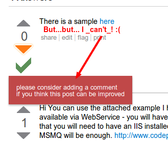
enter image description here

Except that I can't do as it asks, since it blocks the comment button. It disappears, but it takes some time to do so. Could we place it somewhere so that it doesn't interfere with core page elements? Or at least add click to close for these so that we can expedite the process?

This isn't a duplicate, it's an issue with the new new popup behavior.

13
  • possible duplicate of Can we have click-to-close back, please? Commented Feb 18, 2013 at 12:23
  • I see there is no "X" in your screenshot.. didn't the message fade away by itself after few seconds? Commented Feb 18, 2013 at 12:54
  • 3
    @ShaWizDowArd: Yes it did. That's not the point, I'm saying that it makes me wait 5 seconds. And it's not a dupe -- the issue is that there is no way for me to expedite the "fade in 5 seconds" functionality that was introduced to counter the issues in the post you linked to. Commented Feb 18, 2013 at 12:56
  • OK, now it's clear. So what about adding "X" to this kind of popup dialogs as well? :) Commented Feb 18, 2013 at 13:08
  • 2
    @ShaWizDowArd: I don't mind that, though having an implicit click-to close seems better (have an 'x' as a visual aid maybe, but don't make us have to aim for it). But that's a separate issue, really. In the end, these elements shouldn't be covering other stuff in the first place Commented Feb 18, 2013 at 13:17
  • Honestly can't see what can be done; if the dialog will appear elsewhere it will be confusing. Commented Feb 18, 2013 at 13:19
  • @ShaWizDowArd: to the left of the vote counts? Above them? To the right of them (yeah, it covers the post text)? Basically, don't cover the comment link if you're telling me to comment. Commented Feb 18, 2013 at 13:23
  • Yay! they fixed it! sorry for the (temporary) rep loss, but I used this question to test the new look.
    – Azulflame
    Commented Feb 25, 2013 at 16:49
  • @Grammer It won't make a diff on this question, you should test it on an answer with <2 lines of text. The "add comment" button is too low anyway for this question. Commented Feb 25, 2013 at 16:59
  • @Manishearth, yes, it moved, but THEY ADDED A "X" BUTTON TO CLOSE IT. You can now just click and close the message box.
    – Azulflame
    Commented Feb 25, 2013 at 17:01
  • @Grammer: Ooh I see. Sorry :) Commented Feb 25, 2013 at 17:08
  • @Manishearth, nothing to be sorry about. Just a simple misunderstanding :) I'm just happy that they finally fixed it, as it cost me many reviews while waiting for the box to disappear (I prefer to add comments after a downvote when the question or answer can still be saved).
    – Azulflame
    Commented Feb 25, 2013 at 17:14
  • @Grammer: same here :s Commented Feb 25, 2013 at 17:20

0

You must log in to answer this question.

Browse other questions tagged .