10

I've noticed that the feed format has changed. The new format seems inconvenient to read. The layout is more modern style but the actual facts - which is the question with few words of text - is much less present at the first look. I may simply have to get used to it but I fear that the new style is systematically worse. Things to look at:

  1. starting with two huge banners providing very little information except the tag.
  2. size of feed triple of what the old style was
  3. actual content more squeezed into a small box

I'd like to encourage StackExchange to review the design and possibly offer an "old-style" option.

Edit: October 16, 2014: The new scheme returned with some minor rendering changes:
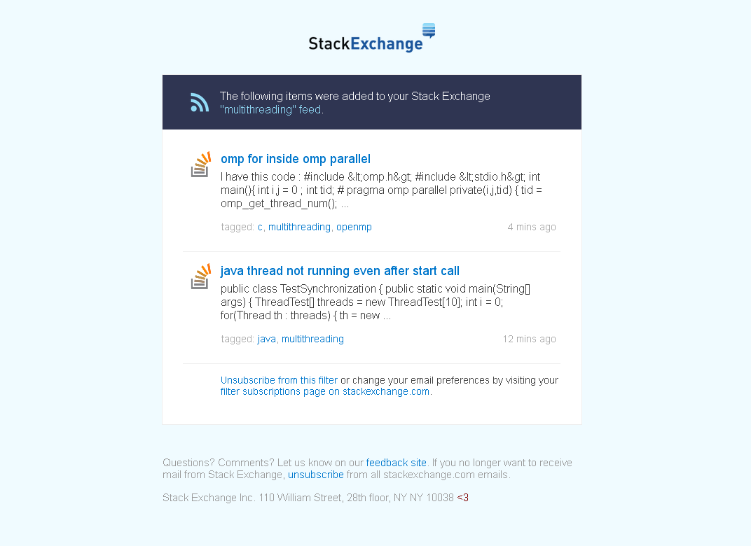
enter image description here Features:

  1. Each mail three times as big; may look neat but takes bytes.
  2. Large banner area above then actual content; need to scroll to get there.
  3. The actual information contained is less, the StackExchange branch (e.g. stackoverflow.com) and the OP's user name is obviously omitted with the new layout; there is no additional information. In my view the comment by Matthew in Egregious whitespace on digest emails does not apply at all.
  4. What about code provided in questions? Look at example capture above. Proper code rendering would be smart when rendering shall be really improved. But: Do we want code in the initial "brief" information at all?
  5. The only thing added is fluff as correctly stated by svick.
  6. It's not my cheese which was moved here. The questions are StackExchange's cheese. StackExchange should be proud of their questions and they should handle them carefully.

Gyro Gearloose said to the fortuneteller: "You may know all answers, but you don't know all questions." However, StackExchange needs people to answer the questions to get more of them. That's why the way presenting the questions shall be of utmost priority. People subscribing for e-mail notifications of a tag have already stated their interest in questions. Advertising and/or appealing graphics may destroy this interest in the long term.

I've changed my mind: I don't ask StackExchange to offer an option as written above.


Frankly, I ask to simply fix this.


P.S.: I appreciate the unscathed survival of the little red <3 at the very end.

6
  • Which feed? I don't think we touched any RSS-related stuff in a while...
    – Adam Lear StaffMod
    Commented Oct 9, 2014 at 15:49
  • @Anna Lear: I'm getting mail feed from [email protected] for subscribed filters. The mails themselves state the name "feed"
    – Arno
    Commented Oct 9, 2014 at 15:55
  • Ah, emails. Can you forward one of them to me? [email protected]. Thanks.
    – Adam Lear StaffMod
    Commented Oct 9, 2014 at 15:56
  • forwarded with some more thoughts
    – Arno
    Commented Oct 9, 2014 at 16:03
  • xkcd.com/1172
    – Scimonster
    Commented Oct 14, 2014 at 16:02
  • @AnnaLear: I had to edit/update my request due to the fact that the new design returned to be active as of today. However, the proposed modifications are negligible.
    – Arno
    Commented Oct 16, 2014 at 7:31

2 Answers 2

11

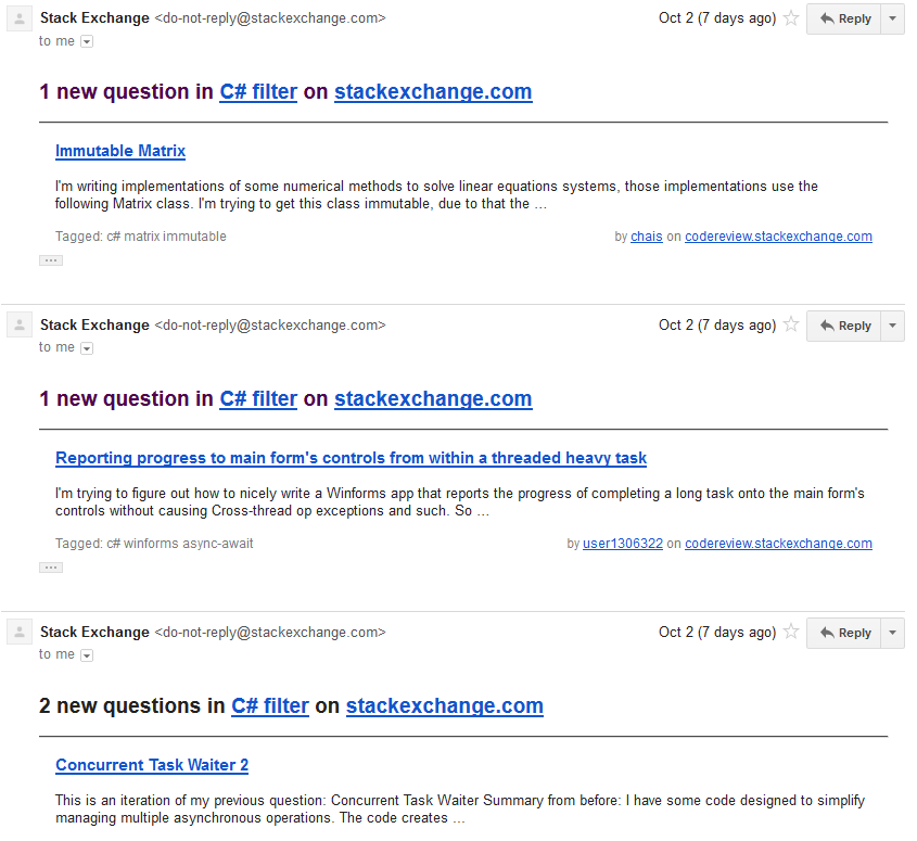
To illustrate the point, here is a screenshot of the old format in my GMail:

old format screenshot

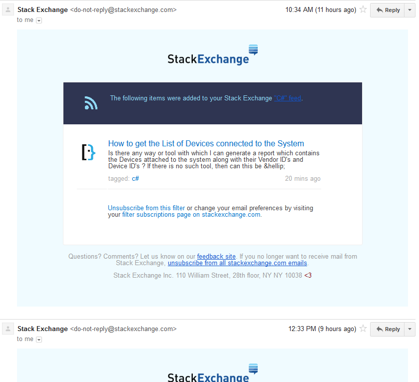
And the new format:

new format screenshot

In the old format, almost 3 emails fit into a screen and GMail can omit some of the repeated parts (notice those "…"). In the new format, only one email fits into a page, there is lots of empty space and GMail didn't manage to remove the repeated parts.

4
  • 2
    We've disabled the new template for now, pending another design pass.
    – Adam Lear StaffMod
    Commented Oct 9, 2014 at 21:08
  • @Anna: Just noticed the return, deeply appreciated!
    – Arno
    Commented Oct 10, 2014 at 7:38
  • @Arno Can't promise that it'll stay that way, but we're going to try to make it more usable before reenabling the new templates.
    – Adam Lear StaffMod
    Commented Oct 10, 2014 at 11:45
  • 3
    Wow, that's just... awful. I don't use the e-mail feed myself, but I can see why those who do would be pissed off. Good to know that it's been reverted. Commented Oct 10, 2014 at 20:39
2

We turned off the updated email design temporarily to fix a few minor rendering issues (colors, font sizes, etc), but it will be coming back very soon.

I replaced the tag with the tag. The problems you point out are design choices, and may not be interpreted as "problems" by most users.

As a consolation, there is a way to hook up gmail to read rss feeds (the gist of which is to set up IFTTT actions). I know that doesn't change the fact that we moved your cheese, but we think the new template will be more appealing to many users (including me).

Update: it's understandable that not everyone will appreciate these changes, which is why I changed this to a feature request. Also, a user has written what is really the best justification for these changes here: https://meta.stackexchange.com/a/241939/136973

8
  • 2
    The "bug" tag was not my choice. Initially my post had tags "discussion" and "support". It was not my intention to report this as a bug. That's why I asked for a "users choice" with respect to the new design. I'd suggest to consider a "choice" and monitor the stats to find out what's more appealing.
    – Arno
    Commented Oct 13, 2014 at 6:41
  • 2
    What's the reason for the change? Is it that you're optimizing for people who receive the emails rarely? If that's the case, maybe each first email in a day could use the new full format, but second and following emails in a day could use a simpler format (similar to the old one)?
    – svick
    Commented Oct 13, 2014 at 16:18
  • @svick here's the best answer: meta.stackexchange.com/a/241939/136973
    – Ben Collins Mod
    Commented Oct 13, 2014 at 16:19
  • 2
    @BenCollins That mostly answers "Why not have more content in the emails?". Personally, I don't want more content, I want less fluff.
    – svick
    Commented Oct 13, 2014 at 16:29
  • @svick yep, I understand, and I'm sure you won't be the only one that feels that way. I think the answer addresses this though - the point is to drive engagement, and visual design has a big impact on that. The thought here is that this will improve overall engagement coming from email subscriptions.
    – Ben Collins Mod
    Commented Oct 13, 2014 at 16:32
  • 1
    @Ben: Your goal is more engagement and you hide the actual information in at most 10% of the space available for the entire message? Are you sure that this looks more appealing and thus improves the engagement? Can you please be a bit more specific and extend your answer accordingly?
    – Arno
    Commented Oct 14, 2014 at 7:30
  • @BenCollins: Funny enough, today I received a single message in the old format! Any changes predictable?
    – Arno
    Commented Feb 6, 2015 at 20:37
  • @Amo, There are no changes planned. If you got an old-style email you should post it as a bug.
    – Ben Collins Mod
    Commented Feb 6, 2015 at 20:45

You must log in to answer this question.

Not the answer you're looking for? Browse other questions tagged .