126
votes

UPDATE 3

This is out on meta! New feedback post is here.

UPDATE 2

We're going to try putting the hot network questions on the homepage - replacing recent tags and recent badges.

Something like this (actual heading still under discussion): hot questions
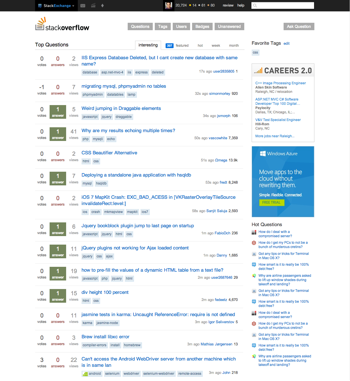
UPDATE

We have made some visual adjustments based on the feedback below.

  • Fixed anti-aliasing on the SE bubble, made the "Exchange" a lighter shade of blue so it's easier to read.
  • Top bar links are now white instead of blue for easier readability
  • Increased red unread count font size.
  • Popups: increased width, also made font size bigger.

We are planning on making your site list order a user setting, but this won't make it into the initial version.

Stay tuned later today or tomorrow for our plan for hot network questions.

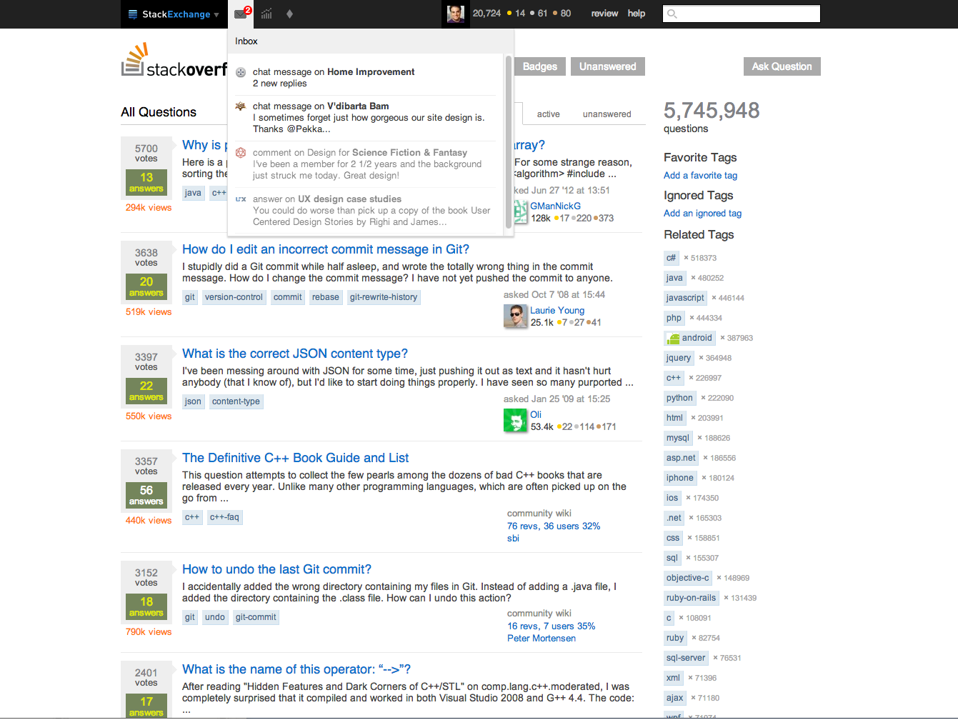
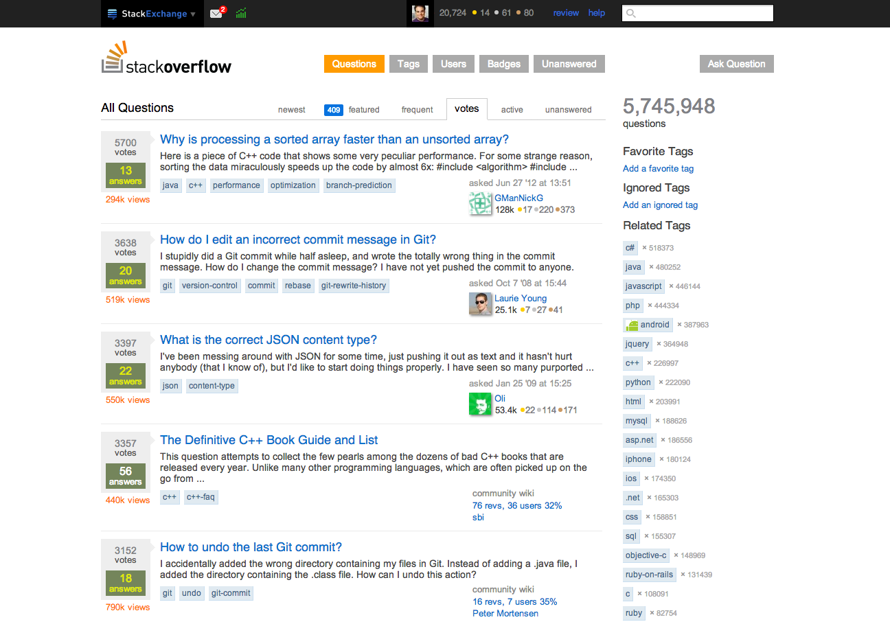
topbar unread topbar inbox

TL;DR:

We’ve incorporated a ton of your requests for the top bar into a new version, and we’re going to ask you to test it here on Meta sometime in the next 2-3 weeks (double-time!).

First, we wanted to share the current work in progress and get your input on anything glaring you think we should know even before we test it.

Insanely short history:

The top bar, and the Multicollider SuperDropdown did exactly what they were supposed to: they integrated your network info in one place on every site, and gave you quick access to a ton of the things that you needed to get to on a regular basis. It was a step in the right direction.

You’ve told us that it’s not quite there yet. And we agree that there’s room for improvement.

Some big-picture goals:

  • Retain easy access to the features and navigation that our top users need
  • Cram fewer things together / group things together more logically. Today, the multicollider contains:
    • Your inbox
    • Another queue for notifications, without clearly indicating how it differs from the inbox
    • Hot questions from other sites (not very related to the first two things)
    • A list of all other sites (static nav, unlike every other item)
  • Make behavior more consistent.
    • Some top bar items are hovers, some are clicks
    • The hovers let you click too, but that does something different
    • Clicking the MultiCollider after you’ve checked notifications shows you a totally different thing (hot questions) in an unexpected way.
  • Make network-wide rep changes more accessible
  • Move toward a more globally consistent top bar across the network
    • The current top bar is small, low contrast, and different on every site
    • This creates a little friction for current users, but seriously undermines users’ ability to recognize they’re on another one of those sites with the good answers.

Here’s the proposal (subject to further tweaks):

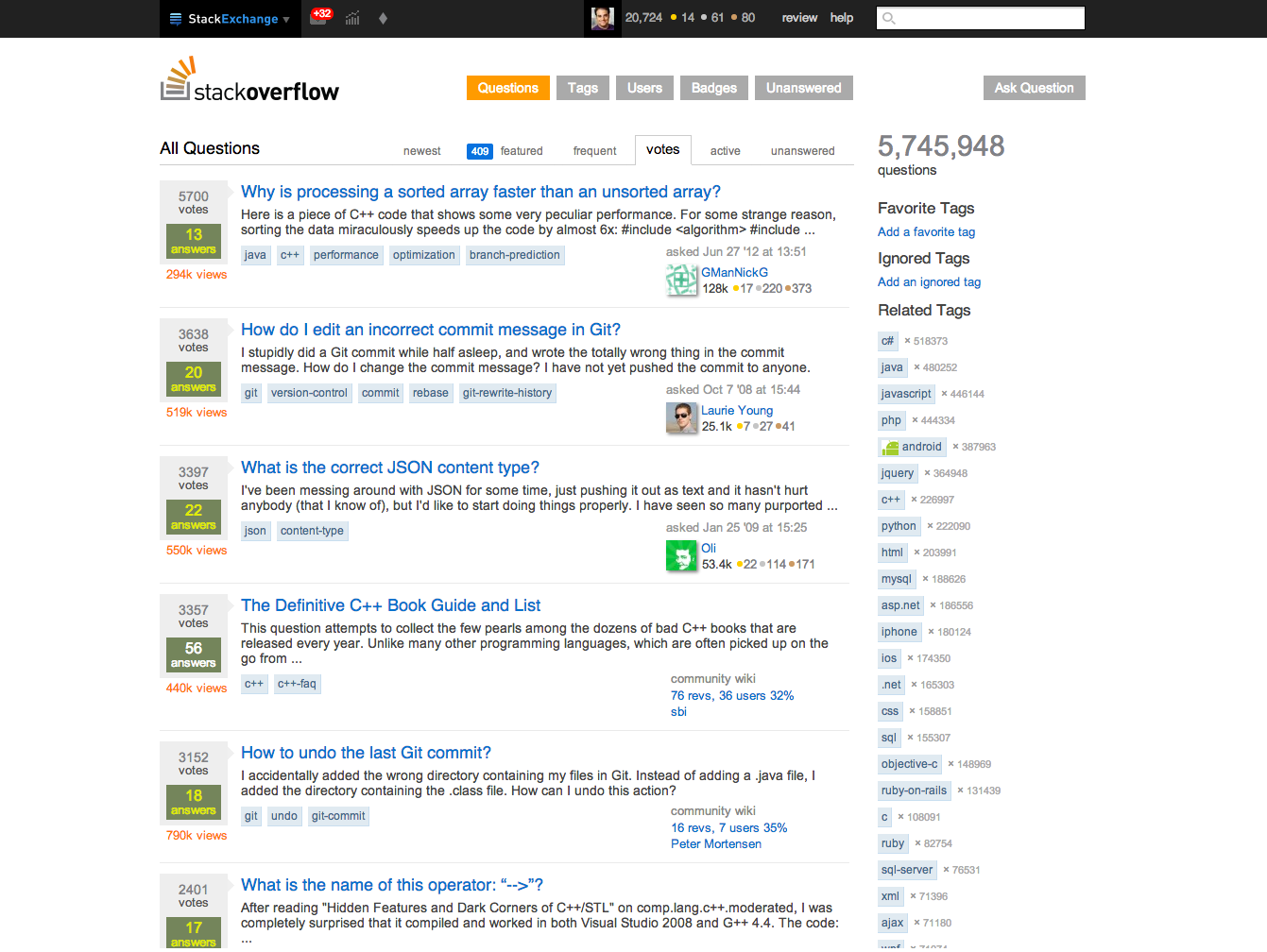
This is still a work in progress, and we expect that once you can touch it, you’ll find a bunch of things that need to be added/tweaked/cut-to-pieces-and-have-the-pieces-thrown-in-a-fire, but we wanted to share these mockups in case you spot anything major that’s missing now.

MultiCollider

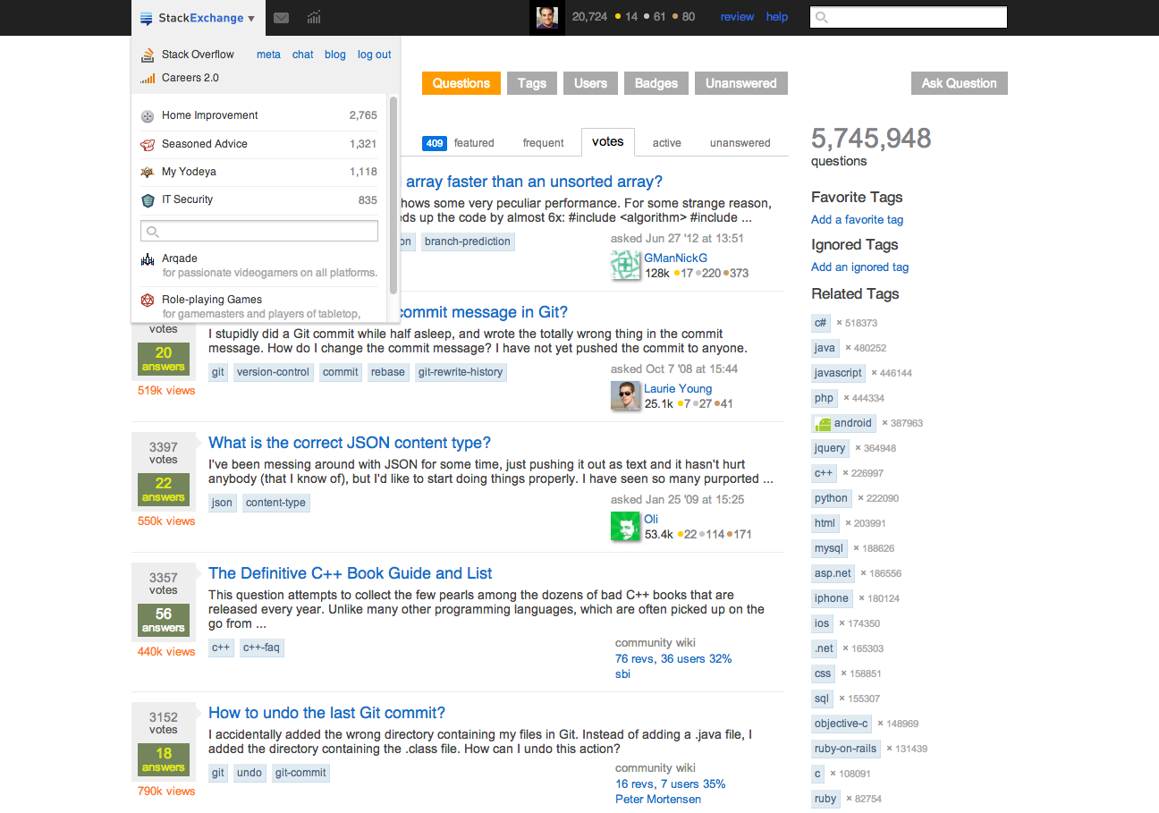
The multicollider now becomes a site switcher. Slightly larger, and in color, it anchors every page on every site and makes it more clear that you are just on one of many Stack Exchange pages.

Your current site appears at the top, along with any relevant meta, chat, and blog links. Stack Overflow gets a careers 2.0 link. Immediately below, in a new condensed format (you certainly don’t need descriptions if you’re participating in a site already), you’ll get a list of all the sites that you have logged into, in order of reputation. Finally, you’ll find the full alphabetical site list with descriptions, searchable by title, URL, and description.

We’ve made larger clickable areas for all of these elements so you don’t have to aim as much.

Stack Exchange menu opened

Inbox

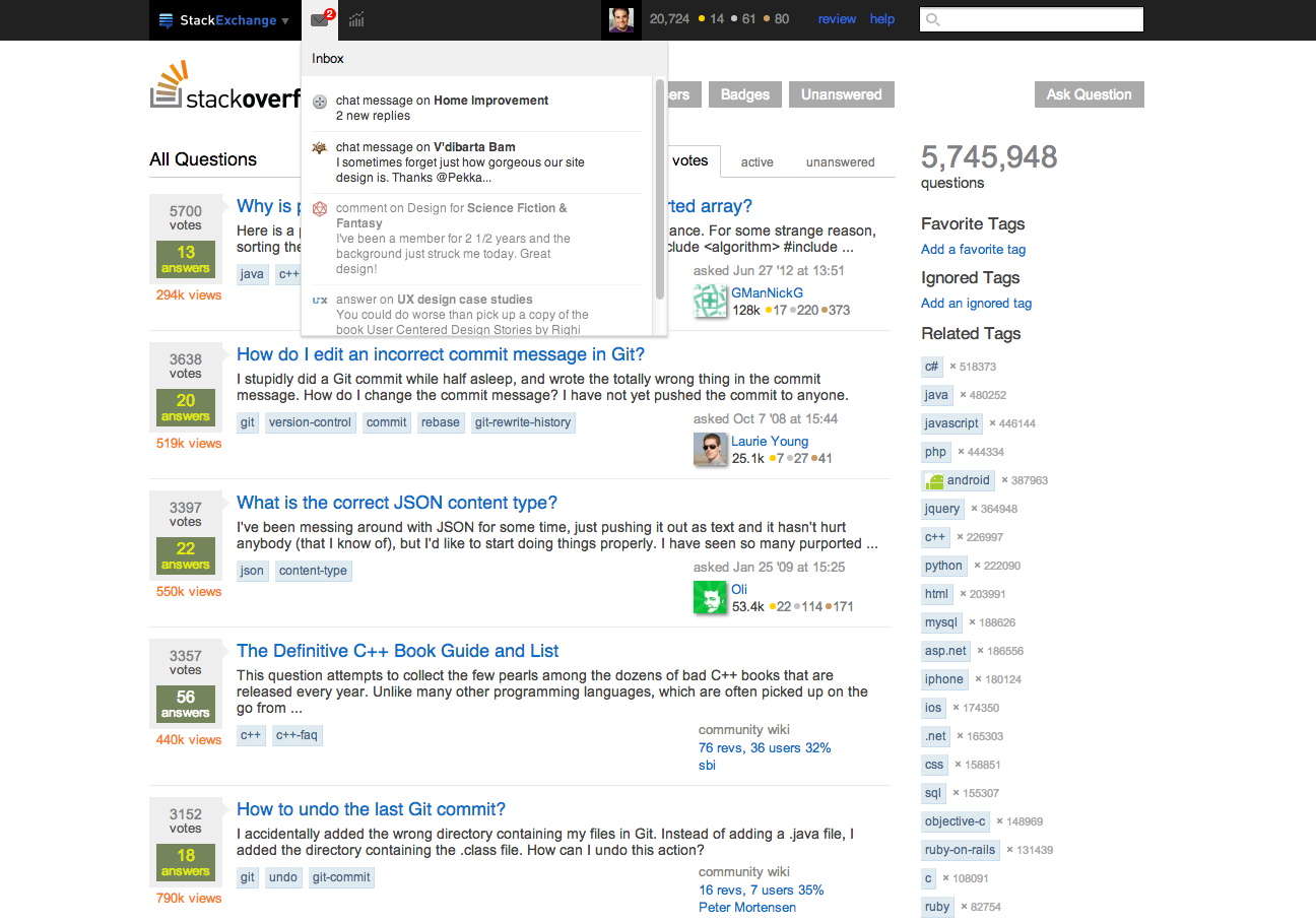
The inbox tab disappears from the MultiCollider. It’s now one click away instead of two, and it behaves just as you would expect: inactive when there are no new inbox items and active with a red number when you have new inbox items.

Things that will now be inbox items that were not before: bounty notices, post migration notices, moderator messages to users, and edits (suggested and regular).

Pending inbox notification Opened inbox showing notifications

Reputation, Privileges, and Badges (Achievements)

While researching the user profile page, we discovered that one of the top use cases was checking on recent reputation changes. We would like to make this easier from the top bar than it is now.

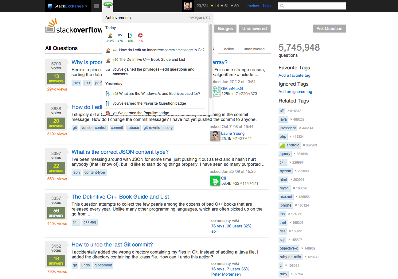
All reputation, privileges, and badge updates now appear under a new achievements drop-down, located next to the inbox. (Privileges and badge notifications were 85% of the notification volume). This drop-down will also incorporate reputation updates that are more detailed than we currently display, rolled up by day and post.

The icon will appear deactivated if there are no badge, privilege, or reputation updates since you last checked; activated (green) if there are, with a green number representing your rep since the last visit.

Additionally, this entire drop-down will now be global, with cumulative rep for today broken down by site for those who have accounts on more than one site.

Achievements

Profile image and clickthrough

The existing “on hover” menu disappears. It didn’t make any sense to have one click menu and one hover menu. Your username is replaced by your avatar, which is clickable (no more weird spacing issues with long names), along with the entire user card through to the profile page - as it was previously.

Help

The help link will now be a drop-down, grouping together the tour, meta, and the help center with descriptions to help people get to the right place.

There are two things that we haven’t addressed here that we are still working on: mod messages and hot network questions. We will figure those out over the next few days.

But before it rolls out, or even goes to development, we want your feedback. We’ve tried very hard to address the needs of new users, experienced users, and power users, but it’s always possible that we’ve missed things. Post your concerns below, and we’ll do our best to make sure we get the most out of the new design.

55
  • 30
    I...assume it's not actually going to be a black bar, right?
    – Tim Stone
    Commented Sep 27, 2013 at 15:08
  • 12
    @TimStone It's the only color that fits on all 106 of our site designs
    – Jeremy T StaffMod
    Commented Sep 27, 2013 at 15:09
  • 16
    Pfft. Orange is the new black.
    – user1228
    Commented Sep 27, 2013 at 15:13
  • 15
    Ick. Could there be a light/dark variant based on the general tone of the site theme? Right now it's kind of a smack in the face, because there's far more colour on Stack Exchange sites than Google, for example. The blue links don't work against the black either.
    – Tim Stone
    Commented Sep 27, 2013 at 15:13
  • 6
    Oh...is the search box going to do that annoying expando stuff still?
    – Tim Stone
    Commented Sep 27, 2013 at 15:20
  • 9
    I hope achievement notification bubbles don't have the same almost unnoticable color as now.
    – juergen d
    Commented Sep 27, 2013 at 15:25
  • 5
    Careers is going to be there? That takes up a lot of space in the screenshot…
    – Ry- Mod
    Commented Sep 27, 2013 at 15:32
  • 16
    @JeremyTunnell Why can't the nav bar be the same color it is right now (i.e. specific to the site design) instead of black everywhere? Commented Sep 27, 2013 at 15:52
  • 7
    I am in love. In a very manly way. Not that there's anything wrong with being in love in a womanly way. But, you know!
    – Andrew Barber Mod
    Commented Sep 27, 2013 at 16:18
  • 6
    That black bar is sexy.
    – gitsitgo
    Commented Sep 27, 2013 at 18:03
  • 4
    The Stack Exchange logo should probably be a brighter blue. Kind of blends into the black there.
    – animuson StaffMod
    Commented Sep 27, 2013 at 18:21
  • 11
    @animuson I'm literally pixel pushing and kicking my dog right now.
    – Jin Mod
    Commented Sep 27, 2013 at 18:40
  • 5
    @bluefeet We intend to apply this to chat
    – Jeremy T StaffMod
    Commented Sep 27, 2013 at 21:36
  • 5
    Oh my, the envelope is back Commented Sep 29, 2013 at 8:15
  • 4
    @hims056 That's going to be a mod notifications area; diamond moderators receive additional notifications that non-moderators do not receive. That diamond will only be visible to moderators. (For mods reading this: we're still working on the details of your view of this topbar.)
    – Laura StaffMod
    Commented Oct 3, 2013 at 14:02

24 Answers 24

72
votes

Please leave at least the meta/main link on the bar. I'm always using the meta/main link to go back and forth between the sites, and now I'd have to click twice every time I would want to do that..

2
  • 1
    Yep, I'm also missing the fast switch Main/Meta.
    – brasofilo
    Commented Nov 14, 2013 at 22:24
  • +70 was not enough even for a "no" comment. :( Commented Nov 14, 2013 at 22:29
45
votes

Suggestion : Make the list of sites that appear in the MultiCollider editable by users

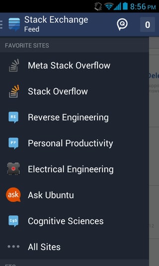
This is partially inspired by my experience of using the Android app for a few weeks now. The suggested MultiCollider and achievements seem to be similar to the implementation in the app.

While using the app, the main way to navigate through multiple sites is by opening the site drawer and then clicking either the site or going to all sites and then searching. The biggest problem that others and I have with this is that reputation is not necessarily a measure of interest in various sites. I may have found a new site SE which I like to browse but not necessarily participate, however it is impossible to go to it directly from the drawer. Sometimes, single questions end up generating a lot of rep thereby pushing up that account on the list. This also does not mean I would necessarily participate on that site more.

Since the design of the MultiCollider seems to be on similar lines, I feel that the site list should be edit-able (for the same reasons).

These are some ways that the sites could be ordered:

  • Let users set the list as they see fit.
  • Set it based on volume of activity over a certain period (taking into account a minimum of 1 week of user participation). This could be done by a doing a simple count of user actions per site similar to how its done on meta sites on the /users?tab=participation tab. (This wont be user editable, but its still better than rep-ordering)

Activity-Based Ordering

Here is another way to go about it. This is an extension of the activity count as mentioned above. While this will have more overhead involved, I think this will be better than either user set, or the simple meta count. Pseudo code:

    CalculateSiteRank ( UserId, AccountList) :

          for Account in AccountList 
          do
            PrevScore = Account.CurrScore
            Account.CurrScore = Account.Votes + Account.Posts + Account.Comments + Accounts.Reviews
            
            Account.Rank = r * [Account.CurrScore + c * (Account.CurrScore - PrevScore)]

            Sort (AccountList, Account.Rank)
          done
          

Here, Account.Rank will decide the site ordering in the multicollider.

Formula

Now, lets look into the main part, which is r * [Account.CurrScore + c * (Account.CurrScore - PrevScore)]

r

In this, r can be a constant that is used to scale the representation of a site in the list based on factors like user reputation, overall site volume, and beta/launched status. This can be used by SE to control some generic properties of the ordering such as by site size.

Derivative

c * (Account.CurrScore - PrevScore) is basically the derivative of activity with time.

  • If the user's activity decreases over time, then this derivative will be negative, thereby decreasing the site rank.
  • If the user's activity increases over time, then this derivative will be positive, pushing up the site rank. So, if you participated by performing 5 actions one week, and 8 actions the next, then the corresponding site will get a positive bump in its rank, reflecting the increased participation.

Thus, the derivative will try to minimize too much of moving around of a site within the list as well as try to order by the most likely active accounts.

c

c is a (positive) factor that can be used to scale the effect of the user's previous weeks' activity on the site rank. c would depend on the duration for which activity is considered and how much is previous activity an indicator of future activity (needs some analysis).

Frequency

This script should ideally be run once a week per user. It should be triggered per user whenever (s)he first logs on to a site, in the beginning of a UTC week.

This will have many benefits:

  • Will make the list static for at least a period of one week.
  • Less and distributed load of running the script compared to more frequent runs. As users may log on for the first time in a week on Sunday, Monday or later, the load will get distributed.
  • By triggering on log on, extra work can be avoided on the part of drive-by users who are less likely to come back every week.
  • Also, when users' take breaks exceeding 1-2 weeks, the MultiCollider ordering will still pick up from where they left off. (which will be beneficial if it becomes indispensable in cross-site navigation.)

Problems:

  • If the SEDE schema is similar to the internal database, then this query will likely generate significant load.
  • List will still be dynamic. Activity volume will likely be proportional to site status, so graduated sites may be consistently higher ranked than beta sites since graduated sites will have more scope of activity than beta sites.

Predictive MultiCollider

If a predictive element is also added (into this formula or otherwise) then the MultiCollider could become a surprisingly useful way to move around, and/or even predict the future of a site's short-term growth (number of users * average_siterank for example could predict how much activity is expected on a site in the next week). I am not sure of what are the full-scale metrics the SE team already uses, but from an outside perspective, this seems like an interesting addition, or at least experiment.

Also, SEDE graphs would make this answer much more interesting, if you get my drift ;-)

7
  • 3
    Even just sorting on recent activity, rather than reputation, would likely be more useful.
    – Servy
    Commented Sep 27, 2013 at 15:28
  • 5
    @Servy but then you can't memorise the site position in the list Commented Sep 27, 2013 at 15:29
  • 9
    @Servy Hmm.. I dont entirely agree with that. It will make the list too dynamic.
    – asheeshr
    Commented Sep 27, 2013 at 15:29
  • 8
    This will almost certainly be editable in the app, so making it editable here too is a possibility Commented Sep 27, 2013 at 19:02
  • @Servy I agree too; I drift between the sites and the site I visit often is not always correlated to my rep. Commented Sep 27, 2013 at 19:54
  • 1
    I'm amenable to this suggestion, but as a navigation element I don't think I could go along with anything that automatically changes the order very often. This list should be predictable. We are thinking about this, but are likely to go with a simple "pick your order". May have to be a tweak after this goes out first, though.
    – Jeremy T StaffMod
    Commented Sep 30, 2013 at 16:16
  • If "Make the list of sites that appear in the MultiCollider editable by users" is done, then make sure that's the order sites appear in the menu on the Android App...
    – AnonJr
    Commented Oct 1, 2013 at 17:22
39
votes

Maybe its just my eyes, but I can't really read anything that is blue on that black background.

Also, straight black seems out of place at the top. It makes me think you are doing a memorial type thing.

13
  • 8
    Jin's already working on the contrast/readability issue. I think your black=mourning may be contextual from being it used to being lighter here today. You probably see a black top bar almost every day and think little of it. And it's challenging to come up with any other color that will be consistent across sites, but won't clash or look wrong with their other design elements.
    – Jaydles Staff
    Commented Sep 27, 2013 at 20:46
  • 1
    You must be blind. I can read it.
    – Cole Tobin
    Commented Sep 27, 2013 at 20:50
  • Michael did you click on the image and view it in true size, or are you trying to make out the text on the scrunched-up resized screen shots in the question?
    – Aaron Bertrand Staff
    Commented Sep 27, 2013 at 20:51
  • 4
    Neon pink - it works with all NFL team colors during breast cancer awareness week @jaydles
    – samthebrand Staff
    Commented Sep 27, 2013 at 20:59
  • 6
    @ColeJohnson, congratulations on your excellent vision. We don't all share it. I can't read that blue-on-black text either (in true size). If the top bar can follow the per-site design that we already know works, that'd be great. Commented Sep 27, 2013 at 21:05
  • @AaronBertrand both in scrunched mode and full size I have trouble reading it.
    – Michael Pryor Staff
    Commented Sep 27, 2013 at 21:13
  • 1
    @jaydles I dont get your link to google? I see no black bar when going to google.com -- the whole page is white for me.
    – Michael Pryor Staff
    Commented Sep 27, 2013 at 21:13
  • I suspect most people see this.
    – Aaron Bertrand Staff
    Commented Sep 27, 2013 at 21:16
  • 1
    @MichaelPryor, weird. I see what Aaron B posted. You may have the newer version - I heard they were changing theirs soon, but mine's still black.
    – Jaydles Staff
    Commented Sep 27, 2013 at 21:24
  • Actually, I agree. Also, while Google's bar is indeed black, their text is of slightly higher contrast, so it's easier on the eyes. The blue on black really is.... unpleasant..? Commented Sep 27, 2013 at 21:31
  • 4
    @Jaydles That's a terrible argument... the black navbar augments Google's mostly white home page. I'd like to see examples of Google or someone else using jet black navbars on a page like Mi Yodeya or TeX - LaTeX or Ask Ubuntu or Android Enthusiasts... Why does it have to be one color across all sites? Why not just use what we've been using all along for the navbar on these sites? Commented Sep 27, 2013 at 22:41
  • 6
    @Yoda, I think they want to make it the same across all sites because it provides consistency such that non-users will recognize they're using the same resource every time they bump into one of the SE sites. There's quite a lot of copycat Q&A sites, some that just directly repeat questions from SO, so doing this will unify all sites as one general Q&A site. Also, MSDN also has a jet black menu.
    – gitsitgo
    Commented Sep 28, 2013 at 1:44
  • 7
    @gitsitgo Again... jet black menu on a white background. I understand the reasons for the navbar, but I just happen to disagree that this is the best solution for that. In any case, the point about copy cats is irrelevant, since there's nothing to stop them from also having a black nav bar with similar stylings. Commented Sep 28, 2013 at 1:58
29
votes

Looking great and think it's really about time for a major design change like this. Kudos!

That said, in my opinion flags are currently not getting the attention they deserve. Users are flagging posts and I strongly suspect that many of those users have no idea how to check on their flags progress, if they were accepted or not etc, which can cause problems like double flagging or continued behavior of bad flagging as they simply don't know their flags are being declined.

Why? Because the only link to the flag history is hidden as a mysterious "helpful flags" in the profile page. Personally I spotted it easily but it's far from being trivial or easy to find. Many users just miss this.

So now with the new design, why not give the flags some love?

Whenever a flag is handled (either accepted or rejected) the number will rise and it can just be a link to the existing flag history page if designing "mini view" would be too much trouble.

I truly believe this will improve the overall flagging quality and reduce "double flagging".

7
  • 4
    It could be me, but I don't think flags have the same level of importance as the other top bar items...more visibility and discoverability sure, but not this far IMHO.
    – Nick Craver Mod
    Commented Sep 30, 2013 at 1:10
  • @Nick I tend to agree, maybe another tab in the user profile page? Commented Sep 30, 2013 at 6:44
  • 5
    Maybe a notification in the inbox?
    – juergen d
    Commented Sep 30, 2013 at 8:11
  • @juergend interesting idea... might work just fine! :) Commented Sep 30, 2013 at 8:13
  • 2
    I think that at a minimum rejected flags should show up in the inbox with the rejection reason. It (should) be infrequent enough to not be annoying, while giving quick feedback on how not to flag.
    – nhinkle
    Commented Oct 5, 2013 at 7:30
  • @nhinkle true, quite like the rejected suggested edits that was suggested already and didn't get much official attention. Let's hope for the best! Commented Oct 5, 2013 at 9:13
  • I'd love to see all possible reviews show up in the toolbar.
    – user213963
    Commented Oct 25, 2013 at 14:22
24
votes

Sounds fantastic!

I'm a stickler for real estate though; so I'd like to request that there be a way for those of us who have only ever visited the careers site by mistake to opt out of seeing the Careers 2.0 link? I don't see a situation in the near future where I'm ever going to click on that on purpose, and I only see it as a way to make the location of links to other sites inconsistent depending on whether I'm on SO or not.

1
  • I don't see them removing that as it's branding internally and one of the few places where they make revenue that isn't ads, so I'm sure they would like us to actually use that site more (side-note: I have perused the site intentionally, and gotten a lead from there before :D )
    – jcolebrand
    Commented Oct 7, 2013 at 20:06
20
votes

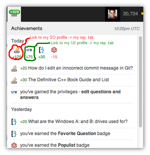
Suggestion: Site icons on a new achievements drop-down should be linked to our relevant profile -> reputation tab.

What I mean is described by the following image:

enter image description here

By this we can quickly redirect to our relevant site's reputation tab.

2
  • 10
    Why would Joel want a link to your rep tab in his achievements dropdown? =P Commented Sep 29, 2013 at 2:23
  • 1
    This is planned. Just wasn't in the write up.
    – Jeremy T StaffMod
    Commented Sep 30, 2013 at 17:12
20
votes
+100

Please leave the Chat and Meta links in the top bar.

This gives us quick access, and advertises the fact that these things exist to new users. These are important features of any site, and I'm concerned the visibility of their existence will be lowered too much this way.

1
  • 1
    Rrrrg.... There are no chat links on top anymore :-(
    – Naftali
    Commented Nov 14, 2013 at 22:28
17
votes

Nice!

I noticed that the badge notifications in the mock-up are more terse than what we currently get: the super-collider tells me what question a per-question (or per-answer) badge was for. I find that handy and it doesn't look like it would cost too much space (you're already doing it, after all). Could we have that info too?

3
  • I think this is actually planned (just not pictured). I think the content will include what's there today. @jeremytunnel, can you confirm?
    – Jaydles Staff
    Commented Oct 1, 2013 at 15:43
  • 1
    I confirmed that all the descriptive and link functionality of the current notices will be included; it's just not in the mockup.
    – Jaydles Staff
    Commented Oct 3, 2013 at 19:03
  • @Jaydles, thanks for checking (and for the good news)! Commented Oct 3, 2013 at 21:24
9
votes

I'm concerned about the size of the red bubble and its text on the inbox: I can only just barely read the number on my full-size monitor, which means it'll devolve to a binary indicator (red dot or no) on my tablet. (And if it gets to a two-digit number it'll be even worse.) Sometimes I deliberately leave inbox notifications unprocessed and save them for later, but I'd still like to know if I'm getting new ones. But if I click it clears them all, so I don't want to click -- I rely on the number in the red bubble.

If you don't want to change the visual design, this problem could be mitigated by an informative tool tip (e.g. "3 notifications" or "3 items in inbox").

8
votes

That rep tab is amazing, but I have one request: please make unread rep events highlighted. My most common use of my profile page by far is to check where that 10 rep came from, and it would be great to have that information a single click away.

1
  • This is planned, just didn't make it into this mockup Commented Sep 27, 2013 at 20:53
8
votes

I use a couple of things in the popup that appears when I hover over my username. Having my user card instead would be totally useless — I know who I am, thank you very much.

Most importantly, I keep track of how many times I've voted today. This is very important for me on Unix.SE, where I have to ration down my votes to keep under the 40/day limit. I can't find this information in the new design. The number of close votes would be a nice addition to that (though it's not a big issue for me personally).

I occasionally look at what posts of mine have been voted on recently. Depending on the site, I'm interested in different information:

  • On subjects where I'm not very comfortable (so sites where I post rarely), I like to see if my recent posts have gotten positive or negative feedback: did I get it right? The existing interface is good for that. The new interface would have these drowned out by my most active sites.
  • On subjects where I'm most comfortable (so sites where I post often), I like to see whch of my old posts are regularly getting upvotes: these are reference posts that I should perhaps polish. The existing interface is bad for that because it's buried in the feedback about recent fire-and-forget stuff that I couldn't care less about; the new interface would be no better.
7
votes

Currently the dropdown box is cached once it is loaded. So if I want to see the current view I have to refresh the page and then hover over my name on the top.

Can the future dropdown menus be always filled with current data without refreshing the page?

1
  • 2
    We plan to do this on the reputation one, which I think is the one most people care about...the others haven't been architected 100% yet
    – Nick Craver Mod
    Commented Sep 29, 2013 at 13:31
5
votes

Would it be possible to add some notification when there's something to review? Currently reviewing requires a lot of refreshes of the review page...

2
  • Maybe use AJAX?
    – Cole Tobin
    Commented Sep 28, 2013 at 19:04
  • 1
    There's currently a feature request to have the review page update without being refreshed. Commented Sep 30, 2013 at 22:34
5
votes

Making this functionality accessible from the keyboard (say, hotkeys on the webpage) would make the site more 508 accessible, and help out regular users to boot.

4
votes

As requested by Shog9...

enter image description here

The collider and profile tabs are unlinked. Visiting your inbox doesn't reset the tabs or vice versa. Visiting what caused the notification (like a comment) doesn't reset either of them. You must visit both the inbox and the tabs to "reset" to the default state.

2
  • @Shog9 and done
    – jimSampica
    Commented Sep 28, 2013 at 4:12
  • 1
    Visiting the responses tab on the profile should clear the inbox notification, but I don't want the reverse. I participate on several sites, some actively and some less-so; if I get an inbox notification for a lower-priority site I want to be reminded that I have something waiting when I go visit it later. Commented Sep 29, 2013 at 2:08
4
votes

Can we revisit this question?

Items that are viewed (regardless of viewing them through the inbox), should be marked as read.

It's been a while since it was asked, and I think since the SuperDropdown is getting an upgrade soon, it should be incorporated.

4
votes

Overall, I like it. Well done!

Suggestions (sorry, no hand drawn circles)

  1. Support the vision impaired (all of us one day) by user selection of either preset color profiles (easier) or individual color selections (yuck), and a user selectable expanded bar (say, double the height).

  2. Every second user has their favorite feature. Support them by allowing them to drop a button (or similar) for their fav feature onto the bar.

Good work folks.

3
votes

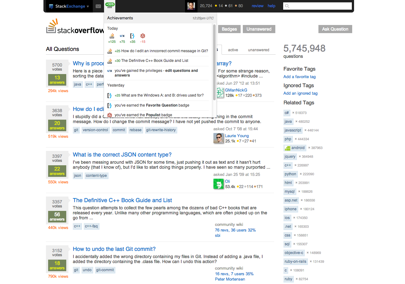
I think the big black bar looks less... err... bold, when it does not extend into the margins.

click image to enlarge

image

I added rounded corners too, so it looks a bit more smooth.

2
votes

When looking at the screenshots, the 'achievements'/'reputation' tab menu feels too small to me. I think it should be a little bit wider horizontally so the content doesn't feel so cramped, and I think it should be expanded vertically so that no scrollbar is needed. When I view the achievement menu, there is nothing on the background I really need (or want) to see (ala it doesn't matter more of the background is blocked by a bigger menu), and I think it is really helpful to be able to see all information in that menu without needing to scroll.

2
votes

Allow exchanges to dictate the nav bar background color

Cool! The new multi collider looks like a step forward.

Except...

Black is being forced as the header color? I am going to have to disagree with the color choice. All of the examples shown in this question seem to indicate that testing was done on stackoverflow. Yet the header color was chosen "for all of stackexchange".

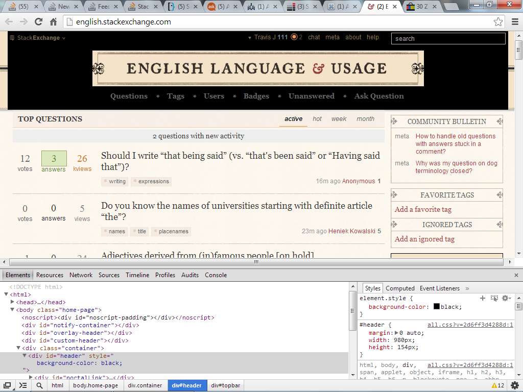
How can this work? Right now almost every exchange site (this is from looking at the top 7 sites on the all sites list) use different html markup to design their headers. It seems that the html is custom and changes from site to site. I don't see a good reason to change the flair that each exchange is using to accommodate the new nav bar. For example, changing the nav bar to use black as a background the English Exchange will cause a rather jarring rendering.

English with dark background

Perhaps the entire structure of html will be different there? I could see it working if the new nav bar was somehow sitting on top of the current structure. I wonder if that will be different for each site in which case does that mean that custom headers will need to be redesigned by each site to somehow incorporate this new nav bar?

3
  • The plan is to use current HTML if it works, or redo the headers if it doesn't. Rest assured English will not look like that after the new bar goes in.
    – Jeremy T StaffMod
    Commented Oct 10, 2013 at 20:38
  • @JeremyTunnell - Can part of the process of redoing the headers allow the exchange to either overload or influence the color/styling of the nav bar?
    – Travis J
    Commented Oct 10, 2013 at 20:39
  • @Travis They're making the top bar black, not the entire header. English.SE might not have its top bar distinguished from the rest of the header, but once the design goes out it will be distinguished, because it'll be a black bar along the top. They didn't say the rest of the header would become black with it. Commented Oct 29, 2013 at 5:58
2
votes

Submitted here in order to ensure that involved feature requests (listed below) are included in the list of feedback items.

Hot questions stay at the top of the supercollider for too long

Above wording is as has been recommended by David Fullerton♦ here.


Involved feature requests (listed in order from earlier to later):

Don't let questions stick to the top of the hot questions list forever (submitted Jul 20 '11)

Sometimes those are interesting questions, but often they are popular mostly because they appear in the hot questions list gaining views and are about a topic where everyone has an opinion (and a vote) to give. I'm fine with promoting the questions via the MultiCollider, but I don't think those highly-voted questions are that good, they don't need to be in the hot questions list for several days.

I think those questions should be thrown out earlier and should not stay in the hot questions list for several days. It makes the hot questions list less useful as you very often encounter the same questions again, even if you check back a day later. I thought the idea was to show a broad mixture of possibly interesting questions from all around the SE network, not to semi-permanently highlight questions that are already popular...

Trial run of modified “hotness formula” for Programmers questions (submitted Jan 25 '13)

Given that current formula appears to give an unjustified value to crappy answers in highly upvoted questions (Qscore/5, no matter how much is answer downvoted), I would like to perform test run to find out if suggested change would make an impact to issues outlined in Programmers meta posts:

In “network hot” questions formula, discard answers when voting evidence indicates that these are not good data points (submitted Aug 6 '13)

contribution of under-scored posts into "question hotness" (which in turn blocks intended time decay) forces questions with multiple low quality answers stick for a long time at the top of the collider, making wrong impression on what kind posts are welcome at Stack Exchange.

This makes it look like good questions are those having many meh answers, the effect that is amplified by these questions being highly visible to collider audience - hundreds and thousands of SE users. Misguided users spread acquired attitude further into other questions and answers, posting stuff that follows what they saw at the "cool" ("hot") questions.

As far as I can tell, this jeopardizes the very idea * of making an Internet a better place.

Please stop counting proven low score answers in hotness formula. Please roll the dice fairly, let user voting and time decay contribute to hotness score as intended. Please promote to collider audience less brain-damaging content to learn from.

2
  • Isn't 1671+ views in 27 days enough attention? :P
    – Himanshu
    Commented Oct 25, 2013 at 11:59
  • 1
    @hims056 well for sticky questions at collider, several hundreds of views is a matter of hours. Is it fair for "sticky" questions ("about a topic where everyone has an opinion") to get that much attention compared to a major design discussion like that? :)
    – gnat
    Commented Oct 25, 2013 at 12:03
2
votes

Can we have something per-user that causes the bar to be sticky to the top of the page? Per-browser is also FINE by me, I'll check it off on like 15 computers, I don't mind.

It's garnered enough interest to have a few userscripts generated for it, so this could be highly useful.

1
vote

I miss the mouseover from the portrait that shows recent reputation activity. I know there is a dropdown that shows all of the reputation activity for the whole exchange, but it is too busy.

Please bring back the mouseover popup that showed recent reputation when I hover over my portrait.

If at all possible, it would also be nice to see my user name again. I feel a little too anonymous.

0
votes

Is it possible to include, on inbox or somewhere else in the bar, notifications for new questions on favorite tags? I now keep extra windows to catch new questions in some 2/3 tags I like to monitor, and would be nice to have that on the inbox instead.

4
  • 2
    ~1000 notifications a day? no thanks.
    – Doorknob
    Commented Sep 29, 2013 at 16:43
  • 2
    @Doorknob, depends on which tags one would choose. I follow the Mootools tag for example and its about 5 questions / day. Would be practical to get a notification. I don't think php or jQuery (for example) should be on this list either :) It's a suggestion.
    – Sergio
    Commented Sep 29, 2013 at 18:12
  • 1
    +1 for making the suggestion. It's just so sad that MSO has this downvote-if-you-disagree culture, since it's impossible to know what the downvotes are for. As for the comment, folks wouldn't have to use this for high traffic tags if they didn't want to. Commented Sep 29, 2013 at 19:21
  • 1
    @Peter meh, I didn't vote either way on this answer, but I think down-voting is fine if you don't find this suggestion valuable. After all, that is probably one of the things they'll use to determine which suggestions they'll implement, since it's unlikely they'll do everything on this page. Down-voting is a way I can rank my preferences on a question like this...
    – Aaron Bertrand Staff
    Commented Sep 29, 2013 at 20:33

You must log in to answer this question.

Not the answer you're looking for? Browse other questions tagged .