![enter image description here][1]
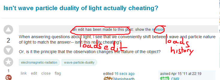
In the edit-realtime-update thingy, a clickable gray bar shows up (that reloads the edit), along with a clickable link that leads to the revision.
Well, the fact is, when you have a shiny blue link, you don't realize that the gray bar is clickable.
I ended up clicking the blue link and being redirected to the revision history. At first, I thought it was a complete bug, but after some pondering I realised that the gray bar must have been clickable as well.
Nesting clickable items is probably bad UX ([We'll find out soon enough][2]We'll find out soon enough). Especially when one of them is a link--it "masks" the clickable-ness (whatever the term is) of the parent item.
Could we make this clearer? It's a minor feature-request , but it ought to be easy to fix. Maybe:
an edit has been made to this post, click to load. (Or see [revision history])
or something of that sort.
What say? [1]: https://i.sstatic.net/cXsbP.png [2]: Is it OK to nest clickable items?
