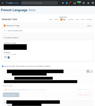
Here's a screenshot of what I see right now on French.SE, on Chrome on Linux:
The main problem with the new UI is that bug the information I want to reach is way down near the bottom of the page. From the top, there's: the top bar, the site name, the page tab bar, a box with a sort of table of contents, a mostly-empty box about people chatting (why doesn't it use the available width?), a checkbox for ignoring the time filter, and FINALLY the flags. The “Unsure?” box is nowhere to be seen.
To reproduce: use an operating system that lets you split the screen between multiple applications and make your browser narrow enough that the right sidebar on the main site pages moves to the bottom of the screen. This is the way I use Stack Exchange and I'm not going to change that.
I find it harder to see where content switches from one flag to an unrelated page than on the old UI. I've occasionally goofed by clicking the button for a flag while looking at the information for another flag, and the lack of separation can only make this worse. The old page had a horizontal line between flagged posts, and a lot of white space (mostly wasted space, but it did help a bit with the separation. feature-request Please add a horizontal line between flags like in the old page, and maybe a little more vertical space.
I never use the time filter. I guess it might be useful on high-activity sites, but on low-traffic sites it kicks off too early to be useful. I guess that most people either have the time filter always on or never on, so feature-request please move the checkbox to a less prominent place.
The first flag is grayed out. Maybe because I've already viewed the flagged post? The old UI had this graying out as well, and it just makes things hard to read. feature-request Don't gray things out at all. Also, bug what I did on the new flag dashboard has somehow caused me to be marked as having seen the second flag even though I didn't actually visit the post.
Why does the chat box on this page show rooms that aren't relevant here? I guess it's the same chat widget as elsewhere showing active rooms. feature-request It would be a lot more useful to show the Teacher's Lounge (which is showing up here because it's a pretty active room) and the site's mod room if any. I know there's no database entry that says “this room here is the site's mod room”, so feature-request please create one.
I only have one major complaint against the current flag dashboard page: it sucks for comments. They aren't shown in context by default — you have to click a button to see the context. Then deleting a comment from the flag dashboard requires confirmation, unlike deleting comments on the main page. I always click through to the post page whenever there's a comment flag. There's no flagged comment for me to handle at the moment so I can't see what it's like in the new UI; I hope these issues are resolved and the dashboard page is now usable for comment flags.

