Answer flags should not link prominently to the question
I keep clicking on the question and expecting to see whatever is flagged. Part of that is muscle memory because that's how it used to work before, but it's also where the new UI drives me on its own.
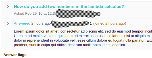
Here's what it looks like when an answer is flagged (text changed to protect the innocent and the guilty):
The question title links to the question. The word “Answered” links to the answer. Ok, fine.
The long, large-font, bold link at the top goes to the surrounding context. A single word in small type links to the flagged post. No, that's not good.
Please change the way answer flags are displayed so that the most prominent link is to the answer. Yes, it's good to have a link to the answer, and many answer flags require seeing the answer in context. But the most obvious link should go to the answer.
I don't know what the best presentation is. Having “Answered” in a larger font than the title would help, but it wouldn't be enough, because it would still be a far smaller target than the question title. The question title does need to be displayed at the top. Making the whole answer snippet a link target wouldn't work when there are links in the answer. Maybe make a big rectangular button in the left margin?

