feature-request status-reviewstatus-declined
Make better use of the screen real-estate.
My favourite view to review in is the side by side view, usually the markdown version of it. As it currently stands the site is served with a max-width instead of being totally responsive. This is already painful on some long posts without many paragraphs, but in this review view it is even worse.
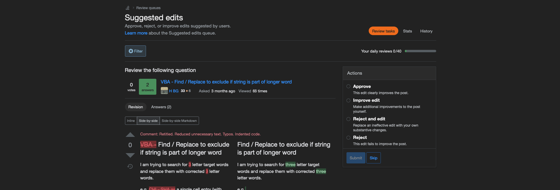
Take a look at this screenshot, of the entire width of my monitor:

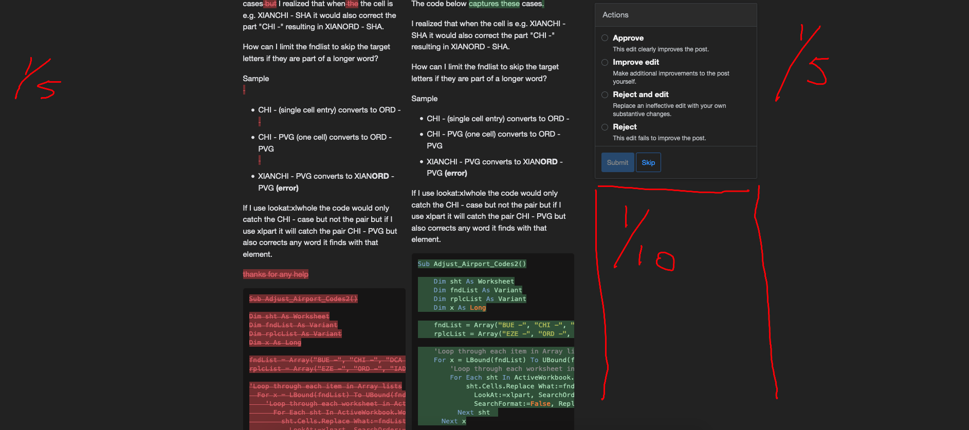
The screen is divided in about 5 equal parts, of which only 2 out of the 5 carry meaningful content, namely the side by side diffs. When reviewing long posts this becomes extra painfull, as then half of the screen will be empty (The first and last column, and half of the column that carries the actions box):
Can we move the actions box back on top, so I can use at least 3/5th of my screen to view the content that is actually of interest.

