added 26 characters in body
Source Link

OMG, MY EYES !!!


The new MacOS fonts are very "slim" and they are very hard to read when the color is not black (eg: blueish or grayish).

Please, consider reverting this change until more research is being done and more issues are fixed.


Updating to system font would have been totally normal move, IF:

  • those fonts would have been readable.

The font (as of Thu, May 13th) is abysmal on MacOS (usually the OS that designers use), and there is no reason to expect them being any better on other platforms.

Especially painful:

  • linked posts on the right sidebar: enter image description here

  • comments: enter image description here

  • homepage: enter image description here

OMG, MY EYES !!!


The new MacOS fonts are very "slim" and they are very hard to read when the color is not black (eg: blueish or grayish).

Please, consider reverting this change until more research is being done and more issues are fixed.


Updating to system font would have been totally normal move, IF:

  • those fonts would have been readable.

The font (as of Thu, May 13th) is abysmal on MacOS (usually the OS that designers use), and there is no reason to expect them being any better on other platforms.

Especially painful:
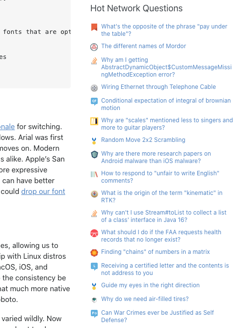
  • linked posts on the right sidebar: enter image description here

  • comments: enter image description here

  • homepage: enter image description here

OMG, MY EYES !!!


The new MacOS fonts are very "slim" and they are very hard to read when the color is not black (eg: blueish or grayish).

Please, consider reverting this change until more research is being done and more issues are fixed.


Updating to system font would have been totally normal move, IF:

  • those fonts would have been readable.

The font (as of Thu, May 13th) is abysmal on MacOS (usually the OS that designers use), and there is no reason to expect them being any better on other platforms.

Especially painful:
  • linked posts on the right sidebar: enter image description here

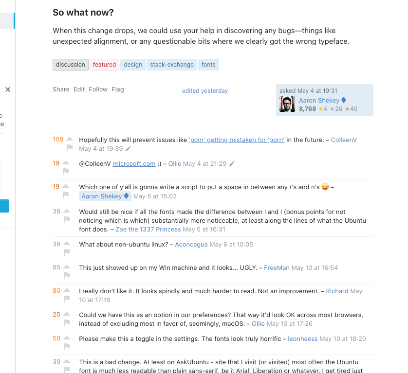
  • comments: enter image description here

  • homepage: enter image description here

Source Link
c69
  • 551
  • 3
  • 16

OMG, MY EYES !!!


The new MacOS fonts are very "slim" and they are very hard to read when the color is not black (eg: blueish or grayish).

Please, consider reverting this change until more research is being done and more issues are fixed.


Updating to system font would have been totally normal move, IF:

  • those fonts would have been readable.

The font (as of Thu, May 13th) is abysmal on MacOS (usually the OS that designers use), and there is no reason to expect them being any better on other platforms.

Especially painful:

  • linked posts on the right sidebar: enter image description here

  • comments: enter image description here

  • homepage: enter image description here