5

I spent some time today with the new android tablet beta app on a Samsung Galaxy Tab 8.4, which has a 16:9 aspect ratio. While browsing questions in landscape mode I noticed there was a lot of whitespace between the first and second questions on the same row. Example:
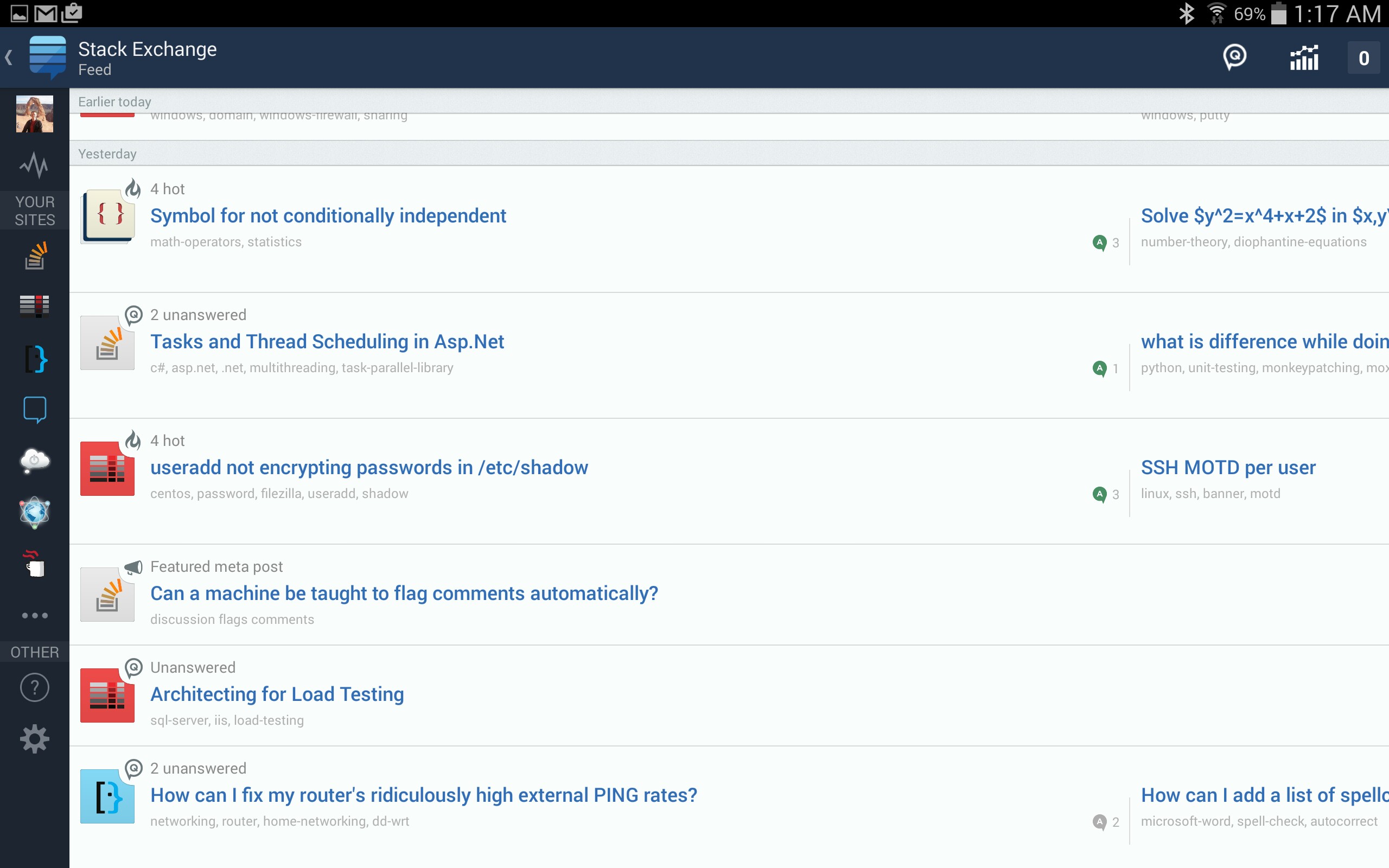
landscape screenshot

In portrait mode the question width is more appropriate. Example:
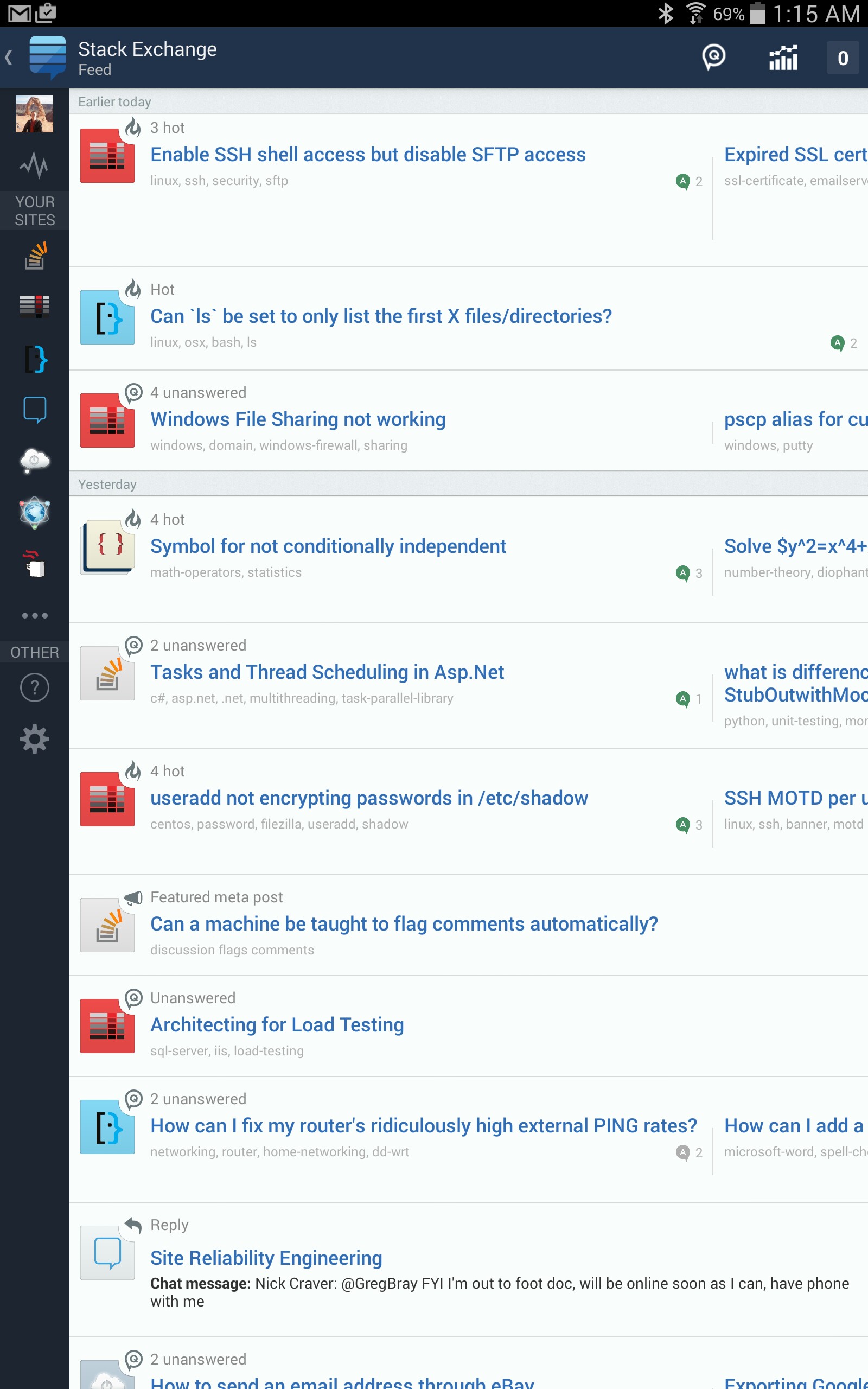
portrait screenshot

Seems like setting a "max width" for the first question would look better on wide screen devices, as you could see more of the second question.

Keep up the great work!

3
  • 1
    This should be posted in the section you linked as answer.
    – nicael
    Commented Dec 20, 2014 at 8:52
  • @nicael Feature requests and bug reports on meta can be done in the question body. There is no reason to use an answer in this case as the answer section will be used for feedback on the suggestion.
    – Caleb
    Commented Dec 20, 2014 at 10:05
  • As the mobile apps are no longer supported I'm closing this as no longer reproducable.
    – Luuklag
    Commented Feb 22, 2022 at 8:40

1 Answer 1

2

This is a great idea. The Android feed hasn't been touched much for the initial tablet release, and this would be a good quick way to make it look a whole lot nicer.

The iPad version subscribes to the idea that "on a tablet the feed shouldn't scroll horizontally at all", so instead of having the 3 hot questions at the top of your screenshot on one row each one of them has its own container and if it doesn't fit width-wise it uses two rows instead. We might do this on Android in the future too but for now this is a great way to make the feed fit the screen-factor better.

Not the answer you're looking for? Browse other questions tagged .