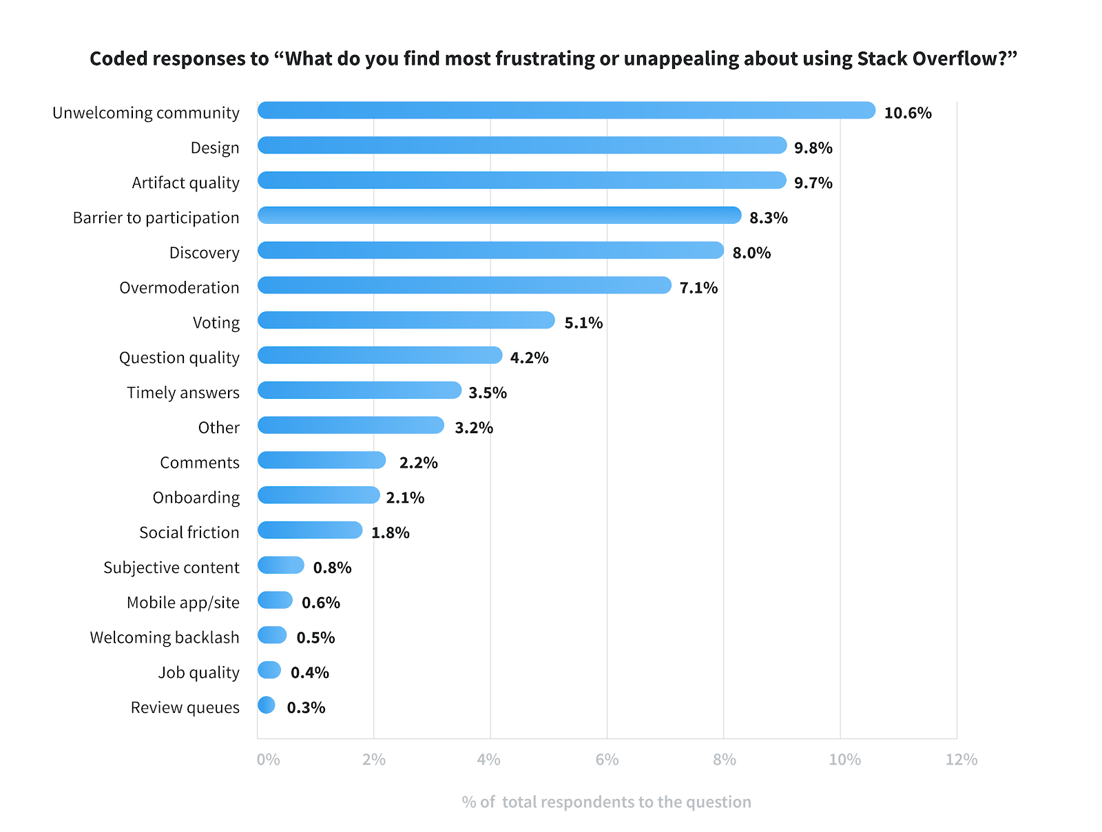
The latest blog post, "The Loop #2: Understanding Site Satisfaction, Summer 2019", contains a graph showing percentages of responses to the site satisfaction survey:
Coded responses to "What do you find most frustrating or unappealing about using Stack Overflow?"
Unwelcoming community 10.6%
Design 9.8%
Artifact quality 9.7%
Barrier to participation 8.3%
Discovery 8.0%
Overmoderation 7.1%
Voting 5.1%
Question quality 4.2%
Timely answers 3.5%
Other 3.2%
Comments 2.2%
Onboarding 2.1%
Social friction 1.8%
Subjective content 0.8%
Mobile app/site 0.6%
Welcoming backlash 0.5%
Job quality 0.4%
Review queues 0.3%
However, if one cannot see images - such as someone using a screen reader, or has images disabled - the information contained on the chart is inaccessible.
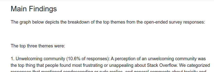
When someone has images disabled, all that shows up is a blank space where the image is placed in the blog post:
...showing that there is no alt text for this image.
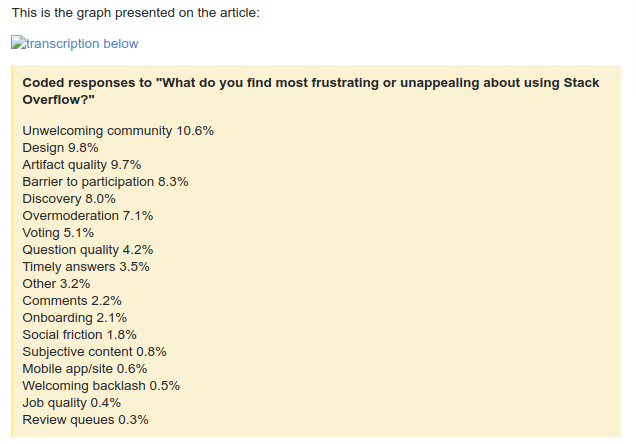
However, in the meta post Can we have the dataset for the loop #2?, for example, (and, uh, in this post above,) the image is included along with a textual transcription:
Could you please include text descriptions and alt text of images in official communications and blog posts?


