26

Clippycorn is a pretty obnoxious fellow, popping up all the time and saying stuff. After a while, though, you realise that half his comments are actually useful. Maybe not to you that much, but they would be useful to a newbie

What I propose is that we keep Clippycorn--in a less obnoxious form. Expand his vocabulary to other help messages, and prune all the April Fools' stuff. Also get rid of the Microsofty feel. There, you have a tool that's actually quite useful for newbies!

To make him less obnoxious, we ought to get rid of the clippycorn (sniff) and turn him into an expandable dropdown/tooltip or something. Maybe prune down the obvious stuff as well.

Since most of SOs users are tech-savvy, it may not be that useful on SO, but the rest of SE could certainly benefit from it. The faq isn't that useful all the time, and obviously we can't stuff it full of all the details. But we can stuff lots of links and helpful stuff into Clippycorn.

23
  • 4
    oh please no :(
    – Lix
    Commented Apr 1, 2012 at 12:04
  • 3
    @Lix: If he was made less obnoxious, it really would be a help. A UI redesign would be required, though.. And make it a bit less intrusive. Other than that, what's wrong with keeping it?? Commented Apr 1, 2012 at 12:06
  • @downvoters did you guys downvote just by reading the title or do you genuinely disagree with the actual proposal? (the bolded stuff) Commented Apr 1, 2012 at 12:07
  • 13
    Man, now I am going to get blamed for this.
    – Cody Gray
    Commented Apr 1, 2012 at 12:07
  • @TheEstablishment: Should I make it a bit more serious? Or should I remove your name from it? I really do think that it would be pretty useful in a less intrusive form. Commented Apr 1, 2012 at 12:08
  • 1
    Ok - it was ME first of all... I do not like this idea... Now that that's out of the way - Users who use this site on a regular basis do not need to be "helped" when performing simple actions like searching... Its fun, its funny but it is no way needed - we have the faq. For me at least - doesn't matter how unobtrusive the "clippy" inspired character is - its using up valuable screen real estate...
    – Lix
    Commented Apr 1, 2012 at 12:08
  • 2
    @Lix: I said to make it less obnoxious. A little note that slides from the bottom of the screen Need help?--click to expand or something would be nice. No, I do NOT want a clippy-like thing, just the functionality of the clippylike thing. And yes, maybe the easy stuff like search help could be removed. Remember that a lot of SE functionality isn't in the faq. I usually have to search meta when I want to check out how something works. Commented Apr 1, 2012 at 12:11
  • @theE - I think I'll change my name to "disestablishmentarianism" if you keep suggesting silly things to people ;)
    – Lix
    Commented Apr 1, 2012 at 12:13
  • @man - ok...possibly if it was stripped down, hidden away and only ever displayed to new users then I guess it might be feasible... But think about it for a second - the users on this site are (supposed to be) tech savvy - don't you think it would slightly be insulting their intelligence? "The system has detected that you have no idea what you are doing! Why not try..."
    – Lix
    Commented Apr 1, 2012 at 12:16
  • As a side note - while trying to re-read these comments - something was blocking me!!!!!
    – Lix
    Commented Apr 1, 2012 at 12:18
  • I love unicorns, but HATE anything that "pop's up" and blocks content I was looking at!
    – Lix
    Commented Apr 1, 2012 at 12:19
  • 3
    Just as a note, not intended to convey support in one direction or the other: Clippycorn is appearing on all SE sites, not just Stack Overflow. And we don't necessarily assume a "tech savvy" audience on all of the SE 2.0 sites. I mean, sure, we assume web literacy. But there's a big chasm between being able to use Facebook and knowing how to program.
    – Cody Gray
    Commented Apr 1, 2012 at 12:21
  • 4
    @Lix umm... "Don't Bother Me Again" - look clear enough to me. Ever tried clicking it? :-D Commented Apr 1, 2012 at 12:24
  • @TheE - my favorite tag has nothing to do with this :P I understand you though - I realize that not everyone on the SE networks have liquid code running through their veins. However trying to assist someone on such a low level could be insulting...
    – Lix
    Commented Apr 1, 2012 at 12:24
  • 1
    @ShaDowWizArd: It's supposed to be a Microsoft feature. M-I-C-R-O-S-O-F-T. Since when was it so easy to make a microsoft feature shut up?? Commented Apr 1, 2012 at 12:26

3 Answers 3

17

Well, if you get rid of all the annoying bits, you don't really have "clippy" anymore. You have... context-sensitive help.

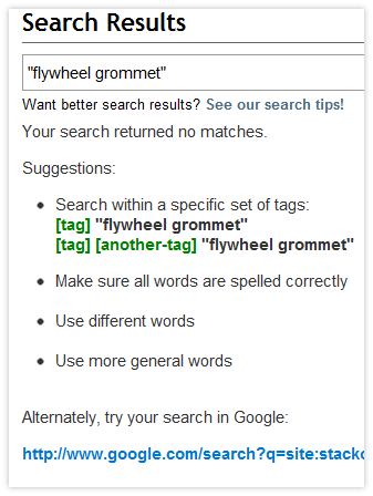
Which already exists:

Context-sensitive help for search when a query returns no results

Note how the suggestions shown for search are displayed only when a search fails, and thus don't intrude annoyingly under normal circumstances. There are plenty of other examples of this sort of UI on Stack Exchange...

If you have specific suggestions for how relevant information could be improved for a particular feature or activity, feel free to post them here on Meta.

7
  • Maybe the 'writing a good title' clippytip? Commented Apr 2, 2012 at 3:51
  • all education should be "just in time". We could do more on the focus event of the title field on the /ask page, I guess -- but we view that as the starting point for general help since the ask field is first-focused on load, not "how do I write a great title". Commented Apr 2, 2012 at 4:21
  • 2
    @Shog9, to be honest, I think the 'speech bubble' presentation would make a difference. What you have in your screenshot here scans as 'yada yada'. I think context-sensitive links to FAQ are maybe better than directly inline 'help' text.
    – Benjol
    Commented Apr 2, 2012 at 7:36
  • @Benjol, there might well be other formatting options that would work, but the "Agent"-style UI really does not. Speaking personally, I've had that clippycorn pop up at least 3 times today when I was already in the middle of navigating away from whatever I'd been doing - in other words, I'd already found something on the page that guided me to the next step. I used search as an example because it is the closest thing we have to the "looks like you're ... Try one of these bullets" format - that it does end up being a wall of text speaks to the ideal of reducing help to only what is needed.
    – Shog9
    Commented Apr 2, 2012 at 7:51
  • @Shog9: I agree with Benjol.. When you see a page with a bunch of text, you feel disinclined to read it (heck, I've never read the search help fully). On the other hand, a little tooltip or something that slides up from somewhere would be nice. It wouldn't clutter (have a click to expand or something), and it would be less intrusive. Commented Apr 2, 2012 at 8:25
  • 1
    To be fair, Shog, you're what would be considered an "expert user". The fact that you already found what you wanted before the Agent-style UI popped up doesn't mean that it wouldn't be useful to other people to present context-sensitive help in some alternative, instantly-recognizable format. I've never read that wall of text on the search page either.
    – Cody Gray
    Commented Apr 2, 2012 at 9:09
  • 1
    It's not just "expert users" who don't read, @The. Consider the "Ask Question" page - there's a big pink animated bubble for each input field with tips and resources for the asker... These are routinely ignored.
    – Shog9
    Commented Apr 2, 2012 at 13:20
12

It's a well thought out and well engineered* April Fool's joke. Let it go.

Too much fun and too many clippycorns lead to this:

enter image description here

*Well, maybe. Chuck Norris had a problem that even he had to call the support department about.

3
  • 2
    -1 Not enough free hand red circles.
    – Lix
    Commented Apr 1, 2012 at 12:39
  • 1
    @slug See the edited post--I'm not talking abut keeping clippycorn, I'm talking about preserving the functionality. Commented Apr 1, 2012 at 12:40
  • 2
    @Lix - fixed. Added some stars as well. Awesome.
    – slugster
    Commented Apr 1, 2012 at 12:47
5

OK, I was too late, my question was closed. Then this is my answer here:

I came upon this "parse HTML with Regex" question.

The user saw this (his comment):

Umm...just a bit of sidebar topic here: as I was typing this post (most of the way through), a weird unicorn graphic showed up on the right side of the page and, like MS Clippy, asked me if I wanted help parsing XML, and then sent me here: stackoverflow.com/questions/1732348/… When I came back to my post to take a screenshot of the unicorn, it was gone. Somebody please tell me that wasn't a hallucination. Somebody? Anybody? Hello?

This creature is magic! It knows when it has to appear and when the user needs help! (At least in this case).

I love this magic creature, knowing what the user wanted to do, bringing him to that weird answer to show him the way.

That user didn't understood, but please keep this nice, beautiful, helping, magic unicorn!

(at least for "parse html with regex" questions or with a working option to turn it off)

OK, I have to admit I was only for a short period active on SO yesterday, I personally saw it only once, but seriously I think it can be a great help for new users, much more visible than the FAQ or context sensitive help.

1
  • 2
    That thing is magic... It's creepy. I was reading this post and several others yesterday, and Clippy-corn popped up, saying something like, "You seem to be spending too much time thinking about this prank. Do you want to answer questions instead?" Commented Apr 2, 2012 at 11:08

You must log in to answer this question.

Not the answer you're looking for? Browse other questions tagged .