I just visited ux.stackexchange and here is what I saw. Is it possible for you to correct it?
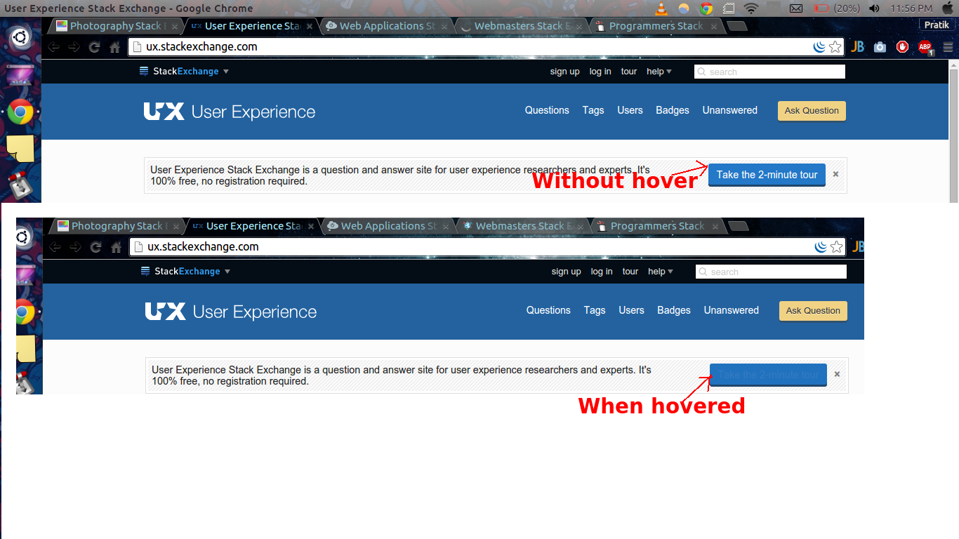
I experienced the same on another site too, webmasters.stackexchange
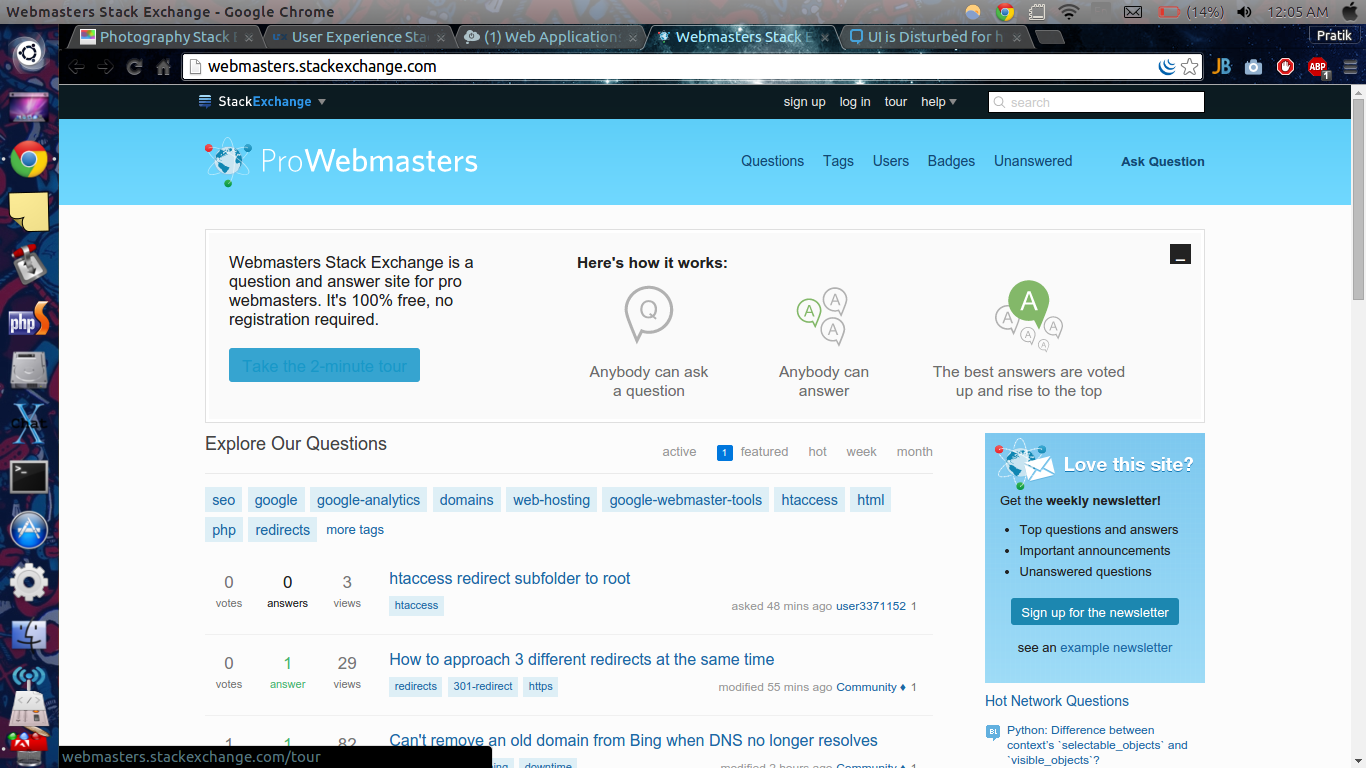
I just visited ux.stackexchange and here is what I saw. Is it possible for you to correct it?

I experienced the same on another site too, webmasters.stackexchange

This is a problem on a lot of sites. I'm going to make the guess that this has something to do with the site update that's sort of in progress... Different sites have slightly different... "issues".
To add to the issue, if you've "visited" the link, the colored font goes away. I'm guessing that the "unvisited hover" CSS is the issue.
Here are the ones I think are problematic (Chrome for OSX):



Here, you can see the orange darkens slightly and the text turns blue. This orange/blue combo is pretty... awful. If you've visited the link, though, the text stays white and the button darkens.


Here the entire button changes to blue and the text is a similar, barely legible blue.


This blue/red combo is also pretty awful.


Can't read this one, either.


Ubuntu gets underlined as well as having the text color change... to a nearly identical shade of red. The button color does not seem to change.

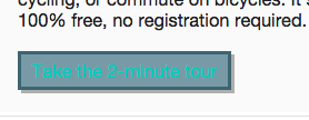
This one is at least still legible but after visiting the link, the text color doesn't change, so I'm guessing it's not really supposed to change here.


It's Christmas over on Biology, apparently.


Similar to Android but with bold text.


Well, this one's legible and doesn't quite make my eyes bleed... but no color change if link is visited, so I think that's the better option.


Same as Cross Validated.


Can't read that...

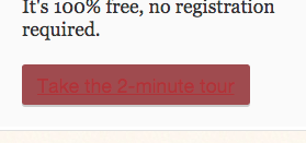
This one gets an underline, too.

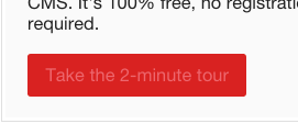
I can read this one, though it's close. If already visited, the text doesn't change, only the background darkens.


This one has a fun color-change but I'm pretty sure the text here should remain white. That's what happens when the link's been visited already.


The clash of the colors!


This raspberry hover text color is really pretty but I'm not sure it's intentional as the text color stays white if the link has been visited.


Same as Mathematica. Nice color but not sure it's intentional.


Clash-y blue and red again.


This blue isn't actually bad. It's the link color for the rest of the site and fits with the logo, seeing as the site is pretty neutrally colored but, when visited, the text stays white.


Is that orange? Whatever it is, it's not legible.


This one's almost legible but, again, pretty sure the text color shouldn't change as it doesn't if the link's visited already.


Gets an underline text decoration and a dark blue color that doesn't seem to be part of the site design.


The button color change seems to be intentional but I don't think the text color is.


This pink is sort of out of place here.


These colors are so similar it's really difficult to read.


This is legible but it's not a great color match. As with others, the text remains white if the link's already visited.


The text is actually darker here, due to the button lightening. Still not very legible.
Some sites aren't affected at all by the hover effect, or aren't affected in a bad way:
The reason is that when you hover over the button, the color of the white text becomes a very similar color to the button's color, which is blue. This cannot be seen normally, you have to zoom in or have 20 out of 20 vision to see it.
This should be a easy fix, either the color of the button changes to something like red or the text color when hovered changes to another color that stands out/is different from the blue used.