16

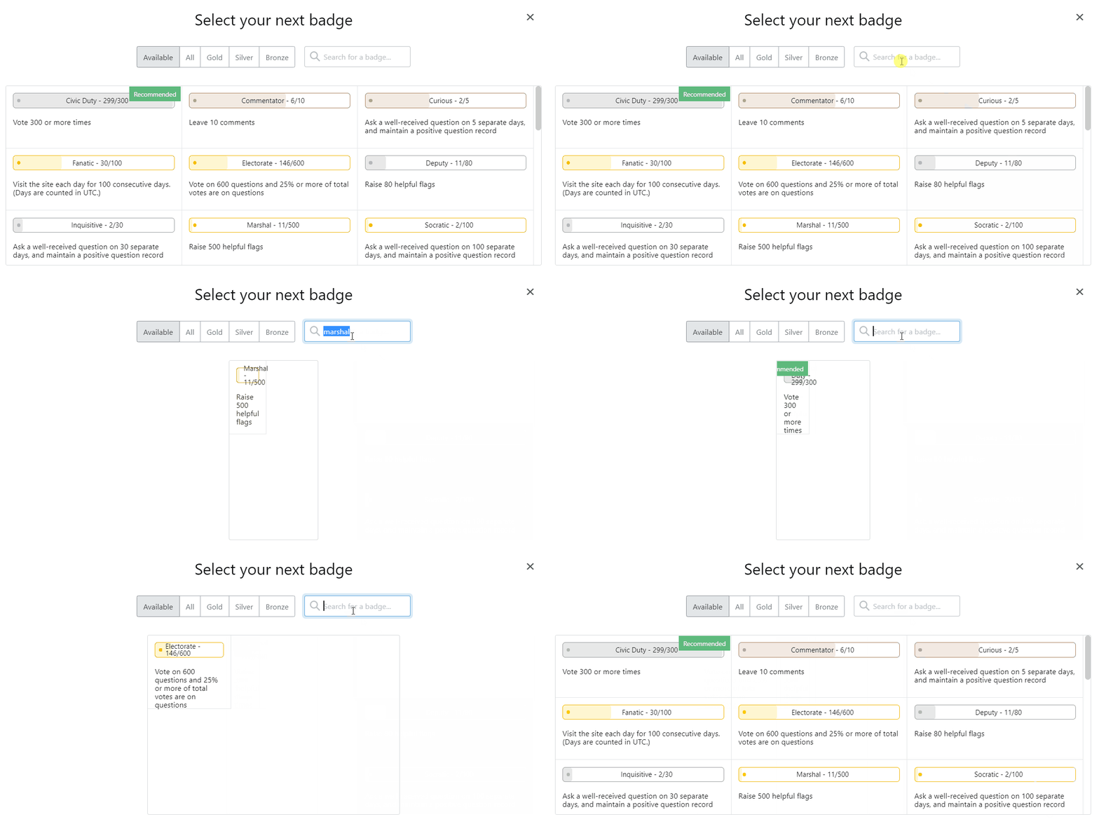
When searching for a badge in the "Select your next badge" modal, the badge width and positioning are incorrect sometimes. The examples below are on Meta Stack Exchange and Stack Overflow:

A gif showing different searches on 'Select your next badge' modal. When searching for a badge, its width may be tightened and the number of done/required actions can overflow the progress bar.

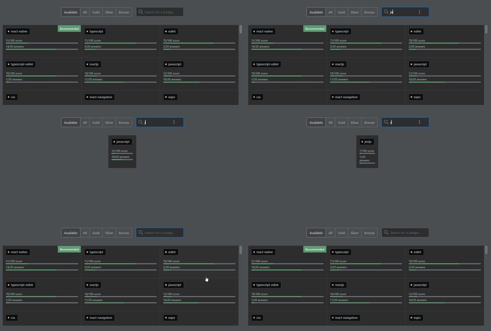
A gif showing different searches on 'Select your next badge' modal. When searching for a tag badge, it may be tightened into different widths for different badges, depending on the tag name.

Even when the search returns three badges, the total width is different from when the modal is unfiltered:

'Select your next badge' modal with three visible badges, but they have a smaller width and they are centered

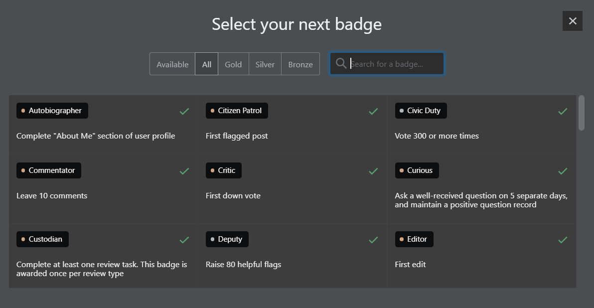
The modal displaying all badges is like this:

'Select your next badge' modal with all badges displayed, three badges in each row, occupying the whole modal width

4
  • 7
    It is assumed at least 3 badges are returned ... assumptions sometimes are wrong ...
    – rene Mod
    Commented Jul 14, 2021 at 18:03
  • 4
    Also reported on MSO: Badge style is broken when filtered to one. Commented Jul 19, 2021 at 12:32
  • [status-no-repro] here on MSE, as in that the size of the box does change, but it is responsive to the contents within, so nothing is lost. Seeing that the page needs to be reworked to become responsive, it will probably be fixed by the end of this year.
    – Luuklag
    Commented Jul 20, 2021 at 8:04
  • I closed this as a duplicate because a similar bug was reported as a mobile bug here and, after its [status-completed], the UI changed completely and thus it doesn't happen anymore. Commented Jan 4, 2022 at 20:19

0

Browse other questions tagged .