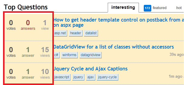
It just seems wrong. In my opinion it looks awful. Will it be like that from now on? :S
15 Answers
An alternative has been pushed. Now unanswered questions are again identifiable as they are the only one without a box. Usability has been restored. Thanks.
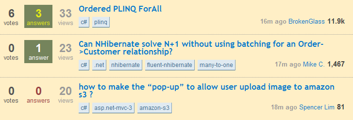
It drastically hurts usability. Change it back, or find an alternative.
Especially on a favored tag, the unanswered block is indistinguishable from an answered block.
The other changes so far (envelope, cross-site notification) actually improved usability. This change decreases site usability.
Yes, the old version may have been ugly, but it was usable. I'm sorry, but I'll chose usability above beauty every time.
Users looking for specific answers come from Google, not from the front page... The front page is used by people wanting to answer questions. Leave them the power to find questions to answer fast. Unanswered questions should have emphasis like it had before.
Having unanswered questions not in emphasis increases the efforts required for someone to find an answer they can answer. If the efforts increase, the number of answers will decrease.
-
Well, the actual text color is different but I do agree that the difference is not pronounced enough Commented Mar 17, 2011 at 19:23
-
14@Daniel DiPaolo: Depending of the type of screen you use and the lighting conditions in your office, they are truly indistinguishable. Commented Mar 17, 2011 at 19:24
-
4I kind of like the way that Accepted-Answer questions stand out more, but now it seems like Answered (but not Accepted) and Unanswered questions are harder to tell apart. (Other than the big red zero, of course.)– drudgeCommented Mar 17, 2011 at 19:30
-
10@jnpcl: Personally, Accepted-Answer should be the least visible. Don't you want to put the emphasis on unanswered questions? I believe Stack Exchange is about answering questions... Commented Mar 17, 2011 at 19:32
-
Just invert the colors of
.unanswered
: i.imgur.com/htmVT.png– drudgeCommented Mar 17, 2011 at 19:33 -
1
-
19If it's red and green being used, I'd like to point out that a non-trivial part of the population is red-green colorblind: blog.yapb.net/post/2010/02/02/Design-for-ColorBlindness.aspx. Commented Mar 17, 2011 at 19:36
-
-
@Andrew: Huh, I thought the "Answered but not Accepted" ones had a background-color as well.– drudgeCommented Mar 17, 2011 at 19:50
-
1@AndrewMoore Think of the anon. user too - if you're just browsing the site, why would questions with no answers be interesting to you? The answers are (usually) more useful to them– Yi JiangCommented Mar 17, 2011 at 19:52
-
15The majority of anon users looking for answers are going to land on the page from a Google search, it makes no difference to them whether the front page unanswered questions stand out. People visiting the front page are going to be regulars who are there to answer questions. Unanswered questions need to stand out more. The new look is awful. Commented Mar 17, 2011 at 20:05
-
-
@George Stocker: It doesn't matter as the lettering is there to indicate them if it is answered or not. The current color scheme is also affected by color-blindness. Commented Mar 17, 2011 at 20:20
-
7Unanswered questions have 0 answers. Answered questions have 1 or more answers. Do we really need colors to support the counts? Admittedly, colors are very helpful for quick scans, but this is imo a bit exaggerated.– user138231Commented Mar 17, 2011 at 22:47
-
1With answered questions still highlighted in green, it seems like the designers are intentionally de-emphasizing the questions without answers (and not just assuming you don't need background color for emphasis). I agree with Andrew - most visitors to the front page are scanning for unanswered questions (and not just questions without a chosen answer).– MayoCommented Mar 18, 2011 at 12:55
I don't necessarily think it should be changed back per se if the change was to improve cosmetics. I do, however, feel strongly that more differentiation is needed between questions with out answers and questions with answers.
-
12
-
I agree. I like the idea of having a red background on unanswered questions just like green is on the accepted answer questions. It's the closest thing that I have to a "new" indicator. Commented Mar 17, 2011 at 20:38
-
It'll grow on you because of the subtle color changes that are already happening as we speak! Commented Mar 17, 2011 at 20:19
-
5@Dan, perhaps. Nonetheless it's getting better. People need to be more tolerant of change.– jjnguyCommented Mar 17, 2011 at 20:23
-
3This is exactly the comic I think of when I compare us to Facebook users Commented Mar 17, 2011 at 20:37
-
Totally agree. I like it. It will take some getting used to, but it looks great.– PekkaCommented Mar 17, 2011 at 21:09
-
-
1That said, I really think we should give the design at least a try since we may be too used to the previous one and it may hurt your eyes the first few days, change is hard :)– TrufaCommented Mar 17, 2011 at 21:34
-
Facebook and Twitter usually give you the ability to try out a redesigned interface early. Commented Mar 17, 2011 at 22:02
-
@tvan true, but for this minor a design change? I was on board with people wanting the envelope back (still am) but I don't like this current tendency to cry out over every small detail. (Not accusing you of that - just looking at the entire thread)– PekkaCommented Mar 17, 2011 at 22:15
-
1Desensitisation is not remotely the same as something growing on you. Commented Mar 17, 2011 at 22:33
-
1I don't see the change as a problem. What bothers me is the 'naked' feeling. It is like icons without color, you can never remember for what they are used... It blends with the question mixing information that doesn't represent the same thing... It's weird...– BrunoLMCommented Mar 17, 2011 at 22:46
-
-
1@tvan, true. But this change is so tiny that it hardly calls for such a giant negative reaction.– jjnguyCommented Mar 17, 2011 at 22:48
-
+1 for using any form of graphics... I am easily amused. Commented Mar 17, 2011 at 23:53
-
Facebook is completely different to stackoverflow, and on facebook the changes they make are more important (to the facebook team) than just changing a box color, there was no need to change the a simple color, whereas on facebook the layout and the features are changed. Commented Mar 18, 2011 at 7:49
Really? After seeing some of the awesome work being done on the new site designs, I've been meaning to ask for SO's look to get a little bit of attention. I was hoping that this was just a first step.
-
4Don't forget my personal favorite-looking, the apple stackexchange– BlueRajaCommented Mar 17, 2011 at 20:17
-
2I support this answer, loved the other beautiful layouts. Commented Mar 17, 2011 at 20:20
-
4I find many of those site designs as sub-par compared to SO. I'm not a big fan of the cutsiness either.– GabeCommented Mar 17, 2011 at 20:28
-
4This is of course another exercise to get SO users desensitized to moved cheese. Jin moves in when the din dies down. Commented Mar 17, 2011 at 20:33
-
2I agree. Let's make it pretty but please keep us informed and ask if we like it or not. The current color scheme is a headache maker Commented Mar 17, 2011 at 20:34
-
You can improve the layout without hurting usability. Find a way that fits with the layout to make unanswered questions more visible. Right now, this change is a major blow to the site's usability as far as answering questions goes. Commented Mar 17, 2011 at 20:51
-
1@Bill this is a first step forward. That's according to Jin. Commented Mar 17, 2011 at 21:37
-
@BlueRaja - Gotta admit, that looks like one of the best skins I have seen so far - beautiful! Commented Mar 17, 2011 at 22:45
-
1It might work on other websites, but on SO I get the 'naked' feeling. Feels like something is missing, the information doesn't get enough value, just like @Matt mentioned on his answer...– BrunoLMCommented Mar 17, 2011 at 22:49
User Styles for those who want an improved readability or just to go back to the original:
Original theme:
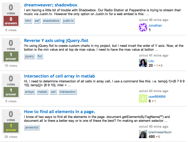
http://userscripts.org/scripts/show/99219
Modded with light background and black text:
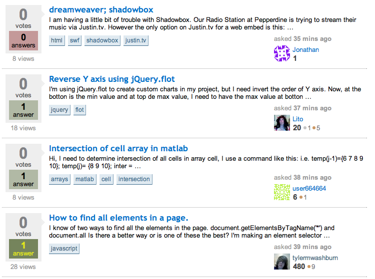
http://userscripts.org/scripts/show/99221
Open to suggestions or requests
-
10
-
-
@Myles: Ahh, indeed. Someone must have slipped me decaf this morning. -_-;– drudgeCommented Mar 17, 2011 at 19:55
-
how about put a highlight border on the tags that you are interested in Commented Mar 17, 2011 at 19:55
-
@jnpcl pah decaf! I just had a sex-tuple espresso... who needs cocaine eh? :P You're luck the colour scheme i suggested was so moderate and not in negative :D Commented Mar 17, 2011 at 19:58
-
@kjy112 that is still in place, i just hadn't highlighted any Commented Mar 17, 2011 at 19:58
-
-
Still too red, the point was probably to make it less obvious that a lot of questions have no answer. How about a subtle grayish blue? Sad question color. Commented Mar 17, 2011 at 22:15
-
@HansPassant Ill mock something up along that line, but to be fair, It NEEDS to be obvious, people coming from Google get linked to the question not the SO homepage only answerers use the homepage, and what do we want? Unanswered questions. Commented Mar 17, 2011 at 22:17
-
I think user scripts is over complicating things. Before we know it we'll have a profile page like myspace did, and we all know how that ended.. Commented Mar 18, 2011 at 22:32
I don't even remember what the old one looked like...
Granted, with the television I don't remember what I did 8 seconds ago, but still.
I don't even remember what the old one looked like...
-
1I can tell you what it looked li...<headswivel>...squirrel! Commented Mar 18, 2011 at 2:16
-
2
-
2This. I saw this discussion, went to the SO homepage, and went - and I quote - what? What changed? Why are people upset? Tempests in teacups like this one just make it less likely for legitimate complaints to be taken seriously.– AarobotCommented Mar 18, 2011 at 14:47
New layout is unreadable for me. And I believe that majority of users will agree that new layout is at least less readable.
There are three equally sized numbers and now there is an effort needed to distinguish number of votes and number of answers.
Question title size is decreased so less questions will fit on one screen
And finally the worst change: number of views increased size. What is the argument for making number of views important as number of answers?
Are there any measurements or A/B test?
I guess it is just a designers whim?
Jeff or designer, please explain your motivation.
-
1Absolutely agree about # of views. It's not needed on the front page at all. Commented Mar 17, 2011 at 21:44
-
7question title text size was not changed; number of views size was not changed Commented Mar 17, 2011 at 23:00
-
@Jeff Atwood: I apologize, then it's just visual effect of the change.– zendarCommented Mar 17, 2011 at 23:23
It seems that this has been, at least to some degree, altered.
Questions with answers now have blocks. Questions that have absolutely no answers have no blocks. So now you go from looking for a red block, to simply noticing a very stand-out lack of a block.
-
-
I noticed this as well. Unfortunately I liked it better when it was all naked. Oh well. As Jin said, this is just a first step. (And it really isn't bad. I just liked naked better.)– jjnguyCommented Mar 18, 2011 at 13:51
-
2Well, now questions with accepted answers are harder to distinguish from questions with answers of which none is accepted. Especially on meta. Oh, whatever ;)– user138231Commented Mar 18, 2011 at 14:18
-
1@BalusC Isn't the difference between the two right now the same as it used to be? Also, Meta uses a green box for an acceptance and a grey box for no acceptance... perhaps the grey just happens to be the wrong shade and might be indistinguishable, though. Commented Mar 18, 2011 at 14:19
The new colors are indistinguishable for those with red-green colorblindness - which affects more than 5% of the male population. Please make either the red one, or the green one darker so there's a distinct contrast when color information is lost.
-
1The giant
0
on unanswered questions doesn't give it away that there's a difference between it and the other questions with answers?– user149432Commented Mar 17, 2011 at 23:50 -
1@Mark: Compared to how easy it was before, no, the zero is by far not "giant" enough. Commented Mar 18, 2011 at 1:49
-
2@Mark When you're scanning the page quickly it's easier to pick out something in a distinctly different color/contrast than it is to parse the numbers and pick out those that are actually 0. Scroll the page, and you'll have a hard time knowing whether what you just saw was a 0 and not an 8, but if the red stood out more than the green, then it would be easy. Honestly, though, this particular point is not a big deal. I'm pointing it out not to request it be changed so much as to encourage them to include color blindness as a test for future design decisions. All designers should. Commented Mar 18, 2011 at 3:09
-
The newest change may alleviate this - the difference is now less on color, more on shape. Color still figures into "accepted vs. unaccepted", but I don't know how much yellow vs. white impacts this. Commented Mar 18, 2011 at 14:03
Best change yet.
Heck, you don't even need to color the number: perhaps the reason why people can't tell the difference between the red and green numbers now is because the color doesn't add any additional semantic information.
That is, the original colored box was just superfluous: a giant
0
is visually distinctive from all the other numbers that could appear in that area. If you see a giant zero, there are no answers. You don't need to figure out what the color is.
Maybe they should call it StackAlbino now.
It has definitely decreased usability for me.
It's like looking at old green-sheets where everything blends into each other.
Here's a screen shot of when it's all white:
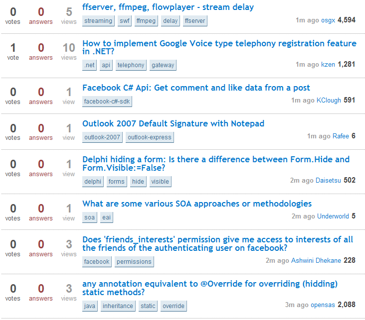
-
shouldn't unanswered questions look naked? They are bereft of answers. Commented Mar 27, 2011 at 10:13
-
I read a book many years back by Steve Krug called Don't Make Me Think. And I'm reminded of the lessons in that book when I see these design updates on stackoverflow.com. The previous design was more intuitive and made things more clear at a glance.
That said, why can't we use technology to come up with a solution that everyone likes? Allow folks to choose a template via preferences.
Much more difficult to scan quickly -- loss of usability ... ugh.
On a related note, this got me to install greasemonkey, and one of the userscripts above to restore the colors. I hope someone takes a whack at restoring the box positions / views to where they were but I imagine that may be more difficult.
I'm not sure what GM allows/doesn't allow one to do, but I have a feeling its possible!
-
1
Hopefully this is constructive.
I am all for rejigging things. The Tagged Questions page can do with more distinction. Bill's answer points to site redesigns that sort of works - at least in two columns, you can still see the 0-answers.. somewhat.
When searching within a Tag or multiple, the votes/answers are collapsed into a single column, blurring the distinction.
Also, I think it better to have the ANSWERS in larger font than VOTES (question), since it is more important piece of information? The range of votes on new questions is invariably 0-1 (90-97%) so there is no real value in making it large.
I Like It.. Keep Going...
I like it so far, maybe the green and red can be darker. But it would be nice to keep going and give SO a full face lift. I mean just look at some of the other SE sites. programmers.SE, math.SE, cooking, apple, they look awesome.
No offence but SO looked dull and still does when compared to the other sites and its the first and most active site.
-
You're saying SO looked duller before than it does after this change? We can argue about usability, but the new styling is drab. Commented Mar 18, 2011 at 9:48
-
I just find that there is less red...not too much of a diff.. But I'm just hoping they're working on an entire face lift.. because common, SO looks so bad compared to some of the other sites. Just have a look at the programmers.SE badges.. the actually shine!!– gideonCommented Mar 18, 2011 at 9:57