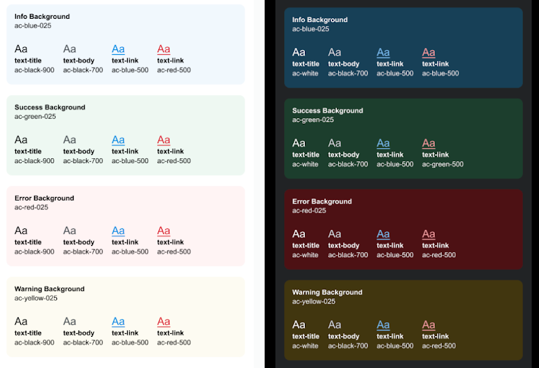
We all know that color is not the same as mathematics but rather is related to perception. But in such large projects, there should be a balanced relationship between data and perception.
I personally see a big jump between colors on a light and dark mode:
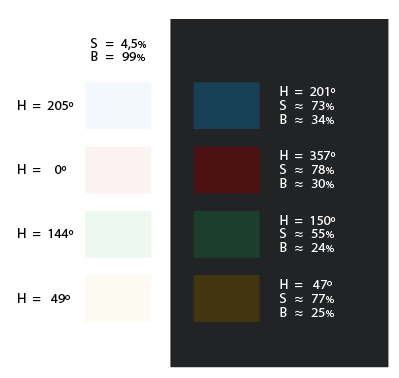
Analyzing a screen capture, I find that the light colors adjust to one tone each and then maintain approximately the same saturation (≈ 4.5%) and brightness (≈ 99%), while in the colors on a dark modee the saturation varies between a 55/80% and brightness between 24/35%:
The next step in perception is to analyze the relationships, in this order:
- Colors with respect to the background
- Colors among themselves (H)
- Saturations and brightness
Perceptually, the colors on a light theme conform to a somewhat dusty pale-pastel pattern, while on a dark theme the different saturations make cohesion difficult.
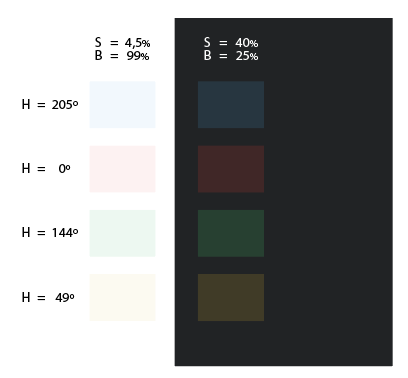
After looking for a base pattern keeping the same tone and trying to give the color on a dark background a reading similar to that of the relationship on a light background, performing the same exercise as with light colors of respecting brightness and saturation, the result is perceptually more balanced:


