edited tags
Link
added 47 characters in body
Source Link
Justin
  • 9.6k
  • 1
  • 24
  • 70

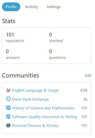
When users have accounts on sites with long names (for example, History of Science and Mathematics) and have them displayed in the visible communities list in the Profile tab, the width of the left column increases:

enter image description here

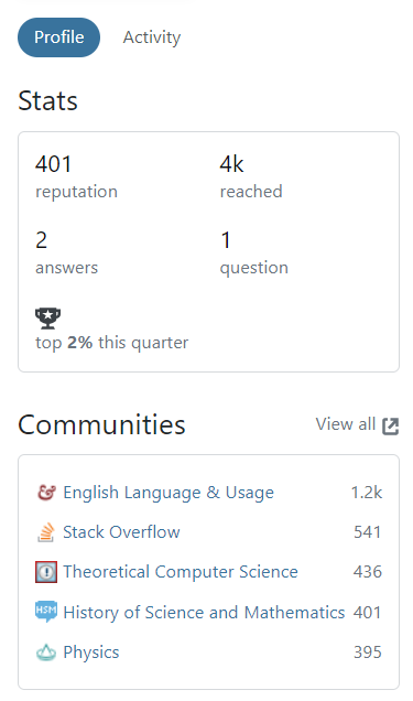
An example from someone else's profile:

enter image description here

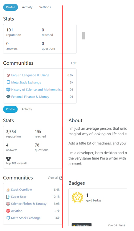
Comparison for reference:

enter image description here

Long siteSite names that cause the width of the left column to increase should be truncated so that the spacing is consistent whether a user has longsuch site names displayed or not.

Example of truncation:

enter image description here


Note: This problem also occurs when a site with a long name appears in the "Hidden communities" section, but it will only look weird for users who can see that section of the user's profile (i.e. the user themself, as well as moderators of the site where the profile is being viewed). The column width will look normal to everyone else.

When users have accounts on sites with long names (for example, History of Science and Mathematics) and have them displayed in the visible communities list in the Profile tab, the width of the left column increases:

enter image description here

An example from someone else's profile:

enter image description here

Comparison for reference:

enter image description here

Long site names should be truncated so that the spacing is consistent whether a user has long site names displayed or not.

Example of truncation:

enter image description here


Note: This problem also occurs when a site with a long name appears in the "Hidden communities" section, but it will only look weird for users who can see that section of the user's profile (i.e. the user themself, as well as moderators of the site where the profile is being viewed). The column width will look normal to everyone else.
When users have accounts on sites with long names (for example, History of Science and Mathematics) and have them displayed in the visible communities list in the Profile tab, the width of the left column increases:

enter image description here

An example from someone else's profile:

enter image description here

Comparison for reference:

enter image description here

Site names that cause the width of the left column to increase should be truncated so that the spacing is consistent whether a user has such site names displayed or not.

Example of truncation:

enter image description here


Note: This problem also occurs when a site with a long name appears in the "Hidden communities" section, but it will only look weird for users who can see that section of the user's profile (i.e. the user themself, as well as moderators of the site where the profile is being viewed). The column width will look normal to everyone else.
edited title
Source Link
Justin
  • 9.6k
  • 1
  • 24
  • 70

Long site names shown in the visible communities in the Profile tab are not truncated, resulting in an increase in the width of theinconsistent left column-column widths

When users have accounts on sites with long names (for example, History of Science and Mathematics) and have them displayed in the visible communities list in the Profile tab, the width of the left column increases:

enter image description here

An example from someone else's profile:

enter image description here

Comparison for reference:

enter image description here

These longLong site names should be truncated so that the spacing is consistent whether a user has long site names displayed or not.

Example of truncation:

enter image description here


Note: This problem also occurs when a site with a long name appears in the "Hidden communities" section, but it will only look weird for users who can see that section of the user's profile (i.e. the user themself, as well as moderators of the site where the profile is being viewed). The column width will look normal to everyone else.

Long site names shown in the visible communities in the Profile tab are not truncated, resulting in an increase in the width of the left column

When users have accounts on sites with long names (for example, History of Science and Mathematics) and have them displayed in the visible communities list in the Profile tab, the width of the left column increases:

enter image description here

An example from someone else's profile:

enter image description here

Comparison for reference:

enter image description here

These long site names should be truncated so that the spacing is consistent whether a user has long site names displayed or not.

Example of truncation:

enter image description here


Note: This problem also occurs when a site with a long name appears in the "Hidden communities" section, but it will only look weird for users who can see that section of the user's profile (i.e. the user themself, as well as moderators of the site where the profile is being viewed). The column width will look normal to everyone else.

Long site names shown in the visible communities in the Profile tab are not truncated, resulting in inconsistent left-column widths

When users have accounts on sites with long names (for example, History of Science and Mathematics) and have them displayed in the visible communities list in the Profile tab, the width of the left column increases:

enter image description here

An example from someone else's profile:

enter image description here

Comparison for reference:

enter image description here

Long site names should be truncated so that the spacing is consistent whether a user has long site names displayed or not.

Example of truncation:

enter image description here


Note: This problem also occurs when a site with a long name appears in the "Hidden communities" section, but it will only look weird for users who can see that section of the user's profile (i.e. the user themself, as well as moderators of the site where the profile is being viewed). The column width will look normal to everyone else.

added clarification; edited tags
Source Link
V2Blast StaffMod
  • 7.8k
  • 4
  • 37
  • 78
Loading
edited title
Link
Justin
  • 9.6k
  • 1
  • 24
  • 70
Loading
edited body
Source Link
Justin
  • 9.6k
  • 1
  • 24
  • 70
Loading
edited body
Source Link
Justin
  • 9.6k
  • 1
  • 24
  • 70
Loading
Found the source of the problem and update the post
Source Link
Justin
  • 9.6k
  • 1
  • 24
  • 70
Loading
added 12 characters in body
Source Link
Justin
  • 9.6k
  • 1
  • 24
  • 70
Loading
added 67 characters in body
Source Link
Justin
  • 9.6k
  • 1
  • 24
  • 70
Loading
added missing word; changed images to medium format with links to original sizes for improved readability
Source Link
Joachim
  • 9k
  • 2
  • 21
  • 67
Loading
Source Link
Justin
  • 9.6k
  • 1
  • 24
  • 70
Loading