34

The per page "label" at the bottom of Questions pages looks clickable (and changes color when you hover over it)

enter image description here

And the effect when you hover over it:

enter image description here

Except... it doesn't actually do anything when you click it. Can it be made to look "not clickable"? Something like this maybe (taken from the Wayback Machine)

enter image description here

This happens on the questions page (tested on Ask Ubuntu and stackapps)

I don't see a good reason for it to have a hover effect and look like it does something if it does nothing.

3
  • 6
    Yeah that's plain ugly and a bad UX. But I'm almost sure it wasn't like that before, so adding a bug tag. Either there was no label at all, or it was normal label, and turned ugly due to some recent "change". Commented Dec 9, 2022 at 8:03
  • 1
    @ShadowTheKidWizard I’m pretty sure it was always like that. Commented Dec 9, 2022 at 10:18
  • 2
    The offending CSS selector is .s-pagination .s-pagination--item.s-pagination .s-pagination--item__clear when it should probably be .s-pagination .s-pagination--item.s-pagination--item__clear. I would assume they're using SCSS or LESS and they have a nested &&__clear instead of &__clear somewhere Commented Dec 11, 2022 at 5:23

3 Answers 3

10

Update: A fix has been shipped to production.


This is a bug! It was introduced after we deployed an update to our Stacks dependency on December 1st.

I've shipped a fix to Stacks and created a pull request in the Core Stack Overflow codebase, but this will probably not be shipped before we halt deploying changes until the new year. I'll update this post when the fix is deployed.

Thanks @cocomac for the report, @zcoop98 for the confirmation, and sorry for the delay!

2
  • "not be shipped before we halt deploying changes until the new year" - so what is the ETA? Mid-January 2023, or later? Commented Dec 15, 2022 at 8:40
  • 3
    The fix for this bug was reviewed and shipped just under the deadline, so we won't have to wait 🎉 If any other (non-critical) bugs arise from now until 2023, we'll need to wait until at least January 2nd for a fix to ship.
    – Dan Cormier Staff
    Commented Dec 15, 2022 at 14:21
16

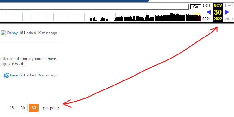
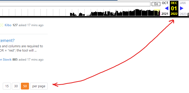
Looks like this specifically broke on December 1st, as confirmed by the Wayback Machine.
On November 30th at 02:02:21 GMT, it was fine:

Snapshot of the "per page" label from the Wayback Machine on 11/30 showing the label not being a button

And then, the next day, it was broken in the first capture of the day at 02:42:05 GMT:

Snapshot of the "per page" label from the Wayback Machine on 12/1 showing the label is now a button

5

Rather a comment adding to the original question: The same goes for the three dots on the left side of the page navigation that denote that there are more pages. Clicking on these dots has no effect, so the dots should not look like a button or link.

enter image description here

As already noted in the comments, all pagination items have the CSS class s-pagination--item, while the two items that are not buttons have the additional class s-pagination--item__clear which might originally be put there to un-style these items. However, no styles are linked to this class, so the two non-button items have the same style as the others, resulting in this bad UX.

A simple (but maybe semantically not overly clean) solution would be to define s-pagination--item__clear in such a way that the two non-button items are not styled as the other items. (And by checking the filed issue at GitHub, I just see at this very moment that this already has been done.)

You must log in to answer this question.

Not the answer you're looking for? Browse other questions tagged .