-5

Now my meta top bar looks like this:

stackmetatopbar

It remind me too much of google's top bar, with these new grey icons, little "bubbles" and dark background.

On more occasions I saw sites trying to copy ideas from some part of a another site's design (which may be a natural thing to do).

But as a visitor at least my personal experience is, that I like if every site has it's own distinctive look. Either beacuse I just like them as they are, or making them resembling an other site just makes them visually too hard to distinguish (at a glance, for example). The result is that I "forgot" (not really, but have this strange feeling) where am I for a moment, and what do I do here. Or if this place was any different from google. I like if a site has an identity.

My question is is meta's top bar distinctive enough?


edit the argument came up in comments that a top-bar that's looking good on every different site theme is hard to make. But was there anything wrong with having a same-layout, different colors version? The old top-bar doesn't use the same colors, but it uses the same layout, and feel, and, it still manages (at least for me) to make you feel like you are part of the same network - without looking exactly the same. I'd even go as far to say that the variants are refreshing.

edit 2 Benjol points out that for example "in the case of Programmers, [the top bar] is evidently an integral part of the whiteboard" - ie. purposefully not the same as everywhere else. And for a fun reason!

edit 3 Deer Hunter adds that hovering is not an option on a tablet.

25
  • 21
    I dislike the black bar because the text within it is hard to read, and I'm glad Google got rid of it. Now I'm dismayed that SO is considering adopting it. Commented Nov 17, 2013 at 23:12
  • 1
    The black bar is part of the Stack Exchange global UI initiative. The point is that no matter which site you're on, the primary interface always looks the same. That's why all the form buttons were changed to black.
    – animuson StaffMod
    Commented Nov 17, 2013 at 23:15
  • 3
    The identity of each site is established by its own theme. The top bar is merely placed over the top of that theme. While the bar will look the same on every site, that's... kinda the whole point; each site will still get to keep its own theme, below that.
    – user102937
    Commented Nov 17, 2013 at 23:20
  • 3
    @animuson I understood this idea even with google. On the other hand, one thing is being dark, and another thing is using similar grey icons, and google-style "bubbles". Apart from all that: whether they are of the same color or not or whether this is even a good idea is not my question. My question is if the topbar design is distinctive enough for giving the site (edit) or the network an identity.
    – n611x007
    Commented Nov 17, 2013 at 23:20
  • 3
    Why does it need to be distinctive? (not that I'm saying it isn't) How about we give it some time and see if it's practical and functional first?
    – Bart
    Commented Nov 17, 2013 at 23:22
  • @RobertHarvey not saying that the top bar would rip the subsites of their identity in being part of the StackExchange network. Instead, my concern is whether the top-bar gives any or enough identity to the SE network at all. The concern is that it's looking similar to the top bar of google.
    – n611x007
    Commented Nov 17, 2013 at 23:23
  • 9
    It doesn't "look like Google" - there were probably thousands of networks that used a similar black bar before Google ever adopted it. It's also not about estsblishing an identity - that's what the logo is for. It's about creating a bar that looks the same everywhere but doesn't clash too much with the specific themes. You don't really have many options when it comes to globally themed top bars. You're kind of stuck with black or white, and personally I think black is a better choice.
    – animuson StaffMod
    Commented Nov 17, 2013 at 23:41
  • 2
    @naxa Downvotes on meta don't necessarily mean that question is bad, just that the premise of the question is disagreed with (i.e. we don't see this as a problem).
    – waiwai933
    Commented Nov 17, 2013 at 23:45
  • 1
    @animuson another thing I now know I miss is the "red glow" (or colored) circle for displaying inbox updates. It didn't look like google or facebook or microsoft. It was a SE-only thing. I think the "red glow" was more distinctive. Personally, for me, keeping the glow would feel like continuity, tradition, past and identity, even if new buttons are different.
    – n611x007
    Commented Nov 17, 2013 at 23:46
  • 1
    BTW if anyone misses the old google black-bar, it's here google.com/?noj=1 - just tag on ?noj=1 Commented Nov 18, 2013 at 3:21
  • 2
    Google implemented a top bar because they have lots of products tied to one account, we have lots of sites that affect and and need to motivate one account. There is a subtle, but immense difference there both in motivation and implementation. To be clear, we've had a top bar for a very long time, it just hasn't been anywhere close to as functional as we wanted when it comes to our needs and goals.
    – user50049
    Commented Nov 18, 2013 at 4:15
  • 1
    @RobertHarvey, not on Programmers it ain't.
    – Benjol
    Commented Nov 18, 2013 at 5:46
  • 1
    @Benjol: Hm? Programmers doesn't have the black bar yet.
    – user102937
    Commented Nov 18, 2013 at 6:09
  • 2
    @RobertHarvey, but everything (including your comment) seems to indicate that it will have. I'm disagreeing with your implying that the top bar is not a part of the site's theme - specifically in the case of Programmers, where it is evidently an integral part of the whiteboard.
    – Benjol
    Commented Nov 18, 2013 at 8:26
  • 3
    The new UI is UGLY. Hovering a mouse is not possible on a tablet. Commented Nov 18, 2013 at 10:33

3 Answers 3

17

I don't really like the black bar vibe in general. I do like the new functionality (although I miss the direct link to main, but I am getting used to the drop down), but the old look was cozy and distinctive.

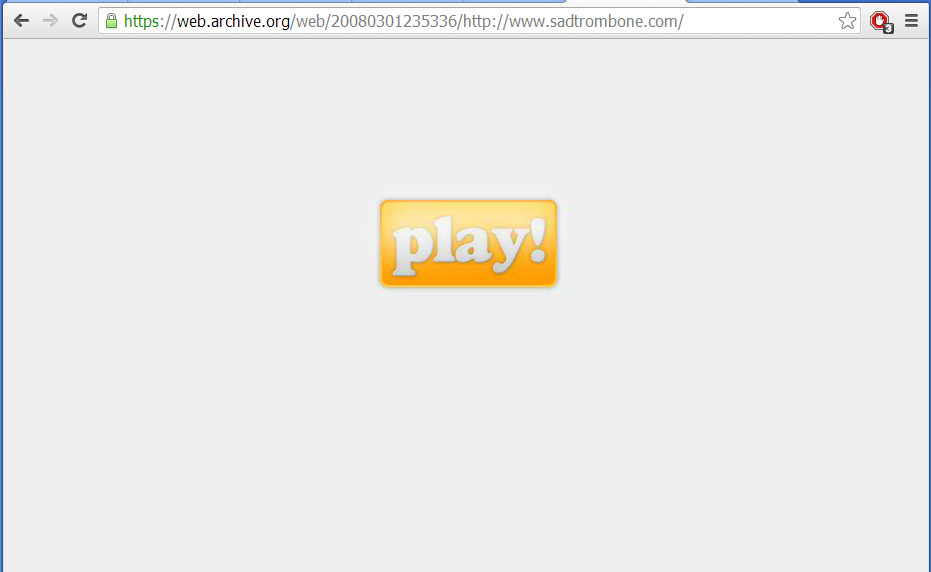
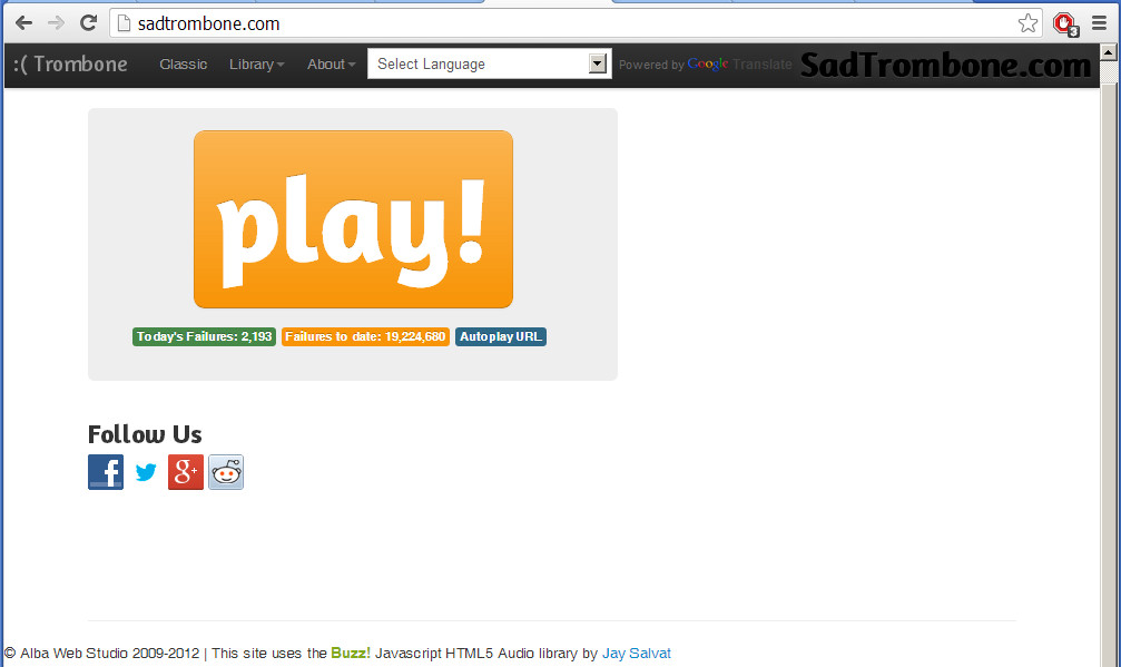
The new look reminds me of some random, unpopular blog/aggregate/whatever web site that only really exists to be some web designers portfolio piece. It's cold and bleak. It reminds me of when sadtrombone.com changed their look:

Old Site (Perfect):

enter image description here

New Site (All it needs is one of those crappy tag clouds on the side):

enter image description here

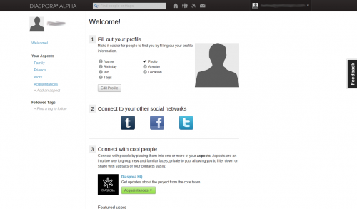
Another example of the vibe I get, Diaspora (supposed to be a Facebook competitor, ultimately another failed social media site):

enter image description here

I don't know. Perhaps I'm being prejudice, but I always associate the full-width, no-margin, black nav bar, white background theme with failed sites in the bleak corners of the internet.

It's sort of the hipster of design themes, tacked on by failing sites at the last minute to try and "look sleak and cool", maybe with a digg button on the side, in a frantic attempt to slow their inevitable slide into becoming a domain name parking site (complete with stock photo of smiling-woman-with-laptop-and-headset) or a Yahoo! portal front-end.

If you keep the black bar, whatever, but please for the love of god promise us you won't add a tag cloud. Those things are like the modern day equivalent of the poorly scaled animated GIF, or <marquee> or that Java applet water reflection text effect (AUUUUGHHHH!).


P.S. Smiling-woman-with-laptop-and-headset, if you are reading this, call me, maybe.

P.P.S. For the ladies.

5
  • 12
    "I always associate the full-width, no-margin, black nav bar, white background theme with failed sites in the bleak corners of the internet." WELCOME TO META
    – Pekka
    Commented Nov 18, 2013 at 3:35
  • But the "sad trombone" example is really very funny.
    – Pekka
    Commented Nov 18, 2013 at 3:35
  • 1
    @probablyPekka And very sad. I'm sure they don't appreciate the irony.
    – Jason C
    Commented Nov 18, 2013 at 3:37
  • 1
    Oh god. I just dug up janim.com. If you (can) watch the animation long enough, a ridiculous bird with flashing rainbow text behind it flies by. Can we have that on the nav bar?
    – Jason C
    Commented Nov 18, 2013 at 3:48
  • 3
    Everything LOL at the Smiling-woman-with-laptop-and-headset combo-image-set. Hey call me first !! Commented Nov 18, 2013 at 4:11
14

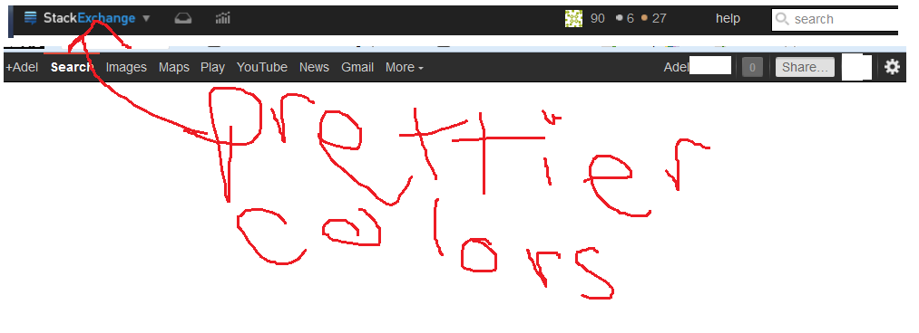
I always liked the easy on the eyes, less is more approach to the style here at stack exchange. There is a lot of contrast which occurs in the new top bar. I like the functionality, but I was kind of hoping for a more gentle color scheme.

Here is what a rollback of styling with the new features looks like. Food for thought...

Name and gravatar

;)!

Name only

unicorns!

4
  • 1
    userscript for image
    – Travis J
    Commented Nov 19, 2013 at 0:31
  • 3
    +2, that looks way smoother.
    – Jason C
    Commented Nov 19, 2013 at 8:52
  • I don't know guys, the only thing worse for contrast than gray on black is gray on gray
    – Jeremy T StaffMod
    Commented Dec 2, 2013 at 19:41
  • 1
    @JeremyTunnell - It is more of a link-visited on gray so it depends on the exchange settings. In this case, #7e4848 on #eee. However, I would like to point out that every tag on meta is themed the same way and no one has spoken up about the color scheme there nor the previous bar on meta. Light color on dark background is very harsh contrast-wise, see this post for some more information on color contrasts. The conclusion is that "Forcing users to fixate on the white text for a long time can strain the user's eyes."
    – Travis J
    Commented Dec 2, 2013 at 20:07
5

Well here's the thing: copying off of Google seems OK if you ask me. Google is Gooogle, synonymous with search. A verb, a noun, etc.

But it's hard to say that Meta is doing copypasta, rather they're borrowing the idea of "white on black"

A comparison:

enter image description here

Which isn't trademarked by Google, btw. KhanAcademy has always delivered videos with the white-on-black style.

enter image description here

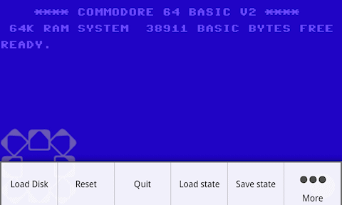
And how about old-school computers? My first PC memories were of dark DOS screens on the 486

enter image description here

4
  • 3
    by the way, I'm ducking the internet now, not going to google it anymore
    – n611x007
    Commented Nov 18, 2013 at 6:12
  • 1
    just to clear up, no copypasta is accused. Design choices are getting limited if you keep putting certain things on the requirement list. However adding functionality could just do without changing the style and feel of the design of this Common Network Bar.
    – n611x007
    Commented Nov 18, 2013 at 6:15
  • 1
    Google hasn't trademarked the black bar, albeit big companies trend to try to do stupid things just like that. For example, Microsoft attempted to patent the ribbon interface that is just about equally stupid and sad like trying to patent mouse-clicking and even the design wasn't their idea to begin with.
    – n611x007
    Commented Nov 18, 2013 at 6:20
  • 2
    +1 just for that commodore screenshot! Commented Nov 18, 2013 at 8:57

You must log in to answer this question.

Not the answer you're looking for? Browse other questions tagged .