1

Not quite the same question as this or this.

SE Notification icons

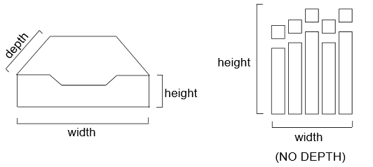
The Achievements and the Winter Bash icons are 2D and flat, so why is the Inbox icon supposed to be seen as a 3D one with perspective? It's obvious why the OPs of the above questions are confused. In 2D that icon could be an envelope, but it isn't, and instead represents a physical real-world inbox and is clearly a 3D icon.

Is there a reason behind this design decision?

UPDATE:
This should make the difference clear:
enter image description here

6
  • Can't see anything 3D in the inbox icon. It is just a drawing. Commented Dec 26, 2014 at 12:00
  • 1
    @ShadowWizard meta.stackexchange.com/a/210040/252153
    – Tim
    Commented Dec 26, 2014 at 12:28
  • What about it @Tim? The picture is indeed kind of 3D, but that's not being used as the icon. Commented Dec 26, 2014 at 12:31
  • 1
    @ShadowWizard: Drawings can be interpreted as 2D (flat) or 3D (perspective). In 2D that icon would be an envelope. To be seen as this you need to look at it as 3D. I'm not the only one who think's the icon is in 3D.
    – SNag
    Commented Dec 26, 2014 at 12:31
  • 1
    @Shadow yes, but the icon is also 3d...
    – Tim
    Commented Dec 26, 2014 at 12:32
  • 1
    Why is this being downvoted? This is a valid case for Consistency of UX. SE should consider redesigning the inbox icon. If you downvote, please atleast explain why.
    – SNag
    Commented Dec 26, 2014 at 18:50

1 Answer 1

5
+25

Generally, I am in favor of making UI/UX elements consistent when possible. In this case, however, I think the "problem" of 2-D versus 3-D elements is a bit of a red herring.

I haven't seen evidence that people are confused by the fact that the inbox icon is 3-D while the achievements graph is 2-D. Rather, the confusion is caused by the fact that the inbox tray is, at this point, a somewhat antiquated and therefore unfamiliar object. (If the only misinterpretation of the inbox tray was that people thought it was an envelope, we'd be fine, since that's another common metaphor for "inbox", but as the questions you linked to illustrate, some people can't figure it out at all and others have a wide variety of interpretations.)

Regardless of whether the issue is one of dimensions or one of a poorly chosen symbol, I actually don't think it's a pressing problem to fix. Even in those threads you linked, people clearly understand the function of the icon, even if they like to debate what the symbol actually is. Sure, we could make it prettier or a more obvious illustration, but since people know that it's their inbox, and that they go there to see replies, there isn't much of a real problem to solve.

As far as why this design decision was made...we needed an icon that was small and recognizable in black and white. Our designer decided to go with the inbox tray symbol (there was some discussion about using an envelope, but I can't recall if there was any reason other than personal preference for going with the inbox tray), and arrived at what you see on the page.

You must log in to answer this question.

Not the answer you're looking for? Browse other questions tagged .