18

[N.B.: I use a Mac, but I'm assuming the following is not Mac-specific.]

I've noticed that, font-wise, SE sites can be divided into two categories:

1) Those that employ a sans-serif font (e.g., TeX SE, superuser SE, and this one). These display numerals as "lining figures" (~full-height numbers designed to line up with upper case text).

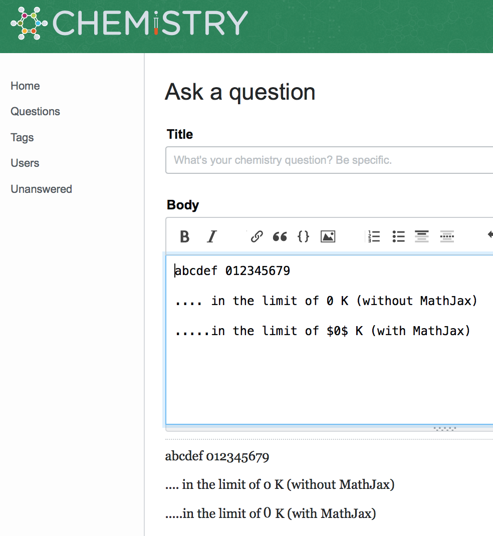
2) Those that employ a serif font. These display numerals as "text figures" (~half-height numbers designed to line up with lower case text) (see: https://en.wikipedia.org/wiki/Text_figures). Here's an example from Chemistry SE:

enter image description here

Here's the problem: Sites like Chemistry SE and Physics SE have many math-heavy posts. The half-height numbers make posting more cumbersome, since they somewhat necessitate the use of MathJax every time a numeral is written, even if it is within a block of text.

I.e., if the poster doesn't use MathJax when writing numerals within text (as in the example above, "0 K", which means zero kelvin), the appearance of the numerals will not only be notably inconsistent with those displayed within MathJax (where they are full-height), but also sometimes confusing to read: For example, on MathJax-enabled sites, "0 K" looks like "o K", i.e., like the "K" is preceeded by a lower-case "o". This is not an issue on sites that use lining numbers, such as this site, where "0 K" looks perfectly fine.

Indeed, within text, I would argue that "0 K" on a sans-serifed site (like this) is not only less cumbersome to type than "$0$ K"——it also looks better: On a MathJax-enabled serifed site, the zero isn't properly positioned (it's too high, and too close to the preceeding text; see screenshot above). It is possible to correct the horizontal spacing, but that makes things even more cumbersome if you have to do that every time.

Given this, why not use a font that displays lining numbers on sites that have math-heavy posts?

And if the standard serif font(s) SE uses are limited to text figures, might not the standard sans-serif font(s) be more suitable for math-heavy sites?

ADDENDUM: What motivates this is the idea that we're all volunteers, and the site should be designed to encourage posting with the minimum "friction". Consider, for instance, this comment (which I added to my answer to this question: Infinite Increase in Entropy when Energy added to Absolute Zero):

enter image description here

Mine is the second comment, made in respose to the question by the OP. As it was a comment, I didn't really want to bother with using MathJax, so I didn't; my focus was instead on doing the work of giving the OP the clarification s/he needed to understand my answer, and getting it out promptly (note the date stamps). Nevertheless, because Chem SE uses text numbers, I had to add dollar signs around every one of the six zeros. When I'm focusing on that, I'm not focusing on the content. That's added friction. And every added bit of friction can make the difference between someone bothering to give additional help vs. not.

With the sans-serif font style used on this site, that comment would have been perfectly clear and readable without the need for the added dollar signs.

15
  • 1
    Very few network sites have MathJax enabled... so I'm not sure why you're saying most of them do? Are you talking about sites with serif vs sans-serif fonts?
    – Catija StaffMod
    Commented Jan 28, 2020 at 4:00
  • @Catija. Yes, serif vs. sans-serif. I noticed that, of the sites I've visited, the serifed one have Math Jax enabled, and the sans-serifed ones don't, so I figured the decision to use serifed vs. sans-serifed followed from the decision to enable Math Jax vs. not. But, since you've told me that's not the case, I'll eliminate the Math Jax generalization. Thanks.
    – theorist
    Commented Jan 28, 2020 at 4:02
  • In most cases, from what I understand, sites with serif fonts specifically requested them as part of their site design but I'm not sure there's a specific reasoning. The choice of specific font is what causes the problem, not that it's serifed. We could, perhaps choose a different font.
    – Catija StaffMod
    Commented Jan 28, 2020 at 4:06
  • @Catija They don't specify that they have to be proportional text figures as one can with CSS and OpenType typefaces — although of course they should. :) But they're using old-school Georgia on some boxes, so you get its defaults. You don't get fixed-width and fixed-height titling figures.
    – tchrist
    Commented Jan 28, 2020 at 4:06
  • Still not quite correct. The vast majority of the network uses a sans serif font (Arial) and a tiny minority (15 or so, I think) use serif, though I haven't counted..
    – Catija StaffMod
    Commented Jan 28, 2020 at 4:08
  • Though it's extra work numbers, Greek characters, and equations (even simple ones, 2*2=4, should go within the dollar signs). As to the "why" for the typeface anatomy I might be able to find an answer in a couple of hours. Possibly because the author of MathJax is more concerned with consistent type design.
    – Rob
    Commented Jan 28, 2020 at 4:09
  • @Catija. OK, thanks for the additional correction. I must have gotten unlucky in my brief survey and coincidentally opened mostly sites that happen to have been serifed. I'll modify accordingly. As to your earlier comment: Yes, that's my point. If they want serifed, fine. But then why not have a serifed font that has full-height numbers?
    – theorist
    Commented Jan 28, 2020 at 4:09
  • Probably the best answer I can get you: meta.stackexchange.com/questions/315762/… @tchrist and I have talked about this a teeny bit but it's been a year or more.
    – Catija StaffMod
    Commented Jan 28, 2020 at 4:12
  • Eh... that's not quite the answer I was looking for... It's around somewhere... Arial and Georgia are fonts that nearly everyone has so the site doesn't require downloading/installing a font, so that's what we picked... I don't think consideration into your specific concern was part of it but the decision was made ~18 months ago.
    – Catija StaffMod
    Commented Jan 28, 2020 at 4:17
  • I don't understand why you wouldn't want proportional text figures in running proportional text. If you need tabular lining figures for accountancy tables, that's different.
    – tchrist
    Commented Jan 28, 2020 at 4:41
  • 3
    @Catija Duplicates: Math.meta.SE: "Why does the font use text figures?" (7 answers), U&L.meta.SE: "Question title font renders 0 (number zero) much like o (lower-case letter)" (3 answers, including Shog9's answer). See: Typesetting Numbers and Palatino Linotype font which has both text figures and lining figures.
    – Rob
    Commented Jan 28, 2020 at 5:04
  • 1
    Wikipedia: Text Figures are not encoded separately in Unicode because they are not considered separate characters from lining figures, only a different way of writing the same characters. High-quality typesetting generally prefers text figures in body text: they integrate better with lowercase letters and small capitals, unlike runs of lining figures. See: "TUGBOAT Volume 38, Number 1 / 2017 - TeX Users Group" (.PDF) on pages 29-30. revolvy.com/folder/Typefaces-with-text-figures/115276
    – Rob
    Commented Jan 28, 2020 at 5:20
  • 2
    @Rob: Thanks for those citations. It seems many feel as I do, but the matter was dropped several years ago. As to your Wikipedia quote, you're quoting from the same Wikipedia article I already cited in my post. I'm aware of the standard reason for using text figures. However, that's a general guideline which doesn't take into account the particular context I mention here (math-heavy posts, where it's inconvenient to have to bracket every number in a text body with dollar signs); this was echoed in the comments made in the threads you nicely cited.
    – theorist
    Commented Jan 28, 2020 at 5:42
  • @theorist You have not answered why you think your site’s text should have 𝙵𝙸𝚇𝙴𝙳-𝚆𝙸𝙳𝚃𝙷 lining figures not 𝒑𝒓𝒐𝒑𝒐𝒓𝒕𝒊𝒐𝒏𝒂𝒍 text figures in running text. That doesn't make sense to me, and it doesn't make sense to Graphic Design either: How to construct “lowercase digits” (i.e. text figures)?, How to construct “lowercase digits” (i.e. text figures)?, Is there a name for digits/figures which fit in the x-height?.
    – tchrist
    Commented Jan 29, 2020 at 22:14
  • @tchrist I haven't answered your question because my entire post was devoted to addressing that question. Hence I don't know how else to explain my reasoning beyond what I've done. Perhaps if you re-read my post (and also read the reasoning articulated by the posters in Catija's links, whose thinking is similar to mine), you'll better understand. Also, the issue isn't about fixed-width vs. proportional. [I never mentioned that.] It's about the fact that the text numbers requre additonal typesetting to be clear, while the lining numbers don't, and I want to minimize friction in posting.
    – theorist
    Commented Jan 30, 2020 at 1:54

1 Answer 1

8

We use a serif font on Chemistry, because we specifically requested it when we graduated and the site design was created. One of the main concerns was that we can distinguish between I (capital i) and l (miniscule L); see Chemistry site design ideas - input welcome! or predating any graduation: Can we have a font that harmonizes with inline MathJAX?. The initial draft actually featured a sans-serif font (Chemistry site design), but after some convincing (disclaimer: I was one of the main advocators for a serif font) that decision was changed. Why this specific font was chosen, I do not know.

Somewhat recently the topic of this font has come up again, see Should chem.SE use Georgia font? I guess most were kind of happy with the status quo, at least happy enough to not follow through with an actual feature-request.


N.B. If you ask me, any mathematical construct should be typeset with MathJax. It is a more consistent look when switching between displayed formulae and inline, and it doesn't break those constructs apart. You know, having the value on one line and the unit on another, etc.. On Chemistry, we even have the mhchem package loaded, which makes typesetting units a lot easier and more robust (It even gets the spacing right); see How to write physical units.
In any case, $0$ K is the worst possible choice, because it combines the disadvantages of MathJax and the font. (Also, it is zero kelvin with a miniscule k and no degree.)

7

You must log in to answer this question.

Not the answer you're looking for? Browse other questions tagged .