4

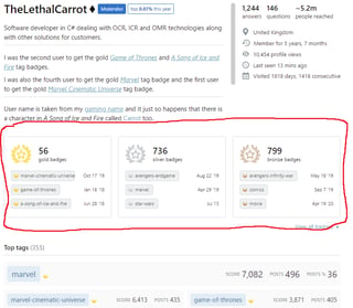
The new profile page badge UI has been released and for an example if you go to my profile on SFF you'll see the following*:


Click image to enlarge.

Could it be moved to under the Top tags widget? I find Top tags is probably more useful, you find out what content someone is active in over what random badges they may or may not have. In general I find myself looking at Top tags or Top posts more frequently than badges. I think a reasonable compromise and something that would work better is to shuffle it down one so the order would be Top tags -> badges -> Top posts.

Looking on the MSO post on the feature it looks like I'm not the only one unhappy with the positioning in the page:

I'm sorry, but this doesn't look like it's using the real estate on the profile page in a way that's interesting. The big images do not convey any information at all. It may look fancy, but it just forces me to scroll more to get the information that I'm interested in. Badges are the least interesting part of a user's profile. – Scratte


*Ignore the freehand red circle, I'm recycling a screenshot.

2
  • 5
    I'd go a step further and say the badges should be moved to the bottom of that column. The new design looks nice and I understand the desire to showcase an area which was recently worked on, but Stack Exchange sites, and user's participation, aren't primarily about earning badges. The sites are about content. On the user's profile page that user's contributions to the site are primarily represented by the list of posts which they have contributed, while an overview of the magnitude of their contributions is represented by the tag badges they've earned.
    – Makyen
    Commented Aug 5, 2021 at 17:08
  • @Makyen it seems Jon Skeet already solved that problem ...
    – Glorfindel Mod
    Commented Aug 5, 2021 at 17:15

1 Answer 1

7

This request is because there is a larger project afoot to reimagine the Profile page. It doesn't make sense for us to start reconfiguring parts of the page at this time when we know that we need to do foundational work to determine what information is most useful. This project is still in the early stages, and we will post on Meta when we are further along and looking for feedback.

10
  • 5
    This reflects the typical corporate mis-think of "we're thinking about some other large project, which we're unsure when we'll actually deliver, so we're not going to spend a short amount of time to address a simple issue." Yeah, if you're actively working on something and both A) the other project is going to be delivered in the relative short-term and B) the issue which is already present would take a relatively large amount of effort, then it's right to push things off. If fixing an issue is simple, easy, and relatively low cost, then pushing it off is the wrong choice.
    – Makyen
    Commented Aug 5, 2021 at 17:18
  • 5
    @Makyen I think that your assumption that rearranging elements on the profile page (which is still not responsive) is a simple issue is flawed. Just because you agree it should be moved doesn’t mean we all do, or even most of us do. Just because we can write a user script to flip it around doesn’t mean it is that simple to do within SE’s code base. Everything seems simple for people who don’t know the details of the code base and change processes. This is why dev don’t let PMs tell them how long a change will take ;)
    – ColleenV
    Commented Aug 5, 2021 at 17:38
  • @ColleenV in this case, the hierarchy of who's telling who what seems to be swapped
    – Kevin B
    Commented Aug 5, 2021 at 17:40
  • 5
    @ColleenV From a technical standpoint, as the originators of the HTML/CSS, just reordering those blocks should be quite trivial for SE (exclusive of whatever review process they have). If it's not, then SE probably has major problems with their code. That there might be disagreement as to what should be at the top is a completely different issue/reason for not doing something. If that's the reason for having the badges at the top, then that should be the stated reason for A) moving them to the top in the recent change, and B) the decision not to move them back to where they were.
    – Makyen
    Commented Aug 5, 2021 at 17:51
  • My understanding is some research was done that lead to wanting to move it up to the top, based on what was said in the original post. but... I can only assume what that research entailed
    – Kevin B
    Commented Aug 5, 2021 at 17:57
  • My assumption is it was less of a research thing, and more of a visual thing. having them at the top with the new design neatly lines it up with the collective badge in the left column. though... updating the design of the top tags box, thus keeping the layout of the page the same, would have accomplished the same goal. Simply designing the new collective badge to fit within the existing page's design would have worked too.
    – Kevin B
    Commented Aug 5, 2021 at 18:36
  • 1
    @Makyen It doesn't make sense for us to start reconfiguring…when we know that we need to do foundational work to determine what information is most useful. It’s pointless to rearrange things when it’s not clear that one position is better than any other. This is not a simple change not getting done because it will eventually be obsoleted by a bigger project. This is a change that got done but its best position on the page was left for later.
    – ColleenV
    Commented Aug 5, 2021 at 18:40
  • @ColleenV Just as pointless as moving it in the first place, no? here it was stated that research did occur that lead to moving it. but that is inconsistent.
    – Kevin B
    Commented Aug 5, 2021 at 18:44
  • 1
    Seeing the recent activity in Stacks on making all pages responsive I think this is a reasonable answer.
    – Luuklag
    Commented Aug 5, 2021 at 19:42
  • 2
    ... we will post on Meta when we are further along and looking for feedback. - I've seen the new profile.
    – Rob
    Commented Aug 5, 2021 at 22:47

You must log in to answer this question.

Not the answer you're looking for? Browse other questions tagged .