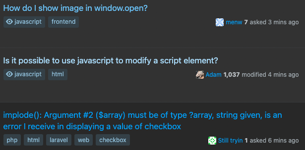
It's become painfully obvious that design changes, especially around colours, are never tested in Dark Mode, at least not for https://stackoverflow.com.
These changes affect other themed sites as well, so please consider that before voting to close this as off-topic for MSE.
I've noted this before and even received a response from the Director of Product Design, @Piper
Thank you for bringing this to our attention. You are correct—reviewing the designs in dark mode doesn't happen enough. I completely agree that this (both the design solution in dark mode and lack of process in dark mode testing) is not okay. I will work immediately on a solution for the arrows in dark mode and I will also work to make sure dark mode testing is added to our process is a more formalized manner.
But this just isn't happening.
So please, pretty please, test the changes you make on the sites where they will be applied in whatever modes are available on those sites.
Some less-than-stellar examples from the past include the ill-fated, eye-watering watched tag:
The contrast deficient vote arrow circles:
The blue-trending-to-white text colour for watched and visited questions which is tricking me into thinking I've visited everything already:
This one happens every single time there's a change to colours!
And most recently, a slew of dark-mode related issues with the New colors launched


