6

Have a look at this sample:

val ls = 1

The small l looks like a 1 in other fonts, while not like the 1 in this same font. Some fonts, for example the one used in the textfield where I put the title, use another l, rounded at the bottom, so the l doesn't look like an 1, and the 1 not like an l. However, I got confused studying another post, because there was no 1 to compare the l to.

But maybe it is a browser/OS/installed-fonts - problem, so I use firefox on xubuntu 9.04 and don't know, how to determine which font is actually used by my browser. Perhaps you may verify the one-ness of the l, but I can take a screenshot too, if you like.

By the way, the normal text-font displays small l like capital I. (l like in small, I as In Inconvenient) :)


After receiving the first 4 answers, I like to summarize the findings and my investigations:

The html-code uses a simple code-tag. The layout is driven by css, which is, according to a testside, defective over and over, but afaik not in relation to this question, see: http://jigsaw.w3.org/css-validator/validator?profile=css21&warning=0&uri=http%3A%2F%2Fmeta.stackoverflow.com%2Fquestions%2F76837%2Fcode-font-doesnt-distinguish-1-and-l

However, the css says: code { font-family : Consolas, Menlo, Monaco, Lucida Console, Liberation Mono, DejaVu Sans Mono, Bitstream Vera Sans Mono, Courier New, monospace, serif; background-color : #eee; }

The standard-Monospace-Fonts on my system: DejaVuSansMono, FreeMono, LiberationMono-Regular and TlwgMono all produce a glyph, which might be mistaken for the digit 1.

Here is a screenshot of diffrent mono-fonts: different monofonts
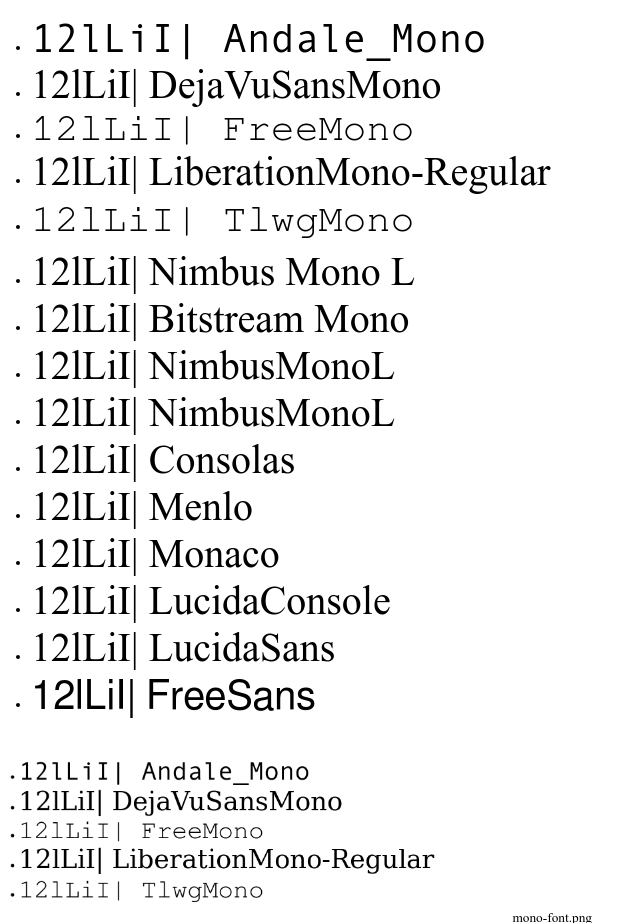
On my system, the only font which would make a difference, is ms-ttcorefont/Andale_Mono, but even if it is used as default-monofont, Liberation and DejaVu are prior in the List, so they are found and used.

I tried, as a dirty hack, to create a symbolic link from Mono_Andele.ttf to Consolas.ttf, but it doesn't change the font. Maybe I need to restart firefox for the change to take effekt? Maybe font-substitution isn't that easy? :)

5
  • 3
    They look distinct to me on Windows 7 (Consolas) and Mac OS X Snow Leopard (Menlo). Commented Jan 28, 2011 at 3:39
  • They look distinct to me too. What browser are you using? Which OS? Did you change the default fonts used by the browser with different fonts?
    – avpaderno
    Commented Jan 28, 2011 at 7:09
  • 1
    @kiamlaluno: second paragraph: firefox on xubuntu 9.04. Commented Jan 28, 2011 at 7:22
  • @Gamecat: Thank you. It seems I jumped out that part.
    – avpaderno
    Commented Jan 28, 2011 at 7:26
  • 1
    @MichaelChirico: Yes, the service finally terminated after nearly 20 years. I uploaded a screenshot image now. Commented Feb 7, 2017 at 1:33

4 Answers 4

7

I suggest you post a message on Super User asking for help installing a better fixed width font on Ubuntu, and configuring Firefox to use it.

4
  • This may involve understanding what font SO calls for in those blocks (inspect the css), so it may not be as straightforward as one might like.
    – Pollyanna
    Commented Jan 28, 2011 at 17:22
  • 1
    It appears to be the generic monospace font. Commented Jan 28, 2011 at 17:41
  • 1
    While investigating how html and css handle the code-tag, I stumbled over this: jigsaw.w3.org/css-validator/… which says 77 css-errors. What the ... . There are about 10 alternatives for the font: code { font-family : Consolas, Menlo, Monaco, Lucida Console, Liberation Mono, DejaVu Sans Mono, Bitstream Vera Sans Mono, Courier New, monospace, serif; background-color : #eee; } Commented Jan 29, 2011 at 15:44
  • From the fontlist, the first ones which I find on my system are: "LiberationMono" and "DejaVuSansMono". Commented Jan 29, 2011 at 16:10
6

Mac OS X 10.6, Safari 5:

enter image description here

Looks distinguishable to me.

5

It looks like this in my browser:

enter image description here

(Windows 7, IE8 and Firefox)

1
  • That's how it look like for me. I should have made a screenshot myself, apologies! Commented Jan 29, 2011 at 15:06
0

The following all showed a distinct l and 1. In all the 1 has a downward slash at the top, where the l is straight. In all but the IE 6 machine (a clean XP install, probably lacks cleartype) the 1 also appeared bolder (thicker lines).

  • Windows 7 FireFox 3.6
  • Windows 7 Chrome 8
  • Windows 7 IE 8
  • Windows XP IE 7
  • Windows XP IE 6

Based on the Mac OS testing I think this may be caused by the known linux-fonts-and-font-rendering-suck bug.

3
  • They look different for me too - but look at the subtle difference between the screenshots of Robert and Dave. In both cases the One can't be mistaken for an small L, but Roberts l might be seen as an One. Commented Jan 29, 2011 at 15:10
  • 1
    Could also be the we-are-on-linux-we-dont-need-no-steenkin-correct-font-config bug. Commented Jan 30, 2011 at 0:26
  • @Donal Fellows: Pardon? Commented Feb 4, 2011 at 23:35

You must log in to answer this question.

Not the answer you're looking for? Browse other questions tagged .