9

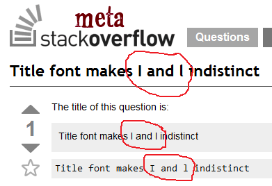
The title of this question is:

Title font makes I and l indistinct

Title font makes I and l indistinct

The font used for question titles makes uppercase 'i' and lowercase 'L' (I and l) visually identical, or nearly so. (I see on close inspection that there's a very small hook at the bottom of the lowercase l, but if the actual letter is uppercase I it's hard to tell that it's not supposed to be l.)

(At least in my browser, the variable-width font has the same problem, but the fixed-width code font does not.)

Usually this doesn't make much difference, but for this question it caused one person to misunderstand the question the difference could be significant. (On re-reading the person's (now deleted) answer, he didn't confuse I and l; he assumed that I was supposed to be i, which isn't related to the font after all.)

I see this on Windows 7 using Chrome, Firefox, and Internet Explorer.

Can something be done about this?

(Somehow I suspect that any solution won't work everywhere and/or will annoy a lot of people, but I thought I'd bring it up anyway.)

Related (but not the same): code font doesn't distinguish 1 and l

Obligatory screen capture with freehand circles:

Screen capture of this very question

4
  • 4
    Shhhhhhhhh! Don't call attention to the "probIem" workaround!
    – Pops
    Commented Aug 9, 2012 at 20:30
  • 2
    SO/MSO uses Trebuchet MS for question titles, whose lowercase L has a tail. It's pretty easy to spot, at least for me. Commented Aug 9, 2012 at 20:31
  • 1
    @BoltClock'saUnicorn: The tail on the l is visible, but it's easy to think that an I is really a tailless l if you don't know that l has a tail. Commented Aug 9, 2012 at 20:33
  • 1
    Oh, the Illiterates!
    – fuxia
    Commented Aug 10, 2012 at 6:40

1 Answer 1

2

There aren't very many "pretty" sans-serif fonts around that solve this better than the current one. In fact, many of them are a lot worse, believe it or not. Have a look at the current font-stack for titles, which handle this problem progressively worse:

Trebuchet MS,Liberation Sans,DejaVu Sans,sans-serif

I still gave the Question a +1, because this kind of distinction is rather important, especially on a programming forum like SO. However, next to choosing a programming font I think the only two available options are:

  1. Stick with the current font.
  2. Move to a serif font.

The latter may end up something like this:

Title font in Comic Sans

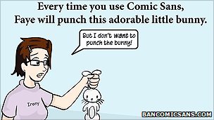
But that may end up getting bunnies killed:

Bunny-kills for using comic sans

Bottom line: +1, good issue, but "no action required" IMO.

5
  • 2
    Woo QC ref woo! (You can vote for any reason or no reason at all, right? Yes? Good.)
    – Pops
    Commented Aug 9, 2012 at 21:28
  • 1
    Actually, I think Comic Sans is even worse: an isolated l could much easier be taken for an upper case I (if such I is not also used in the same title) than the current Trebuchet does.
    – Arjan
    Commented Aug 9, 2012 at 21:59
  • 1
    It looks like what we really need is a variable-width programmer's font. Unfortunately, we also need to use a font that actually exists. (Anybody interested in creating one?) Commented Aug 10, 2012 at 5:57
  • @KeithThompson hehe good idea. We could just programmatically chop off all-but-one-pixel of whitespace on the sides of all Consolas glyphs, but then we'll all probably suffer from this.
    – Jeroen
    Commented Aug 10, 2012 at 7:27
  • @Jeroen: It's a bit scary that I knew what that link was before I opened it. Commented Aug 10, 2012 at 8:01

You must log in to answer this question.

Not the answer you're looking for? Browse other questions tagged .